Image source: artvee.com
Contextualizing the Belle Époque and the Rise of Poster Art
At the dawn of the 20th century, Parisian boulevards and suburban kiosks blossomed with enormous, eye-catching posters that turned urban space into an open-air gallery. This Belle Époque era, spanning roughly from 1871 to World War I, saw an unprecedented fusion of art and commerce. Thanks to innovations in lithographic printing, artists were no longer constrained by the monochrome broadsides of earlier decades; they could now deploy vivid, saturated colors in large formats. Artistic salons and publishing houses flourished, and a burgeoning middle class with growing disposable income created an eager market for consumer goods. Into this dynamic milieu stepped Leonetto Cappiello, an Italian illustrator whose work would redefine the very nature of poster design. His 1908 creation for Cognac Albert Robin stands as a hallmark of this golden age, blending Art Nouveau elegance with a modernist emphasis on visual reduction. By isolating a single, resonant symbol against a flat color field, Cappiello captured attention in a split second, setting a standard for effective graphic communication that endures to this day.
Leonetto Cappiello: From Caricaturist to Advertising Visionary
Leonetto Cappiello was born in Livorno, Italy, in 1875, but made his name in Paris in the 1890s as a caricaturist for leading satirical magazines such as Le Rire and La Vie Parisienne. His early illustrations displayed a keen sense for personality and a knack for exaggeration, qualities that translated powerfully into his poster work. By 1900, Cappiello recognized that advertising needed simplicity and immediacy: posters had to speak directly to hurried urban viewers, distilling a brand’s essence into one arresting image. Collaborating with eminent printers like Eugène Devambez and later Imp. Vercasson & Cie, he mastered color lithography, ensuring his bold designs could be faithfully reproduced on a monumental scale. Over the next two decades, Cappiello would create over 500 posters, often for vermouths, liqueurs, chocolates, and indeed cognac. His stylistic hallmarks—flat backgrounds, minimal text, one dominant motif—revolutionized graphic advertising and firmly established poster art as a modern discipline.
The Albert Robin Cognac Company: Brand Heritage and Market Position
Founded in 1860 by Albert Robin in the Cognac region of southwestern France, Cognac Albert Robin & Co. quickly distinguished itself through meticulous aging processes and a commitment to artisanal tradition. The company’s cellars in the town of Cognac held thousands of oak barrels, each imparting unique flavors of vanilla, spice, and oak tannins to the distilled eaux-de-vie. By the early 1900s, cognac had become an international luxury good, sought after in Europe, Russia, and beyond. Albert Robin’s growing export business required equally sophisticated marketing. In contrast to smaller regional producers, the company aimed to project an aura of cosmopolitan elegance while underscoring its authentic French origins. Cappiello’s poster needed to encapsulate these dual messages: a sense of refined rarity befitting a luxury spirit, yet couched in an accessible visual language. The 1908 design for Cognac Albert Robin succeeded brilliantly, marrying Art Nouveau artistry with commercial clarity.
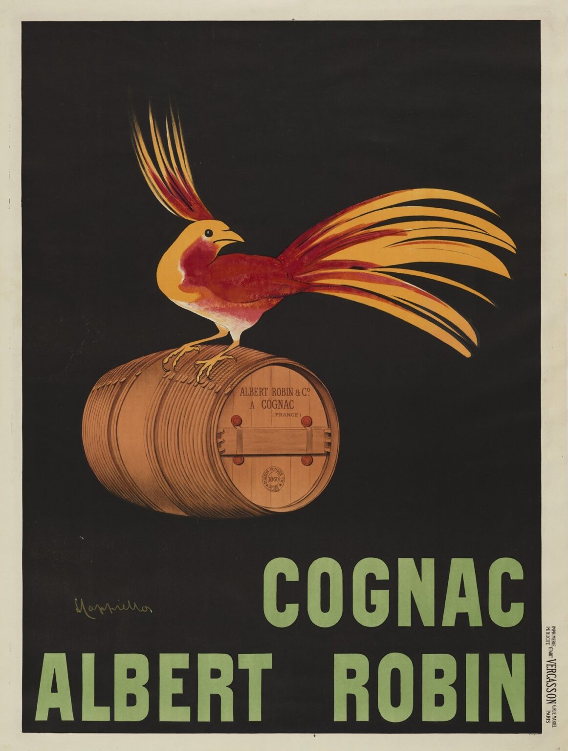
Composition and Central Imagery
At the center of the Cognac Albert Robin poster sits a flamboyant bird resembling a crested cockatoo, rendered in gleaming shades of crimson, orange, and gold. Its long, flowing tail feathers and majestic crest fan out like flames, evoking both vitality and warmth. The bird perches proudly atop a horizontal oak barrel, whose staves and head convey the product’s viticultural pedigree. Behind this tableau lies a stark black background, its emptiness granting the central figure a theatrical spotlight. This compositional strategy—one dominant motif suspended in a void—was radical in 1908 but would become Cappiello’s signature. The barrel itself bears the imprint “Albert Robin & C⁰ À Cognac (France)” in delicate serif lettering, anchoring the visual flourish with a concrete reference to the esteemed producer. Below, the words COGNAC ALBERT ROBIN appear in large, pale green block letters that balance crisp modernity with Art Nouveau curvature. The viewer’s eye is thus guided from the dynamic bird to the reassuring solidity of the barrel, culminating in the direct call to the brand name.
Color Palette and Emotional Resonance
Cappiello’s color choices in the Cognac Albert Robin poster demonstrate his deep understanding of color psychology. The fiery reds, burnt oranges, and golden yellows of the bird’s plumage capture the warmth, richness, and amber glow associated with well-aged cognac. These warm hues contrast sharply with the velvety black background, ensuring immediate legibility and high-impact visibility. The olive green of the typographic band below introduces a cool complement to the warm spectrum, evoking vine leaves or moss-laden cellars, subtly reinforcing the cognac’s botanical origins. The natural brown of the barrel ties the palette together, lending an earthy counterpoint to the more flamboyant bird. By orchestrating these colors into a harmonious yet high-contrast symphony, Cappiello created an image that felt both luxurious and primal, triggering an emotional response akin to the heady first sip of an aged brandy.
Typography: Minimalist Messaging and Modernism
Text in the Cognac Albert Robin poster is purposefully minimal. The brand name appears only once, in large, uppercase sans-serif letters—uncommon in 1908, when serif type still dominated most print advertising. The choice of sans serif suggests modernity, legibility, and confidence. Its placement at the poster’s base anchors the soaring bird motif, providing a visual counterweight. The barrel’s imprint, set in a delicate serif, bridges the contemporary boldness of the headline with the old-world craftsmanship that the cognac embodies. Cappiello’s sparing use of text—no slogan, no pricing, not even a “since 1860”—underscores his conviction that the image alone needed to convey the product’s essence. In doing so, he pioneered a principle that remains fundamental in corporate identity design: let the logo and a single associative image do the bulk of the persuasive work.
Symbolism of the Exotic Bird
The choice of a flamboyant bird as the visual centerpiece carries multiple layers of symbolism. Birds often represent freedom, transcendence, and elegance. The crest and tail of this particular bird resemble stylized flames, hinting at the cognac’s warming effect and the glowing warmth of a fireside drink. Its exotic appearance—more tropical parrot than European finch—suggests far-flung adventures and the global spirit trade that brought cognac barrels from the Charente to distant markets. By perching the bird on a barrel, Cappiello merges exotic allure with aged tradition. The bird’s proud, upright stance and forward gaze convey confidence; as if the cognac itself were boasting its quality and inviting consumers to partake in its rarefied pleasures. In this way, Cappiello transformed a barrel and a bird into a visual allegory for craftsmanship, luxury, and cosmopolitan aspiration.
Spatial Dynamics and Visual Balance
Cappiello’s Cognac Albert Robin poster strikes a careful balance between flatness and spatial suggestion. The black background is deliberately unmodulated, emphasizing the figure and reinforcing the poster’s jewel-like composition. The barrel and bird, however, display skillful shading—cross-hatched lines on the staves and subtle tonal gradations on the bird’s feathers—that suggest three-dimensional form. This juxtaposition allows the motif to pop off the page without sacrificing graphic simplicity. The horizontal barrel contrasts with the vertical reach of the bird’s crest and tail, creating a dynamic X-shaped focal zone. The text below, broad and horizontal, provides a grounding element, preventing the composition from feeling top-heavy. Through this orchestration of positive shapes and negative space, Cappiello guides the viewer’s attention in a seamless visual journey.
Technical Mastery: Early 20th-Century Lithography
Printed as a multi-color lithograph by Imp. Vercasson & Cie in Paris, Cognac Albert Robin showcases the technical prowess of Belle Époque printmaking. Each hue—vermillion, orange, gold, olive green, brown, black—required its own stone and press pass, with exacting registration to avoid overlaps or gaps. The barrel’s fine wood-grain texture and the bird’s delicate feather highlights demonstrate the stone carver’s precision. The large format of the poster—often exceeding one meter in height—meant that ink consistency and paper quality were crucial for avoiding mottling or warping. Cappiello’s close supervision of each printing stage ensured that his design retained its vibrancy and crispness in outdoor display, where rain, sun, and wind could otherwise degrade lesser productions. The result is a poster whose technical excellence matches its artistic innovation, allowing it to endure in near-original brilliance for over a century.
Market Impact and Cultural Reception
Upon its release in 1908, Cognac Albert Robin posters quickly became ubiquitous in cafés, hotels, and tram stops across France and in cosmopolitan centers abroad. Its striking imagery distinguished it from more conventional beverage advertisements of the period, drawing both connoisseurs of graphic art and casual passersby. Business records from the Albert Robin company indicate a notable increase in export orders to Belgium and Switzerland following the campaign’s rollout. Collectors of early 20th-century ephemera have since cited the poster as a watershed moment in brand communication, elevating cognac from mere alcoholic commodity to a symbol of cultural refinement. The campaign’s success prompted other cognac houses to commission their own high-art posters, fueling a golden age of liquor advertising that stretched into the 1930s.
Legacy and Continued Influence
Today, Leonetto Cappiello’s “Cognac Albert Robin” poster remains a celebrated artifact of graphic design history. Major museums—such as the Musée des Arts Décoratifs in Paris and the Victoria & Albert Museum in London—include it in permanent collections. Design schools teach its bold reductionism, effective use of color, and seamless integration of text and image as a paragon of early modern advertising. Contemporary craft distillers frequently cite Cappiello’s work as inspiration for their own minimalist branding, echoing the principle that a single, powerful visual can anchor a brand’s entire identity. Reproductions of the poster grace café walls and tasting rooms, reminding new generations of the enduring power of a well-executed design to convey heritage, quality, and aspiration in one cohesive image.
Conclusion: The Harmonious Marriage of Art and Commerce
Leonetto Cappiello’s 1908 “Cognac Albert Robin” poster stands as a testament to the symbiotic relationship between artistic innovation and commercial necessity. Through a masterful blend of Art Nouveau elegance, modernist economy, and lithographic virtuosity, Cappiello crafted an image that transcended its era and medium to become an enduring icon. The flamboyant bird, perched atop its barrel, embodies the paradoxical charms of cognac: exotic yet grounded, luxurious yet convivial. The poster’s stark black void, vibrant hues, and precise typography demonstrate how a single, well-conceived motif can communicate complex brand narratives in an instant. Over a century later, this work continues to inspire designers, marketers, and aficionados of graphic art, reminding us that at the heart of every great advertisement lies a clear, compelling vision brought to life through color, form, and ingenuity.