Image source: artvee.com
Introduction
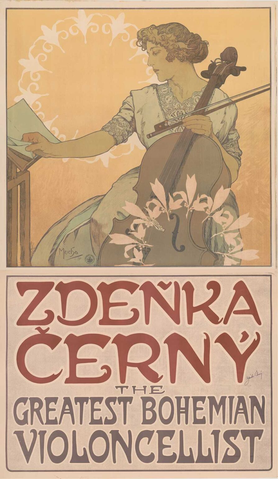
Alphonse Mucha’s poster Zdeňka Černý – The Greatest Bohemian Violoncellist masterfully combines portraiture, typography, and Art Nouveau ornamentation to celebrate the virtuosity of the Czech cellist Zdeňka Černý. Created circa 1910, this lithograph measures approximately 120 by 80 centimeters and was commissioned for promotional display across Europe. Mucha, already renowned for his theatrical posters and commercial work, elevates this advertisement into a work of fine art, using a restrained palette, sinuous lines, and thoughtful composition. Rather than merely announce a concert, the poster conveys the dignity, grace, and national pride embodied by Černý, positioning her as an artistic ambassador of Bohemia.
Historical and Cultural Context
The early twentieth century was a period of burgeoning nationalism in Central Europe. Bohemia, part of the Austro-Hungarian Empire, saw a cultural revival that valorized its language, music, and artistic heritage. Concert promoters recognized the power of visual branding to attract audiences to salon recitals and grand concert halls. In this environment, Zdeňka Černý emerged as a pioneering female cellist, admired for her technical prowess and expressive tone. Alphonse Mucha, himself a Czech expatriate in Paris, was an ideal collaborator. His Art Nouveau style, infused with Slavic motifs and folkloric references, resonated with Czech audiences’ desire to assert their cultural identity. The poster thus operates on two levels: as a promotional tool and as a statement of national pride.
Alphonse Mucha’s Artistic Evolution
By the time Mucha created the Zdeňka Černý poster, he had firmly established the visual vocabulary now synonymous with Art Nouveau. His hallmark features—whiplash curves, stylized foliage, and harmonious color schemes—had first blossomed in his 1894 Sarah Bernhardt posters. In the years that followed, Mucha expanded his repertoire to include travel advertisements, product branding, and cultural commissions. The Zdeňka Černý poster represents a mature phase in his career, where he balanced decorative opulence with refined restraint. Gone are the dense floral frames of earlier works, replaced here by open, geometric motifs that direct the viewer’s focus to the cellist’s poised profile and instrument. This evolution reflects Mucha’s adaptability and his ongoing dialogue between French Art Nouveau and Slavic national themes.
Subject and Portraiture
At the poster’s center is Zdeňka Černý herself, depicted in three-quarter profile as she prepares to play the cello. Her attire—a blouse with lace collar and a softly draped skirt—combines elegance with modesty, allowing her expressive hands and the cello’s form to take precedence. Černý’s gaze is calm and determined, conveying both concentration and artistic confidence. Mucha renders her with delicate linework and subtle shading, employing a limited range of earthy tones—muted ochres, soft greens, and warm taupes—to suggest the natural resonance of the cello’s sound. The cello itself, painted in richer browns and accented by floriform patterns, becomes an extension of Černý’s persona, symbolizing her deep connection to the instrument.
Composition and Spatial Dynamics
Mucha organizes the composition into two main registers: the upper portrait and the lower typographic panel. The figure of Černý occupies the top two-thirds of the poster, set against a softly hued field in which a circular halo of stylized lilies and vine tendrils emerges behind her head. This halo not only frames her visage but also alludes to the cultural symbolism of lilies—purity, renewal, and artistic inspiration. At the bottom, the typographic block boldly proclaims ZDEŇKA ČERNÝ in large, custom-crafted letterforms, while the subtitle “THE GREATEST BOHEMIAN VIOLONCELLIST” appears in a complementary serif. Geometric lines separate these sections, guiding the viewer’s eye and ensuring clarity of messaging without disrupting the poster’s visual harmony.
Decorative Motifs and Symbolism
Throughout the Zdeňka Černý poster, Mucha integrates motifs drawn from Czech folk art and classical ornament. The border along the poster’s top and sides features interlocking chevrons reminiscent of traditional embroidery patterns. The circular vine wreath behind Černý’s head incorporates stylized pomegranate blossoms—a symbol of artistic fertility and cultural richness. These motifs serve a dual purpose: they situate the cellist within a specifically Bohemian aesthetic and reinforce the poster’s overall decorative unity. Mucha’s ability to weave narrative symbolism into ornamental details ensures that every element—border, halo, or instrument carving—contributes to the celebration of Černý as both musician and national icon.
Color Palette and Light
Mucha adopted a restrained yet resonant palette for Zdeňka Černý. The poster’s background is rendered in a warm ivory-beige, creating a luminous ground against which figure and ornament stand out. Černý’s skin tones, achieved through delicate layering of light ochre and rose touches, appear almost luminescent. Her blouse and the cello’s highlights employ soft whites that catch ambient light. The cello itself, depicted in deep walnut and mahogany hues, anchors the scene with its visual weight. Accents of pale green in the wreath and letters add cooling contrast, while subtle gold dust highlights on the instrument and in the halo bring a sense of elegance without overwhelming the overall harmony. This judicious use of color exemplifies Mucha’s mastery of lithographic printing.
Typography and Graphic Integration
The poster’s bottom section illustrates Mucha’s innovative approach to integrating typography with imagery. The name ZDEŇKA ČERNÝ appears in bold, nearly square capitals, their subtle curls and extended serifs echoing the poster’s vine motifs. Beneath, “THE GREATEST BOHEMIAN VIOLONCELLIST” is set in a dignified serif that balances legibility with stylistic consonance. Mucha avoided the common pitfall of segregating text and image; instead, he used dividing lines whose endpoints morph into leaf shapes, visually linking the letters to the surrounding decoration. This holistic treatment ensures that the viewer’s eye flows seamlessly from portrait to text and back, reinforcing the cellist’s identity with every glance.
Printing Technique and Craftsmanship
Producing Zdeňka Černý required meticulous coordination across multiple lithographic stones—likely six to eight—each responsible for a distinct color layer. Mucha’s original drawing, executed in pencil and watercolor, guided printers in ink selection and plate preparation. The careful registration of plates ensured that lines remained crisp and colors aligned precisely. The choice of a lightly textured, cream-toned wove paper enhanced ink adhesion and contributed to the poster’s soft glow. Metallic inks, used sparingly in halo highlights, added subtle shimmer under exhibition lighting. Quality control was rigorous, as the poster needed to withstand outdoor display without color degradation—a testament to both Mucha’s artistic vision and the technical expertise of his Parisian printers.
Reception and Cultural Impact
When Zdeňka Černý – The Greatest Bohemian Violoncellist appeared in 1910, it was met with enthusiasm by both critics and the public. Concert promoters reported increased ticket sales, attributing part of the success to the poster’s alluring design. Czech expatriate communities in Paris and New York embraced the image as a symbol of their homeland’s artistic vitality. Art magazines, including La Plume and Les Maîtres de l’Affiche, reproduced the poster in their pages, further amplifying its reach. Mucha’s innovative fusion of national symbolism and Art Nouveau aesthetics influenced subsequent promotional materials for musicians and cultural events, inspiring a generation of artists to explore the interplay of portraiture and ornament in commercial art.
Legacy and Contemporary Relevance
Over a century later, Mucha’s Zdeňka Černý poster endures as both an iconic example of Art Nouveau graphic design and a document of early twentieth-century Bohemian musical culture. Original lithographs reside in the collections of the National Gallery in Prague and the Musée d’Orsay in Paris, where they are studied for their artistic and technical merits. Contemporary graphic designers continue to draw on Mucha’s principles of integrated typography, harmonious color, and symbolic ornament when creating branding for orchestras, festivals, and solo performers. The resurgence of interest in analog printing and craft-based illustration has further cemented the poster’s status as a timeless masterwork that bridges art, commerce, and cultural identity.
Conclusion
Alphonse Mucha’s Zdeňka Černý – The Greatest Bohemian Violoncellist transcends its function as a promotional poster to become a richly layered work of art. Through its elegant portraiture, decorative motifs drawn from Czech folk art, refined color palette, and seamless typography, Mucha captures the essence of Zdeňka Černý’s musicianship and Bohemian heritage. The poster’s enduring appeal lies in its ability to convey both individual artistry and collective cultural pride. As audiences continue to discover Mucha’s work, the Zdeňka Černý poster stands as a luminous testament to the power of design to celebrate human creativity and national identity.