Image source: wikiart.org
Introduction
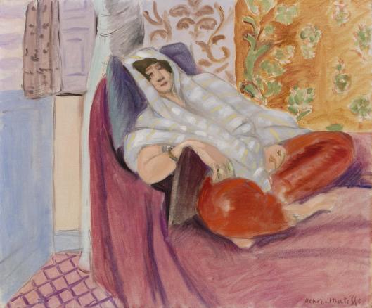
Henri Matisse’s “Woman Reclining” captures a private interval of rest and wraps it in color, pattern, and touch. The model leans back on a divan, head cushioned by pillows and loosely veiled in a pale striped cloth. Her torso settles into a violet throw, while the long arc of her legs resolves into a sumptuous burst of lacquered red—trousers or cushions that read like a single glowing mass. Behind her, the wall is divided into panels of ornament: lilac stripes at left, a central field of tan with scrolling arabesques, and to the right a floral orange-gold that seems to radiate warmth. At the lower left, a wedge of rose tile patterned with a diagonal grid anchors the floor. With the lightest of means—elastic contours, open brushwork, and a palette of tuned warms and cools—Matisse composes a room that breathes, and a body that belongs in it.
The Nice Period And A Modern Classicism
Painted in 1921, the work belongs to Matisse’s early Nice period, when he aimed for a modern classicism after the experiments and upheavals of the 1910s. This phase is less about pyrotechnic color than about measured harmony. Interiors become laboratories where pattern functions as structure, light flows like air, and figures inhabit comfort without theatricality. “Woman Reclining” exemplifies that pursuit. The subject—leisure at home—is ordinary, yet the painting’s order lends it resonance. The room is tuned like an instrument; the pose is a chord that settles perfectly into that tuning.
Composition Built From Diagonals And Enclosures
The composition is anchored by a long diagonal running from the lower right to the upper left, the path the figure’s body traces as it reclines. That diagonal is cradled by counterforms: the dark triangle of the divan, the lavender and cream curtains at left, and the warm patterned panels behind her. The floor’s pink grid, visible in a small triangular wedge at the bottom, subtly pushes the eye upward toward the figure, while the veil’s pale stripes echo the diagonal and soften its authority. Everything in the room seems to lean with the body, then catch and cradle it. The viewer feels the pose before parsing its details.
Pattern As Structure Rather Than Decoration
Matisse’s patterns keep time like percussion. The lilac stripes at the far left are broad and regular; they steady the vertical edge of the composition and cool the adjacent wall. The center field’s arabesques provide a flexible rhythm that answers the figure’s relaxed limbs. The floral orange panel at right carries warmth and complexity but remains held to the surface by visible brushwork, so it does not pull the space apart. Underfoot, the floor’s diagonal grid creates perspective without pedantry and repeats the “tilt” of the recline. Throughout, pattern is an architectural device: it divides and joins space, guides the eye, and keeps large color fields from going inert.
Color Climate: Lilac Air And Embered Reds
The palette balances gentle cools against saturated warms. On the cool side sit the lilac and periwinkle of walls and curtains, the blue-gray cast of the veil, and the lilac tiles. On the warm side, the orange-gold floral panel glows, and the divan culminates in those irresistible red forms—painted so richly they read as both fabric and light. Between them the central wall’s beige arabesques and the mauve-violet throw moderate temperature. Skin tones are kept peachy and restrained, so the face and hands participate in the harmony rather than breaking from it. The total climate is Mediterranean without glare: a room that holds the day’s warmth and lets it diffuse.
Light As A Distribution Of Relations
There is no theatrical spotlight. Light in this painting is distributed, almost democratic. The whites of the veil are not the same whites as the floor’s highlights; the violet throw advances toward us not by brilliance but by contrast with the neighboring beige; the red trousers gleam where Matisse lays a wetter stroke and quiet where he scumbles. Small accents—a bright edge at the veil’s fold, a soft sheen on a bracelet, a glint along the pillow—convince the eye that light is moving without insisting on a single source. The room feels illuminated by air, not by mechanism.
The Reclining Pose And The Ethics Of Ease
Matisse’s model does not perform; she resides. One arm drapes across a cushion; the other rests close to the torso, wrist softened. The head tips gently toward the viewer, eyes half-lidded in a mood closer to reverie than to sleep. This is a picture of ease—an ethic as much as an aesthetic. In the Nice interiors, Matisse repeatedly argues that comfort can be a modern virtue: chairs that cradle, textiles that welcome touch, color that calms without flattening, and bodily poses that honor rest rather than work. “Woman Reclining” makes that argument without a sentence; it lets posture, rhythm, and light do the speaking.
Textiles And The Studio Of Ideas
The painting is also about fabric as thought. The striped veil, violet throw, and floral panels are studio actors, props Matisse recombined across canvases to explore how pattern orders space. Here the veil performs three tasks at once. It frames the face so gently that the features appear like a cameo, it repeats the diagonal so the pose reads clearly, and it cools the hot reds nearby so the palette stays breathable. The violet throw offers volume without fuss; a few long strokes suggest pile and weight. The orange floral panel, placed just beyond the body, plays the generous role of radiating warmth without touching the figure, the way a tiled stove warms a corner.
Drawing With A Living Contour
Matisse’s line is elastic, thickening and thinning in response to structure. It firms the jawline and the outer contour of the shoulder, loosens along the veil’s edges, and all but disappears where the red masses melt into shadow. The contour never cages color; it conducts it. The eye feels the pressure of the head against the pillow, the slower drift of the forearm across fabric, and the soft boundary where drapery meets wall. Because the contour is alive, the figure remains present even when large color fields remain open and unblended.
Brushwork And The Evidence Of Decision
The surface tells you how it was made. The patterned panels are laid in quick, legible strokes—arabesques sketched rather than embroidered—so the marks keep the painting’s time signature. The veil is brushed in translucent stripes, allowing the ground to glimmer through and conjuring gauze without counting threads. The divan’s violet comes in longer, loaded sweeps that assert body and direction. The red trousers and cushions are perhaps the most delicious to read up close: satin-like strokes that catch and release light, a bravura that nevertheless obeys the painting’s calm. Everywhere one senses decisions rather than fuss, edits rather than polish.
Space And Depth Without Pedantry
Depth is established through overlapping planes and value, not by strict perspective. The figure overlaps the divan; the divan overlaps the wall; the patterned panels slide behind without fastening to vanishing points. The tile wedge at the lower left introduces a believable floor but cedes most of the stage to the reclining body. That combination—just enough ground to steady the viewer, no more than needed—keeps the image modern. We inhabit the room while remaining aware of the painted surface that makes it possible.
The Viewer’s Route Through The Picture
The painting encourages a gentle circuit. The eye often begins at the face, moves along the pale veil to the relaxed hand, drifts across the violet throw into the glowing reds, and then climbs the floral panel to return through the arabesque field to the head again. Each lap reveals a new pleasure: a cool seam where veil meets wall, a shadow note deepening the crook of an elbow, a small bracelet catching a warm flicker, a lavender echo between tile and curtain. The route is the rhythm of lounging—no abrupt turns, only soft transitions that let attention wander and return.
The Emotional Key Of Mauve And Red
One might say the painting is pitched in mauve with red as its dominant. Mauve is the prevailing air—curtains, tiles, the violet ground—while red provides the melody that carries. This key is tender rather than sentimental. It avoids the high voltage of primary color and celebrates the quieter pleasures of mixed tones. The result is an atmosphere that welcomes staying, the way a room painted in soft shades keeps conversation unhasty. In Matisse’s hands, color does not simply decorate; it sets the social temperature.
Kinships And Differences With Sister Works
“Woman Reclining” converses with many Nice-period companions—pictures of women in armchairs, on daybeds, in rooms whose patterns serve as architecture. Compared with the later, more flamboyantly exotic odalisque interiors, this canvas is sparer and milder. The patterns are legible but not profuse; the pose is relaxed but not languorous to the point of display. Compared with the earlier Fauvist years, chroma here is tempered, and clarity comes from value and contour rather than electric contrast. What is consistent across Matisse’s practice is the grammar: an enclosing curve; a counter-diagonal; a palette that balances temperature; and a line that breathes.
The Face As A Quiet Center
Even as the red forms command attention, the face remains the quiet center. Matisse draws it with a few decisive marks—arched brow, delicately shaded eyelids, a small mouth that suggests exhalation rather than speech. He resists the urge to sculpt every plane and lets the veil’s pale stripes serve as natural framing, a soft proscenium. The result is a presence that maintains autonomy. The viewer is invited into proximity but not into interrogation. The painting’s respectfulness is palpable.
Sensation Over Description
A list of the room’s things—veil, divan, patterned screens—misses the point. The painting aims to transfer sensation: the coolness of lilac air against warm fabric, the weight of a body settling into a cushion, the soft grip of gauze across hair, the way a red textile can feel almost luminous late in the day. These are achieved not by detail but by precise relationships: warm against cool, opaque against translucent, contour firming then releasing. Matisse trusts viewers to complete what he proposes; that trust is why the picture continues to feel fresh.
Hospitality As An Aesthetic
The Nice interiors make a moral claim for hospitality—the arranging of space and light so bodies can rest. “Woman Reclining” puts that claim into practice. Color is hospitable to skin; pattern is hospitable to the eye; the divan is hospitable to the body. Even the composition’s diagonal, which could feel dynamic, serves rest by lying down across the picture. In a century enamored of speed, this insistence on comfort has its own quiet radicalism.
Why The Image Endures
The painting lingers because it solves multiple problems elegantly and then withdraws, allowing the solution to feel inevitable. It balances saturated warmth with breathable cools; it builds space without sacrificing the modern surface; it grants the figure privacy while sharing her climate with us. The eye can loop through the scene indefinitely without fatigue, always finding a new seam, a softened edge, a resonant color note. The image is a place as much as a picture—a small room of attention that can be re-entered at will.
Conclusion
“Woman Reclining” is not merely a record of a pose; it is a demonstration of how a room and a body can be tuned to one another. Pattern supports composition, color sets the temperature, light distributes kindness, and the line conducts the whole without tightening it. The model’s ease is the painting’s subject and its method. Matisse orchestrates everything toward that end: a calm fit between person and place. What remains after looking is the sensation of having rested in a poised harmony of mauve air and embered red, of fabric and skin, of thought slowed to the pace of breath.