Image source: artvee.com
Historical Context: Post–World War I Paris and the Rise of Modern Advertising
In 1921, Paris was still reverberating from the trauma of World War I even as it embraced the exuberance of the “Années Folles” or Roaring Twenties. The capital’s streets were crowded with kiosks plastered in enormous color lithographs announcing everything from theatrical productions to apéritifs. Lithographic poster art had matured into a primary means of mass communication as printing technology advanced, allowing artists to use rich palettes and bold forms to capture attention in bustling urban environments. Leonetto Cappiello, an Italian émigré who arrived in Paris in 1891, had already established himself by the early 1900s as a pioneer of modern advertising posters. By 1921 he was at the height of his powers, experimenting with more fluid painterly styles that blended Art Nouveau’s sinuous lines with emerging Art Deco’s penchant for simplified shapes. “Woman Holding a Bottle” epitomizes this transitional moment—rooted in decorative elegance yet charged with a fresh dynamism that would influence graphic design for decades to come.
Leonetto Cappiello’s Artistic Evolution and Poster Innovation
Leonetto Cappiello’s career began as a caricaturist for satirical journals like Le Rire and La Vie Parisienne, where he honed the economy of line and wit that later defined his posters. Around 1900, he realized that posters needed a different approach than fine art reproductions. Instead of text-heavy layouts, he championed a single, memorable motif set against a flat, high-contrast background. Early successes such as “Amandines de Provence” (1902) and “Angelus” (1902) showcased his flair for isolating bold figures or objects in vibrant fields. By the postwar period, Cappiello began to infuse greater painterly freedom into his sketches, using broad, energetic brushstrokes and richer color modulation. “Woman Holding a Bottle” represents this peak of experimentation: the composition retains the hallmark of a dominant figure and spare text, but allows the swirling leaves, fruits, and fabrics to assume an almost impressionistic spontaneity. This stylistic evolution reinforced Cappiello’s reputation as the father of modern advertising, bridging the decorative past and the streamlined future.
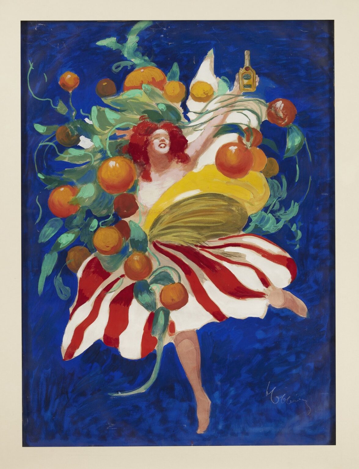
Subject Matter and Brand Connection
While the poster’s text is notably absent in surviving sketches, contemporary accounts identify the woman as the personification of an orange liqueur or apéritif, likely produced by an up-and-coming distillery seeking to capitalize on postwar tastes for sweet, citrus-flavored spirits. The bottle she holds aloft is small and golden, suggesting a concentrated essence meant to be enjoyed in measured sips before dinner. By placing the bottle in the woman’s hand and enveloping her in swirling oranges and verdant foliage, Cappiello transforms the product into an extension of her vivacious energy. The viewer is invited to associate the liqueur with freshness, warmth, and an almost theatrical flourish—a sensory promise that transcends mere flavor and taps into the era’s appetite for escapism and joie de vivre.
Composition: Dynamic Central Figure and Fluid Movement
At the heart of the poster stands a single female figure captured in mid-dance. Her left leg lifts elegantly while her right arm reaches skyward, clasping the small bottle like a trophy. Her body curves gracefully, forming a diagonal axis that cuts across the picture plane from lower left to upper right. Around her torso and limbs swirl broad bands of yellow cloth and red-white striped fabric that mimic the rhythms of her movement. Interspersed among these ribbons are dozens of plump oranges and twisting green leaves that arc outward in concentric whorls, as if spun off by her centrifugal energy. Cappiello uses this interplay of drapery and fruit to create a visual vortex, drawing the eye in continuous loops before resting on the bottle she proudly displays. The composition’s dynamic harmony between figure, drapery, and botanical motifs imbues the poster with a sense of perpetual motion—an apt metaphor for a beverage designed to enliven the senses.
Color Palette: Psychological Resonance and Visual Impact
Cappiello’s choice of colors in “Woman Holding a Bottle” exemplifies his skillful deployment of contrast and emotional resonance. The cobalt blue background serves as a deep, enveloping void that allows every other hue to pop with jewel-like intensity. The pumpkin orange of the fruit and the woman’s hair conveys warmth, vitality, and the citrus notes of the imagined liqueur. These oranges are balanced by the kelly green of the leaves, which suggests verdancy and freshness. The sunflower yellow of her draping evokes sunlight and exudes a cheerful radiance. Finally, the crimson stripes of her skirt introduce a vibrant accent that ties her attire to the swirling oranges. By layering these warm and cool tones in flat planes and subtle gradients, Cappiello achieves maximum eye-catching power while simultaneously evoking the aroma, taste, and effervescent pleasure of the apéritif itself.
Typography and Minimal Text
Unlike many contemporaneous posters that used ornate borders, extensive copy, or multiple slogans, “Woman Holding a Bottle” relies almost entirely on its striking imagery. Surviving proofs indicate that only the distillery’s name and perhaps a brief tagline appeared in small type below the main composition. This radical economy underscores Cappiello’s belief that a poster’s primary duty was to arrest attention at a glance. The omission of large-scale typography also ensures that nothing competes with the central dance of color and form. In this sense, the poster foreshadows later minimalist graphic design, where type serves as a subtle anchor rather than the focal point. The near-absence of text challenges the viewer to decipher the brand through image alone, deepening the visual impact and inviting closer inspection.
Spatial Depth and the Illusion of Three Dimensions
Although Cappiello’s style emphasizes flat color fields, he introduces hints of spatial depth to elevate the composition. The overlapping ribbons of cloth and clusters of fruit create a layered effect, with brighter elements appearing to sit above darker ones. Subtle highlights on the oranges and the woman’s limbs suggest roundness and volume. The brushwork in the blue background shifts from lighter to darker patches, conjuring a sense of atmospheric depth that recedes behind the figure. The bottle, held aloft in the upper right, is rendered with careful attention to reflections on glass, giving it a tangible solidity. These discrete modeling techniques—cross-hatched shadows, tonal gradations, and crisply defined overlaps—allow Cappiello to maintain his graphic clarity while hinting at three-dimensional form.
Symbolism and Emotional Narrative
The imagery in “Woman Holding a Bottle” functions on multiple symbolic levels. The dancing woman embodies the liberating effect of the apéritif: she moves with carefree ecstasy, liberated from constraint. The swirling oranges speak to abundance, fertility, and the tang of fresh fruit—qualities inherent to an orange-based liqueur. Green leaves underscore natural, botanical origins, suggesting that the drink’s ingredients are both exotic and wholesome. The upward thrust of the bottle in her hand positions the product as a prize, inviting viewers to share in her triumphant moment. Together, these symbols weave an emotional narrative of transformation: from gathering fresh ingredients to savoring the final distilled elixir, from the ordinary toward a heightened, celebratory state. In a postwar society seeking simple pleasures and renewed optimism, this allegory resonated deeply.
Technical Mastery: Lithographic Printing in 1921
The 1921 execution of “Woman Holding a Bottle” capitalized on advanced lithographic printing techniques developed in the Belle Époque. Cappiello collaborated with leading printer Eugène Devambez, whose atelier specialized in translating fine‐art color sketches into large‐format posters. Each major hue—blue, yellow, green, orange, red—required a separate limestone stone and press run, with exact registration to maintain crisp edges. Fine details, such as highlights on the bottle and delicate veins on leaves, demanded precise stone carving and inking. The poster’s generous dimensions, often exceeding one meter in height, tested the pressmen’s ability to apply uniform pressure and ink coverage. The result was a print of exceptional vibrancy and durability, ensuring Cappiello’s design would command attention on street walls despite exposure to weather and time.
Market Reception and Brand Impact
Released in 1921, “Woman Holding a Bottle” transformed its apéritif brand’s market presence. Café owners across Paris and major French provinces clamored to display the poster outside their doors, recognizing its power to draw customers. Contemporary sales reports from the distillery note marked increases in demand for the orange‐flavored liqueur following the campaign’s rollout. Journalists and art critics praised Cappiello’s painterly approach, contrasting it with the more formulaic posters of earlier decades. The design’s success prompted competing producers to commission similar “dancing figure” posters, sparking a broader trend in ephemeral advertising that emphasized movement, color, and simplicity over detailed copy. In this way, Cappiello’s work not only sold bottles but also reshaped the visual vocabulary of 20th‐century marketing.
Legacy and Influence on Modern Graphic Design
Decades later, “Woman Holding a Bottle” remains a touchstone in graphic design history. Its synthesis of Art Nouveau fluidity and early Art Deco boldness continues to inspire designers in branding, packaging, and poster art. The principle of isolating one evocative motif against a flat field—so powerfully demonstrated here—became a staple of mid‐century advertising and endures in digital media, where hero images command the screen and text plays a supporting role. Museums of design, from the Musée des Arts Décoratifs in Paris to the Poster House in New York, feature Cappiello’s masterpiece in permanent collections. Reproductions adorn the walls of contemporary cafés and creative agencies, reminding new generations that the art of persuasion lies in clarity, emotional resonance, and color’s primal allure.
Conclusion: The Timeless Power of a Single Image
Leonetto Cappiello’s “Woman Holding a Bottle” stands as a masterwork at the confluence of artistry and commerce. In a single, dynamic scene of swirling cloth, floating oranges, and a triumphant dancer, he conveyed the essence of an apéritif’s fresh flavor, luxurious pleasure, and postwar optimism. The poster’s technical excellence—rooted in expert lithography—and its pioneering use of a single, dominating figure set a template for all modern advertising to follow. More than a historical artifact, it remains a living lesson in how powerful a single image can be when crafted with vision, color, and restraint. As brands continue to seek emotional connection in an increasingly crowded media landscape, Cappiello’s 1921 poster reminds us that the most enduring messages arise from simplicity, vibrancy, and the universal language of movement and color.