Image source: wikiart.org
Introduction
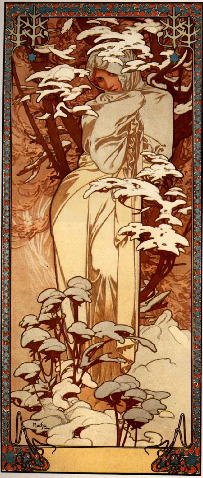
Alphonse Mucha’s “Winter” (1897) is a lesson in how stillness can sing. The tall panel shows a young woman wrapped in a pale mantle, nestled among snow-laden branches and hush-covered plants. Her face peeks from the hood with a sideways glance that is more ember than ice. Around the scene runs a jewelled frame of stars and filigree that turns weather into ornament. Nothing blusters. Instead, winter is rendered as intimacy, a season of shelter and breath seen in warm browns and silvery creams rather than theatrical blues. The result is both emblem and atmosphere, a decorative panel made to warm a room even as it depicts the cold.
The Place of “Winter” in Mucha’s Seasonal Imagination
Mucha returned to the seasons repeatedly, producing several cycles between 1896 and 1900 for the publisher F. Champenois. These decorative panels were sold widely and hung in homes, cafés, and shops, where they acted like visual calendars. “Winter” belongs to this lineage but has a personality of its own. Where “Spring” tends to unfurl and “Summer” luxuriates, “Winter” draws in and listens. It exchanges floral abundance for graphic sparseness and replaces the outdoor fête with an enclosed grove. Yet it is never bleak. Mucha treats the season as a poet would a pause in a line, a necessary hush between declarations.
Vertical Format and the Sense of Enclosure
The composition is a tall rectangle with a narrow view into a woodland niche. Mucha uses the vertical to cradle the figure like a tree trunk, turning the woman into the column that supports the whole design. Branches cross the panel diagonally and arc over her head, their tips softened by thick caps of white. Lower down, herbaceous plants poke through the snow, repeating the rounded forms above on a more delicate scale. This double register—branches high, stems low—makes the central space feel sheltered. The figure is not lost in landscape; she is held by it, a guest invited under the boughs.
The Figure as Hearth
Wrapped in a hooded mantle, the woman is nearly monochrome, yet Mucha paints her face with a gentle warmth that reads like a hidden fire. She turns toward us without fully emerging from the folds, the edge of the hood riding close to the cheek and chin so that the slightest tilt becomes expressive. The hands are concealed, the body language modest, but the eyes have mischief and intelligence. Mucha avoids the cliché of shivering cold. Instead he shows winter as an interior state—reserved, self-aware, and quietly sensual. The mantle’s soft highlights feel like piled snow caught by a moment of weak sun, tying figure to setting without losing human warmth.
Snow as Ornament and Gesture
The snow itself behaves like an Art Nouveau motif. It lies on branches and seed heads in wide, flat caps that curl at the edges, echoing the arabesque of the frame and the folds of the cloak. These white shapes are not merely descriptive; they are calligraphic, the season translated into strokes of paint that swoop and pause. Their repetition builds rhythm across the panel, guiding the eye from top left to bottom right and back again. Because the snow masses are simplified, they read clearly from a distance yet reward close looking with tiny tonal variations that suggest softness and depth.
Color, Temperature, and the Choice to Warm the Cold
Mucha chooses an unexpected palette for a winter subject: warm umbers, cinnamons, and tea-rose browns in the background; creamy whites and faint blue-greens in the snow and mantle; touches of cool gray in shaded folds. The brown ground is not dead leaf but polished wood, a color that steadies the eye and makes the whites gleam rather than chill. This tonal warmth matters in a decorative panel meant for domestic interiors. It lets winter participate in the room’s comfort, making the image a companion rather than a gust of frost blown indoors. Even the woman’s gaze carries warmth, its amber note balancing the cool edges around it.
The Rhythm of the Line
Mucha’s line is a musician’s phrase. Contours of branches and drapery swell and thin like breath, and every curve seems to anticipate the next. In “Winter,” that rhythm is quieter than in his theatrical posters, but no less exact. The line defining the mantle’s edge doubles as a windless horizon; the whiplash curve of a bough becomes a visual echo of the figure’s shoulder; the arabesques in the lower corners of the border pick up the same tempo. The drawing never fights the subject. It accepts winter’s reduced tempo and lets the viewer move through the panel at a measured pace.
The Frame as Seasonal Architecture
Around the image runs one of Mucha’s most intricate borders, a lattice of small red and blue lozenges punctuated by white stars and knotted ornaments. At the top corners, snowflake-like emblems sit within the frame, announcing the theme without words. The border is not a mere surround; it is architecture. It holds the hush within a luminous band, as if the season had been inlaid into a box. The palette of the frame also performs a chromatic service, its cool blues offsetting the warm field so the whites of the snow can sit cleanly between them. Interior designers of the 1890s appreciated such harmony; the panel would hang comfortably beside patterned paper and carved wood.
Light, Surface, and the Illusion of Breath
There is no strong directional light in the scene. Instead, the surface glows as if lit from the paper itself. Snow highlights are often the untouched ground; shadows are transparent washes that let the support’s warmth show through. In the cloak, Mucha uses soft gradations and minimal cross-contour modeling, so the fabric feels airy. That technique turns the figure into a kind of lantern whose flame is the skin of the face. The whole panel breathes, a difficult effect to achieve in lithography and evidence of the printer’s finesse with delicate inks and the artist’s restraint with the black keyline.
Lithography and the Craft of Printing Weather
“Winter” was printed by F. Champenois in multiple color passes, each stone carrying a plate of tone or line. The subtle snow tones require careful registration, while the large fields of warm ground demand even inking to avoid patchiness. Mucha designs for these constraints. He keeps his blacks clean and spare, uses the paper white strategically, and builds mid-tones with grainy crayon textures that read as soft atmosphere. The result is an image that could survive the rigors of street posting and still look refined when brought indoors—a dual life that was one of the Belle Époque poster’s special talents.
Symbolism without Allegory
Mucha preferred suggestion to exposition. The winter he shows is not allegorized with hourglasses or dead vines. Its symbols are native: snow on the branch, a hood against the air, a figure that draws warmth inward. Even the stars in the border feel more like frost patterns than celestial metaphors. This restraint keeps the panel from becoming programmatic. Viewers can project their own associations—quiet after festival, memory alive within cold, the pleasure of a walk and a return—without being instructed how to feel.
The Psychology of the Glance
The panel’s most human event is the sideways look from the hood. It is not an invitation in the usual decorative-poster sense, nor is it aloof. It is the look of someone who has paused and knows she is observed, amused by the fact but not performed by it. That tiny expression bridges the distance between emblem and person. The season gains a face, and the room gains company. It also balances the perfection of the composition with something unpredictable and alive.
Dialogue with the Other Seasons
Seen with its companion panels, “Winter” supplies the system’s minor key. Where “Spring” might explode with blossoms and “Autumn” with grapes, “Winter” shows the value of rest. The seasonal cycle becomes a score, with each panel a movement. Mucha’s control of palette and border ensures that the four can hang together without monotony. In a home, the set would measure the year not like a clock but like a suite of moods. “Winter,” placed where one might sit with a book, would slow the space just enough to feel deliberate.
The Viewer’s Path through the Image
The poster invites a particular route for the eye. Most viewers begin at the face, a small warmth against a snow-lined branch. From there the gaze rides the mantle’s curve downward, meets the clustered seed heads with their white caps, and travels back up the diagonals of the branches to the top where snow masses repeat the plant forms below. The border then catches the eye and sends it around the perimeter before returning to the face. This cyclic path is the visual equivalent of winter breathing: inhale, exhale, pause, repeat.
Domestic Function and Decorative Ethics
Mucha believed beauty should be part of daily life, not confined to galleries. Panels like “Winter” fulfilled that ideal by integrating refinement with utility. They could serve as calendars when paired with date strips or simply bless a wall with rhythm and calm. Their ethics were compassionate. Rather than assaulting the viewer with novelty, they offered continuity, borrowing forms from medieval manuscripts, folk embroidery, and botanical observation and refining them in a modern graphic language. “Winter” is generous in this way. It adds quiet to a room without stealing attention from people in it.
Influence and Afterlife
The panel’s vocabulary—stylized natural forms, integrated frames, restrained palette—has nourished generations of illustrators and designers. Contemporary graphics that depict weather through simplified shapes and limited color owe a debt to Mucha’s seasonal cycle. So do modern interiors that use warm neutrals to make winter imagery feel hospitable. The enduring popularity of this sheet in reproductions is not nostalgia alone; it reflects the image’s continuing ability to reconcile design with feeling, ornament with clarity.
Conclusion
“Winter” is Mucha at his most tender. A season often treated as a test is here a refuge. The woman wrapped in her mantle, the snow perched like soft punctuation on branch and stem, the patient border of stars and knots—together they create a quiet strong enough to change the temperature of a room. The panel does what great decorative art always aims to do: it makes everyday life feel more intentional. Not by shouting, not by dazzling, but by giving a shape to calm and a face to the kind of warmth that survives the cold.