Image source: artvee.com
Historical and Commercial Context
At the turn of the 20th century, Philadelphia’s Whitman’s Chocolates and Confections stood at the forefront of America’s burgeoning candy industry. Founded in 1842 by Stephen F. Whitman, the company grew from a small retail shop into a nationwide purveyor of chocolate novelties, offering boxed assortments that became wedding and holiday staples. By 1900, Whitman’s recognized the power of advertising posters to capture consumer attention, commissioning the celebrated Czech Art Nouveau artist Alphonse Mucha to design a signature poster. Mucha, already renowned in Europe for his theatrical and commercial lithographs, was contracted by Whitman’s to create an image that conveyed luxury, refinement, and the exotic allure of chocolate. His masterpiece, “Whitman’s Chocolates and Confections, Philadelphia,” served as both a promotional tool and a decorative work of art, gracing shop windows, trade shows, and catalog covers across North America.
Alphonse Mucha’s Artistic Evolution to 1900
By 1900, Alphonse Mucha had firmly established his style: graceful female archetypes rendered in sinuous “whiplash” lines, framed by intricate botanical and geometric ornament, and richly layered with translucent lithographic inks. Arriving in Paris in 1887, Mucha studied at the Académie Julien and initially struggled until his breakthrough lithograph for Sarah Bernhardt’s Gismonda in 1894. Over the next five years, he developed a unique decorative vocabulary, blending Japonisme influences, medieval mosaic patterns, and Slavic folk motifs. His mastery of multi‐stone chromolithography allowed him to achieve subtle color gradations and metallic highlights unseen in earlier posters. “Whitman’s Chocolates and Confections” represents Mucha’s transition from European theatrical advertising to the international commercial sphere, adapting his style to American tastes while retaining the elegance and complexity of his signature Art Nouveau approach.
Commission and Artistic Brief
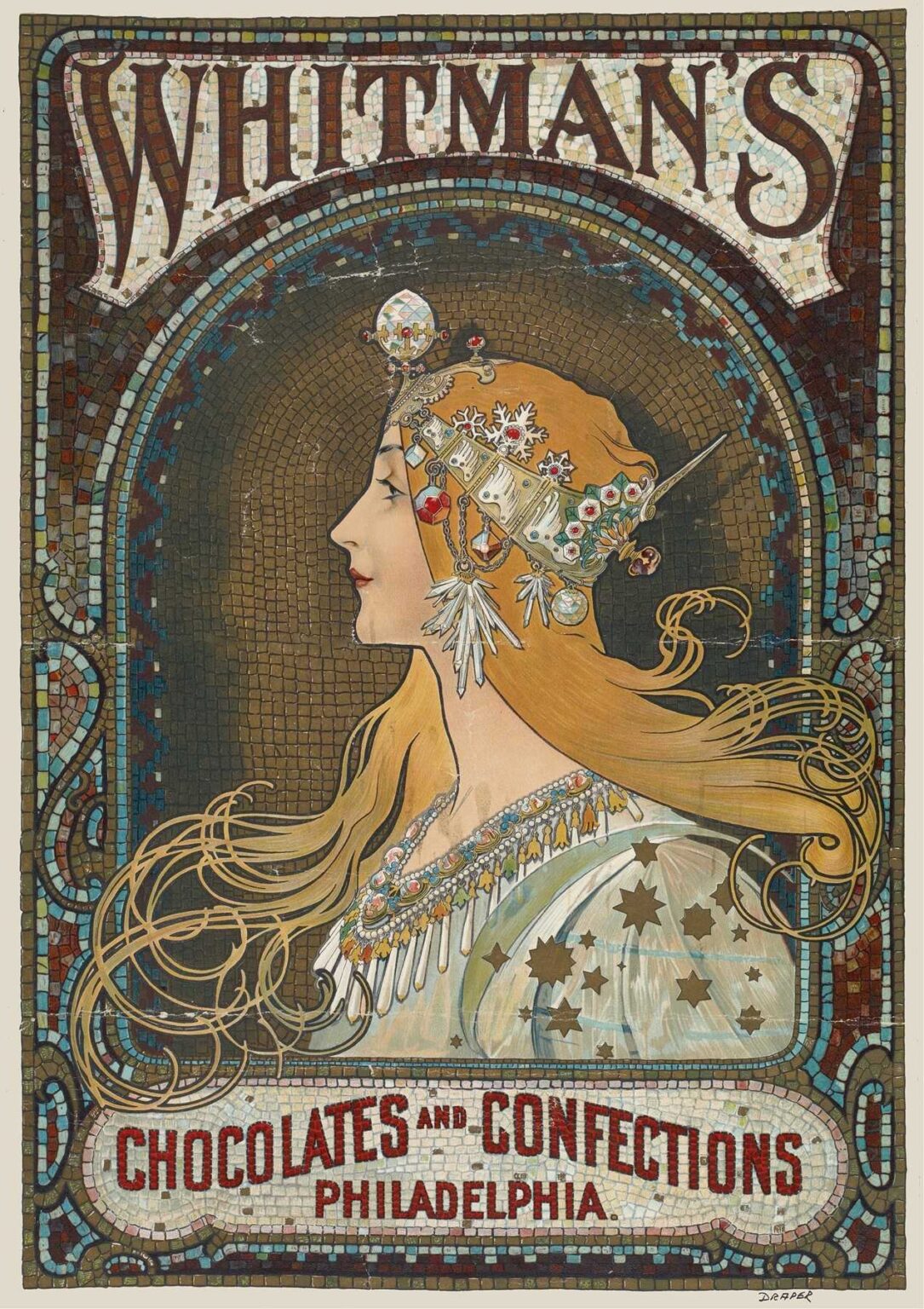
F. Champenois, Mucha’s long‐standing printer in Paris, collaborated with Whitman’s to produce the poster. The brief called for an image that would evoke the sumptuousness of Whitman’s chocolates, suggest their refined quality, and build brand prestige. Mucha’s challenge was to translate the sensory pleasure of taste and aroma into a purely visual medium. He achieved this by selecting a noble female figure—an allegorical personification of confectionery artistry—adorned in luxurious attire and framed by mosaic‐like ornament reminiscent of richly decorated shop interiors. The poster was intended for large‐format lithographic prints—approximately 140 cm tall by 60 cm wide—ideal for in‐store display and trade exhibition booths.
Allegorical Subject and Iconography
The central figure in “Whitman’s Chocolates and Confections” is a stylized female allegory, her profile reminiscent of classical goddesses yet rendered in a modern Art Nouveau idiom. She wears a bejeweled headdress inspired by Byzantine and medieval mosaics, suggesting both exotic luxury and artisanal craftsmanship. Crystals, garnets, and enamel flowers adorn her diadem, evoking the preciousness of chocolate ingredients—cacao, sugar, and exotic spices. Her flowing golden hair tumbles into sinuous curls, symbolizing the melting, luscious nature of chocolate. Around her neck and bodice, pendants resembling cacao pods and confectionery truffles hang like precious gems. The entire composition becomes a visual metaphor: just as fine jewelry combines rare materials and expert craftsmanship, Whitman’s confections blend exotic ingredients and meticulous artistry to create objects of desire.
Composition and Framing
Mucha designs the poster on his characteristic vertical format, optimized for urban display. The figure occupies the upper two‐thirds of the sheet, immediately drawing the viewer’s gaze. Her poised profile faces left, creating a dynamic directional pull toward the poster’s heading, “Whitman’s,” rendered above in grand, mosaic‐inspired type. Behind her, an arched halo of tessellated tiles evokes a domed mosaic ceiling, reinforcing the shop‐interior illusion. The bottom third features the inscription “Chocolates and Confections • Philadelphia” within a rounded cartouche, set against a continuation of the mosaic border. Curved arabesques link the heading and footer, creating a continuous frame that unites text and image. Mucha’s careful balance of figure, ornament, and typography ensures both visual harmony and clear brand messaging.
Color Palette and Light Effects
“Whitman’s Chocolates and Confections” employs a warm, opulent palette of golds, ambers, soft pinks, and muted blues. The mosaic halo behind the figure alternates between burnt sienna, deep olive, and turquoise, creating a shimmering backdrop that contrasts with the figure’s pale skin and ivory gown. Mucha layered translucent lithographic inks—seven to nine stones—allowing the paper’s warm tone to create natural highlights. Metallic bronze and gold inks accentuate key details: the headdress jewels, the star motifs on the figure’s dress, and select tesserae in the mosaic. These reflective inks catch ambient light, giving the poster a three‐dimensional glow when displayed under gaslight or early electric lighting. The color scheme evokes chocolate’s rich browns and golden wrappers, while the cooler aquamarines suggest the crisp interior coolness of a confection case.
Line Work and Decorative Motifs
At the heart of Mucha’s Art Nouveau lexicon is the continuous “whiplash” curve, and this poster abounds with such lines. The figure’s hair, the folds of her gown, the arabesque vines in the borders, and the swirling patterns in the mosaic halo all follow fluid, undulating trajectories. Mucha varies the line weight to create depth and texture: bold contours define the figure’s silhouette, medium strokes render ornamental vines, and fine lines articulate facial features and jewelry facets. Floral and geometric motifs interlock seamlessly: stylized acanthus leaves, starbursts, and tessellated rectangles form a rich tapestry of decoration. The interplay of organic curves and precise geometry mirrors the tension between handcrafted artistry and mechanical reproduction inherent in lithography.
Typography and Brand Integration
Mucha’s custom lettering for “Whitman’s” at the top of the poster draws from medieval mosaic inscriptions. Each letter appears as though formed from tiny tesserae—square tiles of colored glass—set against a translucent background. The choice of an all‐caps serif, inscribed in a gently arcing band, lends gravitas to the brand name while complementing the mosaic halo. Below, the descriptor “Chocolates and Confections • Philadelphia” appears in a simpler, block serif that echoes the heading’s tile motif but ensures legibility at smaller scale. Unlike many commercial posters of the era, Mucha’s design integrates brand text as a natural extension of the ornament, rather than as an afterthought. The result is a shop‐front sign rendered as a unified work of art.
Technical Execution and Lithographic Mastery
The creation of “Whitman’s Chocolates and Confections” demanded exacting lithographic technique. Mucha first prepared a full‐scale watercolor and pencil study, mapping color zones and linework with precision. The study was transferred to multiple limestone plates at Champenois’s workshop—one for each key hue: base flesh tone, gown ivory, hair gold, mosaic tile blues, sienna browns, bronze metallic, and black outlines. Registration guides ensured perfect alignment across eight to ten runs. Artisans mixed inks to match Mucha’s palette, sometimes blending manual pigments into the oil‐based ink. The metallic bronze required specialized oil‐based inks with ground mica or bronze powder. The final proofs, vetted by Mucha, exhibited the warm luminescence and jewel‐like depth for which his posters are famed.
Reception and Cultural Impact
Upon its introduction around 1900, “Whitman’s Chocolates and Confections” garnered acclaim both as advertising and as fine art. Trade journals like Printers’ Ink praised the poster’s elegance and technical sophistication, while The Inland Printer reprinted it as an exemplar of modern lithography. Whitman’s retailers reported increased consumer interest in window displays featuring Mucha’s art, noting that passersby paused to admire the poster’s beauty as much as the promise of confections. Private collectors sought the large‐format lithograph for salon decoration, and art dealers reproduced it as chromolithographic portfolio sheets. Its success cemented Mucha’s reputation in America and influenced subsequent commercial artists to pursue higher aesthetic standards in advertising.
Influence on Graphic Design and Decorative Arts
Mucha’s work for Whitman’s extended his influence beyond Parisian theaters into the American commercial sphere. Interior decorators in department stores and confectionery boutiques adopted mosaic tile patterns and floral arabesques from the poster as stencils for wall friezes. Jewelers created lockets and boxes echoing the star‐bursts and botanical trims. Graphic designers studying The Studio and Brush and Pencil magazines incorporated Mucha‐style lettering and whiplash curves into catalog covers and bookplates. Even into the 1920s, traces of his Art Nouveau vocabulary—stylized vines, geometric mosaics, and pastel palettes—persisted in packaging and store signage.
Legacy and Preservation
Original proofs of “Whitman’s Chocolates and Confections” are held in collections such as the Library of Congress, the Metropolitan Museum of Art, and the Rosenbach Museum in Philadelphia. Conservators address issues of paper fragility, discoloration, and occasional cracking of metallic inks by employing deacidification treatments, careful humidification, and infilling losses with toned Japanese tissue. High‐resolution digital reproductions and facsimiles ensure that Mucha’s poster remains accessible to scholars, designers, and the public. Retrospectives on Art Nouveau repeatedly feature the poster as a pinnacle of commercial lithography, celebrating its seamless integration of brand messaging and decorative artistry.
Conclusion
Alphonse Mucha’s “Whitman’s Chocolates and Confections, Philadelphia” stands as a masterwork of turn‐of‐the‐century graphic design. Through its rich allegorical subject, harmonious composition, luxurious palette, and flawless lithographic execution, the poster transcends its commercial purpose to become an enduring icon of Art Nouveau. Its celebration of luxury and craftsmanship parallels Whitman’s own confectionary ethos, while Mucha’s decorative vision elevates everyday advertising into the realm of fine art. Over a century later, the poster’s beauty and technical brilliance continue to inspire designers, conservators, and admirers of visual culture worldwide.