Image source: artvee.com
Introduction
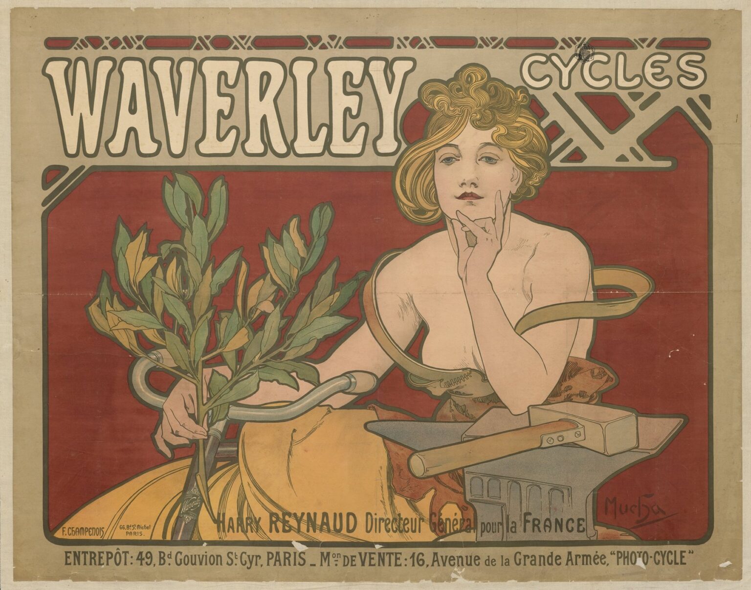
Alphonse Mucha’s 1897 poster “Waverley Cycles” belongs to the most exhilarating moment of fin-de-siècle Paris, when advertising, design, and daily life merged into a single modern spectacle. Here the master of Art Nouveau trades the marbled backdrops and operatic halos of his theatre sheets for a horizontal billboard that sells velocity. A self-possessed woman leans upon an anvil as a swirl of ribbon and laurel encircles her and coils around gleaming handlebars. The brand name surges across the top like a headline: WAVERLEY. There is no landscape, no crowd, just emblem and promise. The poster doesn’t show a bicycle in motion; it shows what the bicycle meant—freedom, power, and the elegant marriage of craft and beauty.
The Bicycle Boom and Paris in 1897
The 1890s were the great decade of the “safety” bicycle. Pneumatic tires, chain drive, and standardized frames turned cycling from a daredevil novelty into a respectable, thrilling means of transport. Paris became one of the sport’s capitals; ribbons of riders filled the Bois de Boulogne, new magazines chronicled gear and routes, and storefronts advertised shining machines in their windows. The bicycle also arrived charged with cultural meaning. For men it promised speed and range; for women it symbolized mobility and a loosening of dress and custom. Advertisers recognized that the bicycle sold not only on engineering but on identity. Mucha, already famous for giving Sarah Bernhardt and luxury products a divine aura, was uniquely suited to turn a cycling brand into a lifestyle. “Waverley Cycles” speaks to that moment. It sells a machine by addressing desire—desire for modern grace, for mastery, for the romance of tools made true.
Format and Scale: A Horizontal Stage for a Modern Product
Unlike the towering theatre columns that made Mucha’s name, this sheet is emphatically horizontal. The long format fits a storefront transom or a hoarding above a shop door, the kind of vantage where a cyclist or pedestrian would read it in a single sweep. The composition fills the rectangle edge to edge, with narrow margins that feel like metal framing. Across the upper third runs the brand’s masthead. Below it, the rectangular image field contains the figure and the product signals (handlebars, anvil, hammer, laurel). A narrow text band along the base lists addresses and the French distributor, transforming the poster into both emblem and directory. Everything is planned for urban legibility: big word, memorable picture, practical details.
Composition and the Reading Path
Mucha choreographs the viewer’s glance the way a good mechanic tunes a wheel. The gaze snaps to WAVERLEY in heavy, rounded capitals, then drifts right to the smaller CYCLES nestled in a web of linear geometry. From there the eye drops to the woman’s face—calm, slightly aloof—and follows her long forefinger to the chin, the classic pose of poised decision. The ribbon that loops from her shoulder to her opposite arm pulls our sight left toward the laurel branch, which in turn hooks around the silver handlebar. Only then do we notice the anvil—quiet, rectangular, purposeful—and the hammer laid upon it like a promise of work completed. Finally, the bottom line supplies addresses in Paris. This route is not accidental. It delivers brand, category, attitude, craft, and point of sale in one fluid circuit.
The Central Figure: The “Mucha Woman” Recast for Speed
Mucha’s women often personify seasons, arts, or mythic roles, draped in soft fabrics and floating halos. The Waverley figure is different. Her hair still tumbles in warm arabesques, but her gaze is frank, her shoulders bare, her presence solid. She does not float; she leans. The posture is confident, businesslike, even slightly ironic, as if she has just forged the tool that will carry her down the boulevard. The right arm bends to prop the chin, a gesture of inward appraisal; the left hand clasps the laurel with the casual strength of someone used to handling metal and wood. This is a new heroine for a new product: not a distant muse, but a modern consumer who understands what quality feels like.
Symbols That Double as Sales Arguments
Mucha compresses a surprising amount of meaning into a few objects. The laurel is the ancient sign of victory; in a cycling poster it implies race wins and the pride of ownership. Wrapped around the handlebar, it makes a neat visual claim: Waverley equals laurels. The ribbon that winds across the figure reads as airflow and speed, but it also behaves like a line of force connecting arm, shoulder, and machine—a graceful diagram of the body’s integration with the bicycle. The anvil and hammer announce manufacturing prowess. They are the emblem of metal worked with intelligence, a promise that these frames and forks were shaped by skilled hands, not stamped indifferently. Set together, the three symbols tell a complete story—craft produces performance, performance earns victory—and they do it without a shred of literal narrative.
How Mucha Shows a Bicycle Without Showing One
The frame and wheels of the actual bike are absent; only the handlebar appears. Yet the viewer never doubts the poster’s subject. Mucha lets the chrome tube, the clamp, and the sinuous grip stand in for the whole machine. It’s a smart advertising move. The handlebar is the part a rider touches most; it carries the sensation of steering and control. By foregrounding that touchpoint, the poster sells feel rather than specs. It also keeps the sheet clean. A full bicycle would crowd the figure and clutter the brand name; a single, well-drawn handlebar says everything through synecdoche.
Typography that Works Like a Frame
The WAVERLEY masthead is as memorable as any logo. Its rounded, blocky letters, shaded by a dark outline, sit proud against the wine-red field. The word stretches almost the entire width, making it impossible to miss at distance. Mucha pairs it with a smaller CYCLES tucked into a geometric trellis whose diagonals echo frame triangles and chainstays without drawing them literally. The lettering is hand-drawn, not typeset, so it harmonizes with the poster’s lines. At the bottom, the addresses and the name of the French director read in a compressed, utilitarian script—legible but secondary. This hierarchy ensures that brand and image stick while practical text remains available for those who step closer.
Color: Heat and Metal
The palette is restrained but strategic. The red ground supplies warmth and urgency. Against it, the pale skin of the figure, the honey of her hair, and the mustard of the skirt feel luminous. The greys of the anvil and hammer cool the composition and signal industry; the greens of the laurel, varied from blue-green to olive, add freshness and a hint of outdoor air. A thin outline in dark graphite ties everything together. This balance—hot background, cool metal, living green—matches the product’s identity: a machine born in the heat of the forge, destined for the cool air of the road, ridden by a living body.
Line and Ornament: Art Nouveau as Aerodynamics
Mucha’s line is famous for its elastic “whiplash” curves. In Waverley Cycles those curves behave like vectors of motion. The ribbon’s coils, the spring of hair, the ivy-like contour of the laurel all suggest airflow streaming around a moving rider. Meanwhile, the long straight edges of the anvil and hammer anchor the page, a reminder that elegant motion begins in stubborn materials. Even the thin border around the image feels like a bicycle frame: minimal, robust, expedient. Art Nouveau isn’t applied decoration here; it is a language for speed translated into line.
Lithography and the Business of Printing
Like Mucha’s theatre sheets, this poster was printed by the renowned Parisian house of Champenois. The technical strategy is visible on the surface. A dark key drawing holds the forms; a handful of flat, transparent color stones provide the fills; small modulations in the red and green fields keep the paper from feeling dead. The limited palette made the job economical and durable—important for a commercial client who expected large runs—and it allowed the poster to maintain impact even after weeks outdoors. The big letters and bold silhouette were not merely style choices; they were engineering decisions about legibility at speed from the saddle of a passing bicycle.
Branding Strategy Built from Image, Not Copy
Nineteenth-century cycle advertising often crowded sheets with specifications and medals. Mucha goes the other way. He gives Waverley a personality instead of a paragraph. That personality is modern, capable, slightly amused, and very sure of itself. The poster tells you that buying this machine puts you in that mood. It’s a strategy familiar today—sell feeling, not features—but in 1897 it was still radical. The addresses along the bottom provide the practical information; the picture does the persuasion.
Gender, Freedom, and the New Woman
The decision to place a woman at the center of a cycle poster carries cultural weight. By the late 1890s female cyclists were a symbol of independence, sometimes attacked in the press and sometimes celebrated as icons of progress. Mucha’s heroine is no caricature of the period’s “new woman”; she is poised and elegant, but the message is unmistakable. She handles tools and laurels as easily as flowers, claims space with her body, and engages the viewer with a level gaze. The bicycle here is not a toy granted by men to women; it is an instrument of self-definition. That subtle assertion expands the brand’s appeal and roots the image in its historical moment.
Industrial Craft and the Poetry of Tools
Why an anvil in a poster about bicycles? Because it is the most condensed symbol of making. Steel frames in the 1890s were hand-brazed and filed; fork crowns and lugs were small sculptures. Mucha brings that craft onto the page as a quiet altar. The anvil’s mass, the hammer’s heft, and the right-angle edges convert the romance of speed into respect for labor. The woman’s elbow rests on the block with relaxed intimacy, a gesture that humanizes the shop. In effect, the poster tells you Waverley is forged as carefully as a jewel—worthy of both workshop and salon.
Comparisons with Mucha’s Other Commercial Images
Set beside Mucha’s perfumes and biscuits, Waverley Cycles looks stripped to essentials. The figure remains, the ornate frame remains, but the symbolic load shifts from floral allegory to industrial metaphor. There’s less filigree and more geometry, less overt luxury and more assurance. It demonstrates how adaptable Mucha’s method was. Give him a theatre and he creates a haloed star; give him a bicycle and he draws a modern emblem that a mechanic could respect and a boulevardier could admire.
The Poster as Street Theatre
Fin-de-siècle Paris treated the streets as a stage, with kiosks for scenery and posters for actors. Waverley Cycles performs well in that theatre. The red field reads from a block away; the white masthead punches through visual noise; the face and hand create a moment of human recognition; the handlebar glints like a prop lifted from backstage. You do not need to stop walking to understand it. But if you do stop, the small pleasures multiply: the tiny leaves that twist individually, the hammered edge of the anvil, the teasing geometry above CYCLES that hints at a frame triangle. The poster respects both kinds of audience.
Legacy and Collecting
Original impressions of Waverley Cycles remain highly sought after because they show Mucha in a slightly different key—still unmistakably himself, yet tuned to commerce rather than theatre. Designers study it for how it balances brand prominence with pictorial elegance, how it integrates symbols without literal storytelling, and how it leverages a limited palette to great street presence. Culturally, the poster stands as a compact document of the bicycle’s social meaning at the end of the century: a tool of mobility, a triumph of craft, and a promise of stylish self-reliance.
Why the Image Still Works
More than a century later, the sheet feels contemporary. Swap the addresses for a web domain and it could hang in a boutique today. The principles hold: proportion the brand boldly, make one unforgettable figure, use a single product detail to stand for the whole, and ground the fantasy in the honesty of materials. It is this balance—desire anchored by craft—that keeps the poster persuasive. Viewers may not know the Waverley model lineup, but they remember the look and the mood: warm red confidence, cool metal patience, a rider poised between thought and motion.
Conclusion
“Waverley Cycles” condenses the bicycle boom’s excitement into a flawless Art Nouveau sentence. The brand name arrives in a shout; the figure answers with a calm gaze; the laurel crowns the machine; the anvil guarantees its making; the ribbon conducts wind around the promise of speed. Mucha does not beg for attention; he designs it, channeling the appetite of a modern city into a single, lucid emblem. The poster proves that a machine can be sold as an idea—freedom shaped in steel—and that advertising, at its best, is a branch of visual poetry.