Image source: wikiart.org
A city turned into color and rhythm
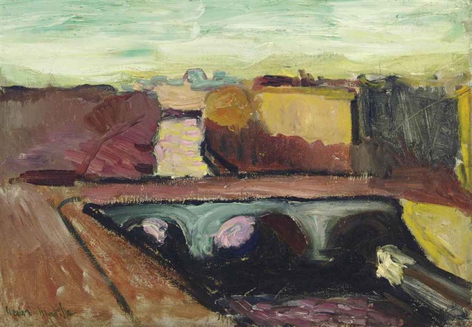
Painted in 1904, “View of the Seine, the Saint Michel Bridge” belongs to Matisse’s decisive Paris years, when the window of his Left Bank studio offered a laboratory for testing how far color, touch, and simplification could reimagine the urban world. The subject is one of the city’s most familiar crossings—the Pont Saint-Michel—yet the paint transforms stone, water, and sky into a compact drama of bands, arcs, and chromatic pushes. The bridge’s two dark spans read like musical rests cut into the river’s surface; buildings compress into mustard, plum, and soot-green blocks; the sky breathes a pale mint that cools the whole design. Rather than inventorying architectural detail, Matisse gives the sensation of Paris compressed into a few essential relations: warm earth against cool air, heavy mass against flowing water, deliberate structure against improvising brushwork.
The vantage and the modern eye
The painting is constructed from a high, oblique viewpoint typical of works Matisse made from studios near the Quai Saint-Michel. That elevation yields a plan of the city more than a postcard of a monument. Streets and quays taper into beveled wedges, the river slices diagonally, and the bridge becomes a horizontal hinge connecting the picture’s halves. He pushes the far distance up the surface until the bands of sky and horizon sit like a header across the top of the canvas. This strategy collapses deep recession and underscores modern looking: the city apprehended quickly, from above and at an angle, as a set of functional forms rather than a theater of anecdotes.
Composition: bands, arcs, and a single commanding diagonal
The whole design is anchored by one quiet but powerful diagonal—the embankment that pours from the lower left toward the bridge. It is a runway that launches the eye into the scene. Across it, the bridge lays a counter-movement, a dark bar whose pair of arches puncture the river’s band. Above the bridge, a staccato rhythm of rectangular masses—ochre, umber, rose—suggests facades catching and refusing light. Between these units, a single haloed circle reads as a tree or a sun-drenched plane; it softens the strict geometry and hints at living change within masonry. Nothing is centered. The asymmetric placement of elements keeps the surface alive, and the cropped margins imply a city continuing beyond the frame.
Drawing with masses instead of lines
Only a handful of lines are truly linear: a few calligraphic sweeps along the quay, a sharp seam where a wall meets the sky, the inner edges of the bridge arches. Everywhere else, drawing is performed by the abutment of colored masses. The side of a building exists because ochre presses into dark umber; the bridge’s upper line hardens because a cool green-gray climbs to meet it. This is Matisse’s lifelong method in embryo. He does not trap things in ink-like contours; he lets edges breathe, as if the city’s forms were carved by light moving over their planes.
Color as structure and atmosphere
The palette looks modest, but its relationships are radical. Warm earth notes—brick, mars violet, umber, ochre—concentrate in the city’s masonry and the riverbank. Cool notes—mint greens, gray-blues, and smoky violets—wash the air and pool in water and shadow. A few small, unexpected accents act as catalysts: a pinkish glint under each arch where light glances off the water; a sulfurous wedge of yellow where the quay turns; a blush of rosy stone in the middle distance. These touches are not decorations; they keep the color system circulating. The result is a chromatic weather that feels plausibly Parisian and unmistakably painterly, with temperature shifts doing most of the work that, in academic painting, would be done by meticulous modeling.
Paint handling: pressure, speed, and scumble
Surface is crucial to the picture’s vitality. In the sky, paint is scrubbed thinly so the ground lends a grain to the air; small horizontal drags suggest cloud movement without describing clouds. Along the facades, heavier loads are laid with a steadier wrist, giving walls and parapets a stony weight. The river receives longer, oilier strokes that pull pigment into shallow currents, and the bridge’s shadows are pressed in with a near-matte density that makes them sit forward as solid bodies. Matisse’s technique advertises how the picture was built—no glazing veil hides the labor. That visibility of process is a pledge of modernity: paint is not pretending to be anything but paint.
The bridge as motif and metaphor
Bridges recur throughout Matisse’s early Paris work not only because they were visible from his studio but because they are perfect compositional machines. Arches deliver repeating curves; parapets offer long, stabilizing horizontals; the change of level from street to water guarantees varied perspectives. In this painting the bridge also operates metaphorically as a hinge between natural movement and urban order. Water slides through, indifferent; stone spans check it and connect neighborhoods. Matisse’s own practice is doing something similar—spontaneous strokes coursing under an architecture of big shapes. The painting is a compact fable about the union of control and freedom.
Spatial logic held shallow and decorative
Although the subject implies a deep city vista, Matisse keeps space shallow to maintain the unity of the surface. The distant skyline is pushed up into the same visual register as the nearer parapet, and the middle ground is a narrow band rather than a long march into depth. That compression shifts the painting from topographic description toward decorative orchestration. It anticipates the planar thinking of his later interiors where wallpaper, tabletop, and window view often share one patterned field.
The eye’s itinerary
A good way to read the picture is to follow the path Matisse choreographs. Enter at the lower left—textured strokes of warm earth pull the gaze forward. Slide along the quay until the dark ellipse of the left arch blocks your route. The eye drops into the shadowed water, then rebounds to the pink glimmer under the right arch. That glimmer sends you up the bridge’s spine and into the mid-town band of facades. With color already warm, the eye ascends into the cool of the sky, rests on its mint and blue parcels, then drifts back down, newly sensitized to the warmth below. The painting is less a snapshot than a loop, a continuous circuit of attention.
From tonal city to chromatic city
Compare this canvas, mentally, with Matisse’s very early Pont Saint-Michel views around 1900. Those are more tonalist and atmospheric, their greys and browns caressing forms with Impressionist courtesy. By 1904 the tone has stiffened into planes and the chroma has brightened into purposeful contrasts. It is not yet the screaming color of 1905’s Collioure summer, but it is on the way. The painting reads as a rehearsal for the Fauvist assertion that color is not a garnish to drawing; it is the drawing, the spatial engine, and the emotional register.
The human city without human figures
There are no pedestrians or carriages specified, yet the picture is full of human presence. The angled cut of the streets, the kinds of buildings, the precise engineering of the bridge—all testify to collective labor. By leaving out anecdotal figures, Matisse avoids making the city a stage for stories and keeps it a site for form and light. The absence encourages the viewer to inhabit the painter’s role rather than the tourist’s, to feel the city’s pulse as pattern and pressure.
Light as edited truth
The illumination here is not a meteorological record; it is edited to support the design. The sky is cool but not dazzling; surfaces catch radiance unevenly, as if sunlight were filtered through high clouds. The most instructive light happens under the bridge arches where a cool, pale reflection turns to a lilac-pink bloom. Those blooms are both believable and boldly artificial, placed to energize the bridge’s dark band and to link water to sky through a shared coolness. Matisse is already practicing the painter’s prerogative: alter what the eye reports to secure what the picture needs.
Material intelligence and likely palette
Without relying on lab notes, one can infer a practical set of pigments at work: lead white for body and veiling; yellow ochre and raw sienna for warm planes; ultramarine and possibly cobalt giving the cools their bite; viridian or terre verte moderated for the minty sky passages; Alizarin crimson and a bit of cadmium red or orange concentrated in the warm masonry and those small pink reflections; ivory black used sparingly to densify the bridge’s interior shadows. Importantly, mixtures appear relatively unmuddied; Matisse lets pigments keep their identity so that temperatures remain distinct even at low saturation.
The moral of simplification
This canvas is an argument for painting less in order to show more. With a dozen key shapes and a handful of deliberate chords, Matisse conveys a specific bridge in a specific city at a specific hour. What is thrown away—ornamental stonework, windowpanes, facial detail on passersby—is replaced by something truer to experience: the way a city resolves at a glance into weighted blocks, the way water darkens under a span, the way a cool sky flattens everything below into warmer relief. The simplification is ethical as well as practical; it respects what the eye actually uses to build a scene.
Resonance within Matisse’s larger project
Seen alongside still lifes and interiors of the same period, “View of the Seine, the Saint Michel Bridge” confirms Matisse’s fascination with thresholds and frames—window ledges, parapets, tabletops, bridges. All of them are devices that sort space and regulate how vision moves from one zone to another. The bridge here is, in spirit, a cousin to a tabletop edge in a still life: a structural datum against which the fugitive play of color can act. The painting is thus both city view and self-portrait of the artist’s method, showing how he relies on a few firm lines of force to hold a blazing array of sensations.
The viewer’s experience today
For a contemporary audience habituated to photography’s detail, the canvas can feel spare. That spareness is the invitation. The eye supplies the missing facts, and in doing so, viewers become collaborators. Street sounds, footsteps, the faint smell of river damp, the feel of breeze off the water—none are painted, yet all are conjured because the picture directs attention to the cues that ignite memory. This is why Matisse’s urban views remain fresh; they do not nail everything down. They cue, they suggest, they set a tempo, and they trust the viewer’s imagination to complete the scene.
Why the painting matters
“View of the Seine, the Saint Michel Bridge” is not just a study en route to Fauvism; it is a complete statement of values that would guide Matisse for decades. Color is sovereign but restrained; drawing is structural rather than descriptive; paint’s material reality is foregrounded; and the world is treated as a set of relations to be orchestrated, not a catalog to be copied. In a compact space, the painting builds a city from chromatic weather and firm geometry, inviting us to feel both the mass of Paris and the lightness of seeing it anew.