Image source: wikiart.org
Introduction
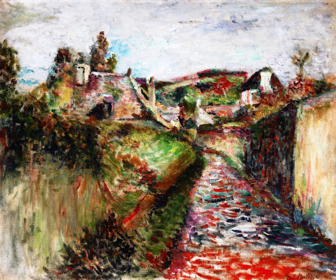
“View of Belle Île” finds Henri Matisse in 1897 looking inland on the Breton island and translating a modest lane, hedges, and hilltop houses into a charged fabric of color and touch. The picture is neither a grand seascape nor a picturesque postcard. Instead, a rutted path climbs diagonally into a scatter of walls and roofs; brushy trees punctuate the horizon; and a pale, weathered sky settles over everything like a sheet of light. What makes the scene compelling is how Matisse refuses to narrate it with detail. He builds it from relations—warm reds against cool greens, rough impasto against scumbled veil, diagonal thrusts checked by horizontal rests—until the landscape reads as sensation made visible.
Belle Île in Matisse’s Development
Belle Île-en-Mer served as a workshop where Matisse learned to simplify forms and let color carry structure. The previous year’s dark, weighty seascapes taught him about mass and tonal order. By 1897 he began to lift the key, abbreviate drawing, and weave surfaces from repeated strokes. “View of Belle Île” belongs to this second phase. The palette is higher, whites are active, and brushwork is more rhythmic. The painting shows him testing how far he can push chromatic contrasts and still keep a convincing sense of place.
Motif and Vantage
The motif is disarmingly ordinary: a country lane that cuts between a hedge at left and a walled garden at right, then breaks into a patchwork of fields and houses. The vantage point is low and close, as if the painter has just stepped onto the path after rain. This position gives the foreground unusual presence; the lane’s broken reds and lilac shadows feel close enough to step on. Beyond, the ground rises in swells and shelves toward small structures perched along the horizon. Nothing is staged; the island’s topography becomes a set of push–pulls that the painting converts into design.
Composition and Spatial Design
The picture organizes itself around a strong diagonal that carries the lane from lower right toward the left-center distance. That movement is countered by the long, dark hedge running up the left edge and by the tall garden wall at right. Between these flanking masses the eye is drawn inward, then released across terraces of fields and houses to the high, pale sky. The composition is a measured sequence of zones—foreground path, mid-ground banks, distant village, and sky—stitched together by color echoes and directional marks. Matisse compresses descriptive perspective and builds space with stacked planes and value steps, so the image stays open yet cohesive.
The Path as Narrative Axis
The path is more than a roadway; it is the narrative axis that shapes the viewer’s journey. Matisse paints it with fragments of saturated red, violet, and blue bound by creamy whites, implying stones and puddles without spelling them out. The lane bends subtly as it climbs, and the broken color suggests surfaces that have just shed water. That chromatic mosaic does triple duty: it reads as wet ground, it pulls the viewer into depth, and it balances the high-key whites of sky and walls.
Color Architecture: Warm Land, Cool Shadow, Active Whites
Color provides the painting’s architecture. The hedge and the banks are a chorus of greens—emeralds, olive, bottle—interrupted by iron reds that behave like earth showing through grass. The buildings are not neutral white; they are chords of pearl, cream, and pale rose that catch the island light. Deep, bruised violets and blue-blacks knit the shaded seams at hedge and wall, letting the greens and reds pop without floating. Matisse relies on warm–cool exchanges to define forms, not on linear outlines. A warmer green lifts a grassy ridge; a cooler green tucks it back; a thread of red along a path edge glues receding zones together. The color is disciplined and relational, the key to why the landscape feels both bright and grounded.
Light, Weather, and the Island Atmosphere
The light is a high, maritime brightness—the kind that cools shadows and diffuses highlight rather than blasting it. There are no theatrical beams, just a steady pressure that bleaches the horizon and sets soft reflections trembling in wet ground. Matisse captures that atmosphere with thin scumbles in the sky, letting the weave of canvas show through; with milky halftones on the white walls; and with lifted, slightly transparent strokes in the distance. The result is a convincing sense of the day’s breadth and humidity without over-modeling.
Brushwork and Surface
The surface is a vocabulary of decisions. In the hedge Matisse stacks short, vertical dabs that suggest bramble and shadow at once. Across the banks he drags longer, curving strokes that move with the land’s contours. The path is built from quick, angled flecks that mimic the gleam and chatter of stones. The sky receives the loosest hand: scumbled whites, pinkish grays, and faint blues that keep it ventilated. This orchestration of marks gives each substance a specific touch—hedge matte and dense, earth springy, stone broken, air thin—and it keeps the painting alive at every distance.
White as a Living Color
One of the painting’s quiet triumphs is how it treats white. Sky, wall, and distant houses are not empty neutrals but tuned mixtures. The sky’s whites carry lilac and pale blue; the house walls hold touches of warm cream and cool mint where eaves throw shadow; foamy whites slip into the puddled path as reflections. Because these whites are participants in the palette, they unify the image and govern the overall key. Later, when Matisse’s colors intensify, this treatment of white as an active hue will remain fundamental.
Edges as Contact, Not Outline
Edges occur where planes meet, not where lines are imposed. The hedge abuts the lane in a narrow seam of cool shadow; the wall meets the sky with a soft, vibrating contour; distant roofs appear because warm red tilts against cool green, not because a black line is drawn around them. This logic makes forms breathe. It also frees color to serve structure: a violet seam can both describe a crease and moderate a hot passage; a jade flick can both mark grass and cool a neighboring red.
Space, Depth, and the High Horizon
Depth is built chromatically. The near lane is high in saturation and texture; mid-ground greens are slightly cooled and smoothed; distant fields are lighter and thinner; the sky is thinnest of all. The high horizon compresses the village, making the houses read as bright chips lodged in land rather than as isolated objects. A few dark notches—gateways, tree clumps, a shadowed stair—act as anchors that keep the climb into distance believable. Perspective lines are implied, not diagrammed; the eye understands depth because the color intervals and brush scales are calibrated.
Materiality and the Role of the Ground
A warm underpaint appears through scumbled layers, especially along the left bank and in the sky, quietly warming the whole. Matisse alternates thicker impasto with thinner veils to create a living surface: thick where he wants form to assert, thin where he wants air to pass through. In places he drags nearly dry pigment across raised marks so that texture catches the light and reads as vegetation. This sensitivity to materiality ensures the painting remains an object as well as a view, its crust echoing the textures it depicts.
Rhythm and Movement Across the Surface
The painting’s rhythm is a measured alternation of diagonals and rests. The lane’s ascent sets the tempo; hedges and walls beat counter-rhythms along the sides; the horizon’s band and the clouded sky slow the pace at the top. Repeated color notes—small red accents stepping up the path, green sweeps that swell and subside, blue-violet stitches in shadow—create an inner pulse the eye follows almost unconsciously. That rhythm keeps the picture from freezing into a diagram; it stays mobile the way walking the lane would feel.
Dialogue with Influences
“View of Belle Île” converses with several traditions without depending on any single one. The broken touch and commitment to outdoor light share ground with Impressionism. The constructive concern for mass—hedges as volumes, walls as planes, roofs as facets—remembers Cézanne. The willingness to let large color fields stand for light and air aligns with the lessons Matisse absorbed from painters who simplified form in Brittany. He borrows strategies but keeps the authority of observation, always letting the land’s push and the day’s color decide.
Foreshadowing of Fauvism
Although the palette is gentler than in 1905, the logic here anticipates Matisse’s Fauvist leap. Color is structural, not decorative. Whites are inflected, shadows are chromatic, and edges arise from abutting hues rather than drawn lines. A few large shapes govern many small incidents: path, hedge, wall, village, sky. Once saturation increases in later years, this grammar will keep the pictures stable. In this painting you can feel the hinge: observation distilled into relations sturdy enough to support audacity.
Human Presence without Figures
No figures are described, yet the landscape carries human presence. The path’s ruts, the cut hedge, the stacked walls, and the perched houses register labor and settlement. By refusing anecdotal staffage, Matisse allows structures and surfaces to speak for habitation. The island appears as a place of use, not of spectacle, and the painting aligns with that dignity by focusing on essentials.
The Sound and Temperature of the Scene
The color and handling convey more than sight. The cool greens pressed against red earth set a temperature around the viewer: moist shade along the hedge, warm reflected light off the wall. The path’s broken reds and blues hint at the sound of footfalls on stone and water. The pale sky’s scumble suggests breeze rather than oppressive heat. These sensory cues arise naturally from the relations in paint; the picture is not atmospheric by rhetoric but by construction.
How to Look at the Painting Today
Start at the lower right corner and follow the lane’s red mosaic. Notice how the fragments grow smaller and cooler as they recede. Shift to the left and read the hedge as stacked, short vertical strokes; feel how a few deep violets knit shadow into the greens. Move to the right wall and test how many colors live inside its “white” face. Let your eye climb to the village and watch roofs appear where warm and cool planes meet. Finally, step back until the painting resolves into five great actors—path, hedge, wall, village, sky—and sense how the whole balance depends on their conversation.
Place within the Belle Île Series
Compared with Matisse’s cliff and harbor scenes from the same period, “View of Belle Île” turns inland and softens the key. The rhythmic brushwork he used to capture chop and wind now maps ruts and foliage; the warm–cool oppositions that set rock against sea now set lane against hedge and wall. Read alongside the seascapes and ports, it demonstrates the consistency of his experiment: regardless of subject, he is testing how few large relations he needs to conjure a place.
Conclusion
“View of Belle Île” matters because it shows Matisse converting everyday ground into a robust color structure. The lane becomes a red–violet engine that drives the eye; hedge and wall act as balancing masses; distant houses flicker as tuned whites; and a high sky ventilates the whole. The painting feels inevitable not because it copies facts but because its relations are so well judged that the facts fall into place. From this kind of clarity, the later, bolder harmonies of Fauvism become thinkable. Here the essentials are already present: color as architecture, edges as contact, and the understanding that a landscape’s truth in paint is a well-made equilibrium.