Image source: artvee.com
Introduction
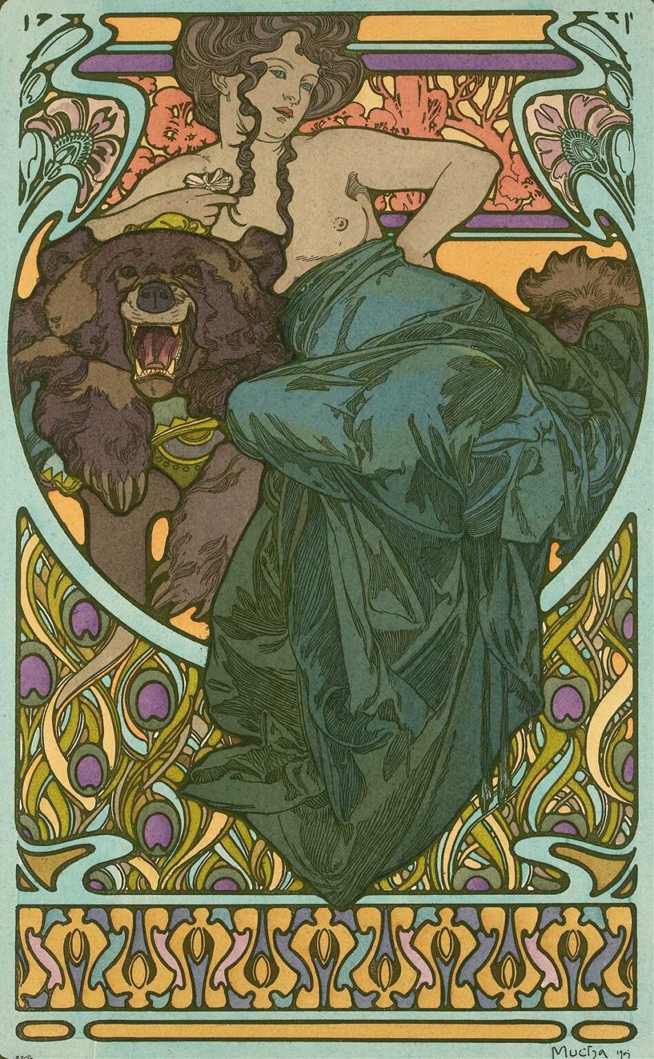
In 1902, at the height of his Art Nouveau mastery, Alphonse Mucha produced a captivating, yet untitled, lithograph that showcases a reclining female figure enveloped by luxuriant decorative motifs. Though lacking a formal title, this piece epitomizes Mucha’s signature synthesis of flowing linework, stylized ornament, and idealized femininity. Rendered in multi‐stone lithography, the work measures roughly 120 by 60 centimeters and was intended for commercial display. Beyond its promotional function, the untitled 1902 sheet invites close reading as a decorative masterpiece—one that seamlessly integrates figure, pattern, and typography (in the form of a subtle printer’s credit) into a unified, immersive visual experience. In the following analysis, we will explore the historical context, Mucha’s artistic evolution, compositional design, color strategy, linework and ornamentation, symbolism and thematic resonance, technical execution, reception and influence, and the piece’s enduring legacy.
Historical and Cultural Context
At the turn of the 20th century, Paris thrived as a cultural nexus of innovation, where new technologies in lithography met an eager public immersed in café society and burgeoning consumer culture. Art Nouveau emerged as a decorative response to academic historicism, drawing inspiration from organic forms, Japanese prints, and medieval craftsmanship. Posters, once considered mere announcements, became works of art in their own right. In this environment, Mucha—an émigré from Moravia—had already revolutionized theatrical and commercial lithography with his Sarah Bernhardt posters (1894–1896) and various product advertisements (1896–1900). By 1902, he was at the forefront of the movement, and this untitled work reflects both his established visual vocabulary and his willingness to experiment within that framework.
Alphonse Mucha’s Career up to 1902
After arriving in Paris in 1887, Mucha studied at the Académie Julian and honed his skills designing magazine illustrations and theater sets. His breakthrough came with the poster for Bernhardt’s Gismonda (1894), which led to a string of high‐profile commissions. From 1896 to 1900, Mucha produced iconic advertisements for cosmetics, jewelry, and biscuits, refining a style characterized by sinuous “whiplash” curves, intricate floral halos, and custom type. By 1902, he balanced commercial work with personal projects, including decorative panels and portfolios that celebrated Slavonic folklore. The untitled 1902 lithograph thus emerges from a period of creative confidence—where Mucha could deploy his mature aesthetic without the constraints of a specific client brief, experimenting with layout and ornamental density.
Commission and Intended Purpose
Although untitled, this 1902 piece likely served both promotional and decorative functions. It may have been commissioned by a print publisher or produced as a specimen sheet to showcase Mucha’s lithographic prowess. The absence of overt branding suggests that Mucha intended the image to stand on its own decorative merit, appealing to collectors and salon audiences. Displayed in shop windows or distributed as art prints, the sheet demonstrated the potential of lithography to marry fine art sensibility with popular appeal. By eschewing product names or theatrical titles, Mucha invited viewers to immerse themselves in the visual harmony of figure and ornament—an ethos central to Art Nouveau’s Gesamtkunstwerk ideal.
Composition and Spatial Design
Mucha arranges the untitled figure within a sinuous, arch‐like cartouche that frames her reclining form. The woman’s body follows a gentle S‐curve: her head tilts back on the left, her torso extends diagonally, and her legs bend gracefully toward the right. This diagonal orientation introduces dynamic tension, balanced by horizontal bands of ornament above and below. The upper register features a pair of mirrored floral panels connected by a slender band, while the lower register carries a repeating abstract pattern—perhaps a stylized peacock‐feather motif. Negative space around the figure’s head and feet prevents visual overcrowding, allowing the central form to breathe. Through careful placement of decorative elements and open areas, Mucha achieves both unity and emphasis, ensuring that the female figure remains the focal point.
Color Palette and Tonal Harmony
Mucha’s choice of color in the untitled work reflects a refined, muted Art Nouveau palette. Predominant hues include soft aquamarine blues in the background, dusty olives and moss greens in the drapery, and warm terra‐cotta accents in the floral details. The woman’s skin glows with subtle peach and ivory tones, layered through transparent lithographic washes. Highlights—on jewelry, floral petals, and metal clasps—employ metallic inks or denser pigment to catch the light. Mucha balances cool and warm tones to create a sense of depth: cooler hues recede in shadowed folds, while warmer tones advance on surfaces that catch the imagined studio light. This sophisticated chromatic interplay evokes both naturalism and decorative abstraction, inviting viewers to appreciate the image as both painting and pattern.
Linework and Ornamental Motifs
At the heart of Mucha’s aesthetic is the “whiplash” line—a continuous, rhythmic contour that animates both figure and ornament. In this untitled piece, the woman’s flowing hair and drapery folds are articulated by undulating strokes that echo the curling vines of the surrounding border. Floral motifs—stylized lilies or mandorla‐shaped blossoms—appear in the upper panels, their petals rendered with crisp outlines and delicate internal veining. The lower border’s pattern repeats a peacock‐feather or lily‐pad form in interlocking loops, reinforcing the central motif’s organic unity. Mucha varies line weight to orchestrate emphasis: thick, confident outlines mark the figure and cartouche, while finer strokes evoke texture in fabric and flora. The result is a dynamic interplay between precise graphic design and fluid, organic movement.
Symbolism and Thematic Resonance
Although untitled, the imagery resonates with symbolic meaning. The reclining woman—half‐nude yet dignified—embodies an idealized notion of feminine beauty and creative potential. Her relaxed pose suggests a moment of repose, perhaps after artistic or intellectual labor, linking the decorative motif to themes of inspiration and fertility. The floral panels evoke nature’s cycles of growth and renewal, while the peacock‐feather patterns connote immortality and artistic splendor. Mucha’s subtle placement of jewelry—a necklace, wrist cuff, or hair ornament—hints at prosperity and cultural heritage. In an era marked by rapid modernization, the poster thus becomes an allegory for harmony between humanity and nature, art and design.
Technical Execution and Lithographic Mastery
Producing the untitled 1902 sheet required Mucha’s close collaboration with lithographic workshops in Paris. The artist first created a full‐scale watercolor and pencil drawing, dividing the composition into discrete color zones. These were transferred onto multiple limestone plates, each responsible for a specific hue or tonal range—likely numbering between seven and ten stones. Registration marks ensured exact alignment across passes. Mucha’s underdrawing guided printers in mixing inks to match his palette swatches. The visible texture of crayon strokes in shaded areas attests to his hands‐on involvement, even as the work embraced mechanical reproduction. The slightly textured wove paper choice lent warmth to the inks and allowed metallic highlights to shimmer, demonstrating a synthesis of artisanal craft and industrial technique.
Reception and Influence
Although less famous than Mucha’s theatrical posters, the untitled 1902 sheet circulated among design aficionados and collectors, earning admiration for its decorative richness and technical sophistication. It appeared in trade catalogs and art journals, where critics lauded Mucha’s ability to elevate commercial imagery into decorative art. Artists across Europe—especially in Vienna’s Secession and Germany’s Jugendstil—drew inspiration from Mucha’s seamless integration of figure and ornament. The poster contributed to Art Nouveau’s international spread, influencing furniture design, stained glass, and interior décor. Even today, the work is studied in graphic design curricula as an exemplar of unified composition, custom typography, and the power of decorative linework.
Legacy and Contemporary Relevance
More than a century later, Mucha’s untitled 1902 lithograph retains its visual allure and pedagogical value. Original lithographs are held in museum collections, where they are exhibited alongside his well‐known posters to illustrate the breadth of his decorative repertoire. Contemporary graphic designers reference the sheet’s harmonious color schemes and fluid line work when creating branding, packaging, and editorial layouts that aim for both beauty and clarity. The work’s thematic emphasis on the union of human creativity and natural forms resonates in today’s eco‐design and artisanal revival movements. As digital media proliferates, Mucha’s advocacy for hand‐crafted ornament continues to inspire those seeking warmth and personality in visual communication.
Conclusion
Alphonse Mucha’s untitled 1902 lithograph stands as a testament to his mastery of Art Nouveau’s decorative imperatives. Through a balanced composition, nuanced palette, sinuous linework, and rich symbolism, Mucha transforms a commercial poster into an immersive decorative experience. The work encapsulates his late‐period confidence—melding figure and ornament into a unified whole that celebrates feminine beauty, nature’s vitality, and the potential of lithographic art. Its enduring legacy in design history underscores Mucha’s belief that commercial art can achieve the sublime, enriching daily life with beauty and meaning.