Image source: wikiart.org
Introduction
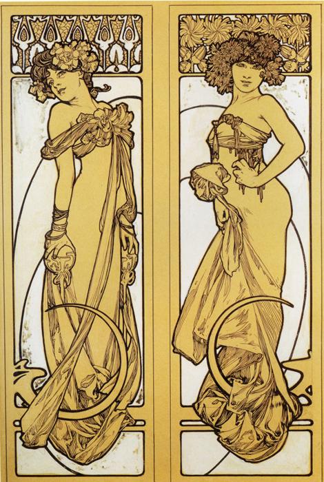
Alphonse Mucha’s “Two Standing Women” from 1902 presents a refined diptych that condenses his Art Nouveau vocabulary to its essence: sinuous line, ornamental framing, and a poised, allegorical femininity. Each panel stages a full-length figure set within an architectural border, their bodies turning in mirrored, complementary rhythms. The palette is intentionally restrained—warm parchment grounds and dark umber line—so that drawing carries the drama. What could have been merely decorative becomes a meditation on flow and balance. The two women do not advertise a product or enact a narrative; they demonstrate a style. In them one sees the principles that made Mucha’s posters and portfolios a grammar for the Belle Époque.
A Diptych Designed for Rhythm
Reading the image as a diptych is crucial. The panels are close in size and proportion, and the figures rotate on a shared axis like dancers captured at different beats. The woman at left turns away, glancing back over her shoulder, while the woman at right faces front in a slow, confident pivot. Between them a quiet dialogue unfolds: retreat and approach, reserve and assertion, curve and counter-curve. Mucha often built harmony by pairing opposites, and here the device operates with unusual clarity. The narrow format elongates every gesture so that a tilt of the head or a twist of the hip feels architectural. The eye moves from left panel to right in a loop, tracing the echoing relationships of shoulders, elbows, and draperies.
Composition and the Geometry of Flow
Mucha composes with a disciplined geometry masked by grace. In each panel the figure and the drapery create an S-curve that threads from head to foot. The arabesque is not a surface twirl; it is the underlying structure that organizes weight and guides the viewer’s path. At the base of both figures a crescent-like band arcs forward, locking the composition and visually “cradling” the drapery. These crescents repeat at different scales in the folds and bracelets, setting up a motif that unifies the pair. The backgrounds are edited to essentials: shallow, pale reserves bounded by thicker linear frames and capped by a frieze of repeating motifs. The subtraction of deep space intensifies the decorative rhythm, placing everything on the picture plane where design can do its work.
Line as Primary Actor
The power of “Two Standing Women” lies almost entirely in line. Mucha varies thickness and pressure with the sensitivity of a calligrapher. Contours swell at points of stress, then taper to a hairline as fabric lifts or light turns a corner. Interior lines are sparing—just enough to suggest a collarbone, the twist of a sash, the pivot of a knee. In several passages, line doubles back on itself, creating a soft band of parallel strokes that reads like a shadow without needing halftone. This economy permits clarity from a distance and nuance up close, the dual legibility that made Mucha’s work perfect for the street poster and the salon alike. Here, with color largely absent, the viewer can observe the logic of his line in its most articulate state.
From Fashion to Form
Clothing is both costume and scaffolding. The left figure wears an off-the-shoulder gown adorned with clustered blossoms and gathered sleeves. The right figure’s bodice is higher, tightened with a ribbon under the bust, while the skirt balloons and returns in rich folds around the ankles. Each detail—gloves, bracelets, garland—serves a compositional function. Gloves echo the roundness of the base crescents. Sashes pull diagonally to counterbalance the hips. Floral knots align with shoulder turns to punctuate the arabesque. The garments feel plausible in the era’s fashion yet are idealized into instruments of movement. Rather than painting fabric for its own sake, Mucha turns it into a choreography of shapes.
The Theater of Gesture
Gesture communicates character without narrative. The woman at left, head tilted and shoulders turned, threads the classic Mucha pose of demure withdrawal. Fingers curl lightly at her hip while her other hand cups the drapery, keeping the silhouette open. The woman at right stands more frontally, hand resting at the waist with a measured assertiveness. Her gaze is steady, her stance grounded by the heavier bunching of fabric near the feet. Together they enact a dialectic of modesty and confidence. Mucha achieves this without facial expression or dramatic props; the tilt of a wrist and the angle of a shoulder are enough to define temperament.
Ornament and the Framed World
The panels’ borders function like a small architecture. At the top, repeating geometric motifs—part floral, part lattice—create a frieze that acts as a cornice for the stage below. Vertical side bars, subtly embellished, provide the “columns” that contain the figures. Mucha’s borders never feel like afterthoughts; they are part of his ambition to design a total environment where figure and frame belong to the same system. The restraint of this border, compared to more florid examples elsewhere in his oeuvre, focuses attention on the figures while still declaring the work’s allegiance to decorative art. The panels could be installed as door surrounds, cabinet inserts, or hanging screens; they read as portable architecture.
Palette, Print, and the Taste for Restraint
The near-monochrome palette is not a limitation; it is a choice. Warm ocher grounds evoke parchment or sun-tinted plaster, while the dark umber line reads as ink or varnished wood. Such restraint suggests the work may have been conceived as a print or as a model plate for craftsmen. The limited color forces the viewer to savor proportion, curvature, and spacing—qualities that determine whether a design lives beyond the moment. In an age famous for champagne palettes and gilded accents, Mucha’s willingness to let line do the heavy lifting reveals the solidity of his design thinking.
Figure–Ground and the Art of Negative Space
The pale background reserves are active. Their simplified shapes, especially the large rounded rectangles behind the women, serve as counterforms that press gently against the figures, “sculpting” them from the outside. Mucha uses these voids as instruments of emphasis: a curve of empty space mirrors the swing of a hip; a clean vertical sets off a cascading fold. This dialogue between figure and ground prevents the panels from becoming busy. Air is part of the composition. The eye rests in these fields before re-entering the vines of line, which is why the panels feel restful despite their intricate contours.
Allegory without Labels
Mucha often titled figure panels with seasons, hours, or virtues. Here the title remains generic, yet allegory is still at work. The floral garlands, the rhythmic crescents, and the opposed but harmonious stances suggest paired qualities—perhaps Spring and Summer, Grace and Strength, Invitation and Reserve. Mucha trusts viewers to intuit meaning from formal relationships rather than explicit symbols. The women are archetypes with the specificity of individual presence, a balance that lets the panels function in various decorative contexts without losing their aura.
Relationship to Portfolios and Pedagogy
The year 1902 is associated with Mucha’s push to codify his style in teaching portfolios. These panels look like they could have stepped from such a portfolio meant to guide designers in applying Art Nouveau principles to interiors and objects. They demonstrate how to build a composition from flowing line, how to stabilize it with a border, and how to coordinate multiple panels as a set. The figures are not bound to a single patron or location; they are templates of grace that other makers could adapt to woodwork, stained glass, ceramics, or textile. Mucha’s legacy was not only a body of images but a method by which elegance could be reproduced without becoming inert.
Movement, Music, and the Sense of Time
Mucha’s art often feels musical. In “Two Standing Women” the meter is andante—neither rushed nor static. Repeating motifs act like refrains: floral bunches at the shoulders, crescents at the hem, bracelets at the wrist. The long verticals are sustained notes; the quick curls of ribbon are grace notes; the swell and release of the draperies become crescendos and diminuendos. The diptych format turns time into spatial sequence: left panel first, then right, then back again. This embedded musicality helps explain the panels’ enduring charm; they are designed to be looked at repeatedly, like a song one returns to.
Feminine Archetypes and the Gaze
Mucha’s women have long been discussed in terms of the gaze, and these panels refine that conversation. Neither figure performs overt seduction. The left woman’s averted look creates a courteous distance; the right woman’s directness is firm but unprovocative. Their adornment reads as ceremonial rather than coquettish. In this, Mucha shifts femininity from object to emblem—figures that crystallize qualities of poise, grace, and presence. The viewer’s gaze is guided to admiration rather than consumption, an ethical pivot that allows the images to function in public and private spaces without dissonance.
Craft Cues and the Promise of Material
Even in a line-dominant work, Mucha hints at materiality. Gloves look soft and weightless, sashes appear to tug with a slight gravity, and the dense hem folds imply a heavier textile. The base crescents could translate into carved wood or gilt metal supports. The top frieze’s repeating units would make natural stencils or inlays. These craft cues explain why Mucha’s designs were so adaptable. He drew not only images but instructions, as if each panel whispered to future artisans how it might wish to be made.
Comparison with Theatrical Posters
Compared with the luxurious color and branding of Mucha’s theater and product posters, “Two Standing Women” is spare. The absence of lettering, logos, and elaborate floral surrounds concentrates the eye on figure construction and border logic. Yet the kinship is clear. The same silhouette sensitivity, the same orchestrated hair and drapery, and the same architectural framing animate both domains. If the posters are public arias, these panels are chamber pieces—closer to the craft bench than the boulevard but no less eloquent.
Psychological Atmosphere
Despite the stylization, each figure carries a distinct mood. The left panel suggests hesitant grace, a fleeting look back that invites the viewer and also keeps a secret. The right panel conveys settling confidence, a woman comfortable with her own measure. The pairing implies that identity is not a single state but a spectrum between reserve and poise. In private interiors where such panels might hang, they would quietly model these temperaments—gentle exemplars of how to move through a room.
The Legacy of a Language
“Two Standing Women” endures because it teaches by example. It shows how ornament grows from structure, how repetition becomes rhythm, how pairs generate harmony, and how restraint can amplify beauty. These are not transient fashions; they are design truths that continue to guide contemporary graphics, fashion, and product design. The panels invite both appreciation and use. One can enjoy their graceful surfaces and also learn from their bones, a dual utility that explains Mucha’s lasting influence across disciplines.