Image source: artvee.com
Introduction
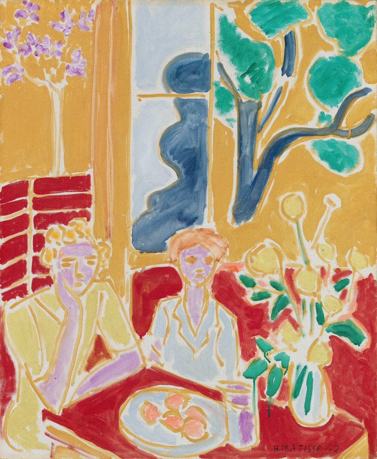
Henri Matisse’s “Two Little Girls, Yellow and Red Background” (1947) is a late, luminous statement from an artist who had already redefined modern color. Painted the very year he published his Jazz portfolio, the canvas shows two children sitting at a red table, a plate of pinkish fruit before them, flanked by a big vase of yellow blossoms. Behind them spreads a wall of ochre yellow punctuated by a sash window and a stylized tree of emerald disks and inky branches. Everything is drawn with ribbons of exposed ground that behave like white chalk lines, letting the painting breathe even as color blocks declare themselves with unembarrassed directness. The result is at once homely and grand: a domestic interior that feels as expansive as a stage set.
The Late 1940s Context
By 1947 Matisse, recovering from illness and surgery, had pared his practice to essentials. He spoke about “drawing with scissors” in the paper cut-outs, but the same economy animates his late oils. Instead of modeling and atmospheric perspective, he organized pictures with large color chords, swift contours, and a shallow, decorative space. The Nice interiors of the 1920s had taught him how to make rooms sing; Jazz clarified his belief that pure relations of hue and shape can carry narrative energy. “Two Little Girls, Yellow and Red Background” synthesizes both lessons. It keeps the lived intimacy of an interior while using color as the chief architecture.
First Read
At a glance, the composition divides into three bands. The left column holds a lilac tree sketched in spurts of lavender over ochre, with a tall red panel beneath it. The center is anchored by the window: two pale blue panes crossed by a vertical muntin, the left pane partly veiled by a sinuous, midnight-blue form. The right side opens to a stylized tree outside, its green leaves clustered like coins. In front of all this sits the red table, the plate of fruit, the purple drinking glass, the large bouquet of yellow flowers, and the two girls—one resting her chin on a hand, the other more frontally posed. These elements are simple enough to read instantly yet arranged to sustain long looking.
The Architecture of Color
Color is the framework, not ornament. Matisse chooses an ochre ground for the walls, a saturated red for the table and bench backs, and then threads through a cadence of cooler notes—pale sky blues, deep navy, and leaf greens—to keep the warm field alive. The children themselves are constructed from pale lilacs and lemon creams, a deliberately non-naturalistic choice that cools their figures against the heat of the room. The bouquet’s buttery heads repeat the wall’s ochre at a higher pitch, while their green stems and leaves echo the tree outside. Every hue has a job: yellow warms and unifies; red grounds and dramatizes; blue and green provide receding calm; lilac supplies a skin-temperature counterpoint that never competes with the background.
Red and Yellow as Stage
The title foregrounds what the painting knows about itself: this is a theatre built on red and yellow. The yellow is not a single note; it wobbles between ochre and mustard across the wall, around the window frame, and within the flower heads. Those variations suggest Mediterranean light sifting through a late afternoon room. The red table, seat and background blocks act like a proscenium and orchestra pit. They pull the figures forward and concentrate the action in a low band, keeping the canvas from dissolving into decorative wallpaper. Matisse often compared painting to music; here, red and yellow are the ground bass over which the other colors solo.
Cool Counterpoints
Without blue and green the picture would overheat. The window’s sky-blue panes set a mild, airy cool that bridges interior and exterior. The darker blue silhouette that flows down the left pane is a masterstroke: a single abstract shape that reads as a curtain, a shadow, or a human profile, cooling the center and creating a vertical rhythm. To the right, the tree’s leaves flicker in opaque emerald surrounded by white reserves; these green disks converse with the bouquet’s leaves on the table so the eye jumps easily from outside world to still life.
Drawing With Light
One of the painting’s most striking features is the way lines are made not by dark contour but by leaving thin channels of the light ground between color areas. This is drawing by omission. The effect is crisp and buoyant; forms seem cut out and laid next to one another, yet they never congeal. Those white seams also act like shafts of light, making the window glow and the blossoms blink. In places Matisse lets the brush skip, so the line frays and the canvas weave shows through. The candor keeps the stylization lively.
Composition and Geometry
The picture balances rectangles and arabesques. The window and the tabletop provide the strong orthogonals; the tree outside, the lumpy bouquet, and the girls’ hair and shoulders supply curves. The large shapes are carefully interlocked: the window meets the tree; the flowers overlap the red seat; the girls’ silhouettes bite into the table’s edge and then pull away. The plate and flower heads introduce circles that rhyme across the lower half, while the palms, leaves, and the deep-blue curtain provide slow verticals that keep the eye from sliding sideways. This geometry is felt rather than announced; it’s why the painting reads as simple without ever going slack.
The Table as Theatre
Matisse loved tables because they collect a microcosm: food, flowers, and people in a compact stage. Here the red tabletop is a field where color performs. The plate of peaches, drawn with milky whites, pinks, and faint citrus rims, echoes the children’s faces and the flower centers. A purple glass sets the only violet in the painting—a small but essential chord that saves the lilac skin tones from isolation. The bouquet explodes upward in foamy yellow circles, their stems shooting diagonally to break the tabletop’s horizontal. Even without descriptive detail, the still life breathes; you believe the weight of fruit and the wet leafy push of flowers.
The Two Figures
The girls are reduced to signs—outlines and washes that record posture and temperament rather than portrait likeness. The left child rests her face in her hand, elbow on the table, an attitude of dreamy absorption. The right leans forward slightly, more alert but not stiff. Matisse assigns both figures pale lilac for skin, a rare, cooling choice that keeps them from merging with the wall and turns them into gentle beacons amid heat. Lemon-yellow garments, drawn with ochre lines, tie them to the room’s atmosphere while separating them from the strong reds. Their hair is hinted as apricot and gold, quick loops rather than strands. The simplification is affectionate and unsentimental; the figures are present as rhythms within the room’s orchestration.
Interior–Exterior Dialogue
A classic Matisse problem animates the painting: how to make the interior and the outside world converse without one swallowing the other. The solution here is to give the window as much authority as any figure. Its vertical divides the canvas but also knits across because the blue curtain shape echoes the tree’s trunk and the bouquet’s stems. The green disks of the outside leaves repeat in the near vase; the ochre wall is the same family as the flower heads. The two little girls become mediators—they sit in the room, but their color chords bridge to the window’s coolness.
Speed and Material Candor
The paint handling is fast. You can sense how Matisse pulled a loaded brush to draw a flower head or a leaf, then rinsed to lay a thin plane of ochre on the wall, leaving ragged edges so the white outline could sit between zones. The red table is laid in broadly, with lighter reds and pinks scumbled on top to keep it from reading as a flat sheet. This speed does not mean carelessness. It is the precision of a musician who can strike a note cleanly without warming up; the confidence is the style.
Cut-Out Logic in Paint
Although this is an oil painting, its logic is that of the cut-outs. Shapes are conceived as solids with clear edges, assembled side by side. The white seams mimic the paper edges in Jazz; the sinuous dark-blue curtain is practically a cut form glued to the blue ground. The bouquet’s coin-like heads, each with its halo of ground, could be lifted straight from the studio floor where Matisse arranged paper flora. This translation from scissors to brush defines the painter’s late language: painting that knows what cutting taught it—clarity, contrast, and breath.
Rhythm and Repetition
Repetition is how the picture keeps viewers circling. Round fruit on the plate repeats the round flowers, which repeat the round leaves outside. The red blocks behind the girls repeat the tabletop and seat; the lilac of the left figure’s face repeats in the right figure’s face and faintly in the small glass; the yellow of the wall repeats in the dresses and blossoms. Meanwhile, differences—lighter versus darker red, pale versus saturated green, deep versus sky blue—prevent monotony. The rhythm is leisurely, childlike in its steadiness, and that steadiness is the source of calm.
Emotional Tonality
Despite its high-key palette, the painting is not loud. The girls’ subdued postures, the domestic scale of the table, and the gently luminous wall generate a mood of unforced quiet—afternoon light, perhaps after a snack or lesson. The color does the emoting: warm ochres and reds for safety and cheer, countered by the contemplative cool of blues and greens. This is the “balance, purity, and serenity” Matisse once said he wanted art to offer, achieved not with piety but with clear, generous relations.
Relation to Jazz and the Late Studio
The date ties the work directly to Jazz, published in 1947, where circus performers and mythic figures are reduced to bright silhouettes. Here, instead of acrobats we find children at a table; instead of the proscenium of a ring we get the red tabletop. Yet the same principles apply: bold fields, cut contours, and chromatic chords that carry narrative by themselves. The canvas also reveals how the studio had become Matisse’s world. Rather than travel outward for subject matter, he examined the room’s everyday theatre—the window view, the vase, the fruit, two children—and made them sufficient.
What the Painting Teaches
“Two Little Girls, Yellow and Red Background” demonstrates how far an image can go with a few tuned elements. Assign each color a role and let it play; use white reserve lines to draw light; balance orthogonals and arabesques; repeat shapes at different scales to knit space; and, crucially, let painting show the hand that made it. Designers and painters continue to borrow from this method, whether in poster design, children’s illustration, or contemporary interiors that work with two or three dominant hues and a handful of clear forms.
Conclusion
This late Matisse is a compact orchestration of domestic life and pure color. Two children, a plate of fruit, flowers, a window, and a tree—nothing exotic, everything indispensable. Yellow and red build the stage; blue and green cool it; lilac humanizes it; white lines make it glow. The picture holds fast to the pleasures of looking and the promise that clarity can sustain feeling. In 1947, as he reimagined what painting could be through paper, Matisse also proved on canvas that a room of primary colors and careful edges can carry the weight of presence, intimacy, and joy.