Image source: artvee.com
Introduction
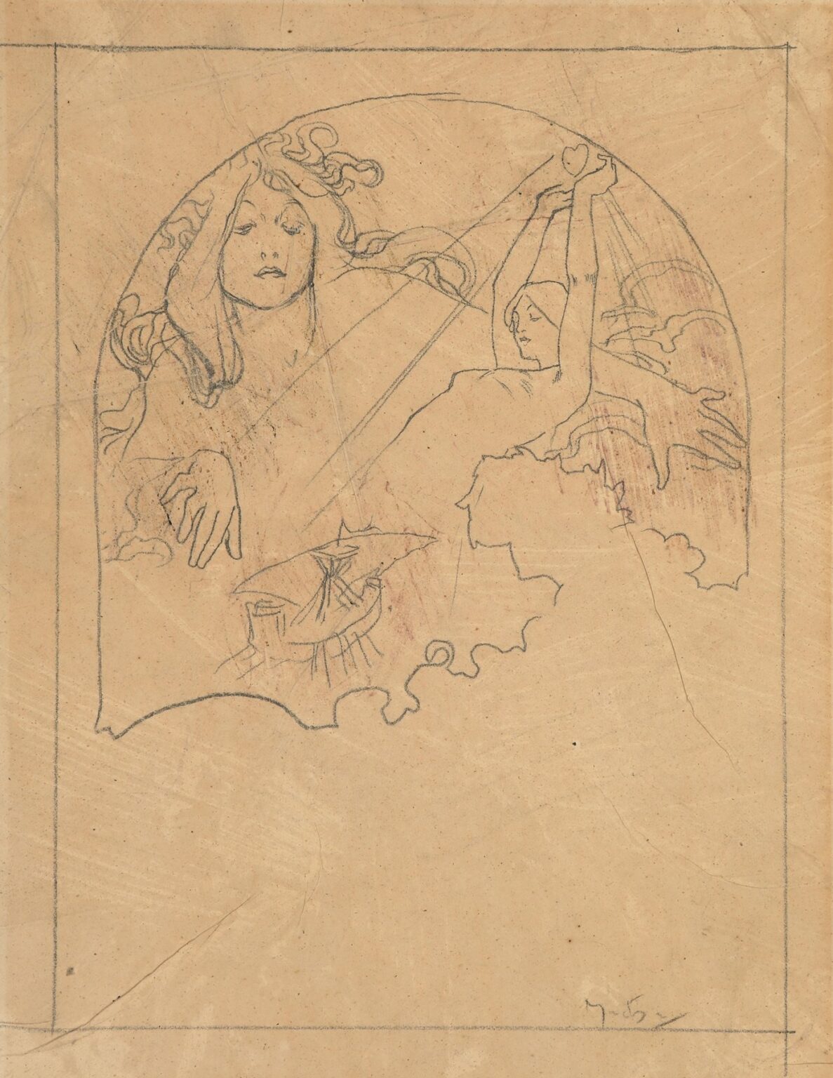
“Two female figures” reveals Alphonse Mucha thinking on the page. It is a preparatory drawing that maps an allegorical scene inside a shaped frame, drafted with a light, decisive hand. The left figure faces outward with a calm, frontal poise; the right figure turns in profile and lifts both arms to raise a small heart above her head. Diagonal rays cross the field; stylized clouds curl along the perimeter; at the lower edge a wavy border encloses a tiny parasol-like motif. Even in this embryonic state, the composition reads as unmistakably Mucha: a union of lyrical contour, ornamental framing, and a clear symbolic thesis.
First Look and Visual Summary
The design sits within a penciled rectangle that marks the intended print or panel size. Inside this, Mucha drafts a large circular or domed cartouche that contains the scene proper. The left figure occupies the near foreground, shoulders and head filling the vertical; her hair unfurls in serpentine strands that join the border. The right figure is smaller and more dynamic. With elbows extended and wrists bent, she lifts a heart, the symbol held where the rays converge. Around them, cloud scrolls and a giant hand silhouette on the right provide atmospheric punctuation. The lower edge of the cartouche dissolves into scallops, as if the image were rising from mist.
The Decorative Frame as Narrative Device
Mucha rarely used frames as neutral borders; he designed them to carry meaning. Here the circular cartouche behaves like a celestial window. Its curvature gathers the two figures into a single emblem, while the wavy break at the bottom implies emergence. The thin outer rectangle records the eventual trim or lithographic margin and also lets us see his spacing decisions: the roundel is centered but nudged upward to leave breathing room for the scalloped base. This hierarchy of frames rehearses how the future print would read on a wall—first the overall silhouette, then the inner scene, then the details.
Relationship Between the Two Figures
The left figure is steady and iconic, the right figure active and aspirational. Mucha often pairs a frontal presence with a lateral actor to balance contemplation and action. The outward-looking face supplies gravitas; the reaching body supplies narrative. Their hair and drapery lines interweave, guiding the eye from left to right along a gentle S-curve. The figures are close enough to feel connected yet distinct enough to suggest complementary roles—guardian and votary, muse and celebrant, reflection and ascent.
The Raised Heart and Its Allegorical Charge
The small heart, lifted high in the right figure’s hands, is the drawing’s conceptual fulcrum. In Mucha’s lexicon, attributes identify virtues and arts. A heart can signal Love, Charity, Devotion, or a generalized idea of the soul’s offering. Its placement at the top of the gesture and near the convergence of rays reinforces the reading of epiphany: the emotion is not hidden within the body but presented to the light. Because the heart is small, it remains a sign rather than an object, preserving the figure’s grace while fixing the meaning.
Rays, Clouds, and the Atmosphere of Revelation
Diagonal rays cut across the roundel, organizing light as design. They create a path from the heart through the composition and provide a counterpoint to the circular border. Around them, coiling clouds soften the geometry. This pairing of straight radiant bands and curvilinear vapor is typical of Mucha’s stagecraft: the architecture of lines declares order; the arabesque of clouds supplies life. In a finished lithograph these rays would likely be rendered in pale color bands or gilt lines, while the clouds would take on soft gradients.
Hair, Hands, and the Whiplash Line
The left figure’s hair unfurls in the whiplash curves that became a hallmark of Art Nouveau. These coils are not decoration pasted onto a figure; they are extensions of her presence, tying her to the border and to the atmosphere. Hands receive equal attention even in this early stage. The right figure’s uplifted wrists are drawn with clean, elastic contours that keep the gesture buoyant. Mucha knew that hands carry drama; he secures their angles before committing to costume or background elaboration.
The Lower Motif and the Scalloped Edge
At the base of the cartouche, Mucha interrupts the round with a scalloped silhouette, as though the image floats above froth or cloud. Inside this gap sits a small parasol- or canopy-like sketch with radiating ribs. It may indicate a future emblem, a pedestal device, or a secondary scene tucked into the border—a strategy he used often to add narrative footnotes. The decision to open the circle at the bottom prevents the composition from feeling sealed and sterile; it gives the design a place to breathe and to anchor future typography if needed.
Evidence of Process and Working Method
The paper carries faint guide lines, erased search marks, and a light, exploratory pressure that thickens only where forms are decided. Mucha very likely established the frame first, then blocked the big masses—heads, hands, and the lifted attribute—before knitting the field with secondary motifs. The right-hand silhouette of an enlarged hand, sketched lightly behind the clouds, shows him testing scale relationships. Such pentimenti are invaluable: they reveal the choreography he intended and the order in which clarity arrived.
Geometry and Flow
Under the ornament sits a lucid geometric plan. Two dominant diagonals organize the field: the ray that runs from upper left to lower right, and the counter-diagonal traced by the raised arms. These lines cross near the heart, creating a visual knot. Around this, circular arcs—the frame, coils of hair, billows of cloud—keep the eye circulating. Mucha’s genius was to let geometry do the heavy lifting while line supplied seduction. Even as a sketch, the page feels balanced because those structural rhythms are in place.
Potential Color Translation
Although the drawing is monochrome, it invites speculation about color. The left figure, calm and frontal, could carry cool tones that read as wisdom or serenity. The right figure, all ascent and offering, suggests warm notes that would harmonize with the heart and rays. Clouds could shift from lilac to cream; the rays might be pale gold; the scalloped base could adopt a soft stone hue. Mucha typically separated figure, attribute, and atmosphere with restrained palettes, allowing linework to maintain unity. The present design is tailored for that approach.
Comparisons Within Mucha’s Oeuvre
The pairing of a stately head with an active figure recalls his decorative panels where a primary personification shares space with a secondary emblem or scene. The roundel echoes the arched formats of his calendars and panneaux décoratifs. The uplifted offering recalls figures in his allegories of Love, Poetry, or the Arts who extend an attribute toward a source of light. What distinguishes this sheet is its candor. Without polychromy or surface finish, we see the skeleton of those celebrated works: a diagram of movement, a hierarchy of forms, and the primacy of contour.
Thematic Readings
The drawing supports several overlapping readings. As an allegory of Love, the right figure elevates the heart while the left provides the stable, witnessing presence of Beauty. As an image of Charity, the heart becomes a gift raised to the world, with rays standing for blessing. As a meditation on Inspiration, the heart is the artist’s inner fire held up to the muse. Mucha often engineered his allegories to be elastic; the same design could title different virtues depending on inscriptions and color programs. Here, elasticity is built into the clean clarity of the gesture.
Negative Space and Stagecraft
Mucha leaves large regions of the roundel open. Those voids are not empty; they are stages on which the figures act. The untouched paper around the left face isolates the expression; the wedge of space under the right arm intensifies lift; the gap at the base promises mist or ornament to come. In the absence of tone, negative space becomes the primary medium of atmosphere. This economy also serves the practical needs of lithography, where flat fields of color reproduce crisply.
The Role of the Borderline
The single pencil line that defines the circle is one of the drawing’s most expressive marks. It thickens slightly where elements overlap it and stays light where nothing presses against it. This variation makes the border feel elastic, a membrane rather than a rigid frame. In finished works, Mucha often turned borderlines into braided bands, bead strings, or floral wreaths. Here, the plain line allows him to perfect placement before committing to ornament.
Anticipated Typography and Application
The rectangular mise-en-page suggests a functional destination: poster, calendar, packaging label, or a decorative plate. The open space beneath the roundel could accept lettering, a date, or a cartouche. Mucha routinely developed such studies with an eye to practical integration of text. The way the scalloped base steps inward leaves natural ledges for titles. Even at the preliminary stage, the design reads as something that could live comfortably on a public wall or private panel.
Craft, Control, and Speed
The linear touch is confident but not heavy. Contours rarely require second passes; when they do, the corrections are small and directional. This balance results from long practice: draw lightly until the relationships click, then seal the decision with a firmer stroke. Mucha’s speed is evident in the rhythmic hair coils and in the swift block-in of the clouds. Yet the crucial forms—the eyes of the left figure, the wrists and heart of the right—are placed with care. He knows where viewers will look first and secures those anchors early.
Why This Sheet Matters
Even as a modest study, “Two female figures” clarifies what made Mucha’s imagery so persuasive. He could articulate a complete, legible idea with a handful of marks: a calm face, a lifted heart, rays that organize meaning, and a border that both contains and breathes. It shows the discipline underpinning his lush Art Nouveau surfaces and demonstrates how allegory can be built from pose before ornament enters. For admirers of his finished lithographs, this drawing is the blueprint that explains their ease.
Conclusion
“Two female figures” captures the threshold where concept becomes composition. Within a roundel sketched on a single sheet, Alphonse Mucha arranges a dialogue between contemplation and offering, stabilizes it with geometry, and breathes life into it through whiplash line. The heart lifted to the rays supplies the narrative core; the serene face and flowing hair supply charisma; the clouds and scalloped base promise an atmosphere that color would later complete. Stripped of polychrome and finish, the design remains eloquent because it rests on the essentials of Mucha’s art—clarity of structure, musical contour, and symbols that read at human scale.