Image source: wikiart.org
Introduction
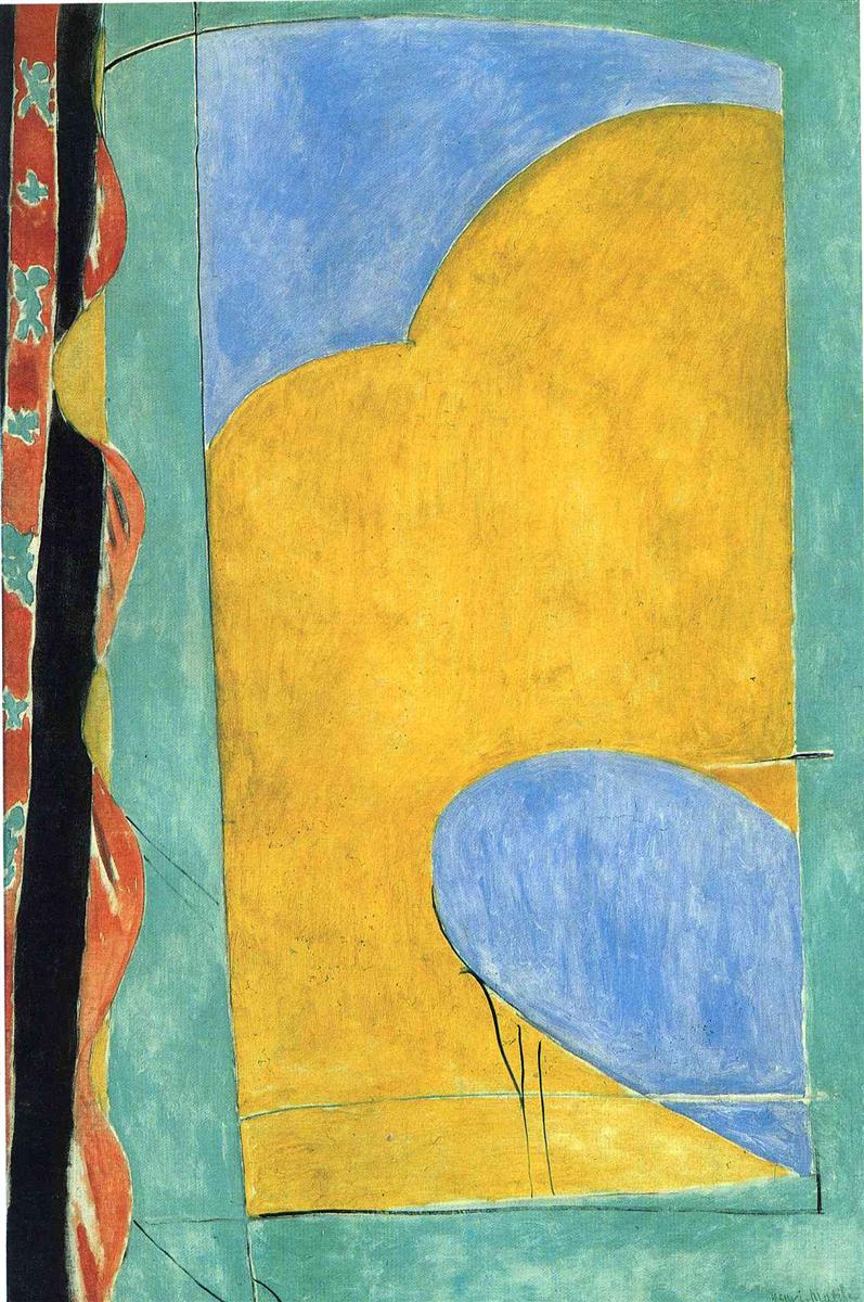
Henri Matisse’s “The Yellow Curtain” (1915) is one of the clearest declarations of his modern credo: a painting can be both a view and an object, both sensation and structure. It takes the familiar motif of a window and strips it to a few luminous planes—an expanse of yellow that reads as curtain and sunlight fused, two blue shapes that suggest sky seen in fragments, and a turquoise-green surround that anchors the whole as wall and air. At the left edge a slender band of patterned red and black insists on the world of textiles and ornament. With almost nothing beyond color and contour, Matisse turns a quiet corner of a room into a radical meditation on thresholds, light, and the grammar of the picture plane.
Historical moment
The canvas belongs to Matisse’s astonishing sequence of 1914–1916 works, a time when he rethought painting after the blaze of Fauvism and the crystalline Moroccan travels. Europe was at war; Matisse, back in Paris, retreated to the studio and pushed toward reduction. Windows became bars and planes (“French Window at Collioure,” “View of Notre-Dame”); portraits shed anecdote and relied on tonal architecture; still lifes turned into balanced fields of color crossed by a few decisive lines. “The Yellow Curtain” sits squarely in that project. It preserves the subject of a lived interior while pressing it toward abstraction, embodying the tension between clarity and mystery that defines his most influential prewar and wartime pictures.
First impressions
From across the room the painting reads as a large golden rectangle set within a cooler turquoise frame. Curving into the gold from the upper left is a rounded field of blue, like a cloud or a slice of sky. A second blue form enters low right, more oval and heavier, as if a distant rooftop or awning had slid into the frame. At far left a vertical ribbon of patterned red—nearly a tapestry edge—adds a hot counterpoint and confirms that we are inside, looking past fabric toward light. Thin black lines, sometimes hairlike and sometimes firm, articulate the seams of wall, window, and textile. The whole surface feels at once austere and buoyant.
A window that is also a painting
For centuries, painting had been likened to a window opening onto the world. Matisse literalizes the metaphor and then interrogates it. The yellow field stands as curtain and sunlit plane simultaneously; the two blues read as glimpses beyond; the green frame is both wall and the painting’s own border. We look out and we look at. The image performs an oscillation that never resolves, a steady reminder that representation and flat design can coexist without hierarchy. In this, “The Yellow Curtain” condenses the lesson of Matisse’s window series into a single, legible chord.
Color architecture
The palette is deliberately narrow—golden yellow, two variegated blues, turquoise-green, red with black and white accents—yet every interaction is rich. Yellow dominates, warm and granular, its warmth intensified by the cooler greens around it. The upper blue has lavender inflections and more air; the lower blue is thicker, edged by a lip of pale tone that reads as light catching a form. The green surround steadies the composition; it is not a passive background but an active intermediary that allows yellow to flare without glare and blue to cool without chill. The red patterned edge is small but decisive: it lifts the temperature and grounds the painting in the world of cloth, memory, and touch.
The poetics of line
Matisse’s line is a record of thought. He draws the window’s edges with slender, elastic strokes; he lets the long curve where blue meets yellow wobble lightly so the edge breathes like fabric in air; he doubles some lines and lets others fade, making process visible. The thin horizontal near the lower right, like a curtain rod or a sash, is not mechanically straight; it bows slightly, registering the body’s movement during drawing. This is not the geometry of a ruler, but a practiced hand tracing relations in real time.
Shape, rhythm, and proportion
“The Yellow Curtain” is a study in how few shapes can sustain a complete rhythm. The principal yellow rectangle carries two major curves, one from above and one from below, whose arcs echo without mirroring. The left-hand textile repeats the logic of alternating bulge and recess in miniature. Proportion is tuned by distance and overlap: the upper blue is cropped by the top edge; the lower blue is cropped by the right edge; the yellow is boxed but never cramped. The result is a cadence of entrances and exits along the borders, keeping the viewer’s eye circulating.
Material surface and evidence of making
The yellow is not an industrial flat; it is built from thin, scumbled layers through which the ground breathes, creating a soft granular light. In the blues, Matisse drags a drier brush so the weave of the canvas shines, lending the “sky” areas a vibrating texture. At some edges, dark underdrawing peeks from beneath the paint; elsewhere, a pale halo shows where a shape was moved. These traces animate the calm, revealing the painter’s revisions and reaffirming that final simplicity is earned.
Curtain, textile, and the decorative ideal
The title invites us to read the yellow plane as a curtain, and the patterned band at left completes the cue. Matisse had long been devoted to textiles—North African carpets, Islamic ornament, domestic fabrics—and believed that a painting should function like a well-composed tapestry: every part contributing to a living surface. Here, the curtain is not decoration over a window; it is the very principle by which the picture is built. Pattern is implied rather than rendered in detail; the rhythm of large shapes replaces the inventory of motifs. The canvas becomes a woven field of color and line, faithful to the decorative ideal without becoming merely ornamental.
Space without illusionism
Depth is suggested but not developed. The blue forms sit “behind” the yellow by virtue of value and temperature, not because of diminishing scale or traditional perspective. The thin lines that bracket the yellow field read as sash and wall seam, giving just enough architectural context to secure space. Yet the overarching feeling is of a unified plane. We are poised on a threshold that never fully opens, like a breath held at the moment curtain and view coincide.
Time of day and atmosphere
Though abstracted, the color climate whispers of late afternoon or morning light—the kind that infuses fabric with warmth while the sky retains cool clarity. The yellow feels sunlit but not glaring; the blues are fresh without icy hardness. The emotional temperature of the painting rests on this balance: a calm brightness that suspends urgency. Matisse avoids shadows that would dramatize and instead opts for an even, breathing illumination.
Dialogue with related works
Placed beside “French Window at Collioure,” this painting looks like a reconciliation. The Collioure window presses toward near-monochrome abstraction, three verticals and a diagonal wedge of floor. “The Yellow Curtain” reintroduces vivid color while keeping the same discipline of large planes. Compared with “View of Notre-Dame,” which frames an exterior with graphlike bars, “The Yellow Curtain” treats the frame itself as a colored participant, reducing architecture to chromatic blocks. And placed against “Goldfish and Palette,” it reveals how the goldfish interiors’ curving ornaments have been sublimated into pure arcs of color. The motif evolves, but the core problem—how to balance structure and delight—remains constant.
Abstraction and representation
Few paintings show more clearly how Matisse navigates the edge between the seen and the composed. If one reads literally, the canvas describes a studio window with the curtain pulled partly across, a strip of patterned fabric at left, slivers of sky beyond. If one reads abstractly, it is a negotiation of a large warm field with two cool lobes inside a green frame. Crucially, both readings hold at once, and the mind’s oscillation between them is part of the pleasure. Matisse’s modernity lies here: he makes representation serve design and design serve sensation without subordinating one to the other.
The ethics of omission
What is absent matters. There is no table, no vase, no figure leaning to peek through, no city beyond. Even the curtain’s folds are mostly withheld. These omissions are not evasions; they sharpen attention. By removing anecdote, Matisse opens a space for the painting’s fundamental relations to assert themselves. The discipline of leaving out allows the included elements to resonate more deeply.
The work as a lesson in color relationships
Yellow against blue is a classic complementary pairing, but Matisse uses it with tact. The yellow is slightly warmed by red; the blues are slightly cooled toward violet. Between them he inserts green, not as a mix but as a separate body that mediates and keeps the composition from becoming a simple duel of opposites. The small red with white motifs at left lifts the key without stealing the melody. Anyone studying how to balance high-chroma fields without harshness will find a masterclass in this canvas.
Scale, body, and viewing distance
At human scale the picture behaves like an actual curtain and window: the yellow fills peripheral vision, while the blues are glimpsed at the edges, as they would be in a real room. The left-hand textile strip occupies the zone where one’s body might brush fabric on the way to the window. That bodily address is part of the painting’s authority. It is not a miniature abstraction but an object that situates the viewer in space.
Anticipations of the cut-outs
Decades later, Matisse would cut colored papers into curving shapes and pin them into airy constellations. “The Yellow Curtain” anticipates that method. The large rounded forms are already behaving like cut-outs laid onto a field; the thin linear elements foreshadow the pins and tacks that would become visible in the late works. The lesson travels forward: big, tuned shapes can carry emotion with surprising clarity.
How to look
Let the yellow fill your eye, then notice how the upper blue’s arc pushes back and the lower blue presses in. Track the hairline along the right where yellow meets the frame; feel how its tiny undulations make the surface breathe. Move to the patterned strip and study how little information is needed—red, white, black, a few petal-like marks—for the mind to register textile. Step away until the painting almost becomes an abstract flag; step close until the scumbles and pentimenti show. Allow the image to alternate between curtain and color-field, understanding that this flicker is the work’s true subject.
Legacy and relevance
“The Yellow Curtain” has remained a touchstone for painters and designers seeking luminosity without illusionism. Its lessons travel easily: use large planes to set the climate; let a few arcs anchor rhythm; keep edges alive; allow a small, hot accent to calibrate an otherwise cool harmony. It also offers a humane model of modern reduction. The painting is rigorous but not sterile, precise but not pedantic. It remembers the body, the breeze, and the pleasure of cloth even as it pursues abstract balance.
Conclusion
With “The Yellow Curtain,” Matisse brings a whole world into the room using the fewest possible means. A field of gold becomes fabric and sun; two blue shapes become the idea of outdoors; a narrow patterned strip keeps the touch of the hand and the memory of ornament. Lines remain flexible, colors are tuned rather than forced, and space is held at the threshold where looking and being meet. More than a century later, the canvas still feels fresh because it trusts essentials. It shows that when relations are right—warm to cool, curve to bar, inside to out—painting can make quiet feel monumental.
