Image source: artvee.com
Introduction
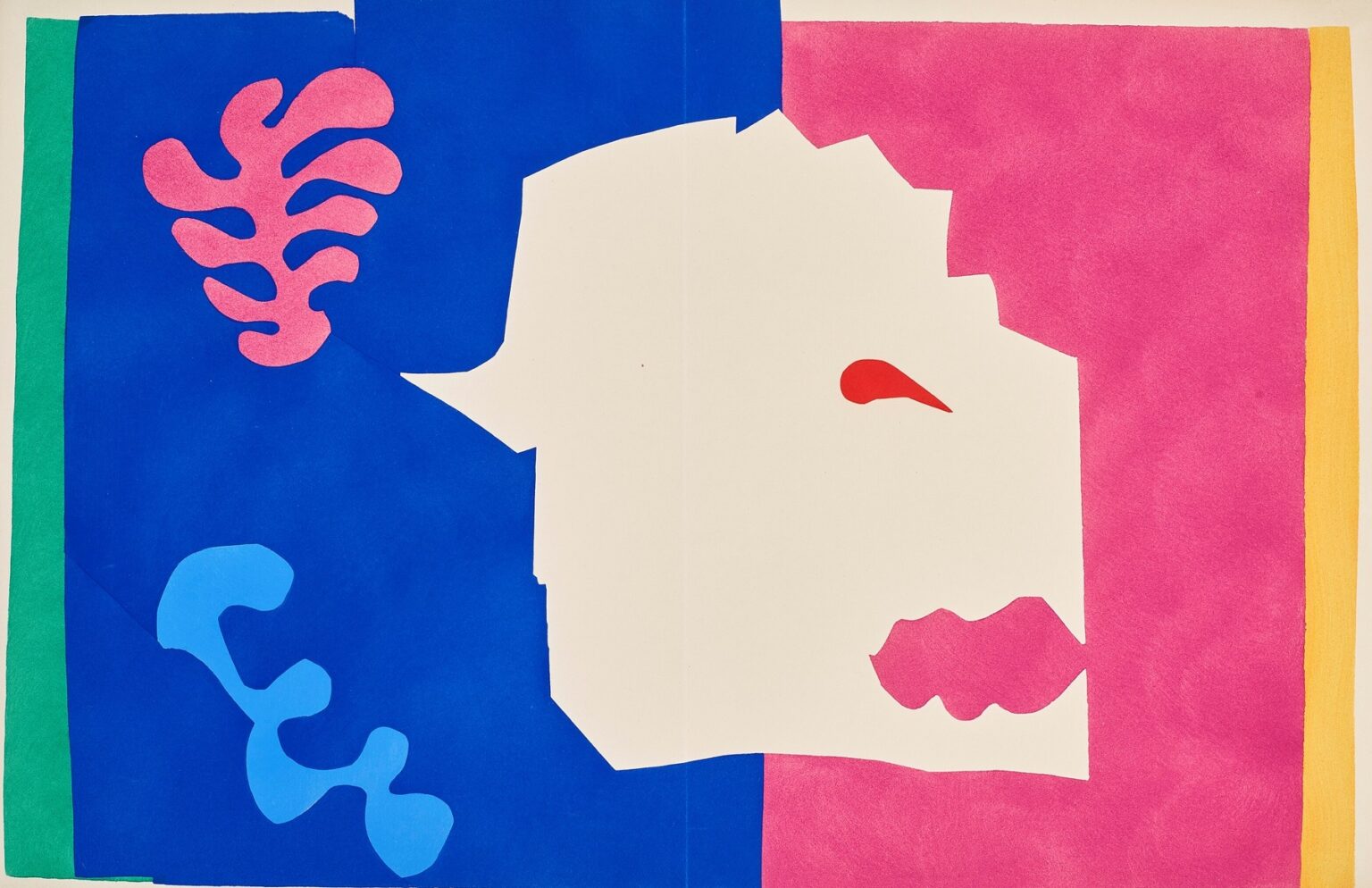
Henri Matisse’s “The Wolf” (1947) belongs to the brilliant late chapter of his career when he “drew with scissors,” cutting shapes from paper painted with saturated gouache and arranging them into blazing fields of color. The image, reproduced as a pochoir plate in the Jazz portfolio, is at once playful and primal: a white, jagged silhouette reads unmistakably as a wolf’s head in profile, its red eye and serrated mouth suspended within a blocky architecture of blue, pink, green, and yellow. Around this central animal sign, biomorphic forms—one coral-like, another serpentine—float like theatrical props. The sheet is flat, but the composition is kinetic; the shapes don’t depict space so much as collide in it. “The Wolf” shows how Matisse turned cut paper into a language capable of drama, emblem, and music.
The Late-Career Invention of Cut-Outs
By the mid-1940s Matisse had redirected his practice. After a major illness and surgery earlier in the decade, painting at an easel became physically taxing. He responded with invention rather than retreat, painting sheets of paper with gouache and cutting them into colored elements he could arrange and rearrange from a chair or bed. He called this “drawing with scissors,” and the method let him move color and line at once. The Jazz portfolio of 1947 presented these cut-paper maquettes as vivid pochoir prints, each accompanied by pages of the artist’s own handwritten reflections. “The Wolf” is one of Jazz’s emblematic plates, revealing how the cut-out technique could translate animal energy into crisp, declarative silhouettes.
Jazz, Theater, and the Animal as Performer
Jazz organized its images around the idea of performance—circuses, folklore, acrobats, swimmers, and creatures imagined with the boldness of posters and the rhythm of music. The wolf belongs to this cast. It is not a zoological portrait but a stage character, a mask of predation simplified into a few telling signs: a saw-tooth jaw, a single red eye, a muzzle projected as a sharp white wedge. The surrounding color fields function like wings and curtains, the bright partitions of an abstract theater. In this sense, “The Wolf” is less about wildlife than about the human habit of turning animals into emblems of threat and appetite.
Color Blocks as Stage and Weather
The sheet divides into big, unmodulated fields: ultramarine dominates the left half, magenta floods the right, a slim bar of lemon glows at the far right edge, and a stripe of green steadies the far left. These zones behave like weather systems meeting at a front. The blue reads cool and nocturnal; the pink radiates heat and appetite; the yellow is a narrow edge of light, a margin of dawn or warning. Against these states of color, the white wolf reads as a flash—an absence that becomes the most present thing in the scene.
The Red Eye and the Logic of a Single Accent
Matisse inserts one small wedge of red for the eye. That choice is surgical. The plate is already loud with color, yet the red remains the highest note because it is isolated. It fixes the direction of the head, anchors the animal’s alertness, and locks the image’s reading at a glance. Without it, the central shape would drift toward generic abstraction; with it, the shape snaps into wolf. This is the economy of the cut-outs at their best: one accent determines the entire narrative.
Figure–Ground Games and the Power of the Silhouette
The wolf is not painted; it is a hole in the color, a crisp silhouette created by what surrounds it. This figure–ground reversal gives the image its charge. We are used to perceiving subjects as positive forms; here the subject is absence, a white shard that takes its identity from the blue and pink that press against it. That reversal feels appropriate to the animal itself—seen in a flash, sensed more than described, present as threat more than substance.
The Coral and the Serpentine Signs
Two biomorphic motifs float in the blue field: a pink, branching form reminiscent of sea coral or vegetal growth near the top, and a light-blue, ribboning form that wiggles near the bottom. They are decorative, but they are not filler. Each extends the composition’s vocabulary of life and movement. The coral form mirrors the wolf’s serrated mouth at the opposite side, a distant rhyme of teeth and tendrils. The serpentine curve introduces a dance step that softens the sheet’s hard partitions. Matisse builds meaning through such counterweights, letting small shapes comment on large ones.
Edges, Seams, and the Presence of the Hand
A faint central seam divides the sheet, a reminder of the portfolio’s book format. Rather than disrupt the image, the seam contributes to its physical candor: these are paper fields joined in a constructed object, not a window onto illusion. The edges of the color blocks are crisp but irregular, revealing the specific paths of scissors through paper. Those irregularities are expressive. They humanize the geometry, letting viewers feel the speed and pressure of the cut like a trace of breath within the design.
Rhythm and Syncopation
“Jazz” is an apt title because visual syncopation drives the plate. Straight edges meet scalloped ones, curves collide with angles, and the eye beats time as it jumps from the red eye to the pink coral to the yellow strip and back to the jagged mouth. There is no hierarchy built through shading or perspective; rhythm alone organizes attention. Matisse composes as a bandleader might, giving each color “instrument” a clear part and letting their entrances and exits produce momentum.
Abstraction, Allegory, and Readability
The cut-outs profit from a unique balance: they are abstract in means but legible in result. A child can see the wolf immediately, yet a designer can analyze the sheet for purely formal intelligence—balance of mass, interplay of warm and cool, symmetry broken by purposeful jolts. Matisse aimed for this double register. He believed that simplification could lead to truth if the essentials were found. In “The Wolf” the essential cues are minimal but decisive.
The Wolf as Cultural Memory
The animal carries heavy freight in European folklore and fable: danger at the forest’s edge, hunger in winter, eyes that glow at night. Matisse does not illustrate a particular tale, but he taps that shared memory by giving the wolf the starkness of a road sign. The bright pink field can be read as the world of the village or the warmth of the hearth; the encroaching blue as night or forest; the yellow as a sliver of sunrise too narrow to soften the moment. The image lives in the threshold where fear and fascination meet.
The Structural Role of the White Field
The largest shape is not colored at all. The white “wolf” is also the image’s breathing room. It prevents the left and right color blocks from merging into a heavy slab, and it gives the small red accent space to ignite. White in the cut-outs often operates this way—as both subject and air. Matisse treats it not as blankness but as an active participant, much as a musician treats silence as part of rhythm.
Cut Paper as a Fusion of Drawing and Painting
In “The Wolf” line and color are inseparable. The outline of a shape is the edge of a color field. There is no underdrawing to conceal, no layering of glazes to build. This is why Matisse described the method as drawing with scissors: the contours are decided at the same moment that color is placed. That simultaneity lends the plate its confidence. Every cut is both a contour and a decision about hue and mass.
Scale, Proportion, and the Feeling of Tilt
The central head is irregular—its top right edge zigzags like a torn cliff—giving the animal a feeling of tilt and forward thrust. The muzzle projects as a sharp beak, a witty exaggeration that sharpens the silhouette without slipping into caricature. Matisse is not measuring anatomy; he is locating the point where a shape becomes an emblem. The proportions are tuned to the rectangle more than to nature, so that the head presses into corners with deliberate tension.
The Poster Tradition and Bold Readability
Decades of designing posters and lithographs prepared Matisse for the impact of the cut-outs. Posters must read at a distance with a few elements. “The Wolf” inherits that discipline. One can imagine it at city-scale, the red eye a pinpoint that still commands. The plate’s success at book size is evidence of how clean the structure is; shrink or expand, it remains legible because it is built from essentials rather than fine detail.
Emotion Without Expressionism
There is no brushy frenzy in the surface, no gestural pathos. Yet the image carries feeling. The diagonal wedge of the muzzle feels aggressive; the teeth register as threat; the red eye pricks like a warning light. Matisse achieves this emotional content by placement and contrast rather than by overt theatrics. It’s the difference between a shouted monologue and a single, perfectly chosen word.
The Role of Chance and Rearrangement
Cut-out practice made composition flexible. Matisse moved pieces around on the studio wall until they locked. One senses that provisionality here—the pink coral could migrate, the serpent could lengthen or shorten, the yellow sliver could thicken—yet the final arrangement feels inevitable. That paradox, an image that looks both spontaneous and fated, supplies much of the cut-outs’ vitality.
Material Brilliance of Pochoir
Although the original studio maquettes were paper collages, the Jazz plates were reproduced using pochoir, a labor-intensive stencil process that preserved the gouache’s opacity and matt glow. “The Wolf” benefits from this method: the flats are dense and velvety, the edges clean, the colors ringing with the artificial saturation that Matisse prized. The process kept the cut-paper spirit intact while letting the artist share the work as a cohesive portfolio.
Dialogue With Other Plates in Jazz
Seen alongside dancers, circus scenes, and other animal emblems in Jazz, “The Wolf” fulfills a structural role: it is one of the portfolio’s sternest signs. Where swimmers arc and acrobats leap, the wolf fixes. It is a pause that resets the suite’s rhythm. The plate also echoes Matisse’s recurring fascination with predator and prey as abstract opposites—teeth versus tendril, cut versus curve, warning red versus marine blue.
Enduring Influence and Contemporary Readings
The graphic clarity of “The Wolf” continues to resonate. Designers cite its lessons in branding and signage; painters borrow its color logic; illustrators emulate its figure–ground wit. The wolf silhouette could sit on a concert poster or a digital interface and remain potent because its grammar is so distilled. At the same time, the plate’s theater invites renewed interpretation: for some, it’s a fable about fear; for others, a mask of appetite; for still others, a meditation on how we project meanings onto animals with a few strokes.
Conclusion
“The Wolf” compresses Matisse’s late genius into a single, unmistakable sign. The central white head, the lone red eye, the biting mouth, and the crash of blue and pink around it create a scene that is both emblem and drama. It belongs to the world of Jazz, where performance and color share a stage, and it demonstrates how cutting paper could become a full-fledged art equal to painting. With minimal means and maximum clarity, Matisse grants a fable’s power to a handful of shapes—proof that vision, pared to essentials, can still howl.