Image source: artvee.com
Introduction
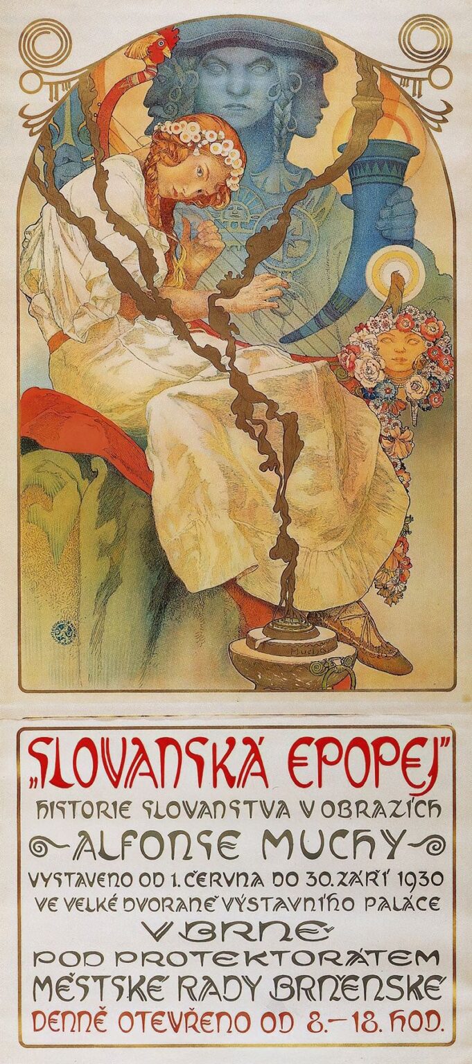
Alphonse Mucha’s The Slav Epic 1930 Exhibition Poster represents a unique convergence of monumental historical narrative and masterful graphic design. Created to herald the first public showing of Mucha’s monumental twenty-canvas cycle The Slav Epic in Brno, the poster distills the vast sweep of Slavic cultural memory into a single, compelling image. In this work, Mucha transcends the role of commercial illustrator to become a visual historian and cultural ambassador. The poster’s combination of allegorical imagery, decorative ornament, and nuanced typography exemplifies the highest aspirations of Art Nouveau while serving a deeply patriotic purpose. In what follows, we explore the origins of the poster, its compositional strategies, symbolic richness, technical execution, and enduring influence on both national identity and the evolution of graphic design.
Historical Context of The Slav Epic
The genesis of The Slav Epic stretches back to 1910, when Mucha received a commission from Czech nobleman Count Karel Chotek to depict the collective history and legends of the Slavic peoples. Over the next two decades, amid the upheavals of World War I, the collapse of the Austro-Hungarian Empire, and the birth of the independent Czechoslovak Republic, Mucha labored to complete twenty monumental canvases. Each painting immortalized a pivotal episode: from the founding of the Slavic tribes to medieval heroes, religious conversions, and modern struggles. By 1930, the cycle was finished, yet it had never been exhibited in its entirety. The decision by the Brno City Council to stage the first complete showing represented a powerful cultural moment for a young nation eager to assert its heritage. Mucha’s poster needed to encapsulate this epic scope, serving as both an invitation to viewers and a visual overture to the stories within the canvases.
Mucha’s Vision and National Identity
Central to Mucha’s ambition was the idea that art could shape and sustain national identity. Unlike the politically charged propaganda of the era, The Slav Epic and its accompanying poster articulated a more inclusive, historical consciousness. Mucha envisioned a Slavic community united not by contemporary borders but by shared language, folklore, and spiritual values. The 1930 poster distills this vision: the central figure—part allegory, part composite of faces drawn from the cycle—stands as an embodiment of Slavic unity. By presenting this figure in a timeless, mythic mode, Mucha invited viewers to see themselves as heirs to a grand tradition. The poster thus functioned less as a mere advertisement and more as a rallying point for cultural pride, reinforcing the nascent Czechoslovak Republic’s self-understanding within a broader Slavic context.
Conception of the Exhibition Poster
Mucha approached the poster with the same rigorous planning he applied to his painted epics. Initial preparatory sketches explored various framings for a composite Slavic figure: some with multiple profiles to suggest collective identity, others overlaying elements from different canvases. Ultimately, Mucha selected a design that prominently features a tri-faced bust—recalling ancient Janus iconography—to evoke past, present, and future. This figure appears in cool green-blue tones, contrasting with warmer gold backgrounds that reference medieval manuscript illumination. Beneath the image, two registers of text convey exhibition details in elaborately lettered Czech script. Decorative motifs at the arch’s apex and base not only echo Slavic folk ornament but also integrate seamlessly with Mucha’s signature sinuous line. The result is a poster that feels both monumental and intimately crafted, a fitting introduction to the epic cycle.
Composition and Visual Hierarchy
The poster’s vertical format measures approximately 95 by 38 centimeters, echoing the nearly equal dimensions of the epic canvases when viewed side by side. Mucha divides the composition into two primary zones: the pictorial arch above and the typographic block below. The pictorial section occupies roughly two-thirds of the height, its broad arch immediately drawing the eye. Within this arch, the tri-faced central figure commands attention, flanked by stylized foliage and decorative spirals. The eye then follows the gentle curvature downward, where secondary imagery—a young Slavic maiden clad in white folk dress—balances the composition at the lower left. The typographic section occupies the remaining third, its bold red title “SLOVANSKÁ EPOPEJ” signaling the subject, while smaller lines convey dates, venue, and sponsor information. Mucha carefully calibrated contrast, scale, and color to ensure that each element contributes to a clear visual hierarchy.
Imagery and Symbolic Content
Mucha embeds layers of symbolism throughout the poster’s imagery. The tri-faced bust at the center, its three profiles slightly offset, suggests past, present, and future Slavic unity. Its cool, statuesque quality evokes ancient stone reliefs, connecting to themes of endurance and permanence. In front, the young maiden—drawn from one of the cycle’s pastoral scenes—symbolizes innocence and renewal. Her white dress and floral wreath echo the lilies and other blooms that frequently appear in The Slav Epic, representing purity and the cyclical patterns of growth. The decorative spirals at the arch’s apex derive from traditional Slavic embroidery patterns, invoking folk craftsmanship. In combining high-level allegory with vernacular ornament, Mucha underscores the inseparability of grand history and everyday culture in the Slavic imagination.
Use of Color and Light
Mucha’s palette for the poster juxtaposes cool and warm tones to achieve both depth and clarity. The tri-faced figure appears in greenish-blue hues, lending it an otherworldly, sculptural quality. This figure floats against a golden field that transitions from pale cream at the top to richer ochre near the typographic block. The effect is akin to a halo or sacred aura emanating from the historic Slavic spirit. Secondary figures and motifs appear in softer warm tones—muted reds, gentle browns, and ivory whites—providing contrast without competing with the central image. Mucha used lithographic techniques to layer colors with subtle gradations, allowing light to illuminate the golden areas while preserving the graphic boldness of the outlines and text. The overall result is a poster that reads clearly at a distance yet reveals tonal nuance upon closer viewing.
Typography and Decorative Ornament
The poster’s lettering exemplifies Mucha’s belief that text could be as expressive as imagery. The title “SLOVANSKÁ EPOPEJ” appears in bold red, its angular letterforms infused with organic curves reminiscent of Slavic scripts and folk motifs. Beneath, the subtitle and exhibition details use a lighter, more linear script, ensuring readability and providing visual relief. Decorative flourishes—spiraling volutes, star-like loops, and foliate accents—frame the arch and punctuate the corners of the poster. These ornaments do more than fill negative space: they echo the letterforms themselves and create a rhythmic pattern that unites text and image. Mucha’s integrated approach to typography transforms the information into part of the overall composition, reinforcing the poster’s decorative cohesion.
Technical Execution and Lithographic Process
Much like his earlier poster work, the 1930 exhibition poster was executed as a color lithograph. Mucha prepared detailed full-scale cartoons that his team of lithographers transferred onto multiple limestone blocks—one for each color. Registration marks ensured precise alignment. The central green-blue tones required delicate shading to achieve a sculptural effect, while the golden background demanded solid application for maximum luminosity. The red title letterforms, too, required a separate block, with careful modulation to maintain uniformity of hue. The lithographic process allowed Mucha to reproduce painterly qualities—soft transitions, nuanced midtones—within the constraints of commercial printing. The printed editions circulated widely, appearing on walls, in newspapers, and in program leaflets, democratizing access to Mucha’s grand vision.
The Poster as Cultural Propaganda
While not overtly political, The Slav Epic 1930 Exhibition Poster functioned as cultural propaganda in service of a young nation. By publicizing an exhibition that celebrated Slavic unity and heroic history, the poster reinforced a sense of shared identity among diverse Slavic groups—Czechs, Slovaks, Poles, Serbs, and others—under the umbrella of Czechoslovakia. The Brno exhibition itself became a landmark event, attracting tens of thousands of visitors and solidifying Mucha’s cycle as a foundational work of national art. The poster’s widespread display in public spaces—city halls, train stations, cafés—helped transform The Slav Epic from an elite artistic project into a collective cultural experience. In this sense, Mucha’s design achieved its purpose: to mobilize art in the service of national cohesion and pride.
Reception at the Brno Exhibition
The inaugural showing of The Slav Epic in the Brno Exhibition Palace from June 1 to September 30, 1930, drew unprecedented crowds. Visitors often first encountered the exhibition poster pinned to walls or handed out as leaflets, setting the tone for their journey through the twenty canvases. Contemporary accounts describe how the poster’s imagery and lettering created a sense of anticipation and gravitas, preparing audiences for the immersive historical narrative. Critics lauded Mucha’s ability to craft a graphic identity for the epic that matched the paintings’ scale and ambition. The exhibition’s success led to subsequent showings in other Czechoslovak cities and in Prague in 1931. The poster remained in continuous use throughout these tours, cementing its role as the visual signature of The Slav Epic project.
Influence on Graphic Design and National Branding
The Slav Epic poster influenced generations of graphic designers in Central Europe and beyond. Its seamless integration of illustration, ornament, and typography anticipated later movements such as the Wiener Werkstätte and the Bauhaus, which also explored the unity of form and function. Designers of cultural campaigns—festivals, exhibitions, commemorations—drew upon Mucha’s model of combining allegorical imagery with clear textual information in a decorative frame. In the realm of national branding, the poster demonstrated how art could articulate and promote a collective identity without resorting to overt nationalism. Its nuanced approach—grounded in history, folklore, and spirituality—offered a template for cultural diplomacy that remains instructive today.
Preservation and Contemporary Legacy
Original lithographic prints of the 1930 poster are prized collector’s items, preserved in museum archives and private collections. Conservation efforts focus on preventing fading of the colored inks and stabilization of the paper support. Digital reproductions have expanded the poster’s reach, making it accessible to new audiences through online exhibitions and educational resources. In academic circles, the poster is studied both as an extension of The Slav Epic and as a landmark in the history of poster art. Contemporary designers continue to reference its compositional strategies and ornamental motifs, adapting them to modern contexts such as cultural festival posters and heritage tourism branding. Mucha’s achievement in 1930 thus endures as a masterclass in the power of graphic design to encapsulate a people’s epic story in a single image.
Conclusion
Alphonse Mucha’s The Slav Epic 1930 Exhibition Poster remains a towering example of how graphic art can embody historical narrative, decorative beauty, and national identity in one compelling composition. Through its careful balance of allegorical imagery, harmonious palette, integrative typography, and technical lithographic finesse, the poster fulfilled its mission of preparing audiences for the monumental cycle of The Slav Epic and fostering collective pride in Slavic heritage. Its influence on subsequent generations of designers and its ongoing legacy as a cultural artifact confirm Mucha’s belief in art’s capacity to elevate public consciousness. More than a mere advertisement, this poster stands as a visual manifesto—an invitation to partake in the epic journey of a people, rendered with the grace and dignity that only Alphonse Mucha could bestow.