Image source: artvee.com
Introduction
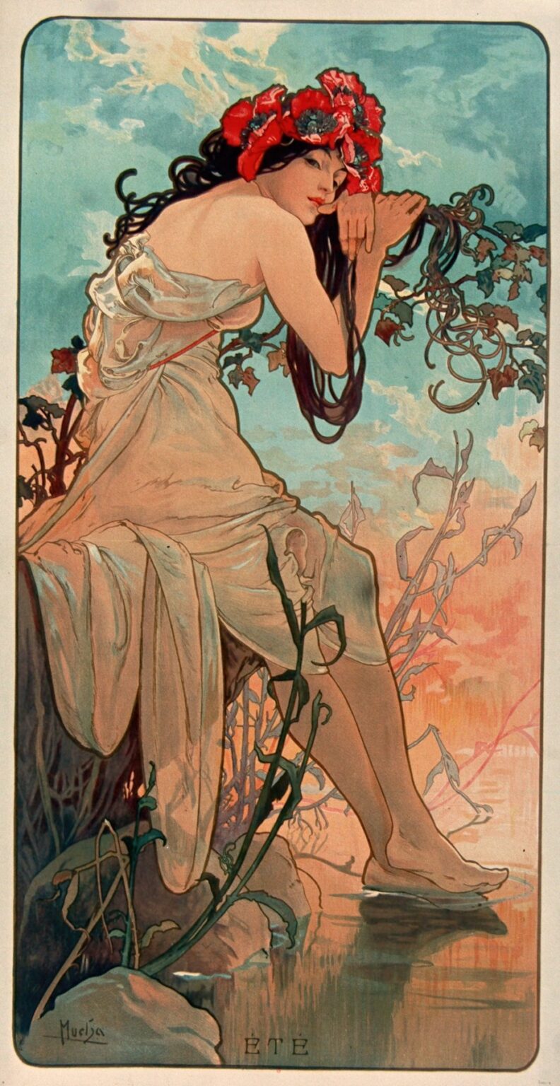
Alphonse Mucha’s 1896 panel “The Seasons – Summer” is one of the most widely loved images from the cycle that helped define Art Nouveau. It presents Summer as a dreaming woman seated on a stream’s edge, crowned with red poppies and wrapped in a veil of light fabric. The composition is a vertical rectangle with rounded corners, framed by a thin border and grounded by the word ÉTÉ. Everything in it—pose, line, color, ornament—works toward a specific mood: languor at the warmest hour of the year. Mucha fuses allegory and design so smoothly that the image reads at once as poetry and as flawless poster craft.
Historical Context
By 1896 Paris was in full fin-de-siècle bloom, and printed posters had become a craze. Mucha, a Czech artist working in Paris, had rocketed to fame the previous year with Gismonda for Sarah Bernhardt. Publishers and collectors wanted decorative panels for the home as much as the street, and portfolios like The Seasons answered that appetite. Each season was issued as a large chromolithograph intended both as art and as interior decoration. Summer, like its companion panels Spring, Autumn, and Winter, borrows from Symbolist allegory but is designed for daily viewing—clear, rhythmic, and endlessly pleasant to live with. The Art Nouveau ideal of unifying fine and applied arts is completely present here: an allegorical subject distilled into a poster’s clean language.
The Idea of the Seasons
Mucha’s four Seasons are not meteorology lessons; they’re personifications—portraits of the moods of the year. Spring flirts, Autumn feasts, Winter retreats, and Summer, in this panel, rests. The model is posed not as a goddess looking down from Olympus but as a woman at water level, in touch with vines and current. That closeness to nature is crucial. Instead of mythic thunder, we get heat haze and the hush of late afternoon. The series’ consistency—tall format, thin border, stylized background foliage—lets Summer be instantly readable as part of a set while retaining its own personality.
Composition and Pose
Summer’s body forms a relaxed spiral. Starting at the poppy crown, the line of her hair coils to her hand, drops along the elbow, rounds the knee and ankle, and ends where her toes skim the water. That long S-curve is textbook Art Nouveau: a single gesture binding the figure and setting together. The rock she perches on is more seat than cliff; the waterline is low, so her shin and foot can break the frame’s quiet with a ripple. Mucha plants vines beside her as counter-curves; their tendrils loop and echo her hair, literally weaving the human figure into the landscape. The figure is placed three-quarters to the left, with a generous sky to the right—a pocket of breathing space that keeps the panel from feeling crowded and suggests hot air shimmering over the stream.
Line and Ornament
Mucha’s controlling device is line—firm, elastic, and musical. Contours are crisp but never mechanical; they thicken at turns, thin in glides, and give the body a soft tensile energy. Inside those contours, short directional strokes hint at fabric roll or muscle without fussy shading. The botanical ornament is linear too: ivy leaves reduce to a few decisive curves and points, stems to calligraphic loops. Because everything is drawn with the same vocabulary, the panel reads as a single thought, not a figure pasted onto a background. Even the hair, drawn as flowing ribbons rather than strands, functions like another plant, another current.
Color and Light
The palette is exactly what the title promises: a warm sky melting from peach to apricot near the horizon, a breeze of turquoise above, and the cool greens and sea-glass blues of water and leaves. Poppies blaze in saturated crimson, the visual high note that anchors the top of the panel. Summer’s skin is sunlit honey; her drapery takes the faintest casts of the surroundings, tilting toward blush where it catches the sky and toward teal where it flickers near water. Chromolithography’s flat inks become an advantage here: color is laid in supple, even fields, so the eye reads true summer heat without the interruption of oil-paint texture. Mucha uses value sparingly—just enough modeling to turn a calf or shoulder—so light seems to bloom from the page rather than strike it.
Materiality of the Drapery
The garment is essentially a veil. Tied once, it slips and pools in diaphanous folds that map the body without clinging. Mucha draws cloth with a few broad, looping strokes and then clarifies edges with thinner lines. You can trace how the fabric’s weight pulls across the thigh or bunches behind the knee, small observations that make the scene convincing without sacrificing stylization. The sheer wrap also plays a thematic role: Summer is generous and unveiled, but relaxed, not theatrical. The casual knot at the hip reads like the season’s loosened belt.
Iconography and Symbolism
The poppy crown matters. Poppies signal heat and drowsiness, the dreamy edge of afternoon. They also hint at harvest and at wine—summer’s promise of autumn’s vintage—linking this panel to Autumn in the cycle. Ivy’s evergreen tenacity threads through the image, a reminder of continuity beneath seasonal change. Water is the cooling element and a symbol of life’s flow; Summer barely disturbs it, grazing rather than splashing, as if the season itself is too languid to break the quiet. The absent attributes are telling too. There’s no sickle or sheaf, no blazing sun-disc. Summer is defined not by tools or cosmic emblems but by sensation—shade, warmth, fragrance—and by a body at ease.
Setting and Atmosphere
Mucha never specifies a place. He hints—low bank, tall stalks, a mirror of water—but the environment is a stage set for mood. Background stems are simplified to cut-outs, trees dissolve into pink silhouettes, and clouds become aquarelle washes. That selective realism is why the poster feels timeless. It isn’t a slice of a particular field in a particular country; it’s a distilled memory of every warm bank. The sky’s gradient helps this immensely: it does what skies actually do at day’s end but reads as abstract color harmony.
Typography, Border, and Format
The thin framing border with rounded corners stops the image from spilling outward and keeps the panel’s architecture tidy. The small inscription ÉTÉ is centered and quiet; it doesn’t compete with the picture. Mucha’s borders always matter. They signal that the work is a designed object, a print intended to live on a wall, and they tune the composition like a mount around a jewel. The long vertical format invites the viewer to “read” the figure from crown to toes—first the flash of poppy red, then the slow descent to the reflex of sunlight in the water.
Technique: Chromolithography at Its Best
Technically, Summer shows Mucha and his printers at peak coordination. Each hue required its own stone; delicate gradients meant overprinting translucent inks so the color could drift from cool to warm without banding. Registration is razor-clean—the black key line sits perfectly on its fills—so the hair’s finest whips and the ivy’s smallest hooks stay sharp. Mucha designs for this medium: large flat areas for stable printing, limited but rich palette for economy, and an outline that can carry the drawing even if a tint prints lighter or darker than intended. The result is a sheet that can be mass-produced yet feels crafted.
The Figure as Allegory, Not Pin-Up
Mucha’s women are often called decorative, but they’re not anonymous ornaments. Summer meets the viewer’s gaze sidelong, almost private, with a sleepy confidence. The body is idealized but not exaggerated; weight is distributed naturally, toes spread against the water’s chill. She isn’t performing; she is inhabiting a temperature, a time of day. That difference matters. Allegory here is empathy with a season, not an excuse for display. Mucha’s respect for his models and his subject is a big reason the image still feels fresh.
Relationship to the Other Seasons
Placed beside Spring, Autumn, and Winter, Summer forms the warmest quarter of the cycle. Spring leans forward, all motion and bud; Autumn reclines amidst grapes, ripe and heavy; Winter curls inward, cloaked and crystalline. Summer sits between outward burst and inward hush, which Mucha expresses through a poised stillness and the slightest touch of water’s movement. The poppies rhyme with Autumn’s harvest reds; the pale drapery foreshadows Winter’s whites. Across the set, the same visual grammar—central figure, botanical frame, border—allows color and gesture to do the storytelling.
Sources and Influences
The poster reflects multiple currents. Japonisme contributes the flat color fields and the cropping that treats the rock and vines as decorative panels. The Pre-Raphaelites contribute the contemplative female figure in nature. Renaissance reliefs inform the clarity of contour. But the piece is fully Mucha: whiplash lines, botanical arabesque, the union of ornament and figure. He turns these influences into a signature language that could sell theater seats, perfume, or—here—pure seasonal feeling.
Why the Image Endures
“Summer” has survived changing tastes because it’s built on fundamentals that don’t date: a readable pose, a limited palette keyed to feeling, and line that is both descriptive and musical. It’s also generous. The poster welcomes multiple readings—sensual, symbolic, design-centric—without insisting on one. You can appreciate it as an allegory, as a masterclass in lithographic color, or simply as a beautiful thing to live with. Many printed images lose power when removed from their original context; this one gains it.
Practical Lessons for Designers and Painters
Contemporary creators still study Summer for its economy. Every element works twice: the poppy crown is both icon and color anchor; the ivy is both frame and narrative; the water is both reflective surface and cooling hue. The image shows how to handle anatomy with restraint and how to stage a figure so ornament supports rather than distracts. It also demonstrates the value of negative space: that clear wedge of sky to the right gives the warm colors room to breathe and makes the panel feel as airy as an August evening.
Reading Summer Today
Viewed now, the panel feels oddly modern in its calm environmentalism. Human and nature are not at odds; they’re entwined. The woman’s body becomes part of the riverside’s rhythm, and the plants curve with the same logic as hair and cloth. In a century anxious about climate, the picture’s quiet trust in seasonal cycles can read as wishful—but also as a gentle corrective. It reminds us that abundance and rest are not enemies but partners.
Conclusion
“The Seasons – Summer” distills a season to its essential sensations—heat, shade, quiet water—and binds them with the most elegant means at a graphic artist’s disposal. Mucha’s lines glide, his colors glow, his symbolism whispers rather than shouts. The result is a sheet that helped make Art Nouveau a household language and still feels immediate more than a century later. Summer sits there with her poppies and her dangling foot, and the room gets warmer.