Image source: wikiart.org
Introduction
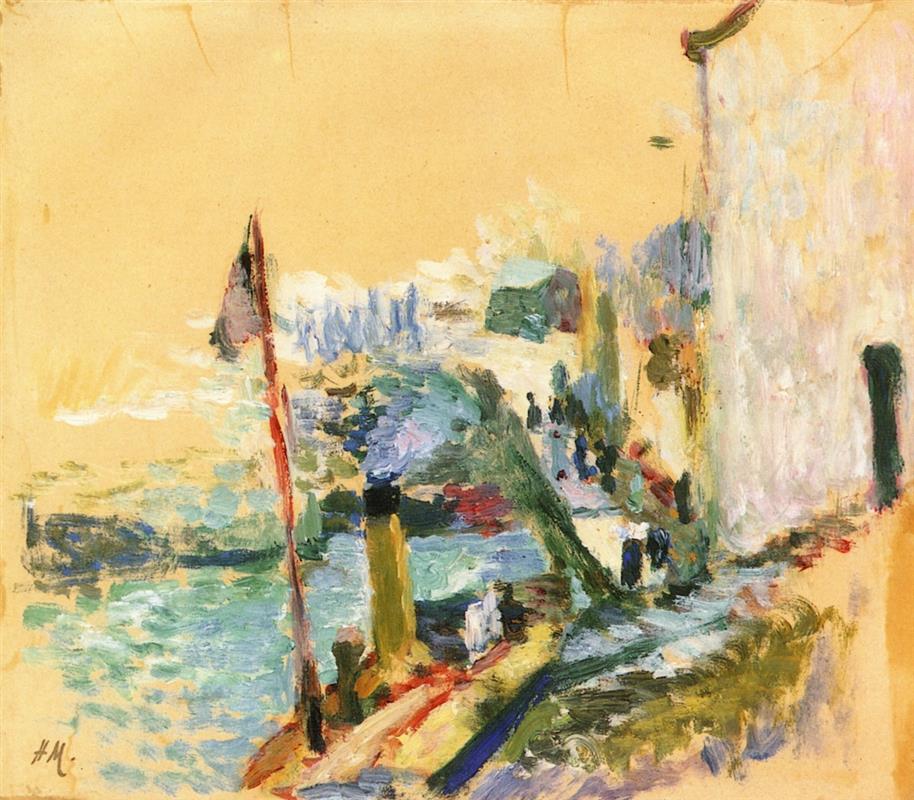
“The Port of Belle Isle Sur Mer” presents Henri Matisse at a threshold moment in 1897, turning a working harbor into an experiment in structure, color, and speed. The scene is spare yet electric: a warm, buff ground fills the sky and streets; a vertical wall of a sun-struck building presses down the right edge; a red mast slices the left side; water flickers in broken strokes of turquoise, teal, and milky white; and a procession of tiny, dark notations suggests townspeople moving along the quay. Rather than rendering every boat, rope, and shutter, Matisse builds the harbor from a handful of commanding relations—warm earth against cool sea, vertical accents against diagonal flow, thick impasto against scumbled veils. The painting reads as both a place and a proposition: what if color and touch, more than description, could carry the life of a port?
Historical Context: Belle-Île as a Workshop for Reinvention
The late 1890s were Matisse’s crucible. After rigorous academic training, he sought a language that would honor observation while escaping polished finish. Brittany—and especially Belle-Île-en-Mer—offered hard geology, quick weather, and vernacular architecture that forced him to simplify. In 1896 he had already wrestled with the island’s cliffs and interiors; by 1897 he turned to the harbor, where human traffic and reflections demanded different solutions. This picture belongs to that second wave. It is at once indebted to Impressionist practice—painting out of doors, allowing broken strokes to register flicker—and already leaning toward the structural color that would support his Fauvist leap. The use of a warm toned support, the paring down of forms, and the reliance on a few decisive chromatic contrasts mark the year’s progress.
Motif and Point of View
The motif is a small port stitched to the sea by a sloping road. We stand on the quay looking diagonally inland. At left, water fills a triangular basin; a slender mast rises, held by quick red and green notes; low buildings and a scatter of figures climb the street; and at right the façade of a whitewashed house, cropped brutally by the frame, becomes a flat, luminous plane that organizes the whole view. The world has been edited to essentials: shove of wall, slice of mast, flow of path, flutter of water. This close vantage and radical cropping convert a town view into an arrangement of forces. The harbor is not a panorama; it is a set of pressures in a particular corner on a particular day.
Composition: Vertical Anchors and Diagonal Drift
The composition turns on two vertical anchors and an oblique drift. The mast near the left edge and the house wall at the right are the painting’s pillars. Between them, the road and shoreline sweep diagonally from lower right to mid-left, carrying the eye toward the water and back into town. The figures—summarized as small, dark, upright dabs—beat time along that path like notes in a bar. Negative space does a surprising amount of work. The buff field of unpainted or thinly painted ground above the town is not empty; it is warm air and bright day, a vast pause that makes the small, saturated accents below ring more clearly. This orchestration of filled and unfilled zones keeps the view buoyant and modern.
Color Architecture: Warm Ground, Cool Water, and a Red Pulse
Color is the painting’s engine. The ground’s warm ochre becomes sky, wall, and sun-struck street; it is allowed to remain visible as the dominant field, so that every cool note registers sharply against it. The sea is written in layered greens—emerald, viridian, and mint—mixed with chalky whites that imply foam and glare. Along the quay, citron, violet, and bruised blues interleave to suggest shadows, doorways, and the churn of bodies passing. The red mast is a structural pulse. Its narrow ribbon of saturated color both describes a maritime fact and locks the cool water to the hot shore, preventing the composition from splitting into halves. Because the palette is concise and relational, the scene feels sunlit without the need for high value extremes.
Light and Weather: Bright Air Without Theatrics
This is not a sunset canvas or a study in cast shadows. The light is the steady, high brightness of a maritime morning. Matisse renders it by letting the buff ground carry the illumination and by using thin, breathable scumbles rather than heavy whites. Air is everywhere: in the unfilled patches around figures, in the pale edges around the building’s contour, and in the translucent passages where water meets quay. The result is credible heat without glare and a sense of the day’s breadth without clouds or dramatic sky effects.
Brushwork and Handling: A Harbor Made of Strokes
The harbor is constructed from gestures. Water is flicked in quick, horizontal dabs that travel with the slight chop; reflections are short verticals dragged into the wet. The road is swept with longer, oblique strokes that echo footsteps and wheel ruts. The house wall is rubbed and feathered, allowing the ground to glow through and preventing the large plane from turning dead. Throughout, you can feel the painter’s hand change gears: a loaded bristle for the red mast, a broad, scumbled brush for the façade, smaller dabs for the crowd. This variety is not decoration. It is how materials become legible—water as broken light, plaster as matte skin, bodies as compact accents that hold their place in a bright field.
Drawing with Color: Edges as Agreements, Not Outlines
There is almost no contour drawing. Edges arise where colors meet at the right value and temperature. The house’s right edge is simply a cool, vertical seam tucked against warm ground; the mast is a red stroke laid over paler air and biting into the green water below; figures appear where dark, upright dabs collide with the warm street. By refusing black outline, Matisse keeps the image breathing. Forms press and yield, as they do in sun and air, and the viewer senses a living harbor rather than a colored drawing.
Space and Depth Without a Diagram
Depth is constructed with stacked color zones and changes in brush size rather than with vanishing-point geometry. The foreground curb is a string of thicker, darker strokes; path and people shrink and cool as they recede; the water broadens into lighter, more horizontal notes; and the far buildings are only hinted with small, cool blocks. The big white wall is close because it is large, warm, and softly modeled; the sky is far because it is a flat, uninterrupted field. The space holds together because every step is calibrated chromatically, not because linear perspective is meticulously plotted.
Human Presence as Rhythm, Not Portrait
No single figure is individualized, yet the port feels full. People are treated as a pattern: dark verticals that punctuate the diagonal road and collect near doorways and steps. This rhythmic handling conveys traffic, conversation, and the stop-and-start of harbor life more effectively than tiny portraits would. The figures’ anonymity keeps attention on the relations that sustain the whole—how bodies mediate between architecture and water, how their dark notes give scale to planes of light.
Cropping and the Modern Edge
The decision to cut the building at the right and the mast at the left is audacious. It denies the completeness of a postcard view and asserts the painter’s position on a specific piece of ground. The crop also creates two powerful verticals that stabilize a composition otherwise made of small, quick fragments. This modern edge implicates the viewer’s body: you feel yourself pressed against a wall, glancing past a mast, turning down a sun-soaked lane toward the water.
Materiality and the Role of the Ground
The warm support is not merely background; it is an active color. Matisse allows it to function as sky, glare, and mortar, saving labor while also unifying the palette. Thin paint and scumbles reveal the tooth of the support, especially in the upper half, where the ground’s grain reads as heat vibrating in air. Where he wants solidity—the curb, the mast, the clustered figures—he lays thicker, more opaque notes that catch actual light and insist on presence. This orchestration of thin and thick passages gives the surface its breathing rhythm.
Influences and Dialogues: From Brittany’s Synthetism to Divisionist Flicker
The painting converses with several currents. From the Brittany circle associated with Gauguin and the Nabis, it inherits the courage to let a flat, warm field stand for sunlight and to simplify buildings into large, graphic planes. From Divisionist practice, it borrows the idea that small, separated strokes can make water and air flicker. Yet the picture remains Matisse’s: construction prevails over system. Color is chosen to hold the composition rather than to obey a rule, and the reduced drawing is tethered to real spatial pressure—the push of a wall, the pull of a road, the spread of a quay.
Foreshadowing Fauvism: Color as Structure, White as a Living Hue
Several habits that would fuel Matisse’s 1905 breakthrough are already clear. Color is structural rather than ornamental; the red mast, green water, and white wall are beams, not decorations. “White” is never neutral but tinted by neighboring hues, making light feel present rather than painted on. Edges are seams between colors. A few large shapes govern the behavior of many small incidents. Once he amplifies saturation in later years, this grammar will keep the pictures coherent. The path to audacity runs through order, and this port scene provides the order.
The Psychology of the Scene: Brightness, Brevity, and the Busy Pause
Beyond description, the picture sets a mood of quick brightness. The actors are on their way somewhere; the heat is dry; the water looks usable, not picturesque. The large field of ochre behaves like stored sunlight; the small cool notes read as relief—shade under doorways, breezes off the basin. The painting feels like a pause between tasks: a glance to the left at the glitter, a step toward the right-hand doorway, a brief conversation in the road. That psychological effect arises from tempo and temperature, not from faces or anecdotes.
How to Look at the Painting Today
Begin with the white wall at the right and notice how many colors inhabit its “whiteness”—pearl, rose, mint, chalk. Slide down to the road where a braid of citron, violet, and blue tracks the diagonal. Let your eye meet the red mast and feel its discipline; everything around it can be loose because it is firm. Drift into the water and read the short strokes as both reflection and depth. Step back and allow the warm, unpainted field to reassert itself as sky and air. Move close again and watch figures form from three or four dabs. The painting rewards this oscillation between structure and detail because it was built from it.
Technique and Decision: A Visible Sequence of Moves
The order of operations remains legible. A toned ground sets the key. Large planes are placed early: the white façade, the seawedge, the sweeping road. Over these, Matisse lays directional strokes that describe use—footsteps, current, traffic. Accents come last: the red mast, the deep door, the knot of figures. Nothing feels overworked. The canvas remembers each decision, and those decisions add up to a harbor that convinces without illustration.
Place in Matisse’s Oeuvre
Among Matisse’s Belle-Île harbor pictures, this panel is one of the leanest and most experimental. It strips the port to its load-bearing elements and tests how far a warm ground and a few cool strokes can go. Seen from the future, it looks like a rehearsal for the Fauve interiors and townscapes where sunlit walls and windows glow as sheer planes of color. Seen from the past, it shows how decisively he had moved away from academic finish in just a year, trusting relations over details and speed over polish.
Conclusion
“The Port of Belle Isle Sur Mer” is a compact manifesto for a new way of painting a city corner. It replaces inventory with structure, swaps outline for color seams, and lets a toned ground perform the work of light. The harbor’s reality—its movement, heat, and human traffic—arises from how a red line anchors a cool wedge, how a white wall breathes against warm air, how broken strokes play across water. The picture proves that the ordinary bustle of a small port can be held by a few clear relations and that such clarity, once learned, can support far bolder palettes. In 1897 Matisse is still testing, but the grammar that will carry his art forward is already beautifully in place.