Image source: wikiart.org
The 1905 Threshold: Between Divisionism and Fauvism
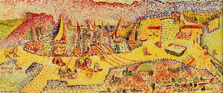
Painted in 1905, “The Port of Abail” sits precisely on the hinge where Henri Matisse traded the measured optics of Neo-Impressionism for the bold liberties of Fauvism. It is a laboratory piece in the best sense—an outdoor subject tested against a new grammar of color. The surface is built from small, discrete touches laid shoulder to shoulder, a memory of Seurat and Signac, yet the palette is hotter, the spacing looser, and the aim less scientific than experiential. Matisse’s question is not “How do colors blend in the eye?” but “How can strokes of pure hue re-create the breath and bustle of a harbor in noon light?” The result is a port scene that glows from within, its energy generated by the mutual friction of yellows, reds, violets, and greens.
Subject and Vantage: An Elevated Panorama of Work and Water
The motif is a small Mediterranean harbor seen from above, as if the painter had climbed a rampart or balcony. The elevated vantage compresses distance and converts the docks, lanes, and buildings into a shallow, stage-like field where human activity is legible all at once. Fishing boats crowd the quays; masts and lateen spars prick the air; people move in bands and eddies; animals and carts cluster near the loading areas. A ring of low hills and walls encloses the scene so that the port reads like a basin of light. Because the horizon is pushed high or omitted entirely, the eye concentrates on the choreography below—the sweep of ramps, the rectangles of buildings, and the triangular sails at rest.
Composition as a Theater of Lines and Planes
Across the canvas Matisse arranges a network of diagonals that funnel attention toward the harbor’s core. On the left, ramps and stair-like bands descend in parallel, functioning as visual runways for the figures and animals that traverse them. Near the center, a cleared oval space acts like a stage, ringed by boats and walls; it is here that the densest clusters of marks occur, implying the site of greatest labor. To the right, bright terraces and blocks of architecture step upward, each band of dots changing temperature as it climbs. The composition thus oscillates between enclosure and passage, between the centripetal pull of the basin and the centrifugal energy of ramps leading out of it.
Color as Infrastructure: Warm–Cool Grids
Matisse builds the port from temperature contrasts that do the work of drawing. Warm yellows, oranges, and pinks form the sunlit ground planes where labor happens; cool greens and violets articulate shaded walls and passages; reds and crimsons punctuate as flags, sails, or awnings. Instead of outlining a building, he throws a belt of cool violet against a field of yellow and lets the seam declare the edge. Boats read as triangles of hot red and salmon edged with cooler strokes that suggest shadowed hulls. The entire harbor becomes a chessboard of warm and cool squares whose interlock generates both clarity and heat.
Brushwork: From Dots to Tiles
The handling is deliberately modular. Marks are short and rectangular rather than pin-pointed; they sit like tesserae in a mosaic. In open areas, the dots are spaced so that the primed ground flashes through, giving the impression of glare skating across the surface. Where Matisse needs density—a cluster of figures, a stack of hulls—he tightens the spacing until the dots merge into bands. This shift from dot to tile, from air to mass, lets him move from atmosphere to object without changing tools. The sea is implied with cooler, heavier touches; the sunlit squares of the dock are breathed into existence with yellows and creams laid lightly so that the canvas can shine between them.
Light, Time of Day, and Atmospheric Logic
Everything about the color scheme implies a steep, dry light—midday or early afternoon under a clean sky. Shadows are not gray; they are tempered violets and greens. The brightest zones read not as white paint but as fields where the ground shows through, which is how actual glare behaves: it strips detail and makes color vibrate. Because the light is vertical rather than raking, forms flatten into decorative planes, exactly the conditions under which Matisse’s new language thrives. He does not paint meteorology—no clouds, no haze—only the fact of heat, and that fact is translated into a high-key lattice of hue.
The Role of the White Ground and Reserve
The painting’s luminosity depends on Matisse’s disciplined use of reserve. Instead of burying the canvas beneath blended tones, he spaces his strokes to let the primed fabric serve as active light. The effect is at once optical and structural. Optically, it brightens color without whitening it; structurally, it binds disparate areas into a single atmosphere. The empty flecks are not indecision; they are the painter’s equivalent of air in music, breaths between phrases that keep the rhythm lively.
Movement and Micro-Narratives
Because the marks are small, the viewer can read micro-narratives without the scene becoming illustrative. In one area a group of figures curves around a boat’s prow; in another a beast of burden lowers its head near a cart; elsewhere a woman or child stands apart in a pocket of cool color. These incidents are sketched as rhythms rather than anecdotes—little crescendos of dots that thicken, turn, and dissolve back into the field. The harbor seems to pulse in waves: loading, bargaining, mending, resting. Matisse turns civic activity into a pattern of visual energy.
Architecture of the Port: Walls, Slopes, and Boats
Built mass is stated as large planes of yellow jolted by bricks of red and violet. The right-hand buildings read as stepped terraces whose tops catch stronger sun; their sides are cooled by green-violet notes so that the volumes remain legible without recourse to contour. Ramps and stairs are written as diagonal bands of alternating hues, a device that makes them feel both walkable and luminous. Boats, scattered along the central basin, are triangles of concentrated color with uprights that break the horizontal weave of the docks. These uprights—masts, spars, poles—act like a forest of exclamation marks punctuating the dock’s steady chatter.
Space Without Linear Perspective
Although the view plainly has depth, Matisse refuses the traditional grid of converging lines. Space is created by overlap, scale, and temperature. Warm fields advance, cool fields recede; denser dotting builds nearer planes while open dotting releases distance. The harbor’s bowl is convincing because warm yellows flare in front of cooler purples and because object clusters progressively shrink toward the top edge. This construction keeps the painting firmly on its surface; the viewer moves through the scene as if sliding hands across a relief map of color.
Human Figures as Motifs of Rhythm
Figures are reduced to a few strokes—two or three notes for a dress, a darker chord for a head and shoulders—yet they anchor the whole. Because they are scattered, they act like rhythmic accents, marking beats along ramps and quays. Their reduction is not dehumanizing; it is the necessary simplification that allows the crowd to register as life rather than as a census. The harbor’s social fabric becomes visible precisely because no single person steals attention from the whole.
Materiality: Pigment Choices and Impasto
The paint sits proudly on the surface. In the hottest zones, yellows and oranges are laid thin so that the ground lends them light; in the shaded areas, violets and greens carry more body, creating micro-reliefs that catch raking light in the gallery. This alternation of thin and thick participates in the meaning of the picture: bright day burns things down to glare; shade preserves texture. Even where Matisse paints a single object—a cart, a wall, a sail—the pigment is allowed to behave as matter, reminding the viewer that the port’s material world and the painting’s material world share a kind of solidity.
Comparisons Within Matisse’s Collioure Cycle
Seen alongside the grove and seascape pictures from 1905, “The Port of Abail” clarifies Matisse’s range. In the olive-grove canvases, he throws open a canopy of broken greens and hot violets; in the seascapes, he opposes orange cliffs to deep blue bands of water. Here the subject is neither nature’s expanse nor secluded shade but civic space. The color is no less audacious, yet the design is more gridded, befitting a place cut by ramps and walls. The pointillist memory is strongest in this harbor scene, and the spacing of strokes is more regular than in the groves—a sign that Matisse was still testing how much divisionist scaffolding he wished to retain as he stepped into Fauvism.
Dialogues with Seurat, Signac, Gauguin, and Derain
The painting conducts a lively conversation with predecessors and peers. Seurat’s example lingers in the modular touch and the patient build-up of surface, but Matisse rejects Seurat’s cloistered calm for a sun-struck hum. Signac’s Mediterranean ports provide a precedent for bright harbors rendered in prismatic dots, yet Matisse’s palette pushes hotter and his spacing is more syncopated. From Gauguin and the Nabis he borrows the decorative authority of large color planes; indeed, several of the bright terraces read almost like cloisonné panels broken into dots. Working in parallel with André Derain in Collioure, Matisse here leans slightly more toward divisionist order, while Derain often favored heavier outlines and poster-like blocks. Each of these dialogues helps explain how “The Port of Abail” can feel both controlled and exuberant.
The Psychology of Color and Urban Energy
Because the palette is weighted toward warm yellows and reds, the harbor feels not merely busy but sun-charged. Cool greens and violets serve as rest notes, pockets where the eye can recover. In psychological terms, the painting proposes that a city’s vitality can be conveyed by temperature rather than by facial expression or narrative event. Heat becomes mood; pattern becomes pulse. The viewer does not need to know the names of streets or trades to feel the day.
Why the Painting Still Feels Fresh
More than a century later, the canvas retains its immediacy because it replaces description with effect without sacrificing legibility. It is easy to map the scene—quays here, boats there—yet nothing is fussy. The dots keep their identity, and the blank intervals keep the air bright. The painting is transparent about its means, which paradoxically makes its illusion more persuasive. You believe the harbor because you can see how it was built.
Practical Looking Guide: How to Read the Canvas
Begin at the central basin where the warmest yellows gather. Let your eye trace the diagonal ramps that pour into it from left and right, noting how the strokes tighten as they approach the crowd. Ride the line of masts upward and feel how they puncture the horizontal weave. Drift across to the bright terraces on the right and watch how a change from yellow to violet creates an instant wall. Then step back and notice how the entire port is held together by a soft perimeter of cooler hues—greens at the far left, violets and umbers along the top—like a bowl rim keeping the light inside. This is Matisse’s harbor not as a map but as a choreography of glances.
Conclusion: A Working Harbor Turned into a Grammar of Light
“The Port of Abail” translates a civic scene into a lucid experiment in color relations. Warm ground planes, cool retaining walls, triangular boats, and a river of human traffic are all constructed from small, decisive touches that let light breathe between them. The painting marks a pivotal step in 1905: Matisse keeps divisionism’s clarity while discarding its doctrine, discovering that a harbor’s life can be written in temperature and rhythm. The port bustles without a single fully drawn face; the sun blazes without a painted sun. What you carry away is not a topographical report but the sensation of standing above a Mediterranean town at midday, watching work, water, and heat resolve into color.