Image source: wikiart.org
Historical Moment And Why This View Matters
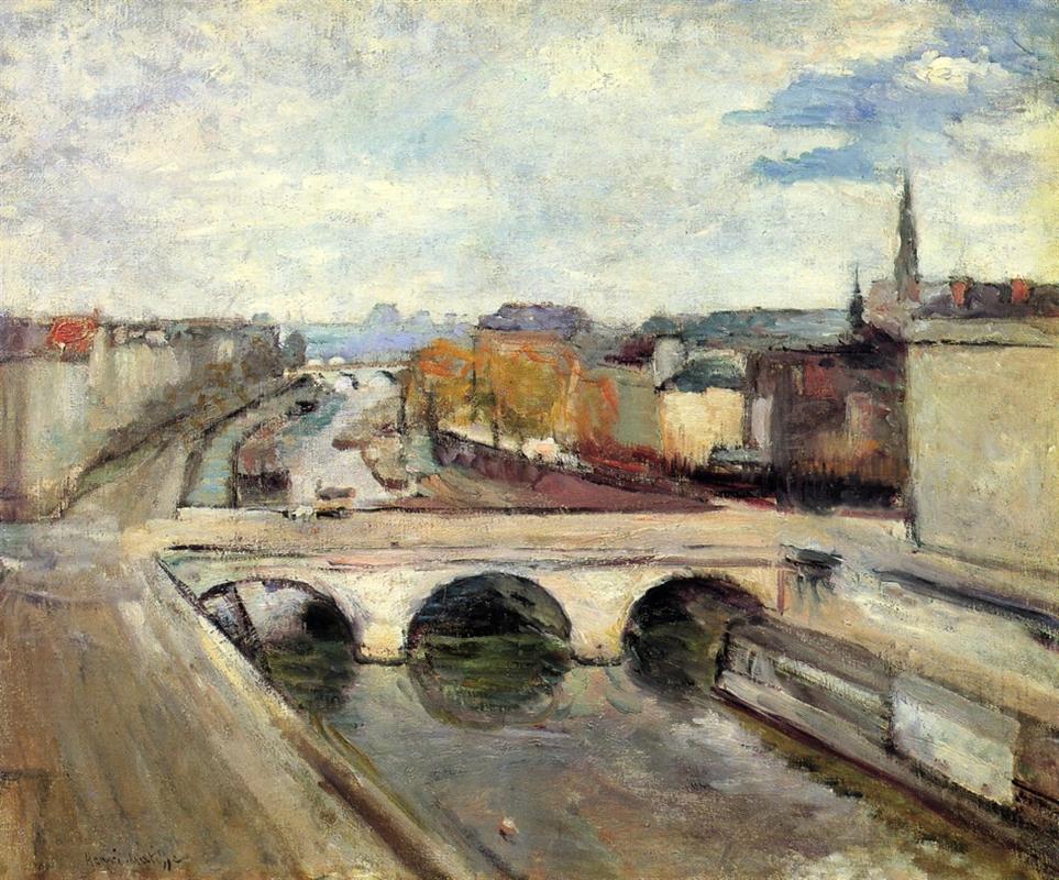
Painted in 1900, “The Pont Saint Michel in Paris” belongs to the moment when Henri Matisse was turning away from academic finish and testing a clearer, more structural use of color and plane. Paris itself—its bridges, quays, and layered traffic—offered him a ready-made laboratory. This canvas retains enough topographical clarity to identify the place, yet it compresses the city into a pattern of luminous bands and arches, anticipating the compositional economy that would guide his breakthrough a few years later.
A Window Vantage Over The Seine
The picture is conceived from a height, almost certainly from a window or balcony above the river. The viewer looks down on the Pont Saint-Michel as it spans the middle ground and divides the composition into stacked zones of city, water, and sky. That elevated vantage reduces people and carriages to notations and turns the river into a shallow, gleaming ribbon. The sense is not of standing in a square but of leaning out over a living diagram of Parisian movement.
The Architecture Of The Composition
Matisse builds the image like a precise interlock. The bridge itself forms a pale plank across the center, its three arches punctuating the span with dark ellipses. Below, the water gathers into deeper tone as it slips under the vaults and then lightens toward the foreground, where reflections break into streaks. Above the bridge a diagonal quay carries us toward a bend of the Seine and a cluster of autumn trees that read as a single amber mass. On either side, the façades of the city simplify into vertical slabs, stabilizing the view like bookends. Nothing is fussy; every shape is engineered to guide the eye.
Color As Structure Rather Than Ornament
The palette is a high, clean chord of cool grays, creamy stones, olive greens, and soft russets, capped by a sky of milk-blue and pearl. Local color gives way to relational color. The deck of the bridge is almost bleached, reading as light more than stone. The arches warm to a subdued brown that anchors the middle. The quays shift between violet-gray and warm earth, setting up temperature contrasts that model space without theatrical shadow. The trees compress into honeyed oranges and muted greens, a single weighted note between city and river. Black is reserved for the deepest pockets: the underside of the arches, the cutwater shadows, and a few emphatic seams that hold the geometry together.
Light, Weather, And The Breath Of The Sky
Illumination is a soft, even wash—an autumn midday when sun filters through a scrim of cloud. The sky is not a backdrop but an active field, brushed in long, airy strokes that float across the upper half and spill their light onto the city below. The refusal of hard-edged shadows keeps the painting poised in a perpetual present; details melt as if in bright humidity, and the bridge glows as though chalked with daylight. Atmosphere is not an effect added at the end—it is a constant condition into which the city is fused.
Brushwork And The Register Of Time
Look closely and the surface reveals a range of tempos. The sky is swept with horizontal and diagonal strokes that let the ground breathe through. The façades are scrubbed in broader planes that read as plaster and stone. On the water the brush drags and lifts, leaving broken streaks that imitate the river’s sluggish sheen. Tiny, compact touches suggest the tree foliage and the busy parapet. The handling never settles into polish; it remains a ledger of decisions, each stroke a small admission of the painter’s pace and attention.
Space Compressed Into Readable Bands
There is depth—the quays recede, the river narrows, the far bank steps upward—but recession is measured. The bridge sits high on the picture plane, and the far city is simplified into horizontal tiers against the sky. Perspective lines exist only as much as the harmony allows; where they would distract, they dissolve into color fields. The result is a city both entered and contemplated at the surface, a place and a pattern at once.
Rhythm, Movement, And The City’s Pulse
Although individual figures are not articulated, the painting hums with the rhythm of daily transit. The three arches beat a slow time through the center. The long diagonal of the quay leads our glance like a procession. Boats and barges condense into dark lozenges that punctuate the river’s glide. The trees along the bank form a sustained chord in the upper middle distance. The viewer’s gaze loops along these cues, returning to the bridge in a steady cycle that mirrors the city’s own circulation.
The Bridge As Modern Motif
Pont Saint-Michel is more than architecture; it is a symbol of Parisian continuity amid change. By choosing a working bridge—and depicting it not as a solitary monument but as a platform for traffic—Matisse aligns himself with artists who sought the poetry of the everyday. The bridge unites banks, spans water, and organizes flows. In the painting it also unites zones of color and binds the composition’s forces. The motif thus operates simultaneously in urban, symbolic, and pictorial registers.
Abbreviation And The Courage To Omit
The power of the canvas owes much to what Matisse leaves out. Windows, individual rooflines, balustrade details, and human features are reduced to necessary signs. This abbreviation resists anecdote and gives structural notes room to ring. The brain fills in what the eye only begins. The city emerges not from accumulated small facts but from the orchestration of a few convincing planes.
Relationship To Impressionism And Post-Impressionism
The painting converses with Impressionist city views in its commitment to present-tense light and urban subject matter, yet it declines the broken, scintillating touch that seeks to reproduce retinal flicker. Instead, Matisse borrows Cézanne’s constructive principle: volumes built by color planes and edges tuned by temperature. The background’s simplification into bands of tone nods to the Nabis’ decorative flattening. But the temperament is Matisse’s own—measured, harmonizing, more concerned with equilibrium than with agitation.
The Role Of Black And Near-Black
Darkness in this painting is never a hole; it is a color among colors. The deep pockets under the arches, the narrow slits of quay shadows, and the darker seams along the water’s edges do not extinguish light; they concentrate it. These notes give grip to the pale deck and the airy sky, preventing the composition from dissolving into whiteness. Matisse’s later practice—opposing saturated color with deliberate black—already has its quiet precedent here.
Materiality And The Skin Of The Surface
The paint sits lean and breathable, with scumbled layers in the sky and distance and slightly denser passages along the bridge where edges must assert. The thinness suits the motif: a city under ample light, seen through a veil of atmosphere. The surface retains the weave of the canvas in places, allowing light to ricochet off minute ridges and enlivening pale fields that might otherwise go dead. That physical liveliness keeps the painting from becoming diagrammatic despite its simplicity.
Human Presence Without Portraiture
People appear as strokes, yet their presence is everywhere—in the slight thickening of pigment along the parapet where walkers gather, in the tiny blurs that suggest carts or cabs, in the scaled boats that slide beneath the bridge. By refusing to individualize, Matisse preserves the decorative coherence of the surface and evokes the social fabric of the city rather than isolated anecdotes. The result feels truer to the experience of looking from a window: you register patterns, not biographies.
Autumn Notes And The Season Inside The Palette
The honeyed trees along the right bank and the milkier light imply late autumn. Those colors temper the grayness that urban scenes can invite and give the canvas a gentle warmth without tipping it into spectacle. The season is felt through palette, not props; it is present in the air and the leaves rather than in coats or fallen foliage. The restraint suits a painter searching for lasting harmonies rather than momentary effects.
Comparison With Matisse’s Other Views Of The Bridge
Matisse painted Pont Saint-Michel more than once around 1900. Compared with versions that use wine-dark arches, deeper river tones, and a mauve sky, this painting is more opalescent and breathable. The deck reads almost chalk white, and the atmosphere lifts architectural edges into haze. The differences reveal a method: hold a stable motif and test how color chords, not meticulous drawing, can recalibrate its mood. The bridge becomes an instrument on which Matisse tunes harmony.
How The Painting Teaches You To Look
The canvas rewards a two-step approach. Stand back and let the large divisions register: sky, city band, bridge plank, river. Then move in and attend to how edges are made—by abutting tones rather than hard lines—and how each zone carries a distinct tempo of brush. Return to the whole and feel how your eye loops along the quay into the distance and back under the arches. In that oscillation between near and far, between brush and band, the painting demonstrates its dual nature as view and design.
The Decorative Ideal Emerging From Observation
Even at this early date Matisse is working toward an art where every area of the surface has a role in a balanced chord. The sky is a quiet lid; the tree mass is a soft counterweight; the bridge is a bright hinge; the river is a dark, slow belt; the side façades are curtains that hold the field. The city is not merely depicted; it is composed. That commitment to decorative unity—achieved without betrayal of observed truth—will drive his interiors and landscapes for decades.
Why This Canvas Endures
“The Pont Saint Michel in Paris” endures because it proves that a modern cityscape can be both faithful and free. It respects the known features of a place and the measured light of a day, yet it replaces descriptive excess with a lucid pattern of planes and temperatures. It shows how bridges and rivers—the very machinery of urban life—can be translated into a calm, legible harmony. And it captures the moment when Matisse recognized that color relationships could carry structure, atmosphere, and mood all at once.