Image source: wikiart.org
Introduction
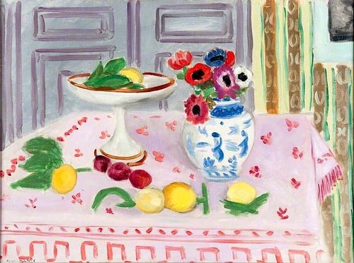
Henri Matisse’s “The Pink Tablecloth” (1925) distills the Nice period’s luminous calm into a tabletop world where color, pattern, and poise carry the full weight of meaning. A white compotier lifts a small harvest of fruit, a blue-and-white ceramic vase blooms with anemones, and a pale rose cloth sprinkled with tiny motifs spreads across the foreground like a soft stage. Beyond the table, cool gray doors with beveled panels establish a measured architecture, while at the far right a vertical strip of patterned drapery reintroduces the Mediterranean warmth that saturates so many of Matisse’s interiors. The subject is modest, but the orchestration is exacting. The painting proposes that a few well-chosen elements, tuned to one another through hue and interval, can produce a complete and lasting harmony.
The Nice Period And The Promise Of Calm
By the mid-1920s, Matisse had settled into a disciplined Riviera routine that replaced the ferocious contrasts of early Fauvism with a calmer, decorative classicism. The Nice interiors—women at pianos, odalisques on striped couches, still lifes poised on patterned cloths—share a conviction that modern sensation can be expressed through balance rather than rupture. “The Pink Tablecloth” belongs to this ethos. It is not a display of abundance; it is a controlled chord. The room’s quiet, the light’s evenness, and the restraint of the palette show an artist who has learned to transform ordinary domestic things into a stable world of feeling.
Composition As A Tabletop Stage
Matisse builds the scene as a shallow stage. The tablecloth occupies most of the canvas, tilting slightly toward the viewer so that objects sit with theatrical clarity. The compotier stands left-center on its slim stem, a white disk that both gathers and reflects light. The blue-and-white vase rises to the right, its swelling volume counterbalancing the dish while introducing a second, more complex surface. Between them and across the cloth, lemons, plums, a green pepper, and leaves distribute small pauses that slow the eye. The background is organized by the double doors, their verticals and panels articulating the flat plane into a quiet architecture. Matisse’s staging is exact but never fussy; every placement is motivated by rhythm rather than by literal description.
Color As The Architecture Of Feeling
Color in “The Pink Tablecloth” is both gentle and decisive. The dominant note is the pale rose of the cloth, cool enough to carry blues and greens yet warm enough to receive yellow fruit without paling. Against this field the compotier reads as white, but its whiteness is inflected by cool grays and warm creams that give it breath. The vase is a concentrated duet of cobalt and white, its floral blue motifs sounding a deep note that anchors the composition. The fruit provide succinct sparks: lemon yellows with a hint of green, plum reds edging toward violet, a pale apple that tempers the spectrum. The background doors are a quiet, lilac-gray that preserves the table’s radiance while preventing sweetness from turning cloying. The overall chord is high-keyed yet stable, a color fugue written for pastel voices with a few saturated tones for ballast.
Pattern As Structure, Not Ornament
The pink cloth is sprinkled with tiny floral marks, and near the front edge a stripe of denser pattern repeats like a border. These marks are not decorative afterthoughts; they distribute small units across a large plane so that the cloth remains active without becoming restless. The vase’s painted blue motifs echo the cloth’s flowers at a larger scale, connecting table and vessel through shared language. At the far right, a vertical band of patterned drapery introduces darker greens and ochres. This stripe behaves like a counter-melody, keeping the background from dissolving into homogeneity while guiding the eye back toward the central duet of vase and compotier. Pattern here is a structural principle that calibrates pace, not an indulgent embellishment.
Drawing, Contour, And The Soft Authority Of Line
Matisse’s drawing is clear and economical. The compotier’s ellipse is firm yet breathing, hand-drawn rather than mechanically perfect. The vase swells in soft arcs whose contours tighten and release in sympathy with the painted figures on its surface. Fruit are described with a few rounded lines that give just enough information for the form to feel graspable. Even the paneling on the doors is drawn with a relaxed exactness; the edges are straight but not rigid, like phrasing in music that never forgets the human breath. This kind of drawing grants objects dignity without over-defining them, letting color carry much of the modeling while line establishes the boundaries that make relations intelligible.
Light, Atmosphere, And The Refined Shadow
The light in this interior is diffuse, as if passing through a high window before settling across the table. There are no theatrical highlights, only a consistent glow that makes whites pearly and colors tender. Shadows are softened into temperature shifts: a cool note under the compotier’s rim, a pale bluish crescent along the vase, small grayer haloes beneath the fruits. This approach dissolves drama and replaces it with clarity. Objects feel embedded in a shared atmosphere rather than spot-lit as isolated specimens. The viewer is invited to linger, not to gasp.
The Compotier As Luminous Pedestal
The raised dish is one of Matisse’s favored devices. Its stem offers a vertical accent on a largely horizontal plane; its wide, shallow bowl creates an elegant stage for a few carefully chosen fruits and leaves. Because it is white, the compotier becomes a reflector that gathers the room’s colors and returns them subdued—a whisper of pink at the underside from the cloth, a gray cooled by the doors, a thin line of warm light along the rim. The dish’s understated grandeur lends the still life a classical note. It is at once ordinary tableware and a small architectural form capable of stabilizing the picture.
The Vase Of Anemones And The Intelligence Of Touch
The anemones in the ceramic vase supply the painting’s liveliest shapes. Matisse paints each blossom with a few loaded strokes that clarify species without botanical pedantry: dark eyes in the petals, ruffled fringes, cups that turn slightly toward or away from us. The bouquet’s colors—pinks, reds, a single violet, touches of black—repeat and vary the palette already established on the table. The vase itself is a second world of painting within the painting: blue arabesques dance across the rounded porcelain, echoing the cloth’s tiny flowers at a different scale and in a different register. Touch is key; every mark is purposeful but light, so that the bouquet feels fresh, not fussed.
Scattered Fruits And The Tempo Of Looking
The lemons and plums arranged along the cloth are tempo markers for the eye. Their placements create a gentle zigzag that carries vision from the compotier to the vase and back, preventing the composition from dividing into two silent halves. Each fruit is a compact lesson in color relations. The lemons are not uniform; one leans warm, another cool, a third catches a gray reflection from the doors. The plums concentrate reds and violets that resonate with the pink ground while holding their own chromatic depth. Leaves, quickly notated, introduce crisp greens that freshen the palette and keep the cloth’s warmth lively.
Background Doors And The Discipline Of Order
The double doors provide an architectural discipline that keeps the foreground’s softness in check. Their panels are mapped with pale blue-violet shadows, and their verticals stage a slow, repeating beat behind the lively bouquet. The doors’ restraint is crucial. They prevent the painting from floating away into pastel haze by anchoring it with cool order, yet they are drawn broadly enough to remain pictorial rather than literal. In many Nice interiors, Matisse deploys shutters, windows, and doors as calm grids against which flowers, textiles, and figures can sing. Here that strategy is condensed and refined.
Space, Depth, And Productive Flatness
Space in the painting is shallow by design. The table tilts, the back wall presses forward, and the objects sit in a close, legible relation. This compression keeps attention on surface relationships where Matisse’s principal drama takes place. At the same time, small cues maintain a believable sense of depth: the compotier’s stem casts a soft oval, the vase occludes a section of the door panel, and the border stripe along the front edge of the cloth reads as a turned hem. The result is a satisfying ambiguity between object and ornament. We recognize a room, yet we savor the painting as a flat arrangement of colored shapes.
Comparisons Within The Still Life Series
“The Pink Tablecloth” converses with several still lifes Matisse painted in the same years. In canvases where a mauve wall and black leafy silhouettes surround a white bowl and a bouquet, pattern comes forward with tempestuous energy. Here the mood is lighter, more aerial. The cloth’s pink replaces the earlier earthier grounds; the doors’ cool geometry substitutes for tapestry-like foliage. The white compotier remains a constant, as does the ceramic vase, but the tonal weighting shifts. The 1925 table is a chamber piece performed in high register, closer to a flute and harp duet than to a full orchestra.
The Musical Analogy And The Discipline Of Pleasure
Matisse often likened painting to music, and this canvas makes the analogy palpable. The cloth’s tiny motifs keep time like a soft tambour; the compotier’s rim supplies a clear sustained note; the bouquet offers melodic turns; the doors lay down a slow bass line in gray. Pleasure arises not from spectacle but from disciplined intervals. The painting’s gentleness is not a retreat; it is a chosen tempo, akin to the adagio in a suite where the listener discovers nuance within restraint. The more one looks, the more relations emerge—pink from the cloth cooling into the doors, a blue from the vase echoing in the shadows, lemon yellow repeated in small glints at the compotier’s edge.
Modern Classicism And The Ethics Of Calm
Although the painting is domestic and contemporary, it aspires to a modern classicism. Its structure is clear, its values stable, and its edges firm. Yet it avoids academic stiffness by keeping touch visible and color alive. In uncertain years between wars, such clarity offered more than decoration. It modeled an ethics of calm: a demonstration that attention and measured relation can transform ordinary life into a sustaining order. “The Pink Tablecloth” does not preach; it shows. Its very ease is an achievement, the outcome of hundreds of calibrated decisions about hue, contour, spacing, and scale.
Material Presence And Evidence Of Process
Surface close-ups reveal the speed and certainty of Matisse’s hand. The door panels are laid in with broad, semi-opaque strokes whose edges feather into neighboring passages. The cloth’s small flowers are single, confident touches that sit on top of thinner paint. The compotier’s stem receives slightly fattier paint, giving it porcelain weight. The vase’s blue motifs vary in saturation, some passages brushed quickly, others corrected and softened. These traces of decision grant the painting time, reminding the viewer that serenity is built from revisions. The final harmony includes the memory of its making.
Why The Painting Endures
“The Pink Tablecloth” endures because it scales the promises of Matisse’s art to a human tabletop and fulfills them without strain. It shows how whites can glow without chalk, how pink can be gentle without sentimentality, how blue can deepen space without chilling it, and how a few fruits and flowers can carry a room’s emotional temperature. It rewards slow viewing, revealing on each return a new hinge—an echo of cobalt in the plums, a reflection of pink under the compotier’s rim, a green leaf aligning with a door panel. The picture’s beauty is not a veneer but a structure. It remains persuasive because it is built, relation by relation, to hold.
Conclusion
In “The Pink Tablecloth,” Matisse brings the Nice period’s decorative intelligence to its most crystalline expression. The composition is lucid, the palette tuned, the touch alive, and the atmosphere serene. A compotier, a vase, a handful of fruit, and a patterned cloth—these are ordinary studio companions. Through attention and discipline he turns them into a visual chord that rings long after the eye leaves the canvas. The painting suggests that harmony is not a luxury but a practice, available wherever color, line, and light are allowed to speak with clarity.