Image source: wikiart.org
Introduction
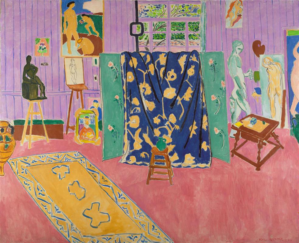
Henri Matisse’s “The Pink Studio” (1911) is a grand tour of the artist’s working world staged as a color-drenched interior. A warm pink floor spreads like a carpet of light, violet wallboards form a gentle envelope, and in the middle of the room a deep ultramarine drapery patterned with buttery flowers billows between two pale-green screens. Scattered around are easels, small tables, a low stool topped with a green jug, a yellow-rimmed carpet, and an assortment of paintings and sculptures—works by Matisse within a work by Matisse. The painting is a cousin to the more famous “Red Studio” from the same year, yet it speaks in a different key. Where the red room is an abstract sea that absorbs objects into line, the pink room is hospitable and polychrome, a theater in which color families converse and the artist’s tools and creations take the stage as characters.
A Studio That Doubles As A Self-Portrait
No figure appears in “The Pink Studio,” but the artist’s presence saturates the space. The furnishings describe habits: a working table pushed to the side so the center remains clear; a stool placed before the hanging drapery as if someone had just stood to step back and look; an easel bearing a study of a nude; a small bronze poised on a trestle stool; canvases with images of dancers, bathers, and portraits that repeat themes coursing through Matisse’s career. The room functions as a portrait by inference. It tells us how the painter thinks—through arrangements, rhythms, and color chords—rather than showing us his face.
Color As Architecture: The Pink Climate
Matisse constructs the studio with color before anything else. Pink is the architectural climate of the floor: a warm, expansive ground that keeps the large interior luminous without glare. Against it, the lilac-lavender wallboards cool and steady the upper register, softening the transition to the small window at center, where mint greens and sap greens suggest leaves and air beyond. Between these climatic hues he sets several color “kingdoms”: the ultramarine floral drapery that cascades near center stage, two sea-green screens painted with pale blossoms, and the saffron-yellow carpet that stretches diagonally across the left foreground. Because each kingdom is flat and saturated, a conventional shadow would be unnecessary and distracting. Light is implied by adjacency, not by theatrical modeling.
Composition As A Stage Of Planes
The composition is organized like a stage set built from planes that touch, overlap, and hinge. The pink floor tilts upward, inviting the eye into the shallow space. A long yellow carpet, edged with a blue arabesque border and dotted with cloudlike motifs, creates a runway that leads from the lower left toward the central drapery. The dark blue cloth, heavily patterned, is the primary vertical curtain; it swells and folds, but it also reads as a large flat panel that divides the room. To either side, the green screens act like wings, turning slightly to create the suggestion of depth without surrendering to strict perspective. At right, a small table on turned legs and an upright classical statuette create a counterweight to the drapery’s mass; at left, the black bronze on a stool and a cluster of frames and vessels balance the field. The center holds, but no point monopolizes attention.
Pattern As Structure Rather Than Ornament
What could easily become decorative clutter is instead structural logic. Patterns operate at several scales. The carpet’s border and scattered forms establish a measured rhythm on the floor; their repetition helps the eye understand the plane and its tilt. The green screens carry a medium-scale floral that organizes the picture’s middle zone. The ultramarine drapery’s oversized cream blossoms are the largest pattern, an emphatic sign that connects the painted textiles on the table and screens to the patterning found inside the framed canvases on the wall. By staggering these scales, Matisse makes pattern do architectural work. It clarifies space, regulates pace, and binds disparate objects into a single visual climate.
Nested Pictures And The Studio As Museum
Along the lavender walls hang or lean several paintings and drawings. This is not mere inventory; it is a declaration of the studio as a museum of the artist’s own themes. A canvas with standing nudes nods to the great subject of the human figure; a small, brightly framed portrait echoes the warm palette of the room; another painting suggests bathers or dancers in a landscape. These nested images create a hall-of-mirrors effect without confusion because Matisse compresses their color ranges and outlines them simply. They serve as windows into the artist’s production and as rhythmic breaks in the long wall plane.
The Central Curtain And The Drama Of Making
The broad blue curtain is a hinge between working and showing. Hung across a makeshift line and pinned with a few light-catching clasps, it might conceal a storage alcove or screen a corner where models changed and props were stacked. It emphatically declares the studio as a place of ongoing decisions rather than a tidied showroom. The cloth’s folds, painted with economical sweeps of shadowed ultramarine and cream highlights, suggest touch and gravity, but the overall effect remains flat. Matisse keeps the duality alive: the cloth is both a real object and a large plane of color that stabilizes the entire picture.
Furniture And Tools As Characters
Every piece of furniture behaves like a person with a role. The low stool near center, topped with a small green jug, is the agile assistant that can be pulled close or pushed away. The table at right, angled so that its top reads as a sturdy trapezoid, implies a surface where brushes, cups, and small blocks of color are tested. The trestle stool holding the black bronze is a proud pedestal for the sculptural counterpart to Matisse’s painting practice. The easel, planted near left center, is the pragmatic stage for works in progress; it carries both the vertical thrust of a figure and the rectangular calm of a panel. These tools are not props; they are actors whose functions define the scene.
Depth Without Anxiety
Traditional perspective is almost entirely absent. Instead of vanishing points and receding lines, Matisse uses overlap, scale, and judicious turns to suggest depth. The green screens hinge ever so slightly to declare their planes. The yellow carpet narrows as it approaches the drapery, enough to suggest distance without building a tunnel. The window grid shifts temperature—from lavender mullions to cool green foliage—signaling spatial difference through color rather than measurement. This calm approach to space keeps the viewer’s attention on relationships, not mechanics.
Drawing With The Brush And The Pleasure Of Edges
Contour in “The Pink Studio” is laid in paint. A slim violet line quietly frames the wallboards; the blue border of the carpet oscillates with the pressure of the wrist; the drapery’s creases are stated with quick, calligraphic strokes that dignify the fold without pedantry. Where forms meet, Matisse often leaves a sliver of undercolor so edges glow—a halo not of light but of decision. The studio’s objects are simplified to clear silhouettes: the jug’s neck flares in a single gesture; the bronze figure reads as a compact dark against the lilac wall; the small yellow picture frame at left is a rectangle animated by a few interior marks. The result is drawing that is both candid and musical.
The Window: A Breath Of Outside
Centered high on the back wall is a small window whose grid punctures the lavender with squares of green foliage. It is not a deep view; rather, it behaves like a cool tile insert, a breath of air set inside the warm interior. The greens echo the jug on the stool and the floral stems on the screens, linking outside and inside in a single chromatic family. Matisse’s windows are rarely conventional vistas; they are compositional lungs, measured intakes that keep the interior from becoming stifling.
The Dialogue With “Red Studio”
The sibling painting “Red Studio” presents the studio as a red ocean where objects survive as outlines and islands of color. “The Pink Studio,” by contrast, uses a gentler floor color and a cooler wall to create a more domestic, walkable room. Objects are not dissolved into the field; they retain their bodies, their patterns, and their small shadows. The pink climate encourages conversation among many hues: yellows, blues, greens, creams, and browns maintain their identities without dissonance. If “Red Studio” is a declaration that color can annihilate hierarchy, “The Pink Studio” is a demonstration that color can host it—objects, artworks, tools, and textiles coexist without being absorbed.
Rhythm, Repetition, and the Viewer’s Path
The eye’s journey through the canvas is choreographed with care. It begins on the yellow carpet’s near edge, follows the blue border up the diagonal, leaps to the ultramarine drapery, and then moves laterally across the screens to the statues and table at right. From there it bounces up to the window’s green and back across the wall to the easel and bronze at left, finally dipping to the cluster of frames near the baseboard. Repeating motifs—pale blossoms on the screens, cream flowers on the drapery, cloud shapes on the carpet—create a rhythm that carries the gaze without fatigue. Matisse has built an armchair for the eye; it can sit anywhere and still feel included.
Light Built By Adjacency
The sense of illumination in “The Pink Studio” arises from neighbors rather than simulated light sources. The bronze reads as glossy because a thin rim of violet separates it from the wall; the green jug appears to gleam because it sits atop a warm, neutral stool that enhances its coolness; the ultramarine drapery feels rich because cream motifs and pink floor abut it. Even the classical statuette at right achieves presence not through modeled shadow but through being pitched in a minty register that distinguishes it from the warmer pink behind. This economy of means allows the painting to read with clarity from across the room and to reward intimate looking with subtle temperature shifts.
Evidence Of Process And The Honest Surface
Matisse leaves the making of the painting legible. Pink floor passages reveal faster and slower brushwork; lavender wallboards bear the rhythm of a loaded brush drawn straight down; the drapery shows where paint was added to plump a fold or where cream motifs were trimmed back by blue to sharpen an edge. Occasional pentimenti—soft ghosts of earlier placements—are subsumed into the final harmony. The studio is both depicted and performed; we see not only where the artist works, but how he works.
The Studio As A Place Of Hospitality
Despite the inventory of objects, the center of the room remains open. That unoccupied space is significant. It is where a viewer’s body would stand, where a chair might be pulled in, where the next painting might be propped. Matisse famously wished for an art that offered “a soothing, calming influence.” The open floor is the offer: a place to rest one’s gaze, to inhabit the room imaginatively, to feel welcome inside the painter’s world without being crowded by it.
Cultural Echoes Without Exoticism
Textiles in the painting bring echoes of varied decorative traditions—floral screens recalling East–West exchanges in fabric design, a patterned carpet that hints at North African or Mediterranean motifs, and the bold ultramarine cloth whose oversized blossoms feel both Asian and modern. Yet the painting avoids turning these into souvenirs. They are structural members in the architecture of color. Matisse’s modernism absorbs cultural materials and reassigns them to a new purpose: building a room that is both specific and universal.
Lessons For Seeing And Making
“The Pink Studio” offers clear counsel to painters and designers. Choose a climate color to unify the space, then stage complementary families as distinct zones. Use pattern at multiple scales to articulate planes instead of relying on cast shadows. Draw with the brush so edges pulse with life. Treat windows as cool breaths rather than narrative views. Keep the center open so the eye can sit down. Above all, remember that coherence does not require sameness; a room can be calm and richly varied when its colors are tuned like instruments in a chamber ensemble.
Enduring Freshness
More than a century after it was painted, “The Pink Studio” still feels startlingly contemporary. Its limited but saturated palette anticipates modern interior design; its frank flatness and large decorative shapes foreshadow the cut-outs of Matisse’s late career; its nested images echo today’s fascination with meta-pictures and studio reveals. The painting’s generosity—its open floor, readable edges, and friendly climate—keeps it approachable even as it performs a sophisticated argument about how color can build a world.
Conclusion
“The Pink Studio” is a manifesto of welcome. Pink builds the floor we stand on, lavender gathers the walls around us, ultramarine and green mark the center with a dramatic curtain and screens, and the artist’s own works populate the room like guests at a conversation. Depth is calm, achieved by overlaps and turns rather than anxious perspective; light is neighborly, born of adjacency; pattern is structural, not frill. The painting reveals a studio that is at once practical and poetic, a place where looking is organized into pleasure. It stands beside “Red Studio” as proof that Matisse could reinvent the interior multiple times in a single year, finding in color an inexhaustible engine for space, mood, and meaning.