Image source: wikiart.org
First Impressions
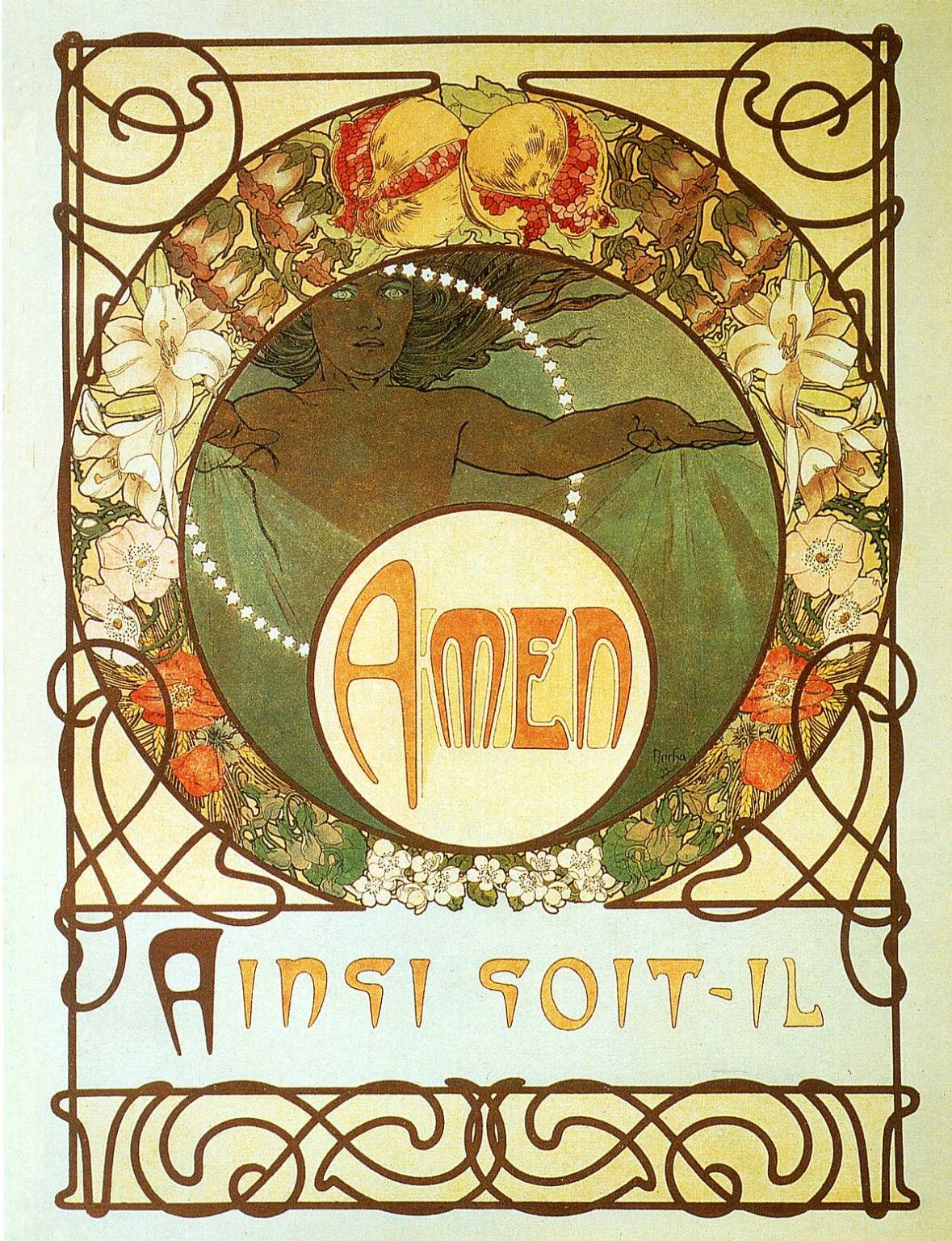
“The Pater” (1899) presents a ceremonial calm that feels at once devotional and unmistakably Art Nouveau. At the center of the composition a young, allegorical figure emerges within a circular window, draped in translucent green, one arm extended as if finishing a benediction. Encircling her is a crown of small white stars that reads like a rosary orbiting a planet. The word “AMEN” fills a second circle below, and at the base a line of stylized lettering spells “AINSI SOIT-IL,” the French translation of “Amen.” Sinuous brown lines frame the whole with interlacing knots, while lilies, pomegranates, and other blooms weave a floral wreath around the figure. It is a serene image of assent, where prayer becomes design and language becomes ornament.
Historical Moment And Artistic Intention
In 1899 Mucha was already famous for his theater posters and commercial designs, yet he longed to express ideas of a more spiritual and philosophical nature. “The Pater,” created as part of his personal meditation on the Lord’s Prayer, reveals that shift in emphasis. Rather than advertising a performer or product, the image turns inward toward contemplation. The work fuses the designer’s precision with the symbolist quest for meaning, replacing celebrity with universality and spectacle with quiet assent. It announces an artist who believes that decoration can hold doctrine, and that graphic art can bear the weight of vision.
The Architecture Of Circles
Concentric circles govern the layout. The outer wreath of blossoms acts as a garlanded cornice; the inner disk stages the figure; the lowest disk houses the word “AMEN.” Circles traditionally signal eternity and perfection, and here they function as both symbolism and scaffold. The eye moves from the wreath to the figure’s serene face, then drops to the circular cartouche of the word that seals the prayer. Mucha’s circles also recall liturgical objects—the sun-like host, the halo, the monstrance—that gather worshipers’ attention around a radiant center. The result is a composition that feels inevitable, as if designed by prayer itself.
Allegory And Gesture
The central figure does not represent a particular saint or person; she embodies assent, the soul’s quiet “so be it.” Her extended arm, neither dramatic nor limp, completes a gentle arc that echoes the curvature surrounding her. Drapery clings and then loosens, suggesting movement restrained by reverence. Hair streams outward in fine dark strands that rhyme with the curving frame, fusing body and border. The face is calm and frontal, lit from within rather than by a directional source, the eyes set to contemplate rather than to address. In this repertoire of restrained gestures, Mucha transforms human anatomy into a script of acceptance.
Flora, Fruit, And The Garden Motif
The border teems with lilies, pomegranates, and white blossoms that form a circular bower. Lilies have long connoted purity and annunciation; placing them along the sides underscores the prayer’s tone of humility and surrender. Pomegranates—split open to reveal a profusion of seeds—suggest abundance, renewal, and life beyond death. Their warm coral halves at the upper arc balance the cool greens of the central disk. Smaller blossoms gather at the base like a carpet of offerings. The garden, in this context, is not literal botany but a symbolic Eden in which affirmation flowers. The botanical diversity becomes a visual “Amen” that the natural world speaks alongside the human voice.
Color Harmony And Emotional Temperature
Mucha chooses a tempered palette of sage green, ivory, honey, russet, and soft coral. These hues avoid theatrical contrast in favor of concord. Greens dominate the interior circle, merging with the figure’s veil to create a devotional coolness, while the surrounding wreath warms to oranges and ochres. The large “AMEN” medallion uses warm parchment tones edged by a darker ring that steadies the composition. Nothing is aggressively saturated. Instead, the colors produce a balanced quietude, the visual equivalent of a sustained chord that supports contemplation without calling attention to itself.
Typography As Theology
The lettering is integral to the imagery. “AMEN” sits inside its own circular seal, the letters stretched vertically with graceful swelling stems and rounded terminals that echo the surrounding curves. The phrase “AINSI SOIT-IL” below repeats the same organic logic, with letters that rise and taper like young shoots. In much late nineteenth-century design, type was appended to pictures; Mucha, by contrast, designs letters as living forms that share the picture’s grammar. Even without reading French, a viewer can sense that these words belong to the image’s breath and rhythm. The typography becomes theology: the final word of the prayer is not tacked on but born from the same creative order.
Line, Frame, And The Whiplash Motif
Dark brown contour lines articulate all the principal shapes: the wreath, the figure’s silhouette, the medallions, and the long interlaced borders. Those borders—ribbon-like lines that loop, cross, and curl—are archetypal Art Nouveau “whiplash” forms, but here they are domesticated to a sacred purpose. They frame rather than dominate, and their interlacing suggests both unity and infinity. The border’s linear play also recalls wrought iron and Celtic knots, mediums associated with craft and continuity. Within this play of line, the composition reads like a visual litany where each turn and loop is another repeated phrase.
Space, Flatness, And The Influence Of Print
Mucha composes for the lithographic press, which favors areas of flat, even color. Depth exists, but it is subtler than in oil painting; the figure lies in a shallow chamber, the wreath floats in front like a decorative arch, and the text medallion projects slightly as a seal. This controlled flatness gives the picture its poster-like clarity and legibility, a directness necessary for a printed work intended to communicate at a glance. The flat color also clarifies symbols, keeping them legible as signs rather than dissolving them into atmospheric illusion.
Lithography And The Craft Of Color
Color lithography operates by printing one hue at a time from separate stones or plates, each carefully registered so that edges meet cleanly. Mucha was a master of this craft, planning his works so that the overlay of tones produced both crisp contour and delicate modulation. In “The Pater,” fine gradations in the central disk, the translucent drapery, and the pale blossoms result from layered inks rather than from brush modeling. The method leaves a characteristic velvety surface, a tactile quietness appropriate to the theme of prayer. Technique and content harmonize: a patient, layered process yields an image about assent and completion.
The Circle Of Stars And The Rosary Analogy
The ring of small white stars around the figure reads immediately as a rosary in motion. Each dot could be a bead marking one recited prayer, and together they orbit the figure like a constellation of devotions. The circle touches the figure’s hand and shoulder, as if prayer were not merely external count but a halo forming from within. The effect is dynamic without being agitated, suggesting the regular cadence of repeated words and the cosmic scope of what those words address. In this way, Mucha binds personal piety to universal order.
The Feminine As Vessel Of Meaning
Mucha’s feminine allegories were never simply decorative; they served as vessels for abstract ideas. Here the woman is not eroticized or surrounded by worldly attributes. She is an emblem of acceptance and serenity. The softness of her features, the translucent veil, and the absence of specific identity keep the figure archetypal. In a culture where religious imagery often carried heavy narrative baggage, Mucha chooses a distilled feminine presence that can accommodate multiple readings—Wisdom, the Soul, Grace, the Church—without becoming didactic. The feminine becomes the visual grammar through which consent to the divine will is spoken.
Balance Between Ornament And Clarity
A hallmark of Mucha’s maturity is his ability to pour ornament into strict structure. “The Pater” is a demonstration of that balance. The border is lavishly knotted, yet the interior remains clear; the flowers are abundant, yet they never obscure the figure; the letterforms are expressive, yet they remain perfectly readable. This balance prevents the religious theme from tipping into sentimentality or the decorative scheme from devolving into pattern for its own sake. The picture is generous but disciplined, a union of beauty and sobriety that honors the finality of the word “Amen.”
Symbolic Readings Of Botanical Motifs
Each botanical element intensifies the meaning of assent. Lilies, often linked to annunciation and purity, flank the figure like lit candles, their petals acting as white flames. Pomegranates, cracked open at the top of the wreath, suggest the mystery of life multiplied through sacrifice; their many seeds evoke the many voices that say “Amen” together. The smaller white blossoms at the base, gathered near the worded seal, resemble offerings placed before an altar. The wreath as a whole suggests a paradise regained, the garden of harmony that results when the prayer’s concluding word is whispered.
Relationship To Mucha’s Poster Work
Comparing this image to Mucha’s celebrated theatrical posters clarifies what is new and what persists. The ornamental border, flowing hair, and graceful drapery belong to the same visual language that enthralled Paris. But the narrative has shifted from drama to devotion. In a theater poster, the central figure advertises a performance; in “The Pater,” she officiates a rite. The integration of type and image, already a Mucha trademark, attains a quieter authority here, as if the artist had turned his virtuosity inward. The result demonstrates that the poster artist could also be a metaphysician of print.
Visual Music And The Cadence Of Prayer
The image operates like a musical composition. Repeated curves generate a steady tempo, from the looping border to the circular medallions to the rounded letterforms. Smaller motifs—star-beads, leaflets, petals—function as grace notes. The measured alternation of cool and warm tones is akin to harmonic modulation. Even the final word “AMEN” lands like a cadence that resolves the preceding measures. Mucha, attuned to the rhythm of patterned line and color, writes prayer as visual music, allowing viewers to feel assent before they analyze it.
Theological Economy And The Power Of A Single Word
“Amen” is a brief word with architectural implications: it closes, seals, secures. Mucha’s design literalizes that function. The “AMEN” medallion acts as a keystone at the base of a great arch marked by the wreath and frame. It is large enough to command attention, yet it does not eclipse the figure above; rather, it gathers and affirms her presence. The French phrase beneath, repeating the meaning, widens the circle of understanding and roots the concept in living language. The design therefore becomes a structure built on assent, proof that a single word can carry monumental weight when architected with care.
Material Spirituality And The Tactile Sacred
Printed ink on paper is humble material, yet here it achieves an aura of the sacred. Part of this effect arises from the work’s tactility: the grain of the paper, the velvety density of ink, the crispness of the line. These physical qualities echo the body’s role in prayer—the touch of beads, the movement of lips, the bow of the head. Mucha’s sacred is not a vaporous abstraction; it is a designed, touchable order in which matter cooperates with meaning. The viewer senses that beauty, rightly ordered, can be a ladder for assent.
Enduring Legacy And Reception
Although many know Mucha for the glamorous posters that once lined Parisian boulevards, images like “The Pater” reveal the depth of his ambition. This work opened a path toward large, spiritually inflected projects he would pursue in the following decade. It also anticipated later designers’ efforts to merge typography, illustration, and symbolism into single, indivisible statements. By staging prayer as a total artwork—image, text, ornament, and rhythm—Mucha offered a model of how graphic design can speak beyond commerce to conscience.
Conclusion
“The Pater” distills Alphonse Mucha’s genius into a gentle yet commanding affirmation. Concentric circles cradle a serene figure, floral emblems preach without words, lines glide like litanies, and letters bloom from the same soil as vines and hair. Nothing is superfluous; everything contributes to the final assent. The picture’s grace lies in its equilibrium—between cool and warm, text and image, ornament and order. It is a poster that behaves like a prayer and a prayer that looks like a poster, a union that could only have been achieved by an artist who believed that beauty and belief are kin. In accepting that kinship, the work quietly says what it depicts: amen.