Image source: wikiart.org
Introduction
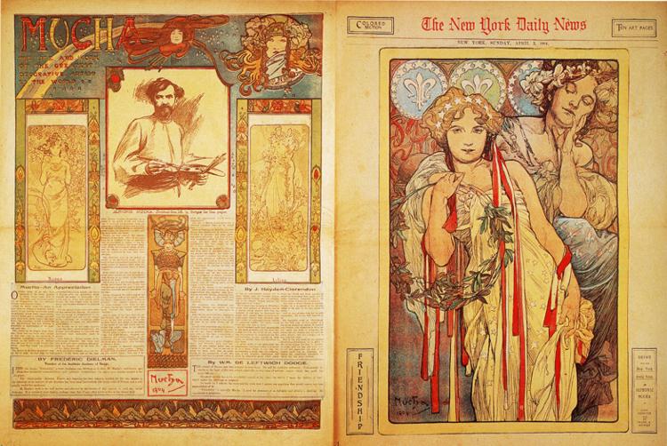
Alphonse Mucha’s “The New York Daily News” (1904) is an arresting demonstration of how a European master of Art Nouveau could translate his language of flowing line, allegorical figure, and floral ornament into the most democratic medium of the era: the Sunday newspaper. Spanning two facing pages, the spread juxtaposes an illustrated feature page about the artist with a full-page allegorical panel labeled “Friendship.” It is journalism that behaves like a portable exhibition. The project shows Mucha adapting his refined poster vocabulary to the grain of newsprint, the grid of columns, and the fast-reading habits of American audiences, without diluting the lyricism that made his Paris work famous.
Historical Moment and Why a Newspaper Matters
At the turn of the twentieth century, newspapers had become mass-cultural theaters. Color supplements and illustrated features transformed Sunday editions into galleries of prints that could reach hundreds of thousands of readers in a single city. For artists, the paper offered a huge audience; for editors, an artist of Mucha’s stature provided prestige and sales. The year 1904 sits at the crossroads of these motives. American printing houses had improved multi-plate color processes enough to carry subtle palettes, and readers expected visual delight alongside the week’s news. Mucha, already renowned for theater posters and decorative cycles, stepped onto this new stage with a spread that invited readers to experience Art Nouveau at breakfast.
Two Pages, Two Roles
The spread is carefully divided into complementary functions. The left page is editorial: an article framed by ornaments, vignettes, and an author’s byline introduces Mucha to a broad readership. It includes a portrait sketch, smaller figure panels, and header lettering that echoes the curvilinear grace of his posters. The right page is iconic: a single large panel, almost altar-like, personifies “Friendship.” This split organizes the reader’s experience into contemplation and information. First you are captured by the beauty of an image; then you are guided through the prose that explains the artist behind it. The format obeys a classic rule of printed persuasion: image arrests, text clarifies.
Composition of the Right-Hand Panel
The right page centers a youthful woman holding a laurel wreath whose long ribbons fall in vertical bands. Behind and slightly above her, a second figure leans in with closed eyes and folded hands, an embodiment of supportive presence. The composition stabilizes around a strong vertical axis—wreath, ribbons, garment—counterbalanced by the circular ring of laurel. The figures occupy nearly the full page height, granting them a monumentality unusual in a newspaper. Mucha treats the rectangle as a frame within a frame: an inner border of pale blossoms and faint heraldic signs contains the scene, while the outer margin of the page preserves the authority of the masthead. The result is a persuasive balance between artwork and periodical.
Gesture, Gaze, and the Drama of Quiet
No dramatic action occurs; all meaning is delivered through calibrated gesture. The front figure looks outward with a steady, almost conversational gaze while her right hand touches the laurel, a sign of honor made tender by the soft grip of her fingers. The companion’s hands are clasped, but not in prayer; the pose reads as inwardness and sympathy. Mucha’s rhetorical choice is to make friendship legible as demeanor rather than event. The panel thus becomes a mirror for the reader’s own experiences of companionship—support felt rather than announced, presence rather than spectacle.
Ornament as the Architecture of Feeling
Mucha’s ornament never sits on top of an image; it builds the space in which the image can breathe. The laurel wreath provides a circular architecture that stabilizes the vertical fall of ribbons and drapery. The background pattern of lilies and pale blossoms is measured in its repetition, creating a soft tapestry that recedes without turning blank. The hair of each figure interweaves with foliage, a signature Mucha device that fuses human and vegetal orders. Ornament here is a grammar of relation: circle to vertical, soft curve to firm band, foliage to hair. Through these relations the panel attains its calm.
Palette and the Warm Intelligence of Color
Newspaper color processes around 1904 encouraged restraint. Mucha selects a warm vocabulary that cooperates with newsprint’s natural cream: muted ochers, quiet blues, gray-greens, and decisive accents of red on ribbons and lips. Flesh is luminous but not sugary; shadows are built with transparent browns rather than harsh black. The palette keeps the image legible under imperfect press conditions and the varied lighting of parlors and street kiosks. At the same time, it evokes the comfort of domestic interiors, fitting for a topic like friendship that belongs to daily life rather than public pageantry.
The Editorial Page as a Decorative Essay
The left page demonstrates how ornamental thinking can organize dense information. A decorated title block announces “MUCHA,” curling tendrils and masks framing the word without crowding it. A portrait sketch of the artist, quick and confident, anchors the center column; vignettes of Mucha’s characteristic women flank the article like miniature pilasters. The text columns remain clear, but borders, initial letters, and thin rules weave them into a unified decorative field. The page teaches by example: even a grid of prose can participate in Art Nouveau harmony when typography, illustration, and spacing are composed as one.
Letters as Design Partners
Mucha treated letters as living forms. On this spread, typography becomes a supporting cast that echoes the curvilinear logic of the images. The masthead of the paper holds its traditional serif dignity, assuring readers of journalistic reliability, while the word “FRIENDSHIP” set vertically along the right margin acts as an elegant label that prepares the viewer for the theme. Drop caps and small cartouches on the article page introduce rhythm without interrupting reading. This partnership between letters and images was central to Mucha’s practice; he believed that the written word should feel at home in the same garden as the pictured figure.
The Americanization of a European Style
Bringing Art Nouveau to an American newspaper raised practical and cultural questions. Space had to respect the masthead and column widths; color had to be limited; headlines and captions could not be swallowed by ornament. Mucha met these constraints with clarity. He preserved the essence of his European posters—the monumental woman, the floral frame, the gentle halo-like field—while streamlining borders and thinning color so the spread remained unmistakably “newspaper.” The translation is successful because he understood difference as an adjustment of degree, not a change of nature.
Virtue Allegories for a Modern Audience
Mucha’s women often personify abstract qualities—seasons, hours, arts. “Friendship” continues the tradition but brings it into the modern social sphere. The subject is not mythic or ecclesiastical; it is a civic virtue that readers could recognize in themselves. The laurel reads as mutual esteem rather than martial victory; the ribbons read as ties that bind rather than ceremonial trappings. By choosing a theme embedded in ordinary life, the panel argued gently that the fine arts and daily relationships share a common floor.
The Psychology of Proximity
Because newspapers are held close to the body, the scale of faces and hands becomes intimate. Mucha uses this proximity to deliver quiet affect. The front figure’s eyes are large enough to meet the reader’s gaze directly; the companion’s lowered lids invite an empathetic pause. Tiny modulations—how a ribbon lies across a knuckle, how a curl rests against a petal—reward the slow look that a lap-held page encourages. The image thus aligns viewing conditions with meaning: friendship itself is a practice of attention at close range.
Background Pattern and Heraldic Echoes
The repeated fleur-de-lis across the upper field carries the faint perfume of heraldry without locking the work into a specific national allegiance. As a lily, it suggests purity, constancy, and renewal—qualities often ascribed to lasting friendship. Mucha deploys the motif at low contrast so it reads like breath behind the figures. The lower field’s dense blossoms provide visual weight near the base, countering the strong verticals of ribbon and garment. These patterns are not filler; they are tonal instruments that tune the panel’s gravity.
Line, Contour, and Reproducibility
On newsprint, muddy hatching or dense blacks could collapse into visual noise. Mucha therefore relies on flexible contour and controlled interior lines. Hairlines thicken at edges then taper into whispers; garments are defined by long arcs; shadows under chins and wrists are limited to a few shaped strokes. This economy is both aesthetic and technical. It respects the limits of the medium while honoring his belief that a line should feel alive—elastic, purposeful, and never mechanical.
How the Spread Choreographs Reading
From a distance, a passerby sees the masthead and the large right-hand image. The bold rectangles of color and the calm faces bring the viewer closer. Only when seated does the reader attend to the left page’s article, slipping between sentences as decorative capitals keep the eye anchored. Small boxes and captions offer momentary pauses, then return the reader to the main column. The spread is thus a quiet piece of stage direction. It leads the audience from spectacle to reflection, then back again to the image, now seen with informed eyes.
Materiality and the Afterlife of Paper
Unlike a lithographic poster meant to endure on a collector’s wall, a newspaper spread was destined for recycling or the attic trunk. Mucha compensates for ephemerality through portability. Readers could clip the right-hand panel and pin it in a parlor; they could fold the spread into a scrapbook. The warm, limited palette cooperates with the aging of paper, so surviving copies still glow rather than sour. The piece achieves a paradox: it is both disposable and keepsake.
Connections to Mucha’s European Projects
The spread does not exist in isolation. It converses with Mucha’s portfolios of decorative plates and with his allegorical series. The floral borders, laurel wreath, and ribbon cascades echo motifs in his “Arts” and “Flowers” cycles; the serene profile of the second figure recalls the hush of his lunar personifications. Yet the editorial grid and masthead frame make this work unmistakably New World in context. The transatlantic conversation becomes part of the piece’s fascination—Parisian elegance meeting New York’s tempo on common ground.
Subtext of Community and the Role of the Press
Choosing “Friendship” for a daily paper is more than decorative coincidence. Newspapers create imagined communities—strangers sharing a city through the ritual of reading the same pages. The laurel wreath becomes a civic crown extended to the readership; the ribbons become threads that link households. The spread gently flatters its audience: by reading, you join a circle of regard. In this way Mucha’s panel functions as a moral compliment to journalism’s social mission.
Ribbons, Colors, and Open Associations
The red and white ribbons are open to multiple readings. They can be pure design—accents that supply rhythm and guide the eye. They can gesture to public ceremony where sashes and rosettes mark affiliation and honor. They can echo national stripes without committing to a specific flag. Mucha keeps their meaning elastic so that the viewer’s own associations can settle on them. This elasticity is one reason the image travels well across cultures and eras.
What the Portrait Sketch Communicates
Centered on the left page is a brisk portrait of Mucha holding a tool of his trade—likely a brush or stylus. It is a deliberately informal counterpoint to the polished allegory across the gutter. The sketch says: behind the serene muses stands a working artist, sleeves rolled, hands engaged. For readers new to his name, the portrait humanizes the legend. For admirers, it offers a glimpse of the maker within a spread that might otherwise float away into symbolism.
Lessons for Designers and Editors
Beyond its historical interest, the spread remains didactic. It demonstrates how to integrate a strong image without suffocating editorial content; how a restrained palette can feel luxurious on inexpensive paper; how typographic hierarchy can cooperate with ornament; and how an abstract virtue can be visualized without sentimentality. Design students can analyze the grid, the margins, the ratio of image to text, the orchestration of captions, and the modulation of line to learn how harmony can be maintained under tight production constraints.
Why the Work Endures
More than a century later, “The New York Daily News” spread continues to feel fresh because it achieves a rare balance. It dignifies a mass medium without pretending it is a museum wall. It carries the warmth of human feeling without sacrificing clarity. It invites a huge, mixed audience into an experience of beauty that asks nothing more than a quiet minute on a Sunday. The spread proves that Mucha’s ideals—unity of text and image, ornament as architecture, figure as bearer of virtues—are not confined to luxury posters. They belong wherever people look, read, and live together.