Image source: wikiart.org
Historical Context And Why This Canvas Matters
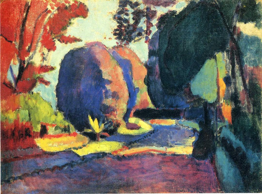
Painted in 1901, “The Luxembourg Gardens” catches Henri Matisse at the moment he was loosening the last ties of academic finish and discovering the structural power of color. Paris’s Jardin du Luxembourg, with its clipped trees, curving paths, stone balustrades, and formal parterres, gave him a motif that was both orderly and living. The place already possessed a strong geometry; Matisse could therefore shift attention from descriptive detail to the orchestration of hue, temperature, and brush rhythm. This painting reads as a bridge between the tonal studies of the late 1890s and the blazing Fauvist declarations just a few years later. The garden becomes a laboratory where complementary colors test each other’s strength and where simplified shapes prove that a scene can be convincing without being literal.
First Look: A Garden Composed Of Masses And Light
The composition presents an avenue or path bending through a garden clearing, flanked by rounded tree masses and lit patches of lawn. At the left, a flare of scarlet foliage climbs the edge of the canvas; at center, two blue-violet trees stand like compressed clouds; at the right, a larger, green-black canopy leans inward, casting the bright yellow embankments into relief. The path itself slips from warm violet into blue shadow and back into warmer notes, as if sunlight were broken by moving leaves. A pale, airy sky stitches the upper thirds together, and the entire image breathes with a sense of an autumn afternoon remembered through color rather than recorded detail. The first sensation is not of botany or ornament but of forces: cool masses, hot counters, and a choreography of light that binds them.
Composition As A Balance Of Weight And Flow
The rectangle is designed like a stage set whose wings are made of trees. The left and right edges carry heavy vertical masses that push the eye inward toward a clearing. The central rounded forms, stacked slightly off-center, act as a hinge between those wings, while the lighted path carves a sinuous S-curve that guides travel from foreground to distance. Matisse keeps the horizon low and the sky thin, so the picture’s energy remains pressed to the surface where the shapes negotiate their boundaries. Cropped silhouettes, especially the right-hand tree, intensify the sense of proximity and make the viewer feel as if they have stepped off the path. The result is frontal without being static, ceremonial without becoming stiff.
Color Architecture And The Prelude To Fauvism
Matisse builds the picture from a high-contrast chord: reds weighted with orange and carmine at the left; blue-violets and cobalt greens in the central masses; a dense teal-black in the right canopy; and a sequence of lemon yellows and chartreuses that break across the ground like plates of light. Instead of neutrals, he uses tempered complements. Red foliage is set against green to make both throb. Blue-violet trees push against the amber lawn, raising each other’s intensity. Black appears as a living color within the teal mixture rather than as a dead outline, making the darks vibrate. Even the sky avoids gray, leaning toward a milky, warm white that carries the echo of nearby color. This language—relation over recipe, temperature over shading—is the early grammar of Fauvism.
Light And Atmosphere Without Theatrical Shadow
Light in this garden is pervasive and broken, not single-sourced and dramatic. You do not see long cast shadows that pin forms to the clock; you see patches of brilliance sliding across the ground planes and pooling at the feet of trees. Matisse models volumes by shifting temperature rather than by deepening value. The blue-violet of a central tree warms toward its sunlit edge and cools into shadow as it turns away. The bright yellows are not blank; they carry small adjustments—greenish toward grass, butter-warm where they reflect nearby reds—that keep them embedded in the scene. The sensation is of weather, not spotlight, consistent with a painter who wants calm and unity even at high chroma.
Drawing Through Adjacency Rather Than Outline
Edges are authored where color fields abut. The rounded central trees are “drawn” by the meeting of blue-violet and sky; the right-hand mass presents its form as teal-black pressed against lemon and pale blue; the path’s curve is discovered where warm violet meets yellow and dark green. Where strong lines occur—trunks, small branches—they are brief and calligraphic, quickly absorbed back into the paint. This method preserves the surface as a single fabric and allows color to carry the tasks that academic drawing once performed.
Brushwork, Tempo, And The Truth Of Materials
The surface registers a variety of touches suited to what they describe. In the sky, thinly laid strokes leave the weave of the canvas visible, admitting literal light and making the air feel present. Across the tree masses, Matisse drags broader, denser paint in curved pulls that reinforce roundness without rendering leaves. The ground is a mix of brisk dabs and level sweeps, some dry-brushed so that underlying hues peep through like pebbles or tufts. The small yellow plant at center-left is struck quickly and decisively, its few flares fully adequate to declare a living accent. The picture’s vitality comes not from busy detail but from the cadence of these marks.
Space Compressed Into A Decorative Field
Although the path recesses and the trees overlap, depth is deliberately shallow. The big silhouettes press forward, and the bands of light behave like cut shapes that lie on top rather than sink into distance. This compression does not falsify the garden; it organizes it. Matisse is already insisting that a painting be a balanced pattern on a flat plane before it pretends to be a window. The Luxembourg Gardens were famous for their formal order, and he leverages that order to keep the scene readable as a designed field of forces.
Rhythm And The Viewer’s Route
The painting teaches the eye a route. One often enters along the violet foreground, pivots at the bright yellow triangle near the left, climbs the blue masses at center, slides under the dark canopy to the right, and then returns along the lighted band that cuts back toward the front edge. Each pass reveals new correspondences: a red echo in the shadowed path, a green inflection inside the “black,” a violet seam between two tree masses that binds them without a line. This rhythm of approach and return is the garden’s walk translated into pictorial terms.
The Luxembourg Gardens As Motif And Myth
Parisian viewers would have recognized the site: the clipped trees, the curving alleys, the bright parterres that catch light. But Matisse declines literal landmarks—the Medici Fountain, the statues, the palace façade—in favor of the garden’s structural identity. The choice matters. By subtracting anecdote, he frees the motif to function as a modern emblem: a city’s cultivated nature condensed to color and shape. The Luxembourg Gardens become not a postcard but an idea about how public space can be harmonized, which is the same idea he is pursuing on the canvas.
Dialogues With Cézanne, Gauguin, And The Nabis
Cézanne’s constructive planes inform the rounded trees and the path’s faceted turns; Gauguin’s non-local color emboldens the red foliage and the glowing yellow lawns; the Nabis’ decorative flattening encourages the big, cropped silhouettes and the pattern-like ground. Yet the temperament is unmistakably Matisse’s. Where Gauguin courts symbol and mystery, Matisse prefers equilibrium. Where Cézanne tightens structure toward tension, Matisse relaxes it into poise. Where the Nabis veil surfaces with pattern, Matisse lets the paint breathe and light circulate.
Materiality, Pigments, And The Skin Of Paint
The saturated palette likely draws on cobalt and ultramarine for the blues; alizarin or madder lakes for violets and reds; viridian and emerald greens balanced with yellow lakes for the lawns; and lead white or zinc mixed thinly for the sky. Matisse alternates lean scumbles with thicker, body-color passages, creating a dynamic skin in which some areas absorb light and others return it. That material contrast heightens the chromatic drama without resorting to deep value swings. The canvas weave is never hidden; it contributes a grain that keeps wide fields lively.
Emotion, Season, And The Psychology Of Color
The dominant chord suggests late summer sliding into autumn. Reds put heat into the left flank; greens cool the right; blues and violets calm the center; and yellows act like sun saved up in the ground. The emotional tone is buoyant but collected. Nothing is frantic; the picture is loud in color and soft in voice. Matisse’s often-quoted ideal of an art that offers balance and repose is already audible, even as he tests how high the color can play.
How To Look Slowly And Profitably
Begin by receiving the large divisions: red wing, blue-violet masses, dark green canopy, bright yellow planes, and pale sky. Let that chord settle. Move closer to see how edges are authored by one color kissing another. Notice the physical thickness of a yellow passage laid over violet, the slight granularity where thin sky paint reveals the fabric, the way a blue stroke pulls across a rounded tree to declare volume without leaf description. Step back again until the path resumes its S and the garden reads as one accord. That near–far oscillation replicates the painter’s own tuning process.
Relationship To Matisse’s 1901 Suite
Compared with the Swiss and Savoy views of the same year, “The Luxembourg Gardens” pushes chroma higher and tolerates more abbreviation. Compared with the still lifes with carpets and pitchers, it exports the same principles—color as structure, black as a live neighbor, omission as clarity—to an outdoor subject. Seen next to “Copper Beeches,” this canvas shares the frontal grove and the complementary battles, but it adds the urban garden’s formal light fields, which let Matisse practice the long, flat shapes that will dominate his interiors.
Why This Painting Endures
The painting endures because it translates a familiar public place into a lucid, modern harmony. It offers a persuasive answer to a problem painters still face: how to remain faithful to sensation while designing an autonomous surface. Matisse’s solution is to let color do the building, to let edges emerge from adjacency, to compress space until it reads as pattern, and to omit until the picture breathes. The garden is not diminished by this treatment; it is made legible at a single glance and revisitable indefinitely. You feel the warmth of the path, the cool of the trees, the quiet electricity where complements meet, and the deep calm of a composition that knows exactly what each part is for.
