Image source: artvee.com
Introduction
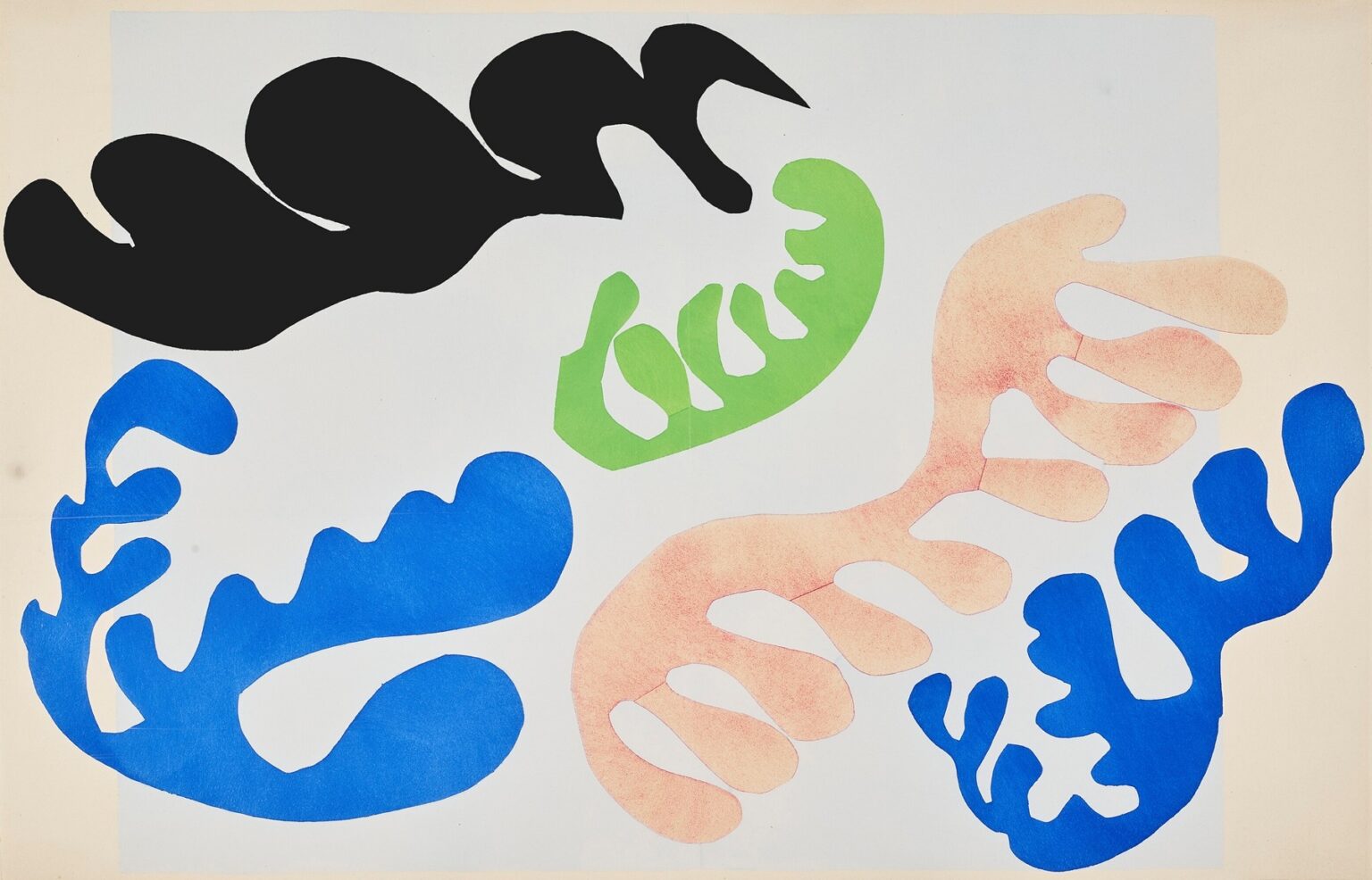
Henri Matisse’s “The Lagoon” (1947) is a late, crystalline statement from the artist’s celebrated cut-paper period. Composed of gouache-painted papers cut into sweeping, coral-like silhouettes and arranged over a pale field, the work belongs to the Jazz suite, where Matisse replaced descriptive modeling with pure relations of color and edge. Five dominant shapes—a black banner, a lucid green frond, a powder-coral organism and two electric-blue forms—hover in a softly bluish rectangle, like flora glimpsed through shallow water. With almost nothing but scissors, paper, and color, Matisse turns the sensation of a sunlit tide pool into a lucid, modern architecture.
The Late Method That Made This Image Possible
Matisse coined the phrase “drawing with scissors” to describe how, in the 1940s, he brushed sheets of paper with matte gouache, then cut directly into color and composed the pieces on his studio walls. The edge created by the scissors is both contour and pigment; it is the artist’s line and the body of color at once. In “The Lagoon” the method’s virtues are unmistakable: the edges are alive but clean; the forms are unequivocal yet elastic; the surface breathes because it is built from discrete, luminous papers rather than a uniform skin of paint. The pochoir process used to reproduce the Jazz plates preserved the density of gouache and the fidelity of the cut, so the image retains the candor of the studio maquette—its tactility and its precision.
A Tide Pool Built From Five Actors
Matisse constructs the picture with theatrical economy. A pale, slightly blued rectangle—a cool stage set inside the cream of the sheet—holds five principal actors. At the upper left runs a great black banner with rounded lobes, a shadow-weed that anchors the composition’s weight. Across the lower half, two brilliant blue forms curve in opposing directions, buoyant and alert. At center, a fresh green frond opens like a hand, its interior apertures letting the ground breathe through. To the right, a powder-coral organism—more softly textured than the others—turns in gentle arcs, its warm tone balancing the blue’s chill. Their scale and spacing create a rhythm that feels tidal: shapes drift toward each other, kiss, and drift apart.
Color As Climate, Not Costume
Color here is not local description (no one needs to know what species these forms are). Instead, each hue establishes temperature and weight. Black supplies gravity and depth; it stops the eye and keeps the rest from becoming merely decorative. The two blues act as water made visible—clear, cool, and quick—pushing the composition toward openness. Green is the note of life, vegetal and springy, while the coral reads as sunlight filtered through shallow water, a warm countercurrent to the cool field. Because the papers are painted in flat, matte gouache, the colors do not shine; they sit with authority, like pieces of cloth pinned to air. Their relations—cool across warm, heavy against light—do the pictorial work.
The Intelligence Of Placement
Matisse’s genius in the cut-outs is not only inventing shapes but placing them. In “The Lagoon” the black banner rides high and left, where Western reading habits begin; it becomes the picture’s opening chord. The green frond, centrally placed but slightly right and low, is a pivot that keeps the eye circling. The coral organism tilts toward the right edge, its warm tone pulling us outward before the right-hand blue form returns us to the center. The left blue shape counters the right with a broader, lower arc, so the pair reads like call and response. The resulting circuit—black to green to coral to blue and back—feels like a current. Nothing is symmetrical, yet balance is constant.
Figure–Ground Play That Feels Like Water
The lagoon impression does not come from painted waves; it emerges from the way figure and ground exchange roles. The pale rectangle can be water or sky depending on which shape you favor at a glance. The green frond is a positive form until the eye notices its internal windows, where the ground becomes an equally active shape. The coral’s soft stipple makes it seem half-dissolved into water; the black banner, by contrast, sits emphatically on top of the field like a silhouette caught against light. This continual toggling—form over field, field through form—mimics the optical ambiguities of shallow water, where reflections fold space and organisms hover between visibility and camouflage.
Edges As Handwriting
Up close, the scissor trail is legible as the artist’s hand. The blue shapes show quick, confident accelerations along long curves; the coral form slows at each lobe, leaving tiny hesitations that keep the contour humane; the black banner’s rounded humps thicken and thin, recording changes of pressure. These micro-events prevent the image from feeling mechanical. They are the late Matisse’s signature: a palpable, unlabored exactness. When the cut edge replaces brushy modeling, every millimeter matters, and here every millimeter is alive.
Scale, Breath, And The Use Of Negative Space
“The Lagoon” also breathes because Matisse leaves generous bays of unoccupied ground. The pale rectangle is not filler; it is a presence that has its own intervals and shapes. The spaces between forms—particularly the long lagoon-like channel between the left blue and the coral—compose as actively as the forms themselves. This clarity of breath is one reason the work reads both at poster distance and at hand’s length. It is a model of modern spacing: big ideas in wide air.
Rhythm, Reprise, And Visual Music
The Jazz title is apt. Matisse composes with reprise and variation. The blue pair shares a family of lobes but differs in scale and orientation; the brain enjoys the recognition and the difference simultaneously. The black banner rhymes with the coral in the count of its lobes but flips value and temperature, like a theme heard in a new key. The green figure is both bridge and solo—smaller, punchier, in the middle of the bar. The whole resolves like a chord: warm and cool, light and dark, broad and tight, all resolved in a sequence that feels inevitable only after you’ve seen it.
The Coral Form’s Unique Texture
Unlike the solid blues, green, and black, the coral element carries a subtle, grainy modulation—as if the gouache were dabbed or rolled to produce a powdery bloom. That textural difference suggests fragility, skin, or porous coral, and it changes how the eye weighs the shape. It seems less assertive than the black and more corporeal than the blues, a tender note that complicates the ecosystem. The choice is small but load-bearing: one texture change stands in for an entire range of sensations—sun, salt, skin, calcium—without any illustration.
A Lagoon Without a Shoreline
Many lagoon images in the Jazz series include framing strips or margins that behave like beaches or retaining walls. Here the “shore” is implied only by the boundaries of the pale rectangle and the way the cream paper peeks around it. That decision keeps attention on the internal dance of forms and avoids the anecdotal pull of landscape. We are not gazing across water toward a horizon; we are looking into water from above. The viewpoint is frankly modern: a map of sensations rather than a window into a scene.
Why The Black Banner Matters
It is tempting to underplay the black shape because it reads as shadow, but structurally it is the hinge that keeps the composition from floating away. Black gives depth by subtraction: it advances sharply in a field of pale values and throws everything else into luminous relation. It also creates a high-contrast edge against the ground, sharpening the surrounding blues and green. Without it, the palette might turn merely pretty; with it, the picture acquires gravity and pitch.
The Green Frond As Pictorial Pivot
The green form’s central position and interior openings make it the picture’s most complex actor. It is at once object and aperture, a leaf and a window. Because green sits between the warm coral and the cool blues on the color wheel, it negotiates between them; as a shape it echoes both the banner’s broad lobes and the blues’ more intricate branching. It is the middle voice of the chord—indispensable and often the place our eye returns to after wandering.
Movement Without Narrative
Nothing in “The Lagoon” moves in the literal sense, but the composition generates a strong kinesthetic pull. The black banner’s lobes lean rightward, the left blue’s spine sweeps left to right, the right blue rebounds upward, the coral rolls toward the edge, and the green tilts like a hinge between them. The long intervals of ground allow our eye to glide from one to another as if following a current. The result is drift without anecdote, a sensation of being carried rather than of watching a story unfold.
The Work Within Matisse’s Marine Vocabulary
Across late cut-outs Matisse returned to sea imagery because it offered abstract, repeatable grammars: fronds, ribbons, spines, and perforated leaves. “The Lagoon” sits at the serene end of that spectrum—few elements, large intervals, strong value contrasts—closer to a quartet than an orchestra. It converses with other lagoon variants by trading the usual magentas and ochres for a cleaner, cooler register. This restraint makes the image especially adaptable; it can be read as biology, map, dance, or textile without stress.
Lessons For Designers And Painters
This sheet remains a primer in durable craft. Give each color a job and avoid redundancy. Stage a few big forms at distinct scales; let negative space act and breathe. Use one dense, dark shape to set pitch for an otherwise high-key palette. Create families of forms so the eye can enjoy recognition and variation. Trust the edge—if it is truthful and specific, you won’t need modeling. Above all, compress sensation into relations the viewer can read instantly and revisit slowly.
The Emotional Weather Of Calm Clarity
Matisse often spoke of offering balance and serenity. “The Lagoon” fulfills that ambition without becoming bland. The calm comes from discipline: limited actors, clear spacing, hues tuned for accord. Yet the sheet never goes flat; the black’s authority, the coral’s tenderness, the blues’ buoyancy, and the green’s life keep the mood alert. It is the kind of restfulness one feels at a shoreline—quiet, but full of minute movements.
Seeing At Two Distances
From across a room, the work is legible as a crisp emblem: five organic shapes afloat in a pale bay. Up close, its hand becomes intimate—the slight bevels of the cut, the grain in the coral, the soft variations in the blue papers, the way the pale rectangle is not a single value but faintly modulated. The image is engineered to succeed at both scales, which is why it works as poster, page, or painting.
Conclusion
“The Lagoon” condenses the Mediterranean into a handful of living shapes. Without horizon or illusion, Matisse conjures depth, light, and drift through the placement of five silhouettes and the orchestration of their colors. The page is frank and generous: nothing superfluous, everything tuned. It offers a model for how to make the world legible with the fewest possible means and reminds us that clarity is not the enemy of richness; in the right hands, it is the way to it.