Image source: artvee.com
Introduction
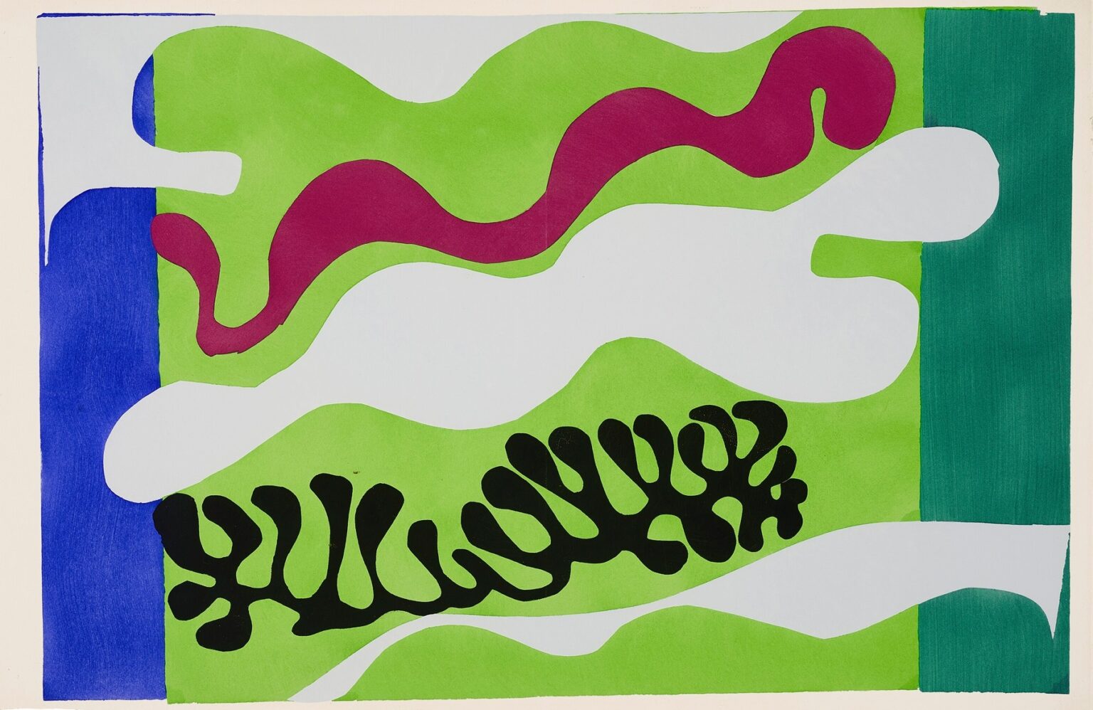
Henri Matisse’s “The Lagoon” (1947) is a late cut-paper composition that turns the sensation of shallow, living water into a lucid architecture of color and edge. A field of spring green rolls like sandbars under a pale, silvery blue; across it, a meandering band of wine-red drifts like a ribbon of algae; a black, coral-like frond anchors the lower middle; ultramarine and deep teal bars close the scene at left and right. Nothing here is painted to imitate waves or foam, yet the page breathes like a tide pool seen from above. With a handful of precisely cut silhouettes, Matisse stages the meeting of sea and shore as pattern, rhythm, and temperature.
The Cut-Out Method and the Jazz Context
In the mid-1940s Matisse reengineered his practice around a simple but radical procedure he called “drawing with scissors.” He brushed sheets of paper with matte gouache in high-keyed hues, then cut directly into the color and composed the shapes on his studio wall. Edge and color arrived simultaneously; the contour wasn’t a line around a form—it was the form. Many of the most distilled statements of this method appeared in the 1947 portfolio “Jazz,” where acrobats, swimmers, animals, and landscapes are transformed into orchestral arrangements of paper. “The Lagoon” belongs to this family. It forgoes depiction in favor of a score of planes and arabesques that lets viewers feel water, light, and growth without a single illusionistic brushstroke.
What the Composition Shows
The composition resolves into five dominant strata. A vertical ultramarine bar at far left and a deeper teal bar at far right behave like cool, architectural wings. Between them spreads an inland sea of leaf-green, not flat but cut into rolling caps and troughs. Running near the top is a long, sinuous band of burgundy that swells and narrows with the tide of the page. Threaded through and over these fields are broad, cloud-like bands of pale bluish white that open passages of air and light. Near the lower middle, a dense black frond unfurls—part coral, part seaweed, part shadow. These few actors—bars, bands, ribbon, frond—carry all the drama, each speaking in the fluent alphabet of the scissor’s edge.
Color as Climate
Matisse assigns each hue a job. Green is the body of the lagoon—nutrient, plant, and shallow ground at once. The pale blue-white is air and reflection, a light skim that turns the surface readable. Burgundy supplies warmth and organic pulse, the undertow of life that runs beneath clear water. Black is depth and structure; it fixes the eye and keeps the harmony from dissolving into sweetness. The two perimeter blues slow the scene’s drift: ultramarine on the left is bracing and coastal; teal on the right leans toward mineral and vegetation. Because the gouache dries matte, these colors behave not as shining cosmetic layers but as true, saturated fields. The climate they create is calm, sun-washed, and slightly saline.
The Forms: Ribbons, Clouds, and Fronds
Look closely at the silhouettes and their logic becomes evident. The burgundy ribbon is a single, continuous cut, animated by repeated bulges and constrictions that read as growth. It travels the length of the picture like a melody, varying just enough to avoid monotony. The pale bands are broader and slower; they act as clouds cast upon water, or as sandbars revealed by light, or simply as intervals of rest between more active notes. The black element is the most articulated—branching, looping, and doubling back on itself—so it instantly reads as something structural: rock shadow on the bottom, a thick plant caught by current, or a piece of living coral. Nothing is literal, but everything is legible because the forms share the cadence of natural pattern.
Figure–Ground Ambiguity That Feels Like Water
One reason the page seems aqueous is that figure and ground continually trade roles—just as reflections and refractions do on a real lagoon. In one glance the pale bands are floating on top of green; in the next they seem like channels through the green, the lagoon’s body resurfacing on either side. The burgundy ribbon sometimes rides the green and sometimes appears embedded in it. The black frond flips from being an object resting on the bottom to a cast shadow stretching across the bed. This reversible reading keeps the image mobile and mirrors the way water unsettles boundaries.
Rhythm and the Music of Drift
Matisse titled the portfolio “Jazz” because he conceived these pages as scores built from repetition, syncopation, and reprise. “The Lagoon” is particularly musical. The two vertical blues are steady bars at either end of the staff. The long burgundy ribbon is a solo line that slides and bends. The pale passages arrive like rests that let the eye breathe; the black frond lands like a bass figure that holds the harmony in place. The green field underneath does what a rhythm section does—keeps time while allowing improvisation above. The result is drift with structure, a tempo that feels tidal rather than metronomic.
Edges as Handwriting
Because line and color are fused in the cut-outs, edges carry the character of the whole. The scissors accelerate through long curves and hesitate at tight turns; little bevels record where a cut paused and resumed. You can feel the low pressure and slight speed-ups in the burgundy ribbon; you can sense calmer, wider breathing in the pale bands; you can trace the careful, almost calligraphic attention in the black frond. That trace of hand prevents the composition from becoming mechanical. It is the human pulse inside a picture about natural rhythms.
Space Built Without Perspective
There is no horizon, vanishing point, or modelled volume, yet the sheet induces the sensation of depth. Overlap—pale over green, burgundy over pale, black over green—does most of the work. Color weight does the rest: black advances, the pale bands hover, green settles, blue frames. The slight value shift between the left ultramarine and the right teal suggests a different quality of water or edge, as if one side opened to sea and the other to mangrove. These cues let your eye assemble a shallow basin and a layered surface without any narrative scaffolding.
A Lagoon Imagined From Above
Part of the design’s freshness comes from the point of view. This is not a horizon-and-sky seascape; it is a top-down map of sensation. The bands run horizontally as a shoreline might on a chart; the frond reads like a specimen pinned to a field. The viewer floats, looking into a bright, weed-threaded shallows where the bottom is close enough to name. That elevated vantage aligns with the cut-out method itself: the shapes were composed on a wall and read at full scale, so the body of the viewer meets the body of the composition head-on, the way one looks down into water and up at a wall with equal directness.
The Role of the Two Blue Pilasters
The vertical blue bars at left and right appear simple, but they temper the composition in critical ways. First, they set a frame that keeps the looser bands from streaming off the sheet; second, they cool the palette and prevent the green-burgundy conversation from overheating; third, they provide directional contrast—upright to the picture’s broad lateral flow—so that the eye toggles between glide and stop. The saturated ultramarine on the left is a trumpet note; the darker teal on the right is a trombone—related timbres with different weights. Their interplay quietly stabilizes the whole.
The Black Frond as Anchor and Counterform
The black element near the bottom acts as a compositional anchor. Its dense value compresses the green around it and snaps the eye into focus. But it also serves as a counterform that makes the surrounding band of pale blue-white read as water’s reflective film. Because the frond contains interior voids, it doubles the page’s larger figure–ground game at a smaller scale: black becomes the ground in which pale “lagoons” appear, an inversion of the main setup. That echoing structure—motif inside motif—gives the sheet a quiet coherence felt more than noticed.
Material Candor and the Pleasure of Gouache
The pochoir printing used to reproduce these compositions preserved two crucial qualities: the velvety, even absorption of gouache and the softness where a cut lifts ever so slightly from the support. Those physical truths matter for “The Lagoon.” They keep the colors from feeling glossy or slick; they sit on the paper like fields of pigment, closer to textile than enamel. In a subject about water’s gloss, Matisse denies gloss and wins something more persuasive: light that seems to come from the paper itself.
A Conversation With Natural History
Matisse’s lagoon is not a specimen sheet, yet it rhymes with the clarity of scientific drawing. The shapes look classified without being particular: a ribbon form that could be algae, a frond that could be coral, bands that could be sand or wake. By keeping names vague and structures sharp, he invites recognition without pedantry. It is an image you can bring your own shoreline to, and it will still hold.
Relation to Matisse’s Other Lagoon Variants
Across the late years, Matisse explored marine motifs repeatedly—sometimes with cascades of many small fronds, sometimes with long banners of color. This version of “The Lagoon” distinguishes itself by the dominance of the green field and the single, emphatic black anchor. Where other treatments might feel like a drift of many voices, this one is a quartet: blue bars, green body, burgundy melody, black bass, with the pale passages as rests woven through the measure. The restraint heightens legibility and gives the page a serene, architectural poise.
Reading at Two Distances
From across a room the plate reads as a clean flag of layered bands—a modern heraldry for coast and water. Up close, the cut edges and slight paper overlaps animate the surface. You notice how the pale band slips just under the teal at right, how the burgundy line pinches thin before widening into a pool, how the frond’s lobes are similar but never cloned. The work sustains both kinds of attention—instant recognition and lingering inspection—because its grammar is simple and its execution exact.
Lessons for Design and Looking
“The Lagoon” models several durable principles. Give each color a distinct job and avoid redundancy. Establish a clear structure—here, lateral bands—then allow one or two elements to improvise across it. Use borders to participate, not just to contain. Let figure–ground reversals carry atmosphere. Trust edges to hold character; a well-cut silhouette can suggest more life than layers of shading. These are not just museum lessons; they are practical rules for posters, textiles, screens, or any place where clarity has to carry feeling.
The Emotional Weather of Quiet Clarity
Matisse often said he wanted his art to offer balance and serenity. In “The Lagoon,” serenity is not emptiness; it is the feeling of a system in accord with itself. Hues are tuned but not loud. The rhythm is steady but not static. Danger is present only as the disciplined black that keeps sweetness at bay. The page offers the kind of rest a tidal flat offers: a place where things are moving, but in long, intelligible phrases.
Conclusion
“The Lagoon” proves how little is needed to summon a world. A rectangle of green dressed with a few bands and a single frond becomes water, shore, and light. The scissors’ path is visible in every turn; the colors carry temperature and depth without trickery; the composition reads at a glance and rewards continued looking. In an era when spectacle can drown perception, Matisse’s late page remains a model of how structure and feeling can meet. It is not a picture of a lagoon; it is the lagoon’s grammar, spoken with grace.
