Image source: artvee.com
Introduction
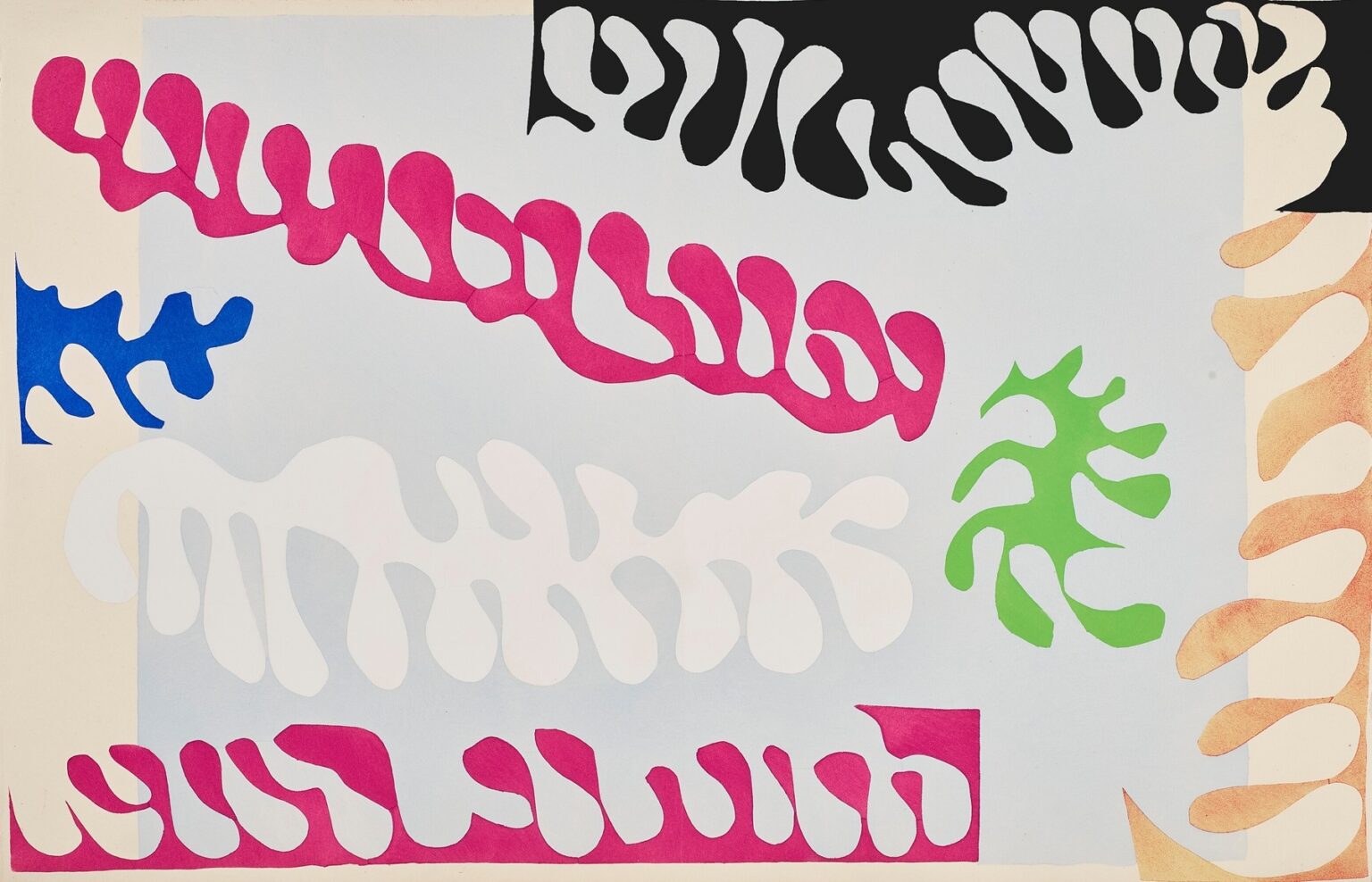
Henri Matisse’s “The Lagoon” (1947) is a crystalline demonstration of how the artist, late in his life, turned color and cut paper into a complete language. Across a pale, aqueous rectangle, curving vegetal forms ripple in magenta, black, white, green, blue, and sandy ochre, like seaweeds, coral fans, and shoreline foam drifting over a tide pool. There is no horizon and no conventional depth, yet the page feels spatial and breathing, as if light were moving across shallow water. The composition belongs to the celebrated Jazz portfolio, in which Matisse “drew with scissors,” cutting shapes from sheets of paper he had brushed with flat gouache and arranging them into dynamic, musical scenes. “The Lagoon” is among the most purely lyrical of these plates: a coastal world spelled entirely in edges.
Drawing With Scissors and the Spirit of Jazz
By the mid-1940s Matisse had traded the long physical labor of easel painting for a method that fused line and color in one gesture. He painted large papers with matte gouache, then cut directly into the color and pinned the pieces to his studio walls, shifting them until the composition clicked. He called the method “drawing with scissors” because the cut edge was both contour and pigment; it behaved like a drawn line that also happened to be a field of color. The Jazz plates were reproduced by pochoir, a stencil process that preserved the gouache’s dense, velvety surface and the immaculate crispness of the cuts. “The Lagoon,” with its buoyant arabesques and floating bands, exemplifies the portfolio’s premise: that rhythm, repetition, and counterpoint are as native to sight as they are to sound.
Composition as a Tide Pool
The architecture of the page is simple and cunning. A central panel of cool, diluted blue sits like a sheet of water on pale paper. Around and within it, Matisse scatters elongated leaf- or coral-like forms. A black fringe presses in from the upper right corner, echoing the profile of sea grass shaded by rock. Two long magenta ribbons—one near the top, one at the base—snake across the field like drifting fronds. A large white garland undulates near the center, translucency made visible through absence. Bright green and ultramarine accents interrupt the dominant pair of magenta and white, while a warm ochre spine climbs along the right margin, a sandy shore or reef edge creeping into view. The eye roams as if snorkeling: no single focal point, but a constant, gentle discovery.
Color as Temperature and Salinity
Matisse assigns each color a role in the lagoon’s climate. The pale blue ground is not quite uniform; it varies subtly, suggesting light refracted by shallow water. Magenta supplies warmth and buoyancy; its saturation reads like sun hitting living tissue. Black is shade and depth, sharpening nearby hues and preventing sweetness. White is breath and foam, the glint of a wave crest or the body of a translucent creature revealed by contrast. Green is the life note, vegetal and quick, while ultramarine’s compact patch cools the corner, like a sudden pocket of deeper water. The ochre to the right introduces land and mineral—a reminder that lagoons are thresholds where sea meets sand and rock. Together, these colors create an ecosystem, not by illusionistic modeling but by calibrated temperatures.
The Motif of Marine Growth
The repeated shapes—ribboned, lobed, branching—belong to a vocabulary Matisse refined across his late cut-outs. Here they behave like sea flora lifted by a tide. Each element is a continuous silhouette, but internal voids and alternating bulges imply growth and circulation. The long magenta band near the top shows the device at its clearest: a single cut translates the rhythm of a frond folding back on itself, while small openings act like the spaces between blades. The white garland below repeats this structure in reverse tone, making negative space feel as tactile as positive form. These shapes do not imitate specific species; they capture the logic of living pattern in water.
Rhythm and the Music of Drift
The Jazz title is not decorative; it captures how these images are built. In “The Lagoon,” rhythm emerges from spacing and recurrence. Magenta phrases open the piece and close it, like a theme stated and reprised. The white line in the middle is the mellow bridge, calmer and broader. Small accents in green and blue add syncopation, while the black and ochre at the edges ground the beat. The eye reads this as movement without a destination—eddies, pulses, gentle sways. It is music for looking, a tempo measured in the distance between one lobe and the next.
Figure–Ground Play That Feels Like Water
Because everything depends on edge, figure and ground exchange roles constantly. The white garland is both a form and the lagoon’s own light pushing through. The black fringe can be read as a solid intrusion or as shadow cut from the blue. The magenta bands sometimes rest on the surface and sometimes seem to sink, depending on what color passes under them. This oscillation resembles the way water itself confuses boundaries: reflections turn sky into surface; submerged plants appear to hover; shadows have volume. Matisse harnesses that perceptual ambiguity to make the page feel aquatic without ever painting a drop.
The Truth of Edges
The cut edge is the plate’s handwriting. Look closely and you can sense the speed of the scissors as they accelerate through a long curve, then slow to negotiate a tight turn. Small changes of pressure produce slight bevels or soft knees in the contour; these micro-events keep the silhouettes from reading as mechanical. The magenta ribbons show this truth perfectly—their lobes are similar but never identical, as if a living frond had been recorded in four or five gestures. The pochoir process preserves these subtleties, so the viewer experiences not only the image but also the touch that made it.
Space Without Perspective
Depth in “The Lagoon” is created not by horizon lines or cast shadows but by overlap, color weight, and atmospheric registration. The pale blue rectangle retreats softly from the cream paper, establishing a pool within the page. The black frond at the top edge asserts itself as foreground because it is the densest color and because it nibbles into the blue like a silhouette against light. The white band sits on top of blue by virtue of contrast, but as your eye adjusts it can flip and seem cut from the blue itself. The warm ochre spine moves forward where it touches cream and back where it slides under the blue. Space is a verb here, not a set of coordinates—something produced by relations and readable at a glance.
The Lagoon as Theatre and Frame
Matisse often treated borders as active players. In this plate, the pale paper frame is not simply margin; it becomes beach, bone, or chalky shell encasing the living center. The ochre sequence on the right acts like a gate into the scene, a broken column that the magenta and white fronds echo. The clipped black at the upper right corner suggests a shape continuing past the paper’s edge, a reminder that the lagoon exceeds the picture’s boundaries. The result is theatrical: the blue rectangle is a stage, and the cut fronds are performers across its surface.
Relation to Other Marine Works
While each Jazz plate stands alone, “The Lagoon” resonates with Matisse’s broader fascination with sea imagery from the same period. He repeatedly mined motifs of coral, seaweed, and floating flora because they answered his search for forms that could be both structure and rhythm. The underwater environment offered arabesques that were inherently abstract yet full of life. In this plate, the motif is distilled to its most legible grammar—ribbons and lobes set against a cool plane—so the sea becomes not scenery but a set of principles for organizing a page.
The Discipline of Reprise and Variation
Matisse builds cohesion through return. The magenta bands at top and bottom share a profile but differ in scale and placement; that slight mismatch animates the frame. The black top fringe rhymes with the sand-colored edge at right, dark and warm versions of the same scalloped cadence. The small ultramarine splash in the left corner is echoed by the green figure to the right, two bright staccatos answering each other across the pool. Such reprises are the visual equivalent of musical motifs; they let the eye predict and then find, which creates satisfaction without monotony.
Elegance Through Restraint
Despite the riot of form, the page is measured. Matisse keeps the palette economical and the shapes clean. He allows large fields of pale blue to remain undisturbed so the eye can rest. He resists the temptation to overpopulate the center, letting the white garland breathe. The page’s elegance comes from this discipline. It is easy to imagine decorative clutter in a subject like “lagoon,” but Matisse reins in description to protect the composition’s larger rhythm.
Reading at Two Distances
Across a room, “The Lagoon” registers as an abstract poster of stripes and fronds swimming across a blue stage. Up close, the craft deepens. You see the slight grain of gouache in the papers, the tiny overlaps where colors kiss, the hairline shifts in curvature that keep each lobe alive. This double success—impact at a glance, intimacy in inspection—is a signature of the late cut-outs and one reason they remain so useful to designers and painters alike.
The Emotional Weather of a Shallow Sea
The page’s mood is unusually serene. Black provides enough tension to focus the composition, but it never overwhelms; magenta glows without shouting; white creates buoyancy; green and blue cool the temperature. The ochre on the right introduces a soft warmth that hints at late afternoon light on rock. Taken together, the colors describe a time of day and a type of place without any narrative incident. The lagoon is an environment of attention: calm, reflective, slightly musical.
Lessons in Design
“The Lagoon” teaches how to construct a world with essentials. A single ground color can carry space if its value is tuned and its neighbors are kept crisp. Repetition becomes rhythm when each repeat carries a small difference. Borders can act as participants, not just containers. Negative space can be as charged as positive shape when contrasts are honest. And most importantly, images can evoke specific experiences—sunlight through water, weed and foam, the soft pressure of tide—without literal depiction. The cut-out medium shines when design, not description, does the work.
A Late Style’s Generosity
Matisse described his aim as offering balance, purity, and serenity, a “soothing, calming influence on the mind.” In his late work, that aim becomes generous rather than decorative. The clarity of “The Lagoon” is not simplistic; it is considerate. The viewer is given a readable structure and invited to wander. Because the shapes are archetypal and the colors unambiguous, the mind can rest in the act of looking. That invitation—to experience something like a tide pool of attention—is the plate’s lasting gift.
Conclusion
“The Lagoon” gathers cut paper into a coastal music. A soft blue stage, a cadence of magenta and white fronds, a dark rim of shade, a sandy edge, quick shouts of green and ultramarine: with these few elements Matisse composes a scene that is both abstract and vividly environmental. The page breathes like water without a single drop of illusionistic paint. It is one of the clearest statements of what the Jazz portfolio discovered—that color, edge, and rhythm can carry the world’s sensations on their own. Look once and you feel drift; look longer and you sense the intelligence that makes drift legible.