Image source: artvee.com
Introduction
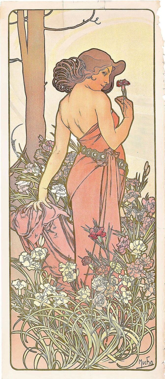
Alphonse Mucha’s 1897 lithograph The Carnation presents a masterful fusion of decorative elegance and allegorical depth, embodying the quintessence of the Art Nouveau movement. Characterized by sinuous lines, a harmonious color scheme, and a rich interplay of figure and flora, the print elevates a simple botanical subject into a poetic meditation on beauty, femininity, and nature’s cycles. In this analysis, we will explore the work’s historical backdrop, compositional strategy, chromatic subtlety, ornamental line work, and enduring legacy, revealing how Mucha achieved a timeless balance between fine art and applied design.
Historical Context and Publication
_By the late 1890s, Europe was aflush with a renewed interest in decorative arts and graphic design. Against this backdrop, Alphonse Mucha emerged as one of the most influential figures of Art Nouveau, a style defined by organic forms, flowing lines, and an embrace of nature-inspired ornament. Mucha’s breakthrough came with posters for the actress Sarah Bernhardt in 1894, which led to countless commissions for magazines, calendars, and decorative panels. In 1897, Mucha produced The Carnation as part of a broader series of botanical allegories, celebrating individual flowers as emblems of seasonal change and human emotion. The lithograph was published in limited editions, finding its way into private collections and the salons of art connoisseurs eager to bring refined, modern aesthetics into their interiors.
Commission and Series Placement
The Carnation occupies a unique place within Mucha’s botanical series, which also includes panels like The Rose and The Lily. Each panel was conceived not merely as a floral study but as an allegorical portrait that fused the likeness of an idealized female figure with the symbolic language of a specific blossom. In commissioning these works, publishers and patrons sought decorative prints that could adorn walls while conveying subtle meanings—carnations, for instance, were associated with fascination and love in Victorian flower lore. Mucha responded to this demand by crafting images that blended naturalistic detail with stylized embellishment, ensuring that each print functioned equally as fine art and as a piece of sophisticated home décor.
Composition and Spatial Arrangement
The Carnation is structured within a vertical, elongated rectangle that guides the viewer’s gaze from bottom to top, echoing the growth of the flower itself. At its center stands a young woman seen from behind and in three-quarter profile, her torso gently turned to present her face in contemplative repose. She is enveloped in a field of blooming carnations that surge upward from the lower margin, their slender stalks and ruffled petals creating both a textural foreground and a natural frame for the figure. Behind her, a pale circular halo of soft gold encircles her head and shoulders, drawing the eye inward and establishing a sacred or iconic resonance. The outer margins remain largely unadorned, allowing the central composition to breathe freely, yet the subtle border line hints at the architectural rigor underlying Mucha’s decorative fantasia.
Color Palette and Tonal Harmony
Mucha’s color scheme in The Carnation is a study in restrained elegance. Soft rose-pinks dominate the composition, echoed in the woman’s gown and in the petals of the carnations themselves. These hues range from muted coral at the gown’s highlights to deeper crimson in the flower centers, creating a naturalistic depth. The surrounding foliage is rendered in gentle sage and olive greens, their cool undertones balancing the warmth of the pinks. The circular halo employs a pale golden wash that diffuses into cream, evoking the glow of dawn or the sheen of mother-of-pearl. Mucha’s subtle layering of translucent inks achieves a luminous surface without resorting to high contrast, ensuring that each element merges into an overall tonal unity that is both soothing and richly evocative.
Line Quality and Ornamental Patterns
At the heart of Mucha’s aesthetic lies his command of the line, and The Carnation offers a textbook example of his technique. The woman’s silhouette is defined by a single, unbroken contour that flows from the curve of her shoulder down to the hem of her gown. Within that outline, parallel hairline strokes articulate the folds of fabric, the strands of her coiffure, and the veins on each carnation leaf. The petals themselves are rendered with a combination of graceful arcs and delicate filigree that evoke the natural irregularity of flowers. Mucha varies line weight to produce a sense of depth—thicker strokes for structural outlines and finer strokes for interior detail—creating a layered visual texture. The overall effect is a seamless blend of naturalism and decoration, where every line contributes to both the form and the ornament.
Allegorical and Floral Symbolism
In Victorian floriography, the carnation carried connotations of fascination, distinction, and deep love. Mucha harnessed these associations by positioning the carnation as a living halo around his central figure, suggesting that she embodies the flower’s symbolic qualities. The woman’s gentle gaze toward a single bloom held aloft—its stem pinched delicately between her thumb and forefinger—imparts a sense of introspection and esteem. Her serene expression and the sumptuous spread of blossoms at her feet transform the print into an allegory of grace and contemplation. By intertwining female beauty with floral elegance, Mucha conveys a message about the harmony between humanity and the natural world, and about the ennobling power of simple botanical wonders.
Drapery and the Human Form
A distinctive feature of Mucha’s work is his treatment of drapery as a dynamic extension of the body, and The Carnation exemplifies this approach. The figure’s gown wraps her torso snugly before billowing into long, cascading folds that trace her movement and echo the verticality of the surrounding stems. The fabric’s weight and direction are suggested through a combination of wash and line: broader color gradients model the cloth’s volume, while thin, undulating strokes define the creases and hems. This dual strategy lends the drapery a sculptural solidity while preserving a sense of rhythmic fluidity. Beneath the cloth, subtle shading at the shoulder blade and the nape of the neck conveys the living presence of flesh, reinforcing the dialogue between the animate body and the animate floral forms.
Lithographic Technique and Production
The Carnation was realized through chromolithography, a process that allowed Mucha to reproduce his rich, multi-layered designs in sizable editions. Beginning with preparatory sketches and watercolors, Mucha transferred his composition onto multiple lithographic stones, each responsible for a specific color overlay. Registration marks ensured precise alignment, enabling the soft pinks, greens, and golds to layer without muddying. Mucha’s collaboration with expert printers refined the selection of inks and papers, achieving washes that retained luminosity and delicate linework that resisted bleeding. Occasionally, select proofs received hand-applied highlights to intensify metallic accents or deepen color saturation. The result was a print that combined the reproducibility of commercial art with the tactile richness of a hand-crafted work.
Influences and Artistic Lineage
Mucha’s decorative vocabulary drew upon a variety of sources, from classical sculpture and medieval illumination to Japanese woodblock prints. In The Carnation, the halo behind the figure recalls Byzantine iconography, wherein sacred figures are framed by golden roundels. The ornamental treatment of flora shows the imprint of Japonisme: flattened color areas, rhythmic repetition of botanical motifs, and an asymmetrical composition that balances natural spontaneity with design coherence. Additionally, Mucha’s training in academic figure drawing ensured that the central form maintained anatomical plausibility, even as it was transfigured by stylization. This synthesis of East and West, of tradition and innovation, produced a style that felt thoroughly modern yet deeply rooted in art historical lineages.
Reception and Legacy
Upon its publication, The Carnation was swiftly embraced by collectors of decorative prints and enthusiasts of the Art Nouveau style. Its graceful fusion of figure and flower found favor in Parisian salons and beyond, inspiring interior decorators to integrate Mucha-inspired motifs into wallpaper patterns, textiles, and furniture inlays. Over the ensuing decades, the print’s influence extended into graphic design, typography, and fashion, as successive generations rediscovered the elegance of Art Nouveau. Today, original impressions of The Carnation are prized in museum collections worldwide, and the work continues to inform contemporary designers seeking to recapture the era’s blend of organic ornament and refined craftsmanship.
Conclusion
Alphonse Mucha’s The Carnation stands as a testament to the enduring allure of floral allegory and the transformative power of decorative art. Through its masterful composition, harmonious color palette, and virtuoso line work, the lithograph transcends mere botanical illustration to become a meditation on beauty, symbolism, and the unity of art and nature. Its production through advanced lithographic techniques affirmed Mucha’s role as a pioneer of modern graphic art, while its rich visual vocabulary drew on a tapestry of classical, medieval, and Japanese influences. More than a product of its time, The Carnation remains a timeless emblem of Art Nouveau’s highest aspirations: to beautify the everyday and to celebrate the poetry inherent in the simplest of natural forms.