Image source: artvee.com
Introduction
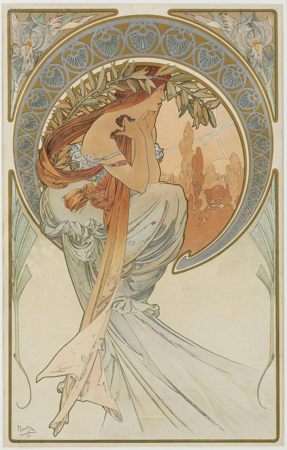
Alphonse Mucha’s 1898 lithograph The Arts 4 represents the culminating chapter of his influential decorative cycle celebrating the creative disciplines. As the final panel in The Arts series, this composition embodies the power of literature and written expression, transforming a simple reading scene into a resonant allegory of intellectual and aesthetic pursuit. Radiating the hallmarks of Art Nouveau—flowing lines, organic motifs, and a harmonious palette—The Arts 4 invites viewers to reflect on the symbiotic relationship between text and image, imagination and reality. Beyond its immediate decorative appeal, the panel conveys a timeless message about the role of literature in shaping culture and individual identity, making it one of Mucha’s most compelling explorations of art’s transformative potential.
Historical Context and Series Overview
By 1898, Alphonse Mucha had already established himself as a pioneer of Art Nouveau through theatrical posters, advertising prints, and decorative panels. His early success with Sarah Bernhardt’s Gismonda poster led to numerous commissions, including a set of four allegorical panels known collectively as The Arts. Each panel in the series corresponds to a distinct creative domain—painting, music, dance, and literature—rendered through the figure of an idealized female allegory. The Arts 4, dedicated to literature, completes this quartet and was conceived at a moment when printed media, books, and magazines were experiencing a golden age of mass circulation. Mucha’s choice to depict literature as a sacred yet accessible pursuit reflects the era’s fascination with the written word and underscores the democratizing power of print technology at the fin de siècle.
Composition and Spatial Dynamics
The Arts 4 employs a vertical format common to Mucha’s decorative panels, directing the viewer’s eye in an upward sweep that mirrors the ascent of ideas from page to mind. At its center sits a young woman in gentle profile, perched on an elegant curved bench or low pedestal. Her body leans forward, fully absorbed in the open book resting in her lap. The figure is enclosed within a circular halo of interlocking motifs—a mandorla that frames her torso and head—nestled inside a rectangular border with decorative corner vignettes. The circular form conveys an intimate focus on reading, while the outer frame situates the scene within a larger architectural and ornamental context. The interplay between circle and rectangle thus balances introspection and outward connection, suggesting that literature links personal reflection with broader cultural narratives.
Color Palette and Tonal Balance
Mucha’s palette in The Arts 4 is characterized by muted earth tones, gentle pastels, and touches of metallic gold ink. The background halo behind the reader glows with a soft apricot wash, evoking the warm glow of lamplight or dawn. The figure’s flesh tones are rendered in delicate pink-beige, modeled with subtle graduations that convey volume without stark contrasts. Her drapery and the surrounding border motifs employ a blend of cream, sage green, and pale grey, each hue chosen to harmonize across the composition. Gold accents in the halo’s geometric filigree and the corner floral panels add a refined luminosity, lending the image an ethereal quality. By avoiding high-contrast or saturated colors, Mucha ensures that no single element overwhelms the design; instead, the entire piece resonates with an understated elegance befitting the contemplative act of reading.
Line Work and Ornamental Flourish
Central to Mucha’s aesthetic is his mastery of line, and The Arts 4 exemplifies his ability to fuse expressive contours with intricate ornamentation. The woman’s silhouette is traced in a confident, unbroken stroke, defining her posture and the gentle curve of her spine. Within that outline, thinner hairline lines articulate the folds of fabric, the curls of her hair, and the veins of ivy leaves that entwine the bench. The circular halo is composed of interlaced rings and radiating arcs, each rendered with precise, rhythmic strokes that evoke both mechanical geometry and organic growth. In the corner panels, stylized ivy and iris blossoms intertwine in a tapestry of curling tendrils. By varying line weight, Mucha achieves a vibrant surface texture: bold strokes guide the eye, while delicate filigree rewards close inspection, creating a dynamic interplay of form and decoration.
Allegorical Significance and Literary Iconography
As the allegory of literature, The Arts 4 employs visual symbols that underscore reading’s transformative power. The central figure holds an open book, its pages softly curved as though caught in a gentle breeze of imagination. Her absorbed expression and restful posture suggest a state of creative immersion. The ivy wreath entwined around her bench alludes to growth, memory, and fidelity—qualities associated with classical literature and its enduring themes. The circular halo framing her head evokes the aura of a scholarly saint or muse, elevating the act of reading to a near-sacred ritual. Subtle references to quill pens and manuscript scrolls appear in the border’s linework, weaving a network of literary allusions that extend beyond the immediate scene. Together, these elements frame literature as both a personal sanctuary and a communal legacy, bridging past and present through the written word.
Treatment of Drapery and the Human Form
Mucha’s depiction of drapery in The Arts 4 balances naturalistic observation with stylized rhythm. The reader’s gown is gathered at the shoulder and waist, its folds cascading around her legs before trailing into the blank lower margin. Fine parallel lines indicate the fabric’s weight and direction, while broader washes of tone suggest the cloth’s volume and depth. This dual approach—line for contour, wash for mass—gives the drapery a sculptural quality, as though the figure has been carved from ivory and then animated by the suggestion of wind or breath. The human form beneath the fabric is rendered with gentle modeling: soft shadows at the shoulder blade, subtle highlights at the cheek, and a nuanced rendering of the neck’s curve. The interplay between the body and its covering underscores the fusion of flesh and idea, reminding viewers that literature both shapes and is shaped by human experience.
Botanical and Architectural Motifs
In keeping with Art Nouveau’s celebration of nature, The Arts 4 incorporates botanical motifs that bridge the organic and the man-made. Ivy leaves and iris blossoms appear in the halo’s corner panels, their shapes echoing the curling lines of the figure’s hair and the drapery’s folds. The bench upon which the reader sits is carved with foliate patterns, suggesting a seamless relationship between furniture design and natural forms. The circular halo itself draws on medieval manuscript illumination, where roundels and filigree often framed saints and illuminated initials. By synthesizing these sources—classical horticulture, medieval art, and contemporary ornament—Mucha creates a multifaceted visual language that honors nature’s diversity while asserting the crafted beauty of human design.
Lithographic Technique and Craftsmanship
The Arts 4 was produced using chromolithography, a process that allowed Mucha to reproduce his complex designs in large editions without sacrificing finesse. He began with detailed preparatory sketches and transferred them onto lithographic stones or plates using greasy crayons and tusche. Each color required a separate stone, carefully registered to align with neighboring plates. The artist’s translucent washes—such as the halo’s apricot glow and the cream tones of the drapery—result from precisely controlled ink densities and multiple overlays. Metallic inks highlight specific motifs, adding depth and shimmer. Mucha worked in close collaboration with skilled printers, refining ink formulations and paper textures until the final proofs captured his intended luminosity and line clarity. This technical rigor elevated his decorative panels to the level of fine art and set a benchmark for commercial printmaking.
Influence of Japonisme and Classical Traditions
Mucha’s style in The Arts 4 reflects the confluence of Japonisme and a revived interest in classical and Byzantine art. The flattened planes of color, asymmetrical floral corner vignettes, and sweeping curves evoke Japanese woodblock prints, while the halo’s mandorla and the figure’s serene pose recall Byzantine icons and classical sculpture. Yet Mucha does not merely juxtapose these sources; he synthesizes them into a distinct visual idiom. The result is a work that feels both modern and timeless, celebrating cross-cultural exchange and positioning literature within a global tapestry of artistic traditions. His decorative strategies—meticulous linework, rhythmic ornament, and harmonious color relationships—would go on to influence graphic designers, typographers, and illustrators well into the twentieth century.
Reception and Legacy
Upon its release, The Arts 4 was immediately embraced by collectors of decorative prints and by design enthusiasts eager to adorn homes and public spaces with Art Nouveau aesthetics. Its allegorical depth and technical excellence solidified Mucha’s reputation as a master of lithographic art. The panel influenced interior designers, who adapted its botanical motifs for textile patterns and furniture inlays, and inspired typographers to explore handcrafted letterforms. In the decades that followed, Mucha’s work experienced periodic revivals—in 1920s modernist reinterpretations, in 1960s Art Nouveau retrospectives, and in contemporary graphic design circles. The Arts 4 endures as a touchstone for the harmonization of fine art and functional design, its themes of literary inspiration continuing to resonate in an age of digital and print media alike.
Modern Resonance and Applications
In the twenty-first century, The Arts 4 remains a wellspring of inspiration for artists and designers across disciplines. Digital illustrators reinterpret its circular frames and floral borders for website interfaces, while fashion brands reference its flowing drapery in seasonal prints. Book cover designers draw on Mucha’s visual vocabulary to evoke literary elegance, and educators highlight the panel in courses on graphic history and Art Nouveau. Moreover, the allegory of the solitary reader speaks to contemporary conversations about literacy, focus, and the role of books in an era of screens and algorithms. By embodying the enduring value of literature and the aesthetic pleasure of printed form, The Arts 4 continues to engage new audiences and affirm the power of art to bridge past and present.
Conclusion
The Arts 4 by Alphonse Mucha stands as a masterful synthesis of allegory, decoration, and technical finesse—a testament to the artist’s vision of art as an integral component of human culture. Through its fluid line work, harmonious color palette, and symbolic interplay of botanical and architectural motifs, the panel elevates the simple act of reading to a universal celebration of imagination and intellectual pursuit. Its legacy, rooted in the golden age of lithography, extends through generations of designers and readers who find in Mucha’s imagery a timeless affirmation of literature’s transformative power. More than a decorative print, The Arts 4 endures as an emblem of Art Nouveau’s greatest aspiration: to beautify life while illuminating the human spirit.