Image source: wikiart.org
First Look: A Beam of Light Turned Into Structure
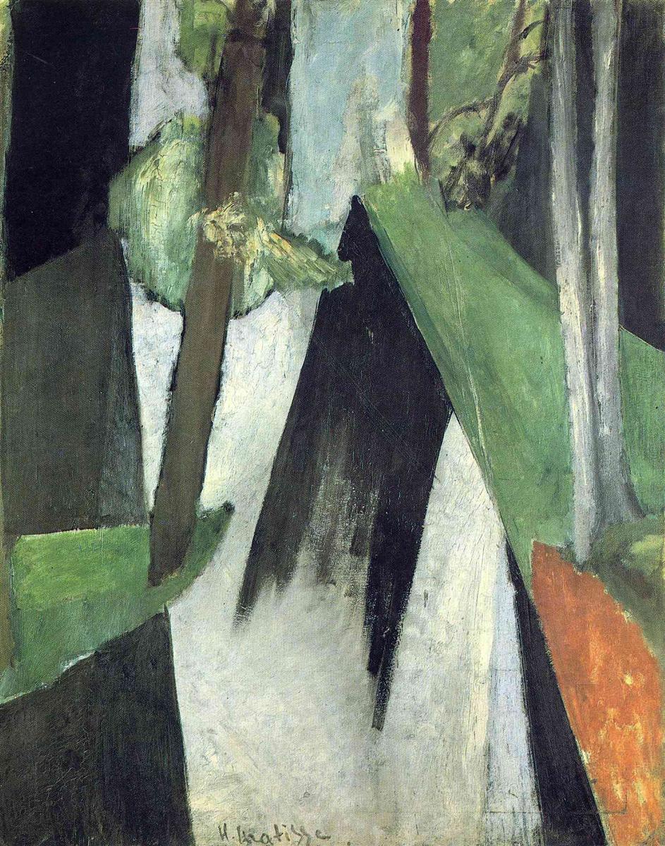
Henri Matisse’s “Sun’s Ray” (1917) reduces a familiar moment in nature—the sudden angle of sunlight cutting through trees—to a set of firm planes, wedges, and verticals. Instead of painting leaves, bark, and sky, he translates the event of light into geometry. A tall format frames a shallow, forest-like space made from pale grays, dense blacks, soft blue-greens, and a single flare of rusty orange at the right edge. The central diagonal, a pale wedge edged by a darker triangular shadow, reads as the titular ray; vertical bars to either side imply tree trunks; broad green facets suggest tilted foliage or embankments catching light. The picture is nearly abstract, yet the sensation of standing in woods at a particular hour is unmistakable. Matisse gives us not a scene but an occurrence, not a place but the way light organizes a place in an instant.
1917: Discipline, Reduction, and a New Use of Black
The date situates the painting at the heart of Matisse’s wartime recalibration. By 1916–1917 he had tempered Fauvism’s blazing chroma into a language based on balance, value, and structural line. Black returned as an active color that could anchor planes, not merely describe shadow. The works from these years—portraits of Laurette, spare landscapes around Issy and the Seine, and experimental interiors—share a clear intent: to build a painting from a few essential relationships rather than a swarm of descriptive detail. “Sun’s Ray” shows the method at full power. Color is limited, modeling minimal, and drawing is carried by edges that behave like architecture. The result feels modern and timeless at once, as if a classical order had been reinvented in the woods.
Composition: Vertical Trunks, Diagonal Light, and a Locked Surface
The composition hinges on a triad of movements. Strong verticals at left and right establish the forest’s pillars. A decisive diagonal, starting high right and slanting down toward the center, cleaves the picture like a blade of brightness. A counter-diagonal in black leans against it, creating a narrow aperture of pale ground between them. These few directions produce a convincing spatial drama without resorting to traditional perspective. Overlaps do the work: a gray trunk occludes a green plane, the black wedge rides on top of a light field, a thinner tree at far right slips behind the slanted green. Despite these cues, depth remains shallow; Matisse wants the event to sit near the surface, where paint and light can meet without illusionistic distance.
Planes Instead of Objects
One of the painting’s quiet revolutions is how it replaces objects with planes. Where another painter might list tree, branch, rock, path, and sunbeam, Matisse constructs broad facets that can be read as multiple things at once. The big green rhomboid can be a leaf canopy, a bank, or simply a plane catching light; the long white wedge is a path or a clearing or the sun’s shaft made visible by dust and air; the black mass is cast shadow and also a compositional counterweight. This ambiguity is not a game of riddles; it’s a way to keep the painting free of anecdote so the relations between shapes can carry emotion and clarity.
The Palette: Greens, Grays, and a Single Flame
Color is reduced to do maximum work. The green family ranges from sage and celadon to cool viridian, each chosen for its value rather than its local truth. Grays drift from pearl to slate, sometimes brushed thin so that the canvas weave cools them further. Black is full-bodied and opaque, an assertive color-field rather than a dulling tone. Then there is the small but potent patch of iron-oxide orange on the right, a flare that tilts the whole chromatic balance toward warmth at the painting’s edge. This lone warm accent operates like a sun-warmed bark or an earth cut exposed to light. Remove it and the scene chills; include it and the temperature of the whole rises a degree, as happens outdoors when sun strikes a nearby surface.
Black as Architecture, Not Shadow
In “Sun’s Ray” black is the painting’s carpentry. The central triangular shadow is not glazed or softened; it is laid like a board, with the brush moving decisively and the paint covering completely. Along the edges of trunks and planes, black either locks shapes together or pries them apart. Because the black is so assertive, Matisse can keep every other value airy. The whites and pale grays are allowed to be genuinely light without losing structure. This is how the “ray” reads as light though the paint is opaque: the surrounding blacks and deep greens are tuned to let the pale wedge feel bright by contrast alone.
Brushwork You Can Read With Your Eyes and Hands
The surface speaks plainly of its making. In the green planes, broad strokes pull in single directions so the bristle tracks align with the plane’s tilt; where Matisse wants a tougher, bark-like feel, he scumbles across, letting underlayers show. The pale wedge includes passes that thin near their ends, leaving feathery edges that suggest illumination fading into air. The large black triangle is brushed more densely, the strokes fanning slightly at the base to imply a shadow that dissipates with distance. The material truth of each zone—thin here, thick there, smooth against rough—becomes a coded description of space and light as tactile facts.
Abstraction Taught by Nature
Although geometric, the picture remains representational at heart because its abstraction is taught by the observed event. Sunbeams in wooded spaces do fall in clean, wedge-shaped shafts; trunks do read as vertical bars; a hillside or canopy can resolve into few, strong facets at certain distances and hours. Matisse does not impose geometry upon nature so much as accept the geometry nature offers at the instant when a ray slices through. That acceptance allows him to push simplification very far without forfeiting credibility. The painting’s authority is born of this pact between eye and structure.
Rhythm and Counter-Rhythm
The picture’s dynamism arises from alternating rhythms. Vertical trunks are steady beats; angled planes are syncopations; the central light wedge is a long, sustained note. Where the black triangle meets the pale wedge, their edges produce a vibrating seam, like two strings almost in unison. Further up, thin branches and smaller green fragments add inner rhythms, preventing the big shapes from freezing into diagram. These temporal metaphors are useful because they describe how the viewer’s eye actually travels, quickening at tight joints, resting on broad fields, and leaping along diagonals.
Space Built From Value Rather Than Perspective
Traditional perspective grids are absent. Instead, value steps define distance. Lightest lights sit in the center and lower foreground; mid-grays and bluish greens occupy the middle register; deepest blacks and dark greens press nearest to the picture plane. The effect is of space that opens where light gathers and closes where darks insist, a way of constructing depth that returns repeatedly in Matisse’s interiors and still lifes from the same period. It reflects a modernist understanding that relative brightness can build a believable world without measuring vanishing points.
The Event of Light as Subject
“Sun’s Ray” shows Matisse thinking of light as an active subject rather than a passive condition. Paintings of sunlight often render its consequences—bright leaves, glinting water, sharp contours. Here the ray itself becomes form. The title tips the hand, but the design already had. The wedge is treated with the same dignity as a trunk; it owns its edges and occupies its place. By making the ray an equal citizen among solids, Matisse gives visibility to what is usually invisible except by effect. The picture becomes a meditation on how painting can make phenomena feel almost material.
Relations to Sculpture and Construction
Matisse’s sculpture—especially his practice of building forms in clay by joining clear facets—echoes here in the way planes abut. The central black and light wedge meet like two parts of a maquette, their seam intentional and legible. Even the rust-colored patch at right sits like an inserted element. This sculptural thinking keeps the canvas from turning into a mere tonal study; it feels constructed, not brushed into vagueness. The outcome is a picture that you can “assemble” in your own looking, re-affirming its clarity each time your eyes trace the joins.
The Right-Edge Orange: Small Area, Large Leverage
The sliver of earthy orange at the right might seem incidental, but it carries large compositional leverage. Chromatically it counters the coolness of greens and grays, making the central light feel warmer without changing its paint. Spatially it pops forward, shoring up the right margin so the big green plane does not slide out of the frame. Symbolically it nods to the earth below the foliage or a trunk lit so strongly that bark’s iron warms. Because it is the only saturated warm, it also acts as a quiet signature, a point of human selection inside a field of nature’s cool tones.
The Tall Format and Human Scale
The canvas’s vertical orientation is not accidental. It mirrors the tallness of trunks and the path of light slicing down from above, but it also aligns with the human body. When you stand before the painting, the beam’s path feels almost life-sized, as if you could step into it. That bodily rapport deepens the sense of immediacy. The format also allows Matisse to keep the design simple while ensuring that each plane enjoys generous breathing room. No need for miniature detail; scale does the expressive work.
Silence Where Detail Would Be Noise
There are no leaves rendered one by one, no insects, no bark textures beyond a few scrapes and shifts of direction. This silence is an ethical choice. In a painting about the presence of light, detail would be noise. Matisse clears the stage for the main actors—the ray, the trunks, the counter-shadows—and trusts that the viewer’s memory of forest experiences will supply the rest. The restraint is not austerity for its own sake; it is a way to honor attention. Less description equals more concentration.
Dialogue With Cubism, Loyalty to Experience
“Sun’s Ray” bears a family resemblance to Cubism in its planar simplification and its insistence on the picture plane, yet it remains loyal to a single, observed viewpoint. There is no multi-perspectival shuffle. Planes are not broken to show successive moments; they are clarified to show one moment intensely. You sense the artist negotiating with Cubism’s lessons, taking from them what reinforces clarity and refusing what would distract from the lived sensation of a ray piercing shade. That negotiation helps explain why the painting feels both abstractly strong and sensuously convincing.
The Eye’s Journey Through the Picture
Lookers often describe a sequence when they stand with this work. First, the pale wedge catches the retina; then the eye slides up its right edge into the large green, crosses to the little orange flare, and bounces off the vertical tree at the far right. From there it returns diagonally to the black triangle, whose tapering base sends a soft gradient downward into the lower light. Finally, the gaze rises along the left vertical to begin the circuit again. The painting sustains this loop because every edge is tuned: some crisp, some soft, all intentional.
Lessons for Painters and Viewers
For painters, “Sun’s Ray” is a primer in building a picture from a reduced grammar: two or three directional forces, a disciplined value scale, and a handful of hues chosen for relation rather than description. It shows how black can be a color and how a single warm can tilt an entire climate. For viewers, it offers a way to look that privileges relations over names. You can ask, “How does this plane lean against that one?” or “What happens when the black meets the white here?” and find your understanding of the subject—light in space—deepening without any narrative help.
Why “Sun’s Ray” Endures
The painting endures because it captures an elemental experience while speaking a thoroughly modern language. Everyone knows the quiet drama of walking into a shaft of light in a grove. Matisse abstracts that event until it becomes a structure you can hold in your mind. By doing so he achieves what few pictures manage: he turns a passing instant into a stable form without extinguishing its vitality. The canvas still feels like weather crossing a place, like shadow and brilliance negotiating a truce. It is both analysis and poem, both diagram and breath, and that doubleness keeps it inexhaustible.