Image source: wikiart.org
Introduction
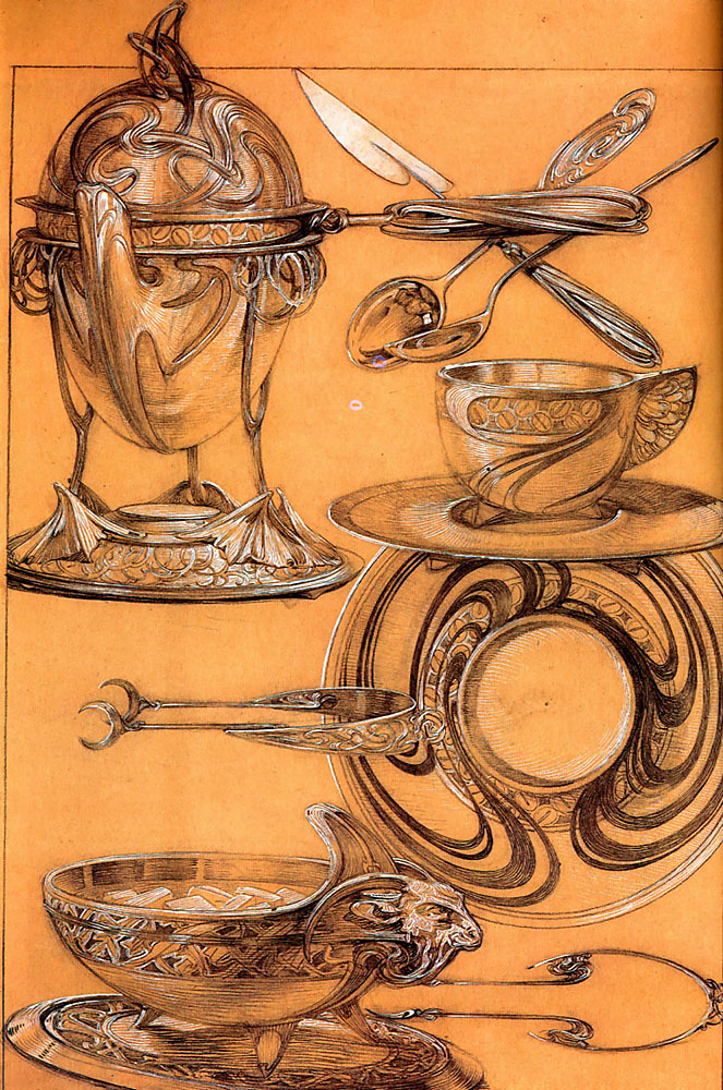
Alphonse Mucha’s “Studies” from 1902 offers a privileged look into the engine room of Art Nouveau design. Rather than staging a theatrical heroine or a commercial scene, this sheet assembles a family of tableware—tureen, bowls, plate, cup and saucer, knives, spoons, and serving tongs—drawn with luminous precision on warm toned paper. It is a blueprint for elegance and a manifesto for the period’s belief that beauty should suffuse everyday objects. The whiplash curves and vegetal lines that made Mucha’s posters famous here become structural ideas for handles, rims, feet, and spouts. What we witness is the moment when ornament turns functional, and function becomes a carrier of style.
Historical Context and Purpose
The year 1902 finds Mucha at the height of his Parisian acclaim and deeply committed to the applied arts. Around this time he produced pedagogical portfolios that codified the Art Nouveau vocabulary for students and craftsmen. “Studies” belongs to that spirit of dissemination. It is not a finished advertising image but a working demonstration of how the same ornamental language can generate a complete service for the table. The sheet invites translation from paper to metal and ceramics, showing makers how to think in curves, how to distribute motifs across a set, and how to maintain unity while allowing variety.
Medium, Technique, and the Illusion of Metal
The surface glow that animates the objects is achieved through firm graphite or ink lines strengthened by white heightening on ochre paper. Mucha deploys the toned ground as a mid-value, then models volume by pulling highlights with white touches that mimic the flash of polished silver. Darker strokes define recesses and undercuts, suggesting cast or hammered metal. This method is as instructive as it is beautiful: a silversmith could read these drawings as a map of where light will break on convex surfaces or pool inside a carved relief. The medium thus prefigures material, making the objects feel almost fabricated.
The Grammar of the Arabesque
Across the sheet a single ornamental grammar keeps reappearing: the whiplash line that coils, turns, and sprouts leaves, sometimes as pure ribbon, sometimes as a stem-like relief. Handles curl into sinewy loops that flare and return; rims host bands of alternating ovals; feet rise like budding shoots. Even the negative spaces between utensils seem to breathe the same spiraling air. This grammar does not merely decorate; it generates form. A bowl’s foot becomes a cluster of plant-like supports. A knife handle tapers like a petiole. A lion-head terminal grows from the rim as if the vessel had a living anatomy. Mucha shows how line can be the seed of three-dimensional structure.
Organization of the Sheet and the Flow of Attention
Although the page presents multiple objects, it is not a random collage. A quiet architecture guides the eye. The upper left is anchored by a lidded tureen on raised feet, its bulbous body counterweighted by a compact cluster of cutlery and a cup at the upper right. The center right hosts a plate whose swirling decoration radiates centrifugally, while the lower register features a wide bowl with an animal-head terminal and a set of serving spoons. Diagonals knit these stations together. A knife laid on the horizontal axis points toward the plate’s orbit; the tongs and ladle create a downward sweep to the punch bowl. The result is a choreographed survey that moves from vessel to implement and back again, mirroring the way a diner’s attention travels around a set table.
The Study of Ellipses and the Discipline of Draftsmanship
Mucha’s command of ellipses underwrites the entire design. Bowls, saucers, and plates all sit at slightly different tilts, each ellipse tightened or relaxed to match its orientation. This discipline ensures that the objects share a believable space even as they float freely on the page. The rims are drawn with supple double lines that thicken at points of foreshortening, while interior rings trace the descent of light into the cavity of a vessel. The cup at upper right, for example, shows the inner ellipse offset against the outer lip, an elegant demonstration of thickness and material. Such clarity of drawing anticipates the precision required in fabrication and invites measurement without sacrificing grace.
Ornament as Structure: Handles, Feet, and Lids
The sheet’s most instructive passages reveal how ornament becomes structure. The lidded tureen’s handles swell organically from the body, their negative spaces shaped to receive the hand. The tripod feet echo the handle’s rhythm while stabilizing the spherical mass above. On the cup, a wing-like handle springs outward in a curve that looks decorative yet locates the thumb naturally. The saucer beneath repeats the motif in shallow relief so that cup and support read as a pair. On the serving bowl, a sculpted beast head marks the terminal, a flourish that also gives the hand a tactile reference point when carrying or pouring. Mucha’s ornament is never parasitic; it grows from use.
Motifs and Symbolic Resonances
Plant-based whiplashes dominate, but zoomorphic notes enliven the set. The animal head at the lower left suggests vitality and strength, a guardian of the feast. Elsewhere, the cutlery handles take on a dragonfly-like profile, slim bodies widening into wing-shaped fins. The natural world, rather than being copied literally, has been abstracted into ergonomic and symbolic shapes. The recurring oval chains along rims hint at grape clusters or seeds, appropriate to vessels that will host food and drink. The plate’s spiraling pattern suggests poured liquid or the eddying of steam, translating ephemeral phenomena into durable decoration. These resonances bind function to image, making the set feel thematically coherent.
The Dialogue Between Metal and Ceramic
Although many forms read as silver or pewter, the saucer and plate could be ceramic, and Mucha’s drawing accommodates both materials. Reliefs are low enough to be chased in metal but also shallow enough to be molded in faience or porcelain. The designer’s restraint—no extreme undercuts, few protrusions—implies an understanding of casting and firing limitations. This flexibility aligns with Art Nouveau’s democratizing impulse: the same design language could travel from luxurious silver to more affordable ceramic, allowing a broad public to participate in the new style.
Ergonomics, Use, and the Ritual of the Table
The implements in “Studies” are designed not only to look beautiful but to enact the choreography of dining. The serving ladle has a generous bowl for soups or punches and a hook-like tail that prevents it from sliding into the vessel. The tongs feature asymmetric ends, one clawed and one spoon-like, suitable for gripping sugar or ice. Knife and spoon handles widen subtly where the hand grips them, then taper to maintain elegance. Every curve anticipates touch. The objects thus stage a ritual: lifting a lid, ladling a portion, setting a cup into its saucer, resting cutlery between courses. Mucha draws not merely objects but actions.
Light Logic and the Performance of Shine
The pattern of highlights across the sheet models a consistent source of light, slightly above and to the right. Rims catch a bright edge; under-surfaces sink into translucent umber; reliefs glint at their crests. Mucha uses this performance of shine to clarify material and to cue the viewer’s imagination. One can almost see reflections moving across a polished surface as a server walks by. On the plate, the highlight arcs emphasize the spiraling ornament, making it read like eddies of light. The resulting illusion is tactile; even without color, the silver seems to glow.
Variation within Unity
A service must feel like a family, but not all siblings should look alike. Mucha achieves unity through a tightly controlled vocabulary—ovals in chain, flowing strapwork, tripodal feet—while giving each item a personality. The cup’s wing-handle is airy, the tureen’s finial substantial, the large bowl’s animal terminal dramatic, the plate’s ornament circular and kinetic. This variation prevents monotony on the table while ensuring that a glance identifies the set. The page functions as both a pattern book and a manifesto for how to maintain identity across diverse forms.
Pedagogy and the Applied Arts
“Studies” reads like a didactic page. It demonstrates line weight, modeling, and the transposition of two-dimensional ornament into three-dimensional relief. It shows how to arrange a sheet so that multiple designs can be understood at once. For students, the lesson is that design proceeds by iteration and that excellence lies in the relation of parts. For makers, the lesson is that drawing must already contain the object’s logic. Mucha’s pedagogical ambition is practical and ethical: he advocates for the dignity of the applied arts by equipping others to produce beauty at scale.
Relationship to Mucha’s Broader Oeuvre
The language on this sheet connects directly to Mucha’s posters, jewelry designs, and interiors for luxury boutiques in Paris. The same arabesques that once framed actresses and allegories now support lids and wrap around cups. The sensuous line that defined hair and drapery becomes a structural rib or a rim pattern. This continuity shows that Mucha did not regard the applied arts as secondary to pictorial art. Instead, he saw them as contiguous domains where a single idea—line as life—could migrate from the wall to the hand. The sheet therefore occupies a central place in understanding his vision of a unified decorative environment.
The Plate as Microcosm of Movement
The plate at the right deserves special attention. Its decoration does not sit passively on the rim but whirls toward the center in looping swathes, creating the sensation of motion within a static circle. The empty well remains calm, ensuring that food placed on it will not be visually confused, while the surrounding currents impart energy. This solution solves a perennial problem in tableware design: how to enliven a plate without compromising its function. The plate becomes a microcosm of Art Nouveau’s credo—the dynamism of nature harmonized with everyday use.
The Poetics of the Finial and the Lid
The lidded tureen at upper left is crowned by a finial that seems to knot itself into being. The form is at once vegetal and abstract, like a tendril gathered into a topknot. Functionally, the finial offers a cool spot for the hand; aesthetically, it completes the vessel’s vertical thrust. The lid’s lip tucks confidently over the rim, promising a secure fit that will keep contents warm. Here again Mucha refuses the opposition between beauty and utility. The poetics of the lid are inseparable from the mechanics of sealing and carrying.
A Designer’s Sense of Scale
The sheet communicates scale without written measurements. Thickened walls in the bowl, stout junctions at the handles, and the relative size of spoons to vessels all calibrate mass. Even the modest flare of a foot tells us how weight will be distributed. Mucha’s sense of scale ensures that the pieces would feel balanced in the hand and substantial on the table. The viewer does not need a ruler to imagine the heft of the tureen or the lightness of the cup; the drawing translates these sensations visually.
From Drawing to Fabrication
One can imagine the next steps after such studies. A silversmith would derive patterns from the profiles, model the relief in wax, and cast or hammer the forms before chasing the ornament. A ceramic factory would adjust the depths for mold release and consider the interplay of glaze and relief. Because Mucha’s lines are clean and his volumes rational, the leap from design to prototype is short. The sheet thus sits at the interface between studio and workshop, the place where the idea becomes a thing.
The Ideal of Beauty in Daily Life
At its heart, “Studies” argues that daily rituals deserve artful companions. Soup, tea, bread, wine, and fruit are not merely consumed; they are framed by vessels that slow time and dignify the act of sharing. By extending his celebrated ornamental language to tongs and saucers, Mucha insists that beauty is not confined to galleries or theatres. It resides on the table, in the hand, at the moment when conversation flows and the curve of a handle becomes an unconscious pleasure. The sheet makes a radical claim with gentle means: life is improved when design is thoughtful.
Legacy and Contemporary Relevance
More than a century later, the lessons of “Studies” remain pertinent. Designers still wrestle with how to unify a product line, how to carry a motif across scales, how to balance ornament with clarity. The renewed interest in craft and table culture makes the sheet feel current, not nostalgic. Its wisdom is practical—draw with an eye to making—and philosophical—let form grow from living lines. In these drawings, one senses the durability of Mucha’s vision, a vision in which the curve is a form of generosity and the everyday object a site of quiet wonder.