Image source: artvee.com
Introduction
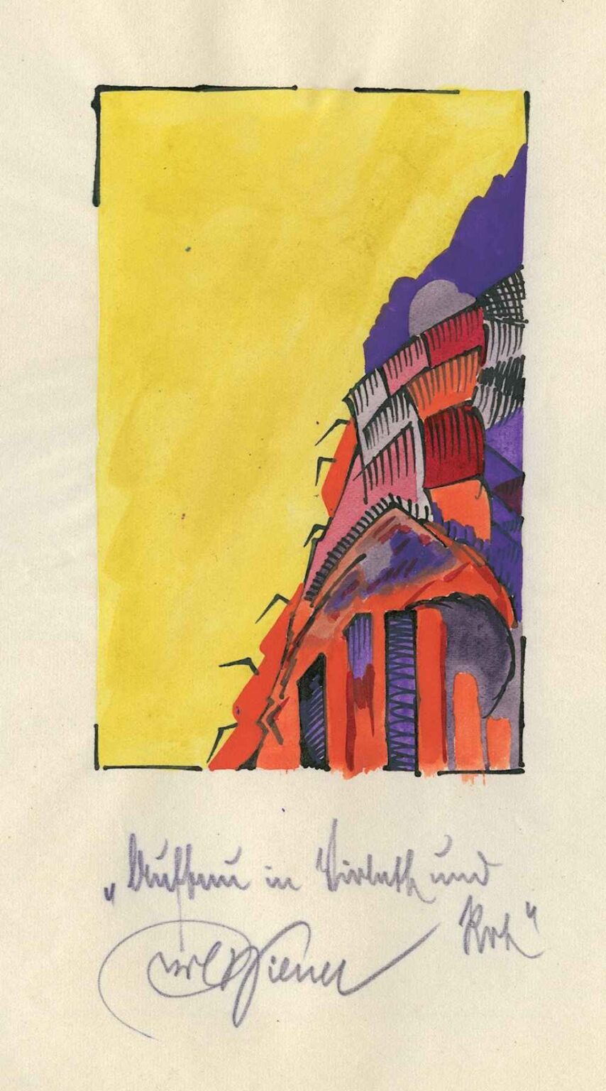
Karl Wiener’s 1921 drawing Structure in Violet and Red exemplifies the artist’s early forays into geometric abstraction, synthesizing bold color contrasts with dynamic, architectural forms. At first glance, the composition is anchored by a vivid red mass in the lower right corner, punctuated by vertical and diagonal accents. Rising from this foundation is an intricate layering of violet shapes, from solid arcs to cross‑hatched wedges, all contained within a roughly drawn rectangular frame. The expansive field of yellow wash dominating the left half of the sheet provides a dramatic counterpoint, its uniform luminosity emphasizing the textured complexity of the colored forms. Bold ink outlines trace the boundaries of both the frame and the abstracted shapes, unifying drawing and color into a cohesive visual statement. Through Structure in Violet and Red, Wiener invites viewers to consider the interplay of color, line, and spatial rhythm as building blocks of a new pictorial language.
Historical Context
In the aftermath of World War I, European artists sought to redefine visual art by stripping it of representational conventions and embracing abstraction. Vienna, Karl Wiener’s principal milieu, had once been the epicenter of the Secession and had nurtured both Klimt’s ornamental stylings and Kokoschka’s expressionist fervor. By 1921, however, younger generations of artists were gravitating toward constructivist and cubist principles, responding to an era of technological innovation and societal upheaval. Wiener, though less documented than some of his contemporaries, was clearly conversant with these avant‑garde currents. Structure in Violet and Red emerges from this ferment, reflecting a desire to articulate form and color as autonomous phenomena. Rather than depict a familiar scene, Wiener abstracts the basic elements of architecture—walls, arches, scaffolding—into a distilled vocabulary of planes and lines, carrying forward the modernist conviction that art could mirror the structural order of a rapidly changing world.
Composition and Spatial Dynamics
Wiener organizes Structure in Violet and Red around a diagonal thrust that emerges from the lower right corner and extends upward toward the center of the frame. This dynamic axis disrupts the rectangular stability of the overall border, infusing the composition with a sense of forward motion and growth. The red mass that anchors the lower corner comprises a series of interlocking rectangles and trapezoids, some filled with solid pigment and others featuring vertical hatch marks. From its apex, violet shapes—arches, scalloped edges, and hatched cross‑beams—layer over one another, creating successive receding planes. The largest violet form curves upward like a shell or vault, while smaller elements fragment its surface, introducing glimpses of underlying hues. The vast undifferentiated yellow field to the left provides negative space that both balances and accentuates the complexity on the right. Through this careful orchestration of positive and negative areas, Wiener achieves a dynamic interplay between containment and expansion, structure and openness.
Color and Contrast
Color serves as the principal driver of emotional and visual impact in Structure in Violet and Red. The red pigment, applied with confident, broad strokes, radiates energy and warmth. Its vertical bars at the base resemble columns, suggesting architectural solidity. Violet—the complementary counterpart—appears in multiple tonal gradations, from deep, almost black hatch‑filled wedges to lighter arcs that allow the paper’s texture to show through. The juxtaposition of red and violet creates a visual vibration that holds the viewer’s gaze, while the expansive yellow wash provides a harmonious foil, evoking sunlight or open sky. Wiener’s use of colored pencil permits layering: in several areas, violet strokes overlap red underlayers, producing subtle, dusky hues that enrich the palette. This nuanced chromatic blending underscores the drawing’s material sensibility while preserving the clarity of key color zones.
Line Work and Gesture
Although color dominates the immediate impression, Wiener’s line work underpins the drawing’s structural coherence. Bold ink outlines define the outer border and the principal shapes, establishing a graphic grid within which the colored forms reside. Within these contours, pencil hatchings—both vertical and diagonal—articulate internal volumes and suggest surface texture. Some cross‑hatched areas form dense patterns that recede optically, while lighter, parallel strokes advance, guiding the eye through the composition. The contrast between the assured ink boundaries and the more spontaneous pencil gestures creates a dialogue between control and improvisation. These visible variances—slight wobble in an inked edge or irregular pressure in a pencil mark—remind viewers of the artist’s hand, anchoring abstraction in human presence.
Structure and Symbolism
While Wiener’s work remains firmly abstract, echoes of architectural and mechanical imagery give Structure in Violet and Red a symbolic resonance. The vertical red forms at the base suggest pillars or supports, evoking the foundations of a building or bridge. The successive violet planes that arch above recall vaulted ceilings or layered roofing, implying shelter and enclosure. Small angular protrusions—reminiscent of scaffolding or antennae—interrupt the smooth curves, hinting at construction, repair, or communication. In this way, the drawing can be read as a metaphor for creative process itself: solid underpinnings giving rise to sweeping innovations, tempered by the pragmatic appendages of tools and connections. The vast unworked yellow field may symbolize potential or the unknown, awaiting the insertion of meaning and form.
Technique and Material Considerations
Wiener’s choice of colored pencil and ink on paper reflects both practical and aesthetic priorities. Colored pencil offers immediacy and directness, enabling the artist to switch fluidly between rich pigment applications and delicate hatching. The yellow wash appears to be a diluted gouache or watercolor, applied evenly yet allowing slight variations that lend the field a softly mottled texture. Ink lines—likely applied with a fine brush or technical pen—exhibit slight irregularities in flow, suggesting manual rather than mechanical execution. The paper’s warm‑toned surface, visible in unpainted areas, enriches the overall palette, providing a harmonious mid‑tone against which pure colors can resonate. Together, these materials produce a layered, tactile surface that rewards close viewing, revealing subtle overlaps, streaks, and pencil grain.
Formal Innovation and Context
Structure in Violet and Red sits at the intersection of several modernist threads. Its emphasis on geometric clarity recalls the cubist dissection of form, yet Wiener avoids the collage‑like fragmentation of early cubist experiments. Instead, he builds forms from within, using color and hatch marks to model volumes. The dynamic diagonal thrust aligns the drawing with Futurist celebrations of speed and mobility, though Wiener’s interest lies less in depicting movement and more in capturing the structural logic of progress. Meanwhile, the painting’s abstracted architecture resonates with Constructivist ideals of art serving as blueprint for social transformation. In synthesizing these impulses, Wiener contributes a unique variation on interwar abstraction, emphasizing the painterly immediacy of pencil alongside the measured precision of ink.
Emotional and Intellectual Resonance
Encountering Structure in Violet and Red, viewers often respond to its vivid energy tempered by a sense of stability. The vibrant red ignites excitement, while the violet arcs impart a contemplative, almost musical counter‑melody. The broad yellow expanse evokes sunlight or boundless possibility, inviting expansive thought. Yet the drawing’s intricate layering and rhythmic hatching stimulate intellectual engagement: one is drawn to trace the overlaps, decode the spatial relationships, and consider the harmony of color juxtapositions. This dual appeal—sensual vivacity and formal rigor—demonstrates abstraction’s capacity to engage both heart and mind, fostering an experience that is at once visceral and cerebral.
Legacy and Influence
Although Karl Wiener did not achieve the renown of some avant‑garde luminaries, Structure in Violet and Red stands as a testament to the vitality of interwar abstraction in Vienna. The work anticipates later minimalist and color field experiments, where color and form operate as autonomous presences on the picture plane. Wiener’s integration of pencil hatch work and bold washes foreshadows post‑war artists who embraced mixed media and visible process. In recent years, curators have revisited Viennese abstraction beyond the canonical figures, recognizing works like Structure in Violet and Red for their inventive formal strategies and unique material sensibilities. As part of this emerging reassessment, Wiener’s drawing contributes to a more nuanced understanding of how regional artists translated international currents into personal idioms.
Conclusion
In Structure in Violet and Red, Karl Wiener orchestrates a compelling dialogue between form and color, line and space. Through the interplay of vivid red anchors, intricate violet arcs, and a luminous yellow field, he constructs a dynamic composition that transcends mere decoration to evoke architectural, mechanical, and emotional resonances. The drawing’s layered technique—combining colored pencil, wash, and ink—reveals the artist’s attentiveness to materiality and process. Rooted in the interwar avant‑garde’s quest for a new visual language, Structure in Violet and Red remains a striking testament to the potential of abstraction to articulate both the structures of modern life and the deeper rhythms of human experience.