Image source: artvee.com
Introduction
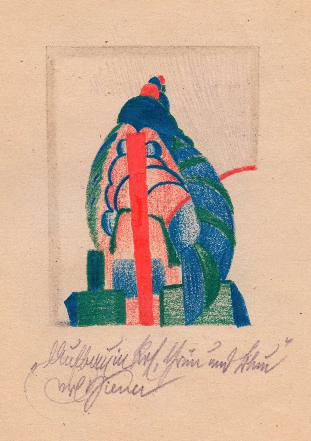
Karl Wiener’s 1923 work Structure in Red, Green and Blue exemplifies the artist’s innovative approach to early modernist abstraction. Rendered in richly pigmented colored pencil on paper, the composition presents a complex interplay of curved and rectilinear forms organized within an implied vertical axis. At its core, two dominant elements—a series of scalloped arcs and a bold central stripe—interlock in a dynamic tension, while blocks of geometric shapes anchor the composition at its base. The vivid trio of red, green, and blue pigments animate the picture plane, creating visual rhythms that draw the viewer’s eye through overlapping layers. Rather than depicting a literal scene, Wiener invites us to explore the underlying “structure” of form and color, engaging both intellect and emotion. In this analysis, we will trace the historical forces that shaped Wiener’s abstractions, unpack the formal strategies that animate this drawing, and consider its enduring resonance in the context of twentieth‑century art.
Historical Context
The early 1920s marked a period of intense experimentation across European art, as creators sought new languages to articulate the upheavals wrought by World War I. In Vienna, the collapse of the Austro‑Hungarian Empire gave rise to a fraught political and cultural landscape. Amid economic hardship and social change, artists looked beyond representational modes to abstraction, believing that distilled forms and pure color could foster deeper, universal connections. Wiener worked alongside contemporaries who embraced the radical ideas emanating from the Bauhaus in Germany, De Stijl in the Netherlands, and Constructivism in Russia. These movements shared a conviction that art need not imitate the visible world but should instead reveal underlying structures—be they mathematical, architectural, or musical. Structure in Red, Green and Blue emerges from this ferment, reflecting both the intellectual rigor and utopian aspirations of the interwar avant‑garde.
Artistic Influences
Although Karl Wiener remains less widely known than some of his peers, his abstractions reveal clear affinities with major currents of the era. The emphasis on overlapping geometric modules recalls the Synchromist painters, who arranged color bands like musical chords. At the same time, the disciplined interplay of curves and angles resonates with Kazimir Malevich’s Suprematist principle: that pure form could convey spiritual transcendence. The central vertical stripe—a vivid red band—invokes El Lissitzky’s “Proun” compositions, where linear elements establish directional thrusts across a plane. Finally, traces of Cubism’s fragmented perspective appear in the way scaled shapes intersect and obscure one another. Yet Wiener synthesizes these inspirations into a distinct visual dialect, one that privileges colored‑pencil texture and the warm intimacy of drawing over the colder austerity of paint or print.
Composition and Spatial Dynamics
Despite its abstraction, Structure in Red, Green and Blue presents a clear architectural logic. The composition is anchored by a vertical red stripe that rises unintermittently from the base to the apex of the drawing. Flanking this axis are scalloped arches—suggestive of vaults or shell‑like forms—that stack in graduated sizes, conveying both depth and movement. At the foundation, rectangular blocks of green and blue provide a stable platform, balancing the more sinuous contours above. The implied framework—a faint penciled rectangle—hints at an enclosing border that has been partially erased, underscoring the interplay between containment and expansion. Through strategic overlaps and shifts in scale, Wiener orchestrates a spatial rhythm that propels the viewer’s gaze upward while inviting closer examination of individual form relationships.
Color Palette and Harmony
In Structure in Red, Green and Blue, color serves as the primary vehicle for emotional and visual impact. The intense red stripe commands immediate attention, its warmth cutting a bright path through cooler surroundings. Adjacent green shapes—rendered in deep emerald pencil—offer a stabilizing counterpoint, evoking associations of growth and equilibrium. Meanwhile, patches of blue, from deep ultramarine to lighter cerulean, introduce a reflective, calming element. Importantly, Wiener layers these pigments rather than applying them in flat fields. The red stripe exhibits subtle variations in density, with underlying paper tones peeking through in places, lending it a tactile, living quality. Similarly, the green and blue areas reveal the grain of the paper and the directionality of each stroke. This nuanced treatment ensures that color retains its purity while also conveying the artist’s hand and process.
Line Quality and Gesture
Although geometry underpins the composition, the drawing’s lines never feel mechanical. Wiener employs a variety of pencil pressures and stroke directions to differentiate structural edges from gestural accents. The curves that form the scalloped arches are drawn with confident, continuous arcs, yet minor undulations betray the artist’s careful hand. The red stripe, despite its boldness, is not perfectly uniform; minute waviness and occasional soft edges suggest the artist’s intimate engagement with the medium. Connecting lines—such as the faint diagonal hatchwork in the background—appear almost as afterthoughts, adding depth without detracting from the vibrant foreground. By modulating line weight and spontaneity, Wiener infuses his abstraction with a sense of vitality and improvisation, reinforcing the dynamic between precision and expression.
Texture and Materiality
Unlike oil or gouache, colored pencil retains the physical qualities of its constituent media: grain, layering, and directional stroke. Wiener exploits these characteristics to enhance the drawing’s material presence. In the green masses, closely spaced vertical strokes create a velvety appearance, while the red stripe’s broader, more horizontal sweeps feel electric and immediate. The blue blocks at the base reveal softer, blended sections juxtaposed with harder-edge pencil marks, suggesting multiple passes of the pencil tip. Even the pale background carries texture in the form of residual hatchings and the panel’s faint rectangular outline. These tactile qualities remind viewers that the work is not a digitally composed graphic but a labor of direct handcraft, where every stroke leaves an indelible trace of the artist’s physical engagement.
Symbolism and Interpretation
While Structure in Red, Green and Blue remains firmly in the realm of abstraction, its forms and colors invite metaphorical readings. The central vertical stripe may symbolize an axis of growth or aspiration, piercing through successive layers of experience (represented by the overlapping arches). The scalloped shapes could allude to organic structures—shells, leaves, or architectural vaults—suggesting a dialogue between the natural and the constructed. The green and blue blocks at the composition’s base evoke foundational elements—earth and water—that provide necessary support for the dynamic energy above. Viewed through a psychological lens, the drawing might depict the journey of consciousness: initial grounding in basic needs, followed by successive expansions of awareness, ultimately unified by a guiding principle or self‑realization (the red axis). By resisting a single fixed meaning, Wiener opens space for the viewer’s own associations and interpretations.
Technique and Medium
Karl Wiener’s decision to work in colored pencil on paper reflects both practical and aesthetic considerations. Pencil offers immediacy; the artist can switch between sharp lines and diffuse shading with ease. In 1923, colored pencils were gaining popularity among avant‑garde artists for their portability and directness. Wiener takes full advantage of this versatility: the wide red stripe is laid down with broad, confident strokes, while the smaller green and blue shapes benefit from precise, controlled applications. The paper’s warm beige tone serves as a mid‑level value, allowing the artist to work both darker and lighter without introducing white pigment. This technique produces a drawing that feels both spontaneous and deliberate—each mark evidences Wiener’s careful planning and his willingness to embrace the medium’s idiosyncrasies.
Emotional and Visual Impact
Although devoid of narrative content, Structure in Red, Green and Blue resonates on an emotional level through its vibrant contrasts and dynamic composition. The vivid red stripe imparts a sense of urgency and life energy, while the green and blue forms temper this intensity with a sense of calm resilience. The rhythmic stacking of curved shapes evokes musicality, as though the work were a visual fugue with repeating motifs and modulated keys. Viewers may experience an initial surge of stimulation from the bold colors, followed by a contemplative settling as they trace the underlying geometric relationships. In this way, the drawing achieves a balance between excitement and harmony, demonstrating how abstraction can engage both mind and heart.
Legacy and Relevance
Although Karl Wiener’s name may not feature prominently in mainstream surveys of early modernism, Structure in Red, Green and Blue holds an important place in the history of abstract drawing. The work anticipates mid‑century artists who would explore colored pencil as a serious medium—figures like David Hockney, whose later pencil drawings similarly blend precision with expressive color. Wiener’s synthesis of geometric rigor and tactile warmth also prefigures minimalist artists who engaged intimately with materials, such as Agnes Martin’s grid paintings, albeit in a different medium. In recent years, curators and scholars have begun to reassess the contributions of lesser‑known avant‑garde practitioners, and works like Wiener’s are gaining renewed attention. Structure in Red, Green and Blue offers a compelling example of how drawing, far from serving merely as preparatory work, can stand as a fully realized form of abstraction in its own right.
Conclusion
In Structure in Red, Green and Blue, Karl Wiener achieves a masterful fusion of form, color, and gesture. Through his bold use of primary pigments, rhythmic layering of overlapping shapes, and nuanced command of pencil texture, he constructs a work that feels both architectonic and alive. Rooted in the interwar avant‑garde’s quest for universal visual languages, the drawing transcends its historical moment to offer enduring insights into the dynamics of abstraction. Viewers are invited to contemplate its structural logic, emotional resonance, and symbolic possibilities, discovering in its vibrant surfaces the traces of human intent and the mysteries of creative order. Nearly a century after its creation, Structure in Red, Green and Blue continues to captivate, reminding us of the power of drawing to reveal new dimensions of form and color.