Image source: artvee.com
Introduction
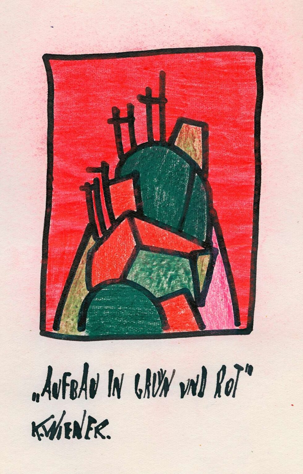
Karl Wiener’s 1921 drawing Structure in Green and Red stands as a vivid testament to the artist’s early exploration of geometric abstraction. At first glance, the composition presents a dynamic cluster of interlocking shapes rendered in deep emerald and blazing scarlet hues, all contained within a loose rectangular frame. The contrasting colors leap from the paper, yet the arrangement of forms conveys a harmonious interplay rather than mere clash. Wiener’s bold use of colored pencil against a pale ground imbues the piece with both immediacy and subtlety: each stroke is visible, yet the overall effect is one of unified energy. Far from a static diagram, Structure in Green and Red pulses with implied movement and invites viewers to trace the relationships between each angular polygon and curved boundary. This analysis will examine the historical backdrop that informed Wiener’s abstraction, unpack the formal strategies at work, and consider the symbolic resonances that render this seemingly simple sketch a profound meditation on balance, tension, and creative order.
Historical Context
Emerging in the wake of World War I, Structure in Green and Red belongs to a period of intense artistic reinvention. The cataclysm of global conflict shattered established conventions and propelled artists toward radical new modes of expression. In Vienna, where Wiener was active, the intellectual climate was energized by cross‑disciplinary debates: architects and designers at the Wiener Werkstätte experimented with unadorned surfaces and functional forms, while musicians such as Arnold Schoenberg and his followers explored atonal structures that mirrored the chaos and fragmentation of modern life. Within this context, Wiener turned to abstraction as a means of articulating the underlying rhythms of reality. His choice of bright, contrasting colors reflects the era’s fascination with synesthesia and the belief that hue could convey emotional and musical vibrations. Structure in Green and Red thus captures a moment when artists sought to rebuild visual language from first principles, forging a new visual grammar out of lines, planes, and pure color.
Artistic Influences
While Karl Wiener never achieved the renown of Mondrian or Kandinsky, his work demonstrates clear affinities with several avant‑garde currents. The compositional grid and emphasis on primary planes recall Piet Mondrian’s Neoplastic experiments, yet Wiener allows for diagonal fractures and circular arcs that Mondrian conscientiously avoided. Traces of Futurism’s celebration of dynamism appear in the overlapping shapes that seem to jostle and flow across the picture plane. At the same time, the piece shares the Constructivist impulse to reduce forms to their elemental geometry, as seen in the works of Vladimir Tatlin and Lyubov Popova. However, Wiener’s application of colored pencil produces a more textured, hand‑crafted surface than the precise painted fields favored by many of his contemporaries. By synthesizing these influences with his own sensitivity to line and hue, Wiener forges a unique voice that balances intellectual rigor with painterly warmth.
Composition and Structure
Wiener organizes Structure in Green and Red around an implied vertical axis that divides the composition into two counterbalancing halves. On the left side, a large emerald semicircle rises like a protective dome, while on the right, a cluster of scarlet polygons stacks upward in irregular tiers. Between these primary masses, smaller shapes—triangles, trapezoids, and rhomboids—fill the interstices, creating a sense of centrifugal force. The outer border, drawn in a thick black line, frames the entire arrangement but is intentionally skewed at the bottom, as if the structure itself must adapt to an uneven foundation. This slight irregularity prevents the piece from feeling overly static. Subtle perspective hints—such as the narrowing of certain shapes toward the top—imply a three‑dimensional volume, yet the overall composition remains resolutely planar. Wiener’s deft placement of each form ensures that no single element dominates; instead, every shape contributes to a balanced yet dynamic whole.
Color and Contrast
The heart of Structure in Green and Red lies in its bold chromatic opposition. The rich green tones, achieved through multiple layered strokes, convey a sense of depth and solidity, while the red areas—worked in a more uniform application—appear to advance toward the viewer. This push‑and‑pull of hue generates visual tension that energizes the composition. Wiener further modulates the palette with touches of warm ochre and soft pink at certain edges, smoothing the abrupt transition between the primary colors and preventing the piece from feeling jarring. The pale, off‑white background provides necessary relief, allowing the vibrant shapes to resonate without overwhelming the eye. Notably, Wiener refrains from blending the green and red directly; instead, he allows each to maintain its purity, relying on juxtaposition alone to create harmony. The result is a composition that feels both vibrant and poised, its colors dancing around an invisible fulcrum.
Line and Gesture
Although Structure in Green and Red exudes a geometric precision, Wiener’s hand remains visible in the slightly uneven pencil edges and the occasional overlap where colors meet. The bold black outline of the frame is deliberately restless, bowing outward at points as though reacting to the energy within. Within the shapes themselves, varying pencil pressures create textural nuance: some planes are densely packed with pigment, while others reveal the paper’s texture through lighter, more open strokes. This interplay of controlled geometry and human gesture imbues the work with warmth, reminding viewers that abstraction is not antithetical to expressivity. Each line, whether defining the border or triangulating internal angles, carries the artist’s intention and evidence of his physical engagement with the medium.
Spatial Dynamics
Despite its refusal to adopt traditional perspective, Structure in Green and Red conveys a sense of spatial interplay through shape overlap and tonal variation. Larger shapes recede or advance based on their color and edge treatment: the darkest green forms tend to sink visually, while the brightest reds seem to float above the surface. Tiny wedges of ochre or pale pink further accentuate this layering, acting like windows into deeper recesses. The slight diagonal tilt of the bottom border suggests the structure sits on an uneven plane, enhancing the illusion of depth. Yet Wiener resists fully immersing the viewer in a three‑dimensional world; instead, he maintains an awareness of the picture plane, treating space itself as one of many compositional elements. This careful balancing act fosters a dynamic tension between surface and depth, keeping the viewer’s eye in constant motion.
Symbolism and Interpretation
Although abstract, Structure in Green and Red invites metaphorical readings that extend beyond formal concerns. The semicircular green dome on the left could suggest shelter or organic growth, while the scarlet stack on the right evokes urban architecture or human‑made structures. Their meeting at the center hints at the intersection between nature and technology—a central preoccupation of early twentieth‑century thinkers. Alternatively, the piece may be read as a visual allegory of harmony and conflict: green representing equilibrium and red symbolizing passion or upheaval. The untethered supplementary shapes—smaller triangles and irregular forms—could stand for individual voices within a collective system, each contributing to the overall harmony despite their unique orientations. By resisting a single narrative, Wiener opens the door for personal associations, allowing the viewer’s own experiences to inform the work’s meaning.
Technique and Medium
Wiener’s selection of colored pencil as his primary medium for Structure in Green and Red reveals both practical considerations and aesthetic intentions. Pencil allows for swift decision‑making and fine control, making it well suited to exploratory compositions. The layering of pigment builds intensity while preserving a sense of immediacy; one can still discern the direction of each stroke and the varying pressure applied. The paper’s slight tooth helps grip the pigment, creating a richly textured surface that contrasts with the smoothness of paint. Wiener’s technique underscores the drawing’s status not merely as a preparatory study but as a finished statement in its own right. The hand‑made qualities of pencil work—erasures, overlaps, and visible stroke rhythms—anchor the abstraction in human labor and affirm the material presence of the artwork.
Emotional Resonance
Beyond its rigorous structure, Structure in Green and Red resonates on an emotional level through its vibrant color interplay and rhythmic composition. The warmth of the red shapes elicits feelings of vitality and urgency, while the green planes offer calmness and stability. Together, they form a visual dialogue that mirrors the ebb and flow of emotional states. The slight irregularities in line and form humanize the abstraction, suggesting that even the most precise systems are shaped by human imperfection and spontaneity. Viewers may find themselves drawn into the composition’s internal logic, experiencing a subtle sense of exhilaration as their eyes trace each contour. At the same time, the full‑bleed intensity of the color fields can evoke a sense of containment, as though witnessing energy held in perfect equilibrium.
Legacy and Impact
Although Karl Wiener did not achieve the widespread recognition of some of his avant‑garde peers, Structure in Green and Red exemplifies the fertile cross‑currents of early modern abstraction. The work anticipates mid‑century explorations of color field painting and minimalist geometry, where artists like Ellsworth Kelly and Agnes Martin would continue to probe the relationships between hue, form, and spatial perception. Wiener’s pencil technique also foreshadows later conceptual artists who embraced drawing as a serious medium, elevating sketches to fully articulated works. In recent years, curators and scholars have revisited Wiener’s contributions, recognizing Structure in Green and Red as a key document of the era’s experimental drive. Its fusion of rigorous compositional thinking and tangible human gesture offers valuable insights into how abstraction served as both intellectual challenge and expressive outlet.
Conclusion
In Structure in Green and Red, Karl Wiener masterfully balances the demands of geometric order with the spontaneity of hand‑crafted mark‑making. Through his dynamic composition, vibrant palette, and nuanced technique, he creates an artwork that feels both meticulously devised and viscerally alive. The drawing encapsulates the interwar period’s quest for a new visual language—one that could accommodate the dislocations of modernity while expressing fundamental truths about harmony, tension, and human creativity. Nearly a century after its creation, Structure in Green and Red continues to captivate viewers with its bold color contrasts and intricate spatial dance. By engaging both the intellect and the senses, Wiener’s composition affirms abstraction’s enduring power to reveal unseen structures and evoke profound emotional responses.