Image source: wikiart.org
First Impressions: Sunlight Turned Into Architecture
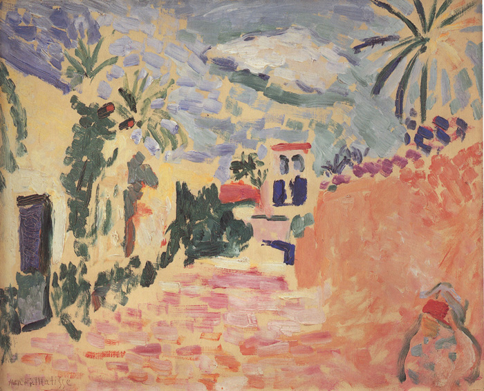
“Street at Biskra” is an ode to heat and glare. The composition opens onto a gently rising lane, flanked by apricot walls, palm clumps, and small white houses whose indigo windows blink in the sun. Above, the sky is not an even wash but a mosaic of lavender, periwinkle, and pearl strokes, like warm wind moving across broken cloud. Every part of the painting—walls, paving, foliage, and air—is built from visible patches of pigment that read as light more than as matter. The scene is recognizably North African, yet it feels less documentary than experiential; Matisse paints not the street as a surveyor would, but the sensation of walking through its noon brightness.
Biskra, 1906: A New Latitude for Fauvism
In 1905, Matisse forged the Fauvist vocabulary in Collioure: saturated complements laid in with direct, unblended strokes; color allowed to carry structure; shadows replaced by cool counterparts. The 1906 trip to Biskra, an oasis city on the edge of the Sahara, provided a second education—this time in the optics of desert light. The glare is different from the Mediterranean: whites blush, shadows bleach into violet, and every surface reflects a second sun. “Street at Biskra” shows Matisse recalibrating his Fauvism for that climate. The chroma is intense, but the palette is milky rather than syrupy; peaches and sands dominate; blues are cooled by lilac; greens sit dry and clipped, like palms adapted to aridity. Fauvism here is not only audacity; it is adjustment.
Composition: A Warm Corridor Framed by Foliage and Wall
The street forms a shallow funnel that draws the eye toward the center-right, where a small white house with cobalt windows anchors the view. On the left, stacked ocher walls step back into space and are punctuated by a dark doorway, a pause that keeps the left edge from dissolving. On the right, a single, sun-blasted wall fills the field, its top bristling with the silhouettes of palms. That hot plane acts as a reflector, bouncing peach and coral across the entire lane. Matisse counters this heat with cool accents—the ultramarine windows, a slate-blue patch in deep shade, and a run of violet roofing and sky. The geometry is simple and sure: a horizontal band of sky, a sloping street, and two asymmetrical flanks that hold the scene like a proscenium.
Color Architecture: Complements Doing the Building
The painting is constructed by temperature contrasts rather than by linear drawing. Peach and coral meet their complement in slate and ultramarine; sap greens and bottle greens are bracketed by yellowed light; violets quench the sky and slip into the street’s shadow notches. When a warm wall touches a cool blue window, edge happens. When a mint-tinted cloud slides across a chalky violet, distance happens. Because the pigments remain clean and the brushstrokes are discrete, each seam between temperatures becomes legible structure. The eye is asked to complete the drawing from color relations—exactly the Fauve wager.
Light Without Heavy Shadow
No part of “Street at Biskra” depends on thick, brownish shade. The darks that do appear—a doorway, the dense evergreen clumps—are chromatic, leaning toward green-black and blue-violet. Most modeling is achieved by stepping from warm to slightly cooler notes within a single hue family: coral to salmon on the wall, lavender to pearl in the sky, rose to apricot in the paving. This is how noon light behaves in the desert; objects are lit everywhere, and shadow becomes a temperature change rather than a theatrical drop in value. The result is a radiant “high key” that still supports clear form.
Brushwork and Facture: Tiled Sun, Scribed Wind
Matisse’s handling varies with what is being described. The street is a quilt of short, rectangular strokes that read as both cobbles and flickers of reflected light. The walls are broader, lightly dragged sweeps with a touch of scumble so the surface breathes and the weave of the canvas contributes to the sensation of grit. Palms and shrubs are written with calligraphic dabs and hooked marks; fronds break into feathery strokes that curve with an airy swing. The sky is set with parallel, slightly arced slashes that carry lateral movement—a visual translation of heat shimmer and passing cloud. Facture becomes a set of dialects; each substance has its accent.
Space and Perspective: Shallow Depth for Maximum Light
“Street at Biskra” builds depth by adjacency and overlap, not by rigorous linear perspective. The paving narrows as it rises, the flanking walls step back, and the small house sits just beyond a bend, but the whole remains pleasantly shallow. This shallow space is a decorative choice as much as an optical one; it keeps the surface unified so color can orchestrate the whole field. The viewer feels only a few paces away from the house, as if pausing mid-walk. The absence of figures intensifies the sense of pause; the street is a volume of air and light rather than a narrative stage.
The Sky: A Ceiling of Color, Not a Backdrop
Matisse never treats sky as neutral filler. Here it is a tessellated canopy of pale violets, periwinkles, and bluish greys with a veil of creamy light laid over the top. Short strokes overlap lightly, allowing earlier layers to glint through. This creates two effects: a feeling of height, because small units at the top recede, and a sense of heat, because the creamy veil acts like glare. The sky thus participates in the scene’s architecture, pressing downward with warm brightness and pushing the cooler house and palm silhouettes forward.
The House and Windows: Cool Eyes in a Hot Field
The modest white dwelling at center-right functions as a keystone. Its ultramarine windows are the most saturated cool notes in the picture, and their rectangular clarity stabilizes the more liquid passages. Matisse rings those windows with warm accents—the red roof, the pinkish wall, the apricot street—so that the blues read even cooler. They are not mere details; they are the picture’s cooling system, the place the eye returns to after traveling through the expanse of heat.
Palms, Doors, and the Vocabulary of Signs
Rather than meticulously articulate botany or masonry, Matisse invents a concise alphabet of signs. A palm is a dark tuft topped with radiating dashes; a door is a vertical void edged by quick strokes; a roof is a trapezoid of red weakened by sun. These signs keep the scene legible without gumming up the canvas with description. They also reveal one of the painter’s long-term aims: to reduce each thing to a rhythm that can live with every other rhythm on the surface. This is the decorative intelligence that will culminate years later in “The Red Studio” and the paper cut-outs.
Rhythm and the Viewer’s Path
The painting scripts a circular route for the eye. You begin at the dark door on the left, travel under the palms across the run of warm wall, and arrive at the little house with blue eyes. From there you slide upward into the broken sky, drop along the right-hand apricot plane as it curves forward, and re-enter the street’s quilt of pinks and corals which returns you to the starting door. Each turn hands you to the next through a rhyme—color, direction, or value—so the circuit feels inevitable. This internal choreography embodies the work’s subject: the pleasure of moving through a sunlit space.
The Feel of Heat and Air
Few paintings communicate temperature so directly. The warmth is not rhetorical; it rises from the palette. Apricots and corals dominate, but their edges are continually cooled—by slate-violet paving, by shadowed greenery, by the milky ceiling of sky—so the heat never flattens the image. Air is everywhere. Matisse leaves reserves of unpainted ground and thin scumbles so that the canvas itself contributes brightness. The viewer senses glare on the cheeks and eyelids, the dryness of the street underfoot, and the sudden crispening of color when stepping into shade.
Biskra and the Question of the Exotic
Because Biskra was a crossroads for European travelers seeking the “exotic,” it risks being reduced to a backdrop for fantasy. Matisse avoids that trap by refusing anecdote and costume. There is no picturesque scene of local life rehearsed for an outsider’s gaze, no picturesque marketplace with storybook figures. Instead he attends to universal painterly problems made fresh by a new latitude: how to keep color clean in strong light, how to let shadow stay bright, how to knit vegetation and wall into one climate. The specificity of the place—palm forms, low white houses, glowing walls—remains, but it is honored through structure rather than through ethnographic detail.
Comparisons Within Matisse’s 1906 Works
Placed beside “Seascape” (1906), this street view shares the milky high key and the refusal of heavy chiaroscuro. Compared with “Vase, Bottle and Fruit” the same year, the palette here is more outdoor, more peach-and-lilac than lemon-and-emerald, but the organizational principles are identical: complementary chords, rhythm of strokes, reserves used as illumination. If the 1905 Collioure canvases trumpet color’s freedom, “Street at Biskra” showcases color’s discipline—how hot and cool can be rationed to create balance and hospitality.
Material Presence: Paint That Behaves Like Plaster and Palm
The painting never disappears into illusion. The apricot wall at right is a broad, thin scumble whose matte, chalky aspect recalls sun-dusted plaster; the palm fronds’ calligraphic tips are a perfect painterly analogy for their spiny resilience; the cobbled street’s short strokes catch actual light on their edges, like stones in glare. This fidelity of material to material—paint to surface—anchors the Fauvist exuberance in tactile truth.
How to Look So the Scene Opens
Start at the small cluster of violet strokes in the sky and note how they lean; now see how that lean echoes in the palm fronds and in the slant of the street. Fix on a single blue window; step back and feel how it cools the entire block of wall around it. Locate a patch of green shadow at the base of the left wall; trace the way its chill spreads into nearby peach and turns it into believable light. Sit for a moment with the big apricot wall on the right—really a field of separate marks—and watch how your eye knits them into a plane. After a few circuits, the picture stops being a map of parts and becomes a place with weather.
Meaning: Ease, Clarity, and the Ethics of Seeing
Matisse wanted painting to be “a soothing influence, a mental balm.” “Street at Biskra” embodies that ambition without sentimentality. Clarity, not drama, carries the day. Everything has room; intervals are respected; no color shouts over the others for long. The painting suggests a way of looking that is also a way of being: to move through heat with composure, to let differences—warm and cool, near and far—enhance rather than cancel each other. That ethic of clarity is why the canvas still feels hospitable more than a century later.
Legacy: A Step Toward Later Harmonies
What Matisse stabilizes in Biskra—high-key light without heavy shadow, shallow space unified by color, forms simplified to rhythmic signs—feeds his next decades. The Nice interiors will bathe figures, textiles, and windows in the same optimistic climate. The great monochrome orchestrations (“Harmony in Red,” “The Red Studio”) will push the idea of a single color field organizing everything in it. And the cut-outs will distill palm, wall, sky, and window into pure, authoritative shapes. “Street at Biskra” looks modest, but it is strategic: a compact proof that life in strong light can be expressed through relationships alone.