Image source: artvee.com
Introduction to the Painting
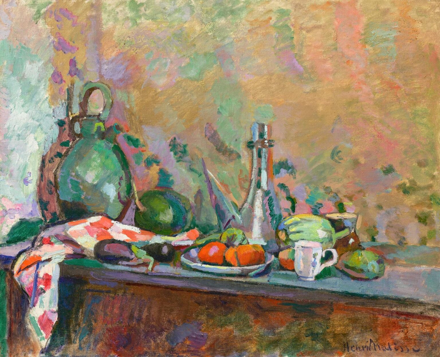
“Still Life with Purro, I” opens like a small theater of color. On a narrow tabletop, Matisse assembles a kettle-shaped green jug, a tall, tapered bottle, a shallow plate loaded with orange-red tomatoes, a striped or checked kitchen cloth that tumbles over the edge, and a handful of garden things—a purro (a leek-like stalk), a round melon, an aubergine, a cabbage-green gourd, and a plain white cup. Behind them, a wall becomes a radiant field of broken greens, mauves, peaches, and golds. The eye wanders from the lustre on glass to the porous skin of earthenware, from the plaid fold of the cloth to the waxy surface of the vegetables, and finally back into the wall’s shimmering atmosphere. Everything in the arrangement participates in a single orchestration: color first, then volume, then detail.
1904 and the Threshold Before Fauvism
The date of this still life matters. In 1904 Matisse was negotiating the lessons of Neo-Impressionism on the Côte d’Azur and moving steadily toward the audacity that would erupt at Collioure in 1905. He had absorbed the chromatic discipline of painters like Paul Signac and Henri-Edmond Cross—clean mixtures, luminous complements, and a belief that color could structure a picture as surely as line. Yet he was never doctrinaire. Instead of strict dotting, he uses patches, troweled veils, and feathered strokes to keep the surface breathing. “Still Life with Purro, I” is emblematic of that hinge moment: the palette is high-keyed and deliberate; the brushwork is frank and mobile; the objects are simplified into big, legible forms that behave as notes within a chromatic chord.
The Stage of the Table and the Arc of the Arrangement
Matisse composes the tabletop like a shallow stage set. From left to right the objects rise and fall in a slow arc—the squat, round jug; the small melon; the tall bottle acting as a vertical pivot; the low plate of tomatoes; then the bright white cup and a compact brown pot. The draped cloth at far left drops like a stage curtain, opening the scene and pulling our attention inward. The table’s front edge is a dark, steady line that doubles as a baseline for the entire orchestration. Because the objects are staggered rather than aligned, the eye travels in waves across their silhouettes, a rhythm that is quietly reinforced by the repeated circularity of jug, melon, plate, cabbage and cup.
Drawing with Color and the Authority of Contour
Contour here is painted rather than drawn. Matisse establishes edges by the meeting of color fields—a violet shadow slipping under a green jug, a thin blue seam catching the bottle’s profile, a pale lemon highlight clipping the edge of a tomato. Where he needs firmness, he tightens the boundary with a decisive stroke; where he wants air, the edge dissolves into the neighboring hue. The result is a hierarchy of attention: crisp around the bottle’s neck and the lip of the cup, softer around the vegetables and background fronds. The drawing is never pedantic; it is a system of necessary emphases that keeps the color poised.
Color Harmony and the Red–Green Engine
The painting runs on complementary oppositions, especially red against green. Tomatoes blaze on their white plate; the purro’s blade and the green jug answer them; the towel’s vermilion squares ping against the mint and celadon in the wall. These complements are not scattered for fireworks; they are positioned to stabilize the whole field. Warm notes—tomatoes, pinks in the cloth, orange blushes on the wall—occupy the lower and middle zones, while cools—bottle reflections, the green ceramics, and the lilac–turquoise scumbles of the wall—ventilate the picture vertically. Because the palette is tuned rather than indulgent, a small accent of saturated orange or pure emerald feels structural, like a chord tone rather than a decoration.
Light, Surface, and the Atmosphere of the Wall
Light in this still life is more environmental than directional. The objects are modeled, but shadows are rarely heavy; instead, value shifts and temperature steps give the sensation of roundness. The wall behind the table is crucial. It is not a neutral backdrop but an atmospheric engine made of overlapping, semi-transparent veils. Scumbled gold meets blue-green; lavender meets warm rose; a few leafy silhouettes drift across, suggesting foliage beyond or a hanging textile. That softly pulsing backdrop makes the objects read forward without isolating them. It is as if color in the room were a weather system that wraps the ensemble, fusing object and space.
Materials Portrayed and Materials Used
Matisse relishes material contrasts. The green jug carries a matte, earthen feel with dull glints where the brush slides; the bottle is a column of quick, bright accents that describe glass without fuss; the cloth is all directional strokes that bend around folds; tomatoes are smooth, inflated ovals with crisp highlights; the white cup is an economy of planes. These differences are achieved not through fussy rendering but through changes in paint handling—dragged strokes, firmer impasto, thin translucent skins. The painting thus offers a double materiality: we see ceramics, fabric, fruit and metal, and we see oil paint declaring itself as the means by which those sensations are built.
The Purro as Line and Link
The picture’s title singles out the purro, the leek-like stalk that arcs across the center. It is drawn with a handful of green notes topped by a pale, fibrous tip and a violet shadow. Functionally it connects the left cluster of jug and melon to the right cluster of bottle, plate and cup. Structurally it acts like a sweeping brushstroke drawn from life, translating a vegetable into an elegant curve that animates the whole arrangement. Matisse often treats one humble object as a compositional hinge; here the purro is that hinge—bridge, line, and rhythm.
The Checked Cloth and the Art of the Edge
Few things announce Matisse more than a patterned textile. The red-and-white cloth that spills from the table is a compact lesson in his method. He blocks the checks with confident slabs of color, lets under-tones flicker along their edges, and then throws a green shadow across them so the cloth belongs to the ambient light. At the very corner, the cloth’s fall exposes the table’s thickness, a practical reminder of gravity that deepens the space without tightening it. The motif also amplifies the painting’s core complement: the cloth’s warm reds sharpen the neighborhood greens and lead the eye toward the tomatoes’ richer reds at center.
Space, Depth, and the Refusal of Illusionism
The still life holds a credible depth, but perspective is never the star. The table top tilts just enough to display the objects; the wall’s mottled field refuses a fixed horizon; cast shadows are descriptive, not theatrical. Matisse protects the primacy of the surface by keeping depth shallow and by allowing the background to behave as a decorative plane. This refusal of heavy illusionism frees color to do structural work. We read the world as arranged volumes and, simultaneously, as interlocking shapes on a flat support.
Rhythm Across Forms and the Music of Repetition
Look long enough and the painting reveals a musical repetition: circles and ovals recur—the fat belly of the jug, the round melon, the tomatoes, the cabbage-like gourd, the mouth of the cup. Between them stand slender verticals—the bottle, a knife handle barely suggested, the purro’s stalk—and oblique accents—the leaning plate, the angled folds of the cloth. These repeating types give the eye a beat to follow. Rhythm, not narrative, is what carries the picture forward, and that rhythm is embedded in the very shapes of ordinary kitchen things.
Influences Absorbed and Transformed
The high, clean color and broken surface recall the Neo-Impressionist legacy, but Matisse declines to calculate optical mixtures scientifically. He prefers a freer syntax where a mauve may sit unblended beside a spring green if the harmony requires it. There are also Cézannian echoes in the way volumes are simplified and set as weights on the table; yet Matisse loosens Cézanne’s geometry and lets color breathe. The result is neither pointillism nor constructivism. It is an early form of the Matissean decorative order: a world clarified to essentials so that light and color can speak plainly.
The White Cup and the Logic of Accents
With so much chroma at work, a single non-colored element can steady the eye. The plain white cup near the right edge does exactly that. It introduces a local high value that punctuates the rhythm of reds and greens; it calibrates scale; and it hints at daily use. Matisse models it with two or three planes and a clipped handle, avoiding fussy highlights so it remains a calm accent rather than a distraction. The cup’s whiteness also lifts the surrounding colors, much as a rest in music clears the air for the next phrase.
The Table’s Front and the Weight of the Scene
Across the bottom extends the table front, a deep plank painted in browns stained with violet and green. It bears the signs of layered under-painting and quick scumbles, all of which give it weight. That weight is essential. Without a dark, steady footing, the airborne wall might make the objects float. The table’s density grounds the harmonies above it and anchors the entire composition in a plausible world.
Process on the Surface and the Presence of Time
The surface retains traces of revision. Around the bottle’s base a soft halo of earlier color survives; under the cloth the first lay-in of the table peeks through; a ghost outline at the jug’s shoulder hints that its profile was moved. These remains add a gentle vibration to the scene and make the act of painting part of what we see. Matisse’s goal is not to polish away the making but to let it settle into the image. Time—the time of decisions—is visible and gives the still life an immediate present tense.
Sensory Truth over Literal Description
“Still Life with Purro, I” is faithful not to photographic detail but to the sensations of looking: weight where objects sit, gleam where light concentrates, coolness in glass, porosity in clay, freshness in the vegetables. The wall does not pretend to be wallpaper or plaster; it is the color weather of a room. That sensory truth is what makes the everyday subject feel ample. Ordinary utensils and produce become carriers of temperature, light, and balance.
The Decorative Ethic and the Everyday
Matisse’s decorative intelligence is often discussed in relation to odalisques and patterned interiors, but it is already fully active in this kitchen tableau. Decoration, in his sense, is the translation of observed things into a coherent, pleasurable order. Here that order is built from tuned complements, repeating forms, and a background that is active rather than apologetic. The painting honors the everyday—humble food, a jug, a towel—by setting it within a structure that is exact and generous at once.
A Prelude to the Fauve Breakthrough
The high pitch of color, the simplification of volumes, and the refusal of somber tone all anticipate the Fauve canvases of 1905. Yet this earlier work remains more intimate, more conversational with observation. It shows Matisse practicing the very moves he would soon amplify: color as architecture, contour written by the brush, and a surface that is both picture and ornament. The prelude is audible in every passage, especially in the way a single red tomato can energize a whole field of green.
Why the Painting Feels Fresh Today
The still life’s freshness lies in its candor. Nothing is over-explained. The means—strokes, scumbles, clean hues—remain visible and sincere. Because the composition relies on relations rather than anecdote, it resists staleness; the eye can return to those relations indefinitely, finding new correspondences between warm and cool, hard and soft, matte and gloss. The painting teaches a way of seeing that is both humble and exalted: attend closely to color, trust simple forms, and let pleasure and structure coincide.
Conclusion: A Table Laid with Color
“Still Life with Purro, I” lays a table of color and invites us to sit with it. The jug, bottle, plate, vegetables, cloth, and cup are not props; they are the very instruments by which harmony is played. The background breathes like weather, the table steadies like ground, and the purro draws a single fluent line through the ensemble. In 1904 Matisse already knows the lesson he will repeat throughout his career: when forms are simplified and colors are tuned, the ordinary becomes luminous.