Image source: wikiart.org
Introduction
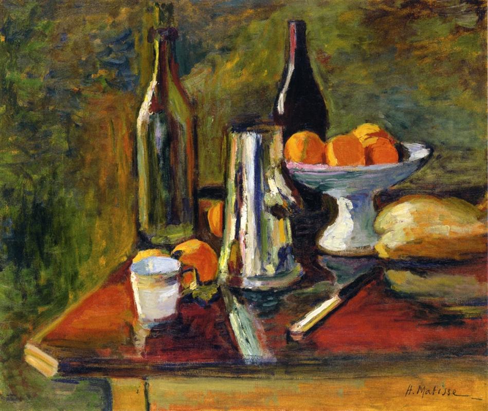
“Still Life with Oranges” belongs to the pivotal year 1898, when Matisse’s art pivoted from tonal naturalism toward a modern language grounded in color. At first glance the motif is familiar: fruit heaped in a dish, bottles, a loaf, a knife, a cup, a metal pot. On closer inspection the painting proposes a new contract between painting and reality. Forms are not bounded by hard contours; they arise where a warm field meets a cool neighbor, where a reflection breaks across polished metal, where a highlight leaps along a rim. The table is not a neutral platform but an active register that receives and redistributes color, tying the ensemble into a single climate of light.
The Moment of 1898
In 1898 Matisse was absorbing the high-key light of the south, looking closely at Cézanne, Gauguin, and the Nabis, and testing whether color could shoulder the work usually done by linear drawing. The impact is evident here. Shadows are chromatic—greens, violets, plums—rather than bituminous browns. Whites are alive with neighboring tints. Edges breathe. Paint ranges from thin, aerated scumbles to buttery ridges that catch literal light. The still life becomes a laboratory for decisions that will soon ignite in the canvases of Collioure and the Fauvist exhibition.
The Motif and Its Spatial Poise
Matisse sets the objects on a table that tilts gently toward us, its front edge crisply beveled and its top soaked in a deep, wine-red that doubles as both color and value anchor. The metal coffee pot stands near the center like a vertical axis. To its left a tall empty bottle echoes that vertical; behind it, a darker, fuller bottle masses at right. The pedestal compote piled with oranges sits between the pot and the second bottle, its white stem a cool pillar amid the warms. A loaf of bread takes up the right edge; a small cup, a knife, and scattered fruit provide transitions across the foreground. The green wall behind is not flat; it breathes in swirls of olive, pine, and sienna, as though the air itself had substance.
Composition: Verticals, Disks, and Diagonals
The design rests on a conversation between three types of shapes. Vertical elements—the bottles and the coffee pot—lock the composition upright. Circular forms—the bowl’s rim, the oranges, the cup’s mouth—soften and stabilize. Diagonals—the knife, the bevel of the table, and the slanting reflections across the pot—animate the surface and lead the eye across it. The pedestal compote functions as a hinge: its cool white stem ties the verticals to the tabletop, while its dish gathers the painting’s hottest color. There is balance but not symmetry; masses lean slightly to the right, which the knife’s oblique thrust and the loaf’s pale bulk counterweigh.
Color Architecture: Warm–Cool Counterpoint
Color is the painting’s engineering. The table’s saturated red sets a warm ground note; against it Matisse places chromatic darks in the bottles and the pot’s shadow, cool greens and blue-greens in the wall and reflected passages, and the vivid orange of the fruit. The compote’s white is never empty; it carries mint and lavender tints where it turns or reflects neighbors, so it belongs to the atmosphere rather than floating as uninflected light. The bread reads as pale straw scrubbed with warmer ochres along its crust, and the cup holds a whisper of sky-cool at its lip. Everything participates in a heated yet breathable climate: warms swell forward, cools pull back, and the meeting of the two creates the edges that convince the eye.
Light as Relationship, Not Spotlight
Nothing in the painting suggests a theatrical beam. Illumination is built from the way values and temperatures trade places. The coffee pot shows the principle most clearly. Its body is not painted with a single metallic “color”; it is a mosaic of the room: vertical streaks of bottle-green, bursts of orange from the fruit, a pale sky-tint where the wall brightens, a column of cream that acts as the main highlight. The bowl’s lip glows where it faces this highlight and sinks to pearl where it turns away. The table’s red pales toward the objects and deepens at the front edge, which makes the surface tilt without resorting to diagrammatic perspective.
Brushwork and the Tactile Logic of Surfaces
Matisse’s handling assigns each substance a distinctive handwriting. The coffee pot is written with firm, downward strokes that curve at the shoulder, reinforcing its cylindrical volume. The bottles are built with longer, more viscous pulls that stack into density, suggesting glass filled with air or liquid. Oranges are modeled with short, rounded touches that accumulate like pores and skin. The compote receives broader, creamy strokes that follow its turn; along the stem, a couple of decisive scrapes create the illusion of porcelain’s weight. The loaf is laid with blunt, crusty touches that read as surface roughness against the smoothness of metal and glass. This variety of touch is not decoration; it is the means by which the painting delivers substance.
Drawing by Abutment
The painting contains almost no literal outline. Instead, objects are “drawn” where one color abuts another at a tuned value. The knife’s blade appears as a cool, dark sliver against the red; the bottle’s shoulder is just a seam where a green-black meets a lighter neighbor; the bowl’s underside turns where lavender touches mint. This method preserves a single atmosphere; edges soften where light spreads and harden where contrasts sharpen. It also lets Matisse adjust form with color choices: to move an edge forward, he warms it; to send it back, he cools or grays it.
Space Without Ruler Tricks
Depth is achieved through stacked planes and value sequences. The red table rises toward us because it is saturated and bounded by the sharp front bevel; the middle ground sits under the objects, lighter and cooler; the far ground—the green wall—expands by thinning paint and loosening edges. Overlaps finish the job: the knife crosses under reflections, the bowl’s stem interrupts shadows, the bottle stands behind the compote’s rim. The space is shallow yet persuasive, like a stage where the actors press forward to the footlights.
The Oranges: Concentrated Warmth
The oranges are the picture’s emotional core. Matisse does not paint them one by one with illustrative detail; he builds a harmonic cluster. Each fruit subtly changes hue around its arc—cadmium in the lights, red-orange toward shade—with small cool flicks where reflections land. In the bowl they read as weight, not decoration, because the painter adjusts the rim’s value to show how their mass presses into it. Their color repeats in the pot’s reflections and in the table’s warm zones, so the oranges feel dispersed through the scene, as if their heat radiated.
The Coffee Pot: A Mirror That Tells the Truth
The polished pot is both object and narrative device. As a mirror, it records the world around it—bottles, fruit, cloth, wall—in slivered translations. As a volume, it turns convincingly because those reflections double as modeling. The central cream highlight is not outlined; it is squeezed between cooler neighbors, changing width as the cylinder rounds. A darker belt near the base grounds the object, preventing the shiny body from floating. Few painters of the period made metal feel so alive without leaning on photographic tricks; Matisse does it by treating reflection as color already present on the table, not as a separate “metallic” effect.
The Bottles: Chromatic Darks with Weight
At left, a tall bottle of greenish glass, likely empty, stands like a column of cool darkness; at right, a squatter bottle, fuller and redder, provides the composition’s heaviest dark. Instead of flat black, Matisse stacks greens, aubergines, and browns to build mass. Each bottle carries small, hard highlights—thin flicks of pale paint placed exactly—so that glass feels slick and dense. These specifics keep the still life from becoming merely decorative; it retains gravity.
The Table as Stage and Reflector
The red table does as much work as any object. Its color sets the key, and its surface reflects and receives. Along the pot’s base, red warms to salmon where reflected light pools; beneath the knife, a cool blue-gray scrape cuts the warmth and suggests sheen; near the compote, the table pales because the white dish bounces light downward. The beveled front edge, crisp and lighter, is a structural line that contains the tableau and prevents depth from drifting. The table thus organizes both space and the emotional temperature of the scene.
Background Atmosphere: A Living Wall
Rather than a flat backdrop, the wall behind the table is a murmuring field of greens, olives, mosses, and earthy reds. Its movement is subtle, a slow eddy of brushwork that registers as air. Crucially, its chroma is moderated so that the objects can advance. Yet it is not dead; it pushes small cools into the pot and compote and absorbs warm echoes from the bread and oranges. This reciprocity—background tinting object and object tinting background—is why the still life breathes.
Light, Time of Day, and Mood
The scene feels like late afternoon. The red table glows as though it has stored heat; the oranges are at their richest; the wall calms toward cooler greens. There is no human figure, yet the arrangement narrates a human rhythm: a pot just off the boil, a bottle opened, a loaf placed, fruit heaped, a knife set down. The mood is not celebratory excess but concentrated domestic abundance. Matisse elevates the ordinary by discovering exact relations rather than by adding anecdote.
Dialogues with Cézanne, Gauguin, and the Nabis
The picture speaks to contemporaries without imitation. From Cézanne, Matisse borrows the conviction that shape and depth can be built through adjacent color planes; the bowl’s rim and the pot’s turn are Cézannian in method. From Gauguin comes courage with saturations and the simplification of large forms; note the broad red of the table and the emphatic white of the pedestal dish. From the Nabis he shares a domestic intimacy and a willingness to let background pattern participate in the composition. Yet the temperament is distinctly Matisse’s—more lucid than Bonnard, steadier than Van Gogh, warmer than Cézanne’s analytic chill.
Materiality and Ground
A warm undertone vibrates beneath thin passages, especially in the wall and the lighter zones of the table. Matisse lets this ground peek through to bind warms and cools and to prevent blues from going chalky. Where solidity is required—the bread’s crust, the pot’s base, the knife’s handle—paint thickens into low impasto that catches actual light. Where breath is needed—the wall’s upper reaches, glancing reflections on the compote—paint thins to a cloudy veil. The surface itself thus enacts the painting’s theme: density and air in measured exchange.
How to Look Slowly
Begin with the front edge of the table and feel how its crisp bevel plugs the picture into your space. Let your eye rise to the knife and read its blade not as a drawn outline but as a cool interruption in the red. Slide to the coffee pot and watch reflections stack; notice how they echo the oranges and bottles without copying them. Move right to the compote’s rim and see it change from warm to cool as it turns through light and reflection. Pause over the oranges to register their minor differences—some redder, some lemoned—and follow their color out into the pot and table. Finally, relax your focus until the still life resolves into three commanding fields: red ground, white dish and metal axis, green air. The clarity of this triangle is what makes the complexity coherent.
Foreshadowing Fauvism
While the palette is tempered compared to 1905, the grammar of Fauvism is already here. Shadows are chromatic, not brown; whites are inflected; edges occur at seams; a few big shapes hold many small incidents. Intensify the red table, push the greens toward viridian, lift the oranges to cadmium, and the composition would still stand because its scaffold is exact. That is why this canvas feels prophetic: Matisse has already learned to let color carry structure.
Place in Matisse’s Oeuvre
Among the Corsican landscapes and Toulouse interiors of 1898, “Still Life with Oranges” shows that the new method functions indoors with reflective surfaces as fluently as outdoors with trees and stone. It also confirms Matisse’s lifelong love for the still life as a site of invention. Decades later, his interiors would set bolder patterns against open windows and luminous objects; the discipline learned here—chromatic darks, living whites, edges by abutment—would keep those later storms coherent.
Conclusion
“Still Life with Oranges” proves that the ordinary can be rebuilt by paint into something both true and newly seen. A red table, a polished pot, two bottles, bread, a cup, and a bowl of fruit become a system of tuned relations. Warm and cool exchange places; reflections model volume; brushwork performs substance; space unfolds not by ruler but by color intervals. The picture’s quiet authority lies in its balance: chroma is bold but not brash, structure firm but not rigid, atmosphere alive but not noisy. In this small theater of domestic things, Matisse discovers the language that will sustain his greatest color—clear, humane, and inexhaustibly alive.