Image source: artvee.com
A Luminous Late Still Life
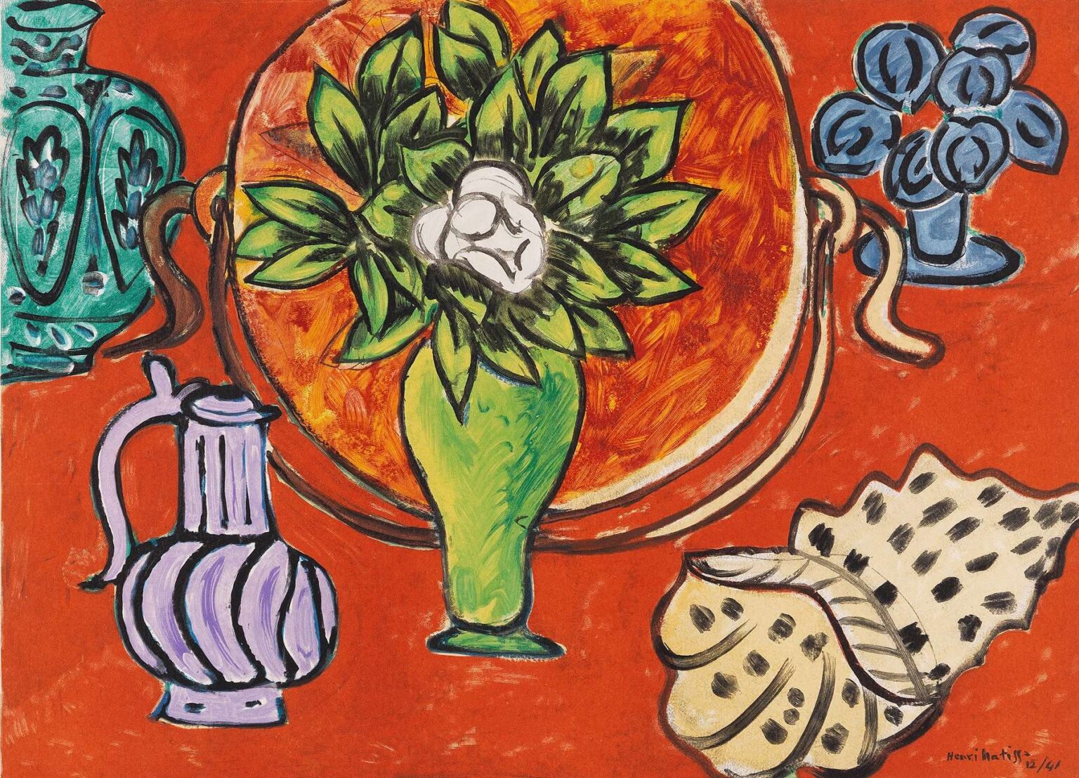
“Still Life with Magnolia” brings together a handful of studio objects—a green vase bursting with leaves, a white magnolia bloom, two ornamental jugs, a purple ewer, a seashell, and a small bouquet on the right—on a saturated red ground. Everything is held by bold black contours, the background a continuous field of color with no traditional tabletop to pin things down. The image reads instantly and boldly, yet it yields a surprising amount of nuance: the circular tray behind the vase functions like a halo or sun, the green of the leaves is tuned against the hot red like a chord, and the shell’s creamy body, stippled with black, becomes a counterpoint of pattern within the larger design.
A Late Style Focused on Clarity and Color
By 1950 Matisse had shifted fully into a language that privileged pure color, simplified shape, and decisive line. After surgery and declining health in the 1940s he restructured his practice around economy and impact, developing the famous cut-outs and a stripped-down painting style that shares their logic. “Still Life with Magnolia” belongs to this late mode. It rejects illusionistic modeling in favor of flat, high-key fields animated by calligraphic drawing. The work sits alongside his designs for the Chapel of the Rosary in Vence and the book “Jazz,” united by a belief that color can be architecture and line can be music.
The Subject: Familiar Things Reimagined
Matisse’s still lifes were never inventories; they were theaters where ordinary objects could perform as shapes and intervals. Here he collects studio stalwarts: ceramics with voluptuous profiles, a fluted ewer, a vase of leaves crowned by a single white magnolia, a spotted shell, and a small blue bouquet. Each item is legible as a thing, but each is also an emblem—a type of curve, a kind of mass, a patch of chroma. The magnolia, with its creamy petals, adds a note of innocence and coolness; the shell introduces patterned complexity; the jugs deliver silhouettes that bounce the eye around the picture.
The Composition as a Solar System
The picture is organized like a solar system with the magnolia bouquet at the center. A great orange-gold circle behind the vase acts as a tray and a radiant disc, stabilizing the composition while intensifying the greens in front of it. Around this “sun” revolve five satellites: turquoise jug at left, lilac ewer below, shell at lower right, small bouquet at upper right, and the partly cropped vessel at the far left margin. The red field serves as infinite space. This radial layout makes the painting read at once; it also allows the viewer to orbit slowly, discovering how each object is angled to keep the eye moving.
Color Architecture and the Heat of Complements
The work runs on the classic complementary engine of red and green, supercharged with accents of blue and violet. The red ground is not a backdrop; it is the picture’s temperature setting. On it, the vase and leaves blaze as green flames, the orange disc radiates warmth, and the blues of the side bouquets and jugs cool the edges. Because the colors are laid in broad, unmodulated fields, their relationships—not their shading—create depth and emphasis. The red–green clash sparks energy at the center; the blue notes damp and balance that heat; the shell’s cream and black offer a tertiary chord that adds sophistication without noise.
Black Contour as Calligraphy
Thick black strokes outline every major form. Far from imprisoning color, these lines make it vibrate. The contour changes width, catching speed around a handle, slowing to define a leaf, and snapping taut at the outer rim of the disc. The effect is kin to Matisse’s cut-outs, where a scissor edge serves as both line and border, and to his admiration for Arabic and East Asian calligraphy. Here the brush behaves like ink: it draws, it separates, and it animates. Because the color fields remain flat, the contour supplies rhythm and structure.
A Surface Built for Impact
The medium reads as opaque, water-based paint laid confidently and quickly, with the grain of the paper or canvas showing through in places. The orange disc is brushed in small, swirling movements that simulate radiance; the red ground is flatter, a steady field that lets objects float; the greens of the leaves carry visible strokes that give a hint of volume without modeling. In several places the black line bites into wet color, leaving slight halos where underlayers show. The physical evidence of making—overlaps, ridges, small hesitations—keeps the image lively within its radical simplicity.
Space Without Table or Horizon
Conventionally a still life depends on a tabletop and cast shadows to create space. Matisse subtracts both. The red field and the encircling disc flatten the scene; spacing is achieved by overlap and by color hierarchy. The vase sits in front of the disc because its line crosses the disc’s line; the ewer and shell move forward by being drawn darker and with heavier contour; the cropped jug on the left is thrust behind the red field at the picture’s edge. The viewer experiences the image as both a decorative carpet and a plausible array of objects—Matisse’s favorite double vision.
The Magnolia as Icon and Emblem
At the picture’s center the magnolia reads as an icon. White petals simplified to three or four lobes nest in dark foliage, a pale face surrounded by green aureole and orange light. Magnolias often carry associations of purity and resilience; whatever symbolism Matisse intended, he clearly uses the flower as a calm heart within chromatic heat. The whiteness calibrates the value scale of the entire painting: nothing else is as light, so everything revolves around this cool core.
Ceramics, The Ewer, and the Pleasure of Profiles
The left-hand turquoise vessel and the lilac ewer below provide a repertoire of profiles—handles, spouts, fluted bellies—that enrich the painting’s rhythms. Their cool hues offer relief from the central warm clash, while their contours echo one another across the composition. The ewer’s spiral body repeats the shell’s coiled form; the tall turquoise jug’s vegetation motifs rhyme with the bouquet. In Matisse’s late work such echoes are not accidents; they are ways to weld disparate things into a single decorative sentence.
The Shell and the Game of Pattern
The spotted shell at lower right is a small masterclass in pattern handled with economy. Creamy planes are bounded by black line; within those planes, dashes of black articulate a dotted rhythm that answers the striped body of the ewer and the veining of leaves. The shell’s off-white sets up a dialogue with the magnolia’s purer white: one is bodily and earthy, the other luminous and cool. As a form, the shell tips outward toward the viewer, momentarily breaking the flatness to engage us directly.
Memory, Selection, and the Late Working Method
By 1950 Matisse often arranged objects from his storeroom and worked from bed or chair, relying on assistants to place things where he wanted. That constraint sharpened his taste for essentials. “Still Life with Magnolia” feels chosen rather than observed: a bouquet reduced to emblem, a disc instead of an elaborate tray, a few favorite vessels simplified into glyphs. The method is one of memory as much as sight—what the object does in the composition matters more than its anecdotal details. The result is a still life that behaves like a language: nouns (vase, shell, jug), adjectives (green, blue, cream), and punctuation (black line) speaking a clear sentence.
Echoes of “Jazz” and the Vence Chapel
The red field and black contour recall pages from “Jazz,” while the simplified, glowing color masses anticipate the stained-glass windows of the Vence chapel completed around this time. In all three arenas—book, chapel, and studio still life—Matisse pursues a color that is not merely descriptive but architectural, able to define space and mood on its own. The orange disc here is a cousin to a rose window; the green leaves could be cut paper; the black line could be lead cames in glass. The painting shows how the late vocabulary travels freely across mediums.
Ornament as Structure, Not Decoration
It is tempting to call this image decorative. Matisse would agree, provided that “decorative” is understood as structural clarity rather than surface prettiness. Ornament in his sense is the revelation of underlying order—the way shapes repeat, the way intervals balance, the way color chords hold. The red ground is not wallpaper; it is the field that makes the system audible. The picture is decorative because it is exact: every shape carries weight, every color is tuned, every line has work to do.
Movement, Tempo, and the Viewer’s Path
The composition sets a clear tempo. The eye lands on the white magnolia, circles the orange disc, bounces to the turquoise jug, drops to the violet ewer, skips over the shell’s dots, and rises to the small blue bouquet before returning to center. This loop is unbroken because handles, stems, and contours act like arrows and bridges. The viewer is not meant to stop at any one object but to keep circulating, as if tracing the steps of a dance laid out on a red floor.
Gesture and the Evidence of the Hand
Within the apparent flatness the hand remains eloquent. The brush inside the disc turns in small arcs; the leaves carry quick, elastic marks that thicken at their bases and taper at their tips; the shell’s dots vary just enough to keep them alive; the black line accelerates and slows like a conductor’s baton. Even the scuffs and rubs in the red ground contribute—a reminder that this clarity is achieved by active making, not mechanical fill.
Ambiguity and Play
Matisse keeps a gentle playfulness alive. The disc could be tray, sun, or drum. The bouquet at right reads as flowers, but its petals are near-abstract medallions. The cropped jug at left is partly outside the fiction of space, its handle tugging at the edge like a ribbon. These soft ambiguities prevent the picture from closing into diagram. They invite the imagination without threatening the underlying order.
Emotional Temperature and Quiet Joy
Despite the blazing palette, the mood is not aggressive. The magnolia’s cool core, the measured pace of the black line, and the serene radial balance generate an atmosphere of bright calm. It is joy without frenzy—a late Matisse hallmark. The painting feels hospitable, like a room arranged for pleasure and clarity, a place where color has been tuned so carefully that being in its presence steadies the viewer.
Why the Painting Still Feels Contemporary
“Still Life with Magnolia” reads cleanly across a room, thrives in reproduction, and rewards close looking—qualities that make it feel surprisingly contemporary. Its flatness and line anticipate graphic design; its limited, saturated palette resonates with digital color; its economy of means aligns with minimalist sensibilities. Yet it remains unmistakably handmade, its humanity evident in every waver and overlap. That union of immediacy and warmth is why Matisse’s late work continues to speak so directly.
A Concluding View: The Everyday Transfigured
At heart this is a table of ordinary things made luminous by decisions. A red ground becomes atmosphere and stage; a circle becomes sun and tray; a magnolia becomes icon; black line becomes melody. The painting demonstrates Matisse’s late conviction that art need not imitate life to intensify it. By simplifying forms and tuning colors until they ring, he turns a still life into a clear, durable harmony. Standing before it, one feels not only the presence of objects but the presence of order itself—confident, generous, and bright.