Image source: wikiart.org
Introduction
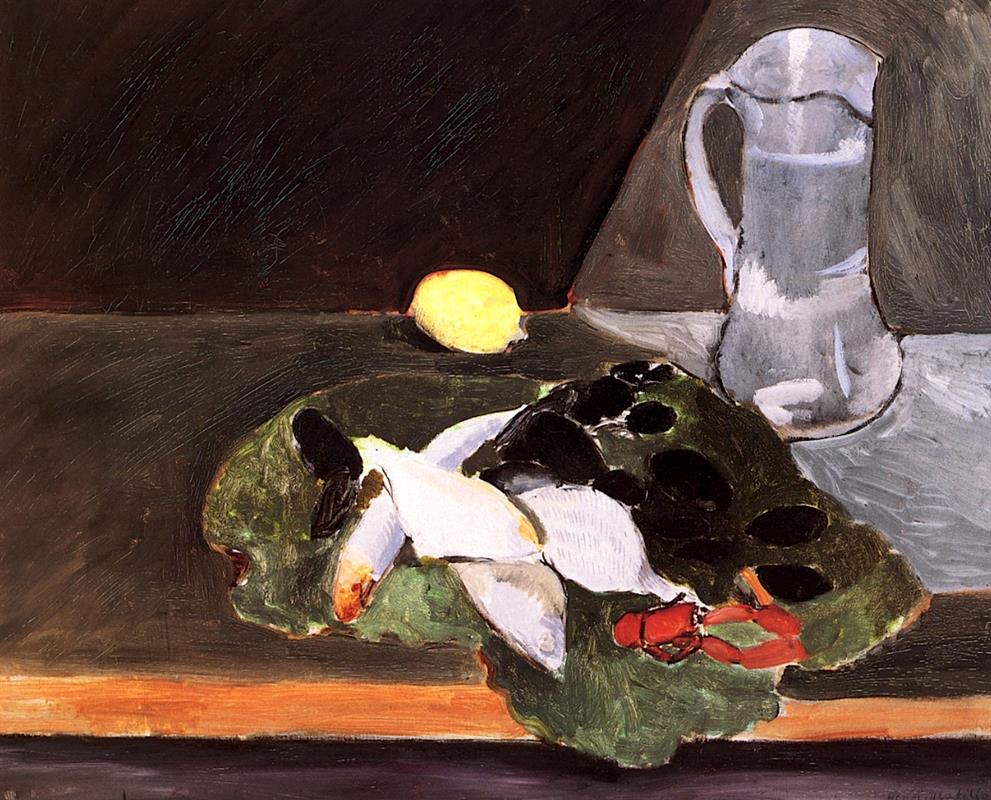
Henri Matisse’s “Still Life with Lemon” distills the experience of a table into a crisp orchestration of planes, colors, and weights. A single lemon shines like a small sun against a near-black wall; a cool gray pitcher anchors the right edge; and a heaped platter of sea things—white fish, glossy black shells, and a flash of red crustacean—rests on a leafy bed at the front. The table’s edge is a warm ocher bar, almost architectural in its firmness, that separates the viewer from the objects while making their presence immediate. Nothing is fussy. Each element is reduced to its most telling shape and value, then tuned to the others so that the whole reads in one clear breath.
The Nice-Period Tabletop
Matisse made a stream of interiors and still lifes in the early 1920s, pursuing an art of balance after the volatility of the previous decade. In these works, he treated rooms and table settings as laboratories where color and form could be simplified without losing sensuous force. “Still Life with Lemon” belongs exactly to that program. The scene is ordinary—market fish, a jug, a lemon—and yet the arrangement feels ceremonial. Every object has a job to do, and the relationships among them are so exact that the everyday turns emblematic.
Composition: A Theater of Three Masses
The composition pivots on three actors: lemon, pitcher, and platter. The lemon glows in the middle distance, a low orb set against a dark triangular wall; the pitcher rises as a vertical counterweight on the right; and the platter spreads like a horizontal island across the lower half. Their positions triangulate the surface, guiding the eye in a dependable loop. The diagonal seam in the background—dark plane above, gray plane below—acts like a backdrop and a stage floor. It is a small but decisive piece of geometry: it tilts the space, keeps the lemon from floating, and makes the jug’s silhouette legible.
The Lemon as Pictorial Sun
The lemon’s power comes from contrast and isolation. Matisse surrounds its acid yellow with the deepest tone in the painting, then sets a thin halo of warmer edge along the top where the dark meets the gray. The fruit is not over-modeled; two or three shifts of value are enough to round it. Because the rest of the canvas lives in muted greens, grays, and blacks, the lemon carries a disproportionate charge. It is the painting’s sun and its metronome: wherever the eye travels—to the fish, the shells, the jug—it returns to that bright note and measures all other colors against it.
The Pitcher as Architectural Anchor
The pitcher answers the lemon with cool authority. Painted in slatey, broken grays and edged with a soft, reddish contour, it has presence without heaviness. Its scalloped lip and broad belly echo the platter’s curves, and the handle’s loop repeats the rounded forms of shells and fish heads below. Importantly, its value never reaches black; it sits just above the table’s midtone so that reflections can read. This pitch of gray lets the jug play two roles at once: figure (as a solid object) and ground (as a cooling field that calms the lemon and the red crustacean).
The Platter as Abundance and Structure
Across the foreground, a heaped mound—leafy greens, white fish, black shells, a wedge of red—becomes both bounty and compositional engine. Matisse uses the bed of greens as a midtone cushion on which extremes can rest: the whites of the fish flare, the blacks of the shells settle, and the red crustacean snaps into focus. The platter itself is barely indicated; the food becomes the plate. Edges are bold where clarity is needed (the fish’s flank, the shell’s glint) and softened where masses should fuse. The whole mound reads as a single, legible shape whose internal rhythm keeps the lower half of the painting alive.
Black as a Full-Blooded Color
One of the painting’s revelations is Matisse’s use of black. The shells are pools of near-absolute dark, yet they feel rich rather than dead because they sit inside surrounding greens and whites that keep them resonant. The black wedge of background is not emptiness but a field full of scraped and scumbled strokes that catch light differently across its surface. Treating black as color—the way a pianist treats the left hand’s bass notes—lets Matisse stabilize the composition and give the lemon its glow without resorting to theatrical highlights.
The Table Edge and the Ethics of Distance
The warm ocher bar at the bottom is more than a ledge; it is a declaration of the picture’s terms. It keeps the viewer on our side of the table while asserting that the tabletop is a plane, not an illusionistic trench. The bar’s color—honeyed orange tipping toward sienna—adds a necessary warmth to the lower register, preventing the greens and grays from cooling the scene too far. In a quiet way, that strip declares the painting’s modernity: depth will be suggested by overlap and value, not by deep perspective.
Brushwork: Candor and Control
The surface carries the evidence of choice. On the background wedge, Matisse drags the brush so that parallel scratches breathe through the paint; on the pitcher, he patches grays that leave faint hinges of undercolor; on the lemon, he smooths the small form with short rounds; and on the platter he alternates loaded, opaque strokes (for fish flesh and shell caps) with translucent leaf passages that let the support’s warmth play. This variety in facture is not decorative. It clarifies what matters—edge, weight, volume—while maintaining the directness that keeps the image fresh.
Space Without Pedantry
Depth is managed with a few clean devices: overlap (platter before table edge, pitcher on the gray plane, lemon before dark wall), value steps (the far wall at deepest value, the tabletop a middle band, the objects carrying higher contrast), and scale (the pitcher larger and more vertical than the lemon). There is no fussy perspective, no receding grid—just enough cues to make the table believable while the surface remains a coherent design. The result is a space that invites the hand to reach outward even as the eyes enjoy the painting as an arrangement of shapes.
A Mediterranean Climate of Taste
Though nothing in the painting names a location, the menu hints at the coast: small white fish, black shells that read as mussels, a scarlet morsel of lobster or crayfish, and the citrus—salt, shell, flesh, and acid. The cool gray jug could be for water or wine; either suggests a table prepared for eating rather than mere display. Matisse does not describe flavors, but he composes them visually: the lemon’s brightness stands for tartness, the shells’ black for brine, the fish’s white for mildness, the leafy greens for peppery lift. Seeing becomes a prelude to tasting.
The Viewer’s Route Through the Picture
The painting guides the gaze in a satisfying circuit. Many viewers enter at the lemon (brightest spot), slide right along the table seam to test the pitcher’s volume, drop to the platter’s black ovals and white flanks, catch the red accent at the lower right, and then ride the warm table edge back to the left before climbing again to the lemon. Each lap gathers details: the green rim’s serration, a blush on a fish’s head, a warm glint on the jug’s handle. The loop is a choreographed walk around the table; the image offers no dead corners.
Relation to Tradition: Chardin, Manet, Cézanne
“Still Life with Lemon” converses with the history of French still life while remaining unmistakably Matisse. Like Chardin, he treats humbly scaled objects with dignity and clarifies their mutual distances; like Manet, he lets black sit on the surface as an active color; like Cézanne, he trusts planes and tonal scaffolding more than description. Yet Matisse’s temperament is gentler here than any of those predecessors: he preserves the flat modern surface, heightens the lemon’s lyric glow, and refuses to make the fish and shells weighty or moralizing. The picture is a lesson in how tradition can be honored through re-composition rather than quotation.
The Lemon’s Halo and the Question of Light
Why does the lemon seem to emit light? Partly because of placement: it sits where the dark plane meets the gray tabletop, so the surrounding values function like shadowbox velvet and reflective shelf simultaneously. Partly because the lemon’s edge carries a warm, thin line that looks like light rimming form. And partly because the rest of the painting avoids high-key whites; the fish are creamy gray rather than bright, the jug is tempered, the table cool. With competition muted, the lemon rises without shouting. That is Matisse’s larger strategy: make one note sing by composing the chord around it.
Order, Economy, and the “Enoughness” of Forms
The image is striking for what has been left out. The platter has no elaborate rim; the shells have no precise species markings; the jug has no polished reflections of windowpanes; the lemon shows no pinprick pores. The subtraction is not laziness; it is discipline. Each object carries just the information needed to enter the conversation—shape, tilt, value—and no more. This economy bestows dignity on the chosen notes and keeps the whole from feeling crowded. It also respects the viewer, allowing our own seeing to complete what the brush proposes.
Tension and Ease: How the Picture Holds Together
There is always a little tension in Matisse’s best still lifes: between dark and light, warm and cool, curve and angle, weight and buoyancy. Here, the black background presses down slightly toward the lemon; the pitcher answers with an upward bulge; the platter pushes forward; and the table edge resists as a horizontal brace. These opposing forces do not cancel each other; they settle into ease. That felt ease—the sense that everything has found its right place—is the artwork’s true subject.
Sensation Over Description
A naturalistic account of this table would enumerate fish species, shell varieties, exact materials. Matisse is after something else: the sensation of the set table in a particular light. You feel the coolness of the jug, the satiny give of fish flesh, the slick hardness of shell, the tart sting of lemon. These sensations arise not from detail but from relational accuracy—how a warm note sits next to a cool one, how a sharp edge meets a dissolved one, how a heavy dark is cushioned by midtone green. The painting persuades the senses by tuning the whole.
The Hum of the Background
At first the deep background reads as a void—then its hum becomes apparent. Short, diagonal scratches run across the dark paint like a gentle wind. They catch light inconsistently, so the surface seems to breathe. This hum is crucial. It prevents the lemon from floating theatrically in a black hole and keeps the wall’s darkness feeling like paint—material and present—rather than an abstract absence. The quiet activity back there echoes the gentle immobility of the still life: still, but not inert.
A Modern Classicism
The picture achieves what might be called modern classicism: it uses contemporary means (flatness, frank brushwork, color as structure) to achieve the timeless clarity of classic still life. Nothing is mannered; nothing is sentimental. The lemon will sour and the fish would spoil outside the frame, but inside it the arrangement feels permanent, like a well-composed sentence. That sense of lasting order amid perishable things is a core pleasure of still life and one Matisse renews here without cliché.
Conclusion
“Still Life with Lemon” proves how little is required to make a tabletop unforgettable when each element is placed with intelligence. A bright fruit, a cool jug, a mound of sea things, and a patient bar of wood become a chord of taste and light. Black behaves as color; yellow behaves as illumination; greens and grays do the quiet engineering. The painting respects the viewer’s eyes, trusts the power of relation over detail, and shows how a modest scene can sustain long looking. It is at once breakfast, market haul, and a lesson in composition—an image that keeps the senses awake while the mind rests in clarity.