Images source: wikiart.org
A Small Tabletop Turned into a World
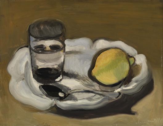
Henri Matisse’s “Still Life with Lemon” (1917) proves how much drama and clarity can be extracted from the humblest things. On a white, scalloped plate, the painter arranges a lemon, a glass, and a spoon. Nothing more is needed. The tabletop is a warm, earthen brown; a soft, pooled shadow gathers beneath the plate; strong black contours and a handful of cool grays carry structure and light. With an economy that typifies Matisse’s wartime language, the picture reimagines still life as a site for architectural order and intimate sensation. It reads instantly from a distance and rewards slow, close looking with a wealth of painterly decisions.
A Composition Built from Three Anchors
The design rests on a triangular relationship. The lemon occupies the right half of the plate, the glass stands on the left, and the spoon lies along the plate’s front edge, its bowl catching a single, bright note. Together they lock the eye into a stable circuit. The plate’s ruffled rim is an elegant stage: its alternating convex and concave edges counter the straight cylinder of the glass and the oval of the fruit. Beneath, the generous cast shadow widens toward the picture’s lower edge and narrows toward the upper left, tilting the whole ensemble into believable space without the strain of linear perspective. Everything is measured, calm, and intentional.
The Plate as Architect of the Scene
Matisse treats the white plate as the painting’s primary architect. It is not merely a support for objects; it is the arena in which relations happen. The rim’s sculpted scallops are stated with few, heavy strokes—warm grays where the form turns, cool grays where it catches sky-like light. Those scallops become a repeating bass line holding the composition together. The plate’s ovoid interior, subtly off-center, gives the glass and lemon room to breathe while preventing them from feeling adrift. Even the plate’s shadow works architecturally: a deep, soft band that tethers the white to the brown plane and lets the bright ensemble sit convincingly in the world.
A Lemon That Is Fruit and Form
The lemon is both object and idea. Its color is a restrained yellow-green—not a theatrical acid, but a fruit tempered by the room’s light. Matisse outlines it with a bold, dark contour that conveys firmness without hardening the image into a diagram. Modeling is minimal and efficient: a cooler, olive-shadowed side that curves away from the viewer, a warmer passage that swells toward us, a small green nub at the stem end that punctuates the silhouette. A few strokes suffice to state rind, pith, and weight. The lemon’s oblique placement, slightly tipping toward the plate’s rim, enlivens the otherwise symmetrical stage and directs the gaze back toward the glass.
The Glass as Mirror and Counterpoint
At first the glass reads as simple cylinder, but Matisse turns it into a modernist device for seeing. Dark ellipses band its top and base, and a thick, nearly black passage pools where liquid—or the table’s reflection—accumulates. In the midzone, grays and off-whites float like clouds trapped in the vessel. These tones don’t fuss with transparency for its own sake; they make the glass a reflective actor, replaying the room’s palette in miniature. The cylindrical verticality answers the lemon’s plump oval and the spoon’s sleek diagonal. Thick black along the glass’s left edge and base keeps the form legible, especially against the plate’s white—a signature move in Matisse’s 1916–1917 vocabulary where black is a constructive color rather than a void.
The Spoon’s Whisper of Light
The spoon is the quietest element and a triumph of restraint. One curved stroke states the handle; a thicker, oval stroke sets the bowl; a small, crisp highlight—just enough—confirms metal and catches the viewer’s attention before it slips out of the frame. Placed along the plate’s near rim, the spoon stabilizes the composition like a musical cadence. Its subdued silver grays echo the plate’s modeling but carry a different sheen, so the materials never confuse: ceramic breathes, metal flashes, glass reflects, peel absorbs.
A Palette Tuned to Climate, Not Spectacle
Color here is a climate. The tabletop is a warm, ochre-brown laid with broad, directional strokes that suggest wood without imitation. The plate’s whites shift between cool and warm notes as light turns across porcelain relief. The lemon’s yellow-green sits squarely between these temperatures, linking warm ground and cool plate. Black does essential work: contouring edges, deepening the glass, and organizing shadows. Because the palette is reduced, every relationship becomes legible and expressive. You feel, rather than simply see, the room’s even daylight and the unhurried hour at which such a still life might have been painted.
Light as an Even Envelope
There is no spotlighting, no theatrical chiaroscuro. Illumination arrives as a broad envelope in which forms clarify themselves. The plate’s rim blooms with soft highs where it catches the most light; the glass shimmers with mild contrasts; the lemon turns gently from lit to shaded flank without a hard crease. The shadow under the plate is velvety at its core and feathered at its edges, grounding the white without stealing attention. This democracy of light is central to Matisse’s aim at the time: to produce an art of balance and serenity in which the eye moves freely and rests comfortably.
The Authority of Black Contour
Around 1916–1917, black returns to Matisse’s work as a decisive structural color. In “Still Life with Lemon,” black does the carpentry. It outlines the lemon, secures the glass’s base, toughens the spoon’s bowl, and reinforces the plate where white and brown need separation. These lines are not fencing off color; they are bearing weight, thickening and thinning according to pressure, alive to neighboring tones. Black’s presence also revises the inheritance of Impressionism, which often dissolved outlines into atmospheric edges. Here the contour clarifies and dignifies the scene without making it stiff.
Brushwork That Records Touch
The painting is frank about its making. The tabletop shows long, slightly arced strokes that track the sweep of Matisse’s arm. On the plate, the brush turns tightly to follow scallops, then loosens into broader passes across the central field. The lemon is modeled with short, directional strokes that bend with the rind. The glass contains both thin scumbles, where pigment lets undercolor breathe, and thicker, almost enamel-like passes that assert density. Nowhere is the surface polished to anonymity. Texture participates in truth: porcelain feels different from peel, metal from wood, glass from air.
Space by Overlap, Value, and Shadow
Depth is achieved with simple means. The plate overlaps the tabletop’s shadow; the glass sits slightly forward on the plate’s left, its base ellipse pressing into white; the spoon crosses the plate’s rim and introduces a tiny overlap at the edge—enough to clarify near and far. The shadow’s weight gathers toward the viewer, making the plate feel closer at the bottom of the canvas. No vanishing points are needed. The believable space arises from the way tones stack and shapes interrupt one another.
Time, Place, and the Discipline of 1917
The date matters. During World War I, Matisse’s palette tightened, black re-entered as structure, and compositions favored clear planes and essential forms. “Still Life with Lemon” belongs to this disciplined moment. It refuses the blazing primaries of early Fauvism and anticipates the serene, patterned interiors of the Nice years by focusing on clarity and repose. The painting feels like a pause—perhaps in the studio, perhaps between larger projects—where the painter recommits to fundamentals: relation of shape to shape, color to color, weight to light.
Dialogues with Tradition, Spoken in Matisse’s Accent
Still life has a long history—from Chardin’s sober tabletop harmonies to Cézanne’s constructive apples and bottles. Matisse draws on that lineage but speaks in his own accent. He keeps Chardin’s respect for ordinary things and Cézanne’s insistence on form, yet refuses heavy modeling and philosophical labor. Instead, he proposes that a few right notes—lemon, glass, spoon on white—can open a complete world when their relationships are tuned. Tradition remains present as a conversation about order rather than as a set of effects to copy.
The Eye’s Route Through the Picture
The painting designs a satisfying itinerary. Most eyes enter at the bright oval of the lemon, trace its dark edge to the plate’s rim, cross to the glass’s dark band, drop to the spoon’s highlight, then travel along the plate’s front curve to the pooled shadow and back up into the white. Each leg of this circuit is marked by a clean contrast: yellow-green against white, black against gray, bright against dark. The route can repeat indefinitely without fatigue because the picture offers both variety (round, oval, cylinder, scallop) and constancy (the plate’s refrain of white).
Material Facts that Keep the Image Honest
Look closely and you’ll find modest pentimenti—slight corrections where the rim meets shadow or where the lemon’s contour was nudged. These traces of decision-making keep the still life from feeling schematic. They insist that the image is not a decal but a record of seeking and finding. Even the tabletop’s brushwork, resisting uniformity, reminds you that the ground is painted plank rather than an abstract field. Honesty of surface equals credibility of vision.
Symbolic Readings that Remain Optional
A lemon can be pure fruit, but still life invites metaphors: brightness set against sobriety, tang against calm, life against vessel. The glass might stand for clarity or containment, the spoon for service, the plate for hospitality. Matisse neither enforces nor forbids such readings. He trusts his objects to carry their own dignity first. If meaning blooms, it does so because the relations are true: a sour sun beside a quiet cylinder under a democratic light.
Why This Small Canvas Feels Large
“Still Life with Lemon” feels larger than its dimensions because it solves, with grace, the big problems of painting: how to make flat color hold volume; how to stage objects in believable space without pedantry; how to let black support color; how to convey light as a shared atmosphere rather than an effect. Its modesty is the vehicle for mastery. The eye leaves the picture steadier than it entered, calibrated to the pleasures of proportion and the relief of seeing essentials set exactly.
A Closing Reflection on Balance and Everyday Beauty
Matisse often spoke of an art that offers balance and repose. This still life embodies the principle without sermon. A fruit you could buy at any market sits beside an ordinary glass and a spoon you could find in any drawer. Yet in the painter’s hands these items become a structure of intervals, temperatures, and weights that the eye recognizes as inevitable. The world of objects, he suggests, needs only attention and the courage to choose. On that scalloped plate—white like a piece of borrowed light—three actors perform a quiet play whose final scene is contentment.