Image source: wikiart.org
First Impressions: A Table That Vibrates With Color
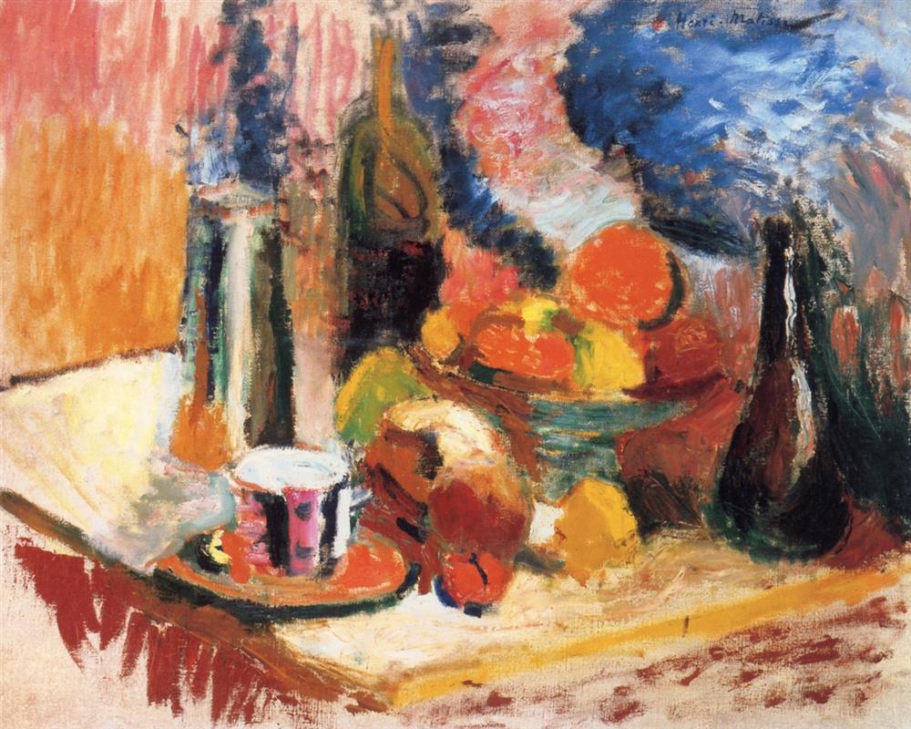
Henri Matisse’s “Still Life with Fruit” of 1896 is an early declaration that matter can be made to shimmer through color alone. The setup is ordinary—bottles, a cup on a saucer, a fruit bowl heaped with oranges and lemons, a table edge—but the experience is anything but. The painting hums with complementary contrasts: orange and blue, red and green, rose and viridian. Brushstrokes remain visible, layered wet-on-wet and scumbled in places so that the eye registers both the object and the act of painting it. Nothing is meticulously outlined; everything is held together by a lattice of color temperatures and directional strokes that travel across the canvas like musical phrasing. Seen from a distance, the objects lock into a coherent still life. Step closer and the scene dissolves into a storm of marks, an early sign of the freedom that would soon carry Matisse toward Fauvism.
What Is On the Table
At center right, a wide bowl brims with oranges and a few yellow fruits, probably lemons. Around it cluster other motifs familiar to Matisse’s studio: tall, dark bottles; a compact carafe; the sharp ellipse of a cup filled to the rim, perched on a vibrant saucer; a sliver of white plate; and a slant of folded cloth. The tabletop is thrust diagonally toward us, ending in a bold horizontal band of yellow near the bottom edge—a luminous strip that behaves like a ledge and a beam of light at once. Behind the arrangement, veils of blue, coral, and ochre suggest drapery or wall coverings, their rhythms echoing the curves of the fruit and the silhouettes of glass.
Composition as a Network of Forces
The still life is constructed as an energetic triangle. The fruit bowl dominates the middle register; vertical bottles anchor left and right; the cup and saucer lock the foreground. The diagonal of the table steers the gaze inward, while the back wall’s color bands push down from above. The effect is centrifugal and centripetal at once: color explodes outward, but the triangular armature keeps everything from flying apart. Negative spaces—especially the pale wedge of table at left—are as carefully shaped as the objects, offering breathing room that prevents saturation from becoming noise. Even the long, dark bottle at the far right reads less as an individual object than as a counterweight that stops the viewer’s eye from sliding off the canvas.
The Color Strategy: Warmth Against Cool
Matisse builds the painting on warm oranges and reds, then ignites them with cool opponents. The blue haze in the upper right is not a literal sky; it is a thermodynamic field that makes the oranges blaze hotter by opposition. Coral-pink and peach climb the left background like a rising temperature, while a vein of green around the fruit bowl quells the heat just enough to keep the palette from tipping into uniform warmth. Shadows are rarely gray. They are green-browns and deep violets, tones chosen not to mimic a photograph but to register how color behaves in light. This is a decisive step away from academic tonality: color is no longer a cosmetic laid atop form; it becomes the very architecture of the scene.
Brushwork and the Physical Surface
The paint handling is athletic. Strokes curve with the fruit, slant along the table, and rise in vertical bands around the bottles. Dry-brushed passages let underlayers peek through like breath on glass; loaded strokes leave ridges that catch light and carry pigment from one hue into another. In places the brush seems to skip, depositing broken color that the eye optically blends at viewing distance. The surface holds history: first decisions, corrections, and quick reinforcements are all legible, and that legibility gives the still life its pulse. You are not only looking at oranges; you are looking at the speed with which an orange was seized in paint.
Light and How It Moves
There is no single theatrical beam in this interior. Light seems to pool and flow, bouncing off the cloth, glancing on the cup’s rim, and glazing the rounded shoulders of the fruit. Matisse suggests this mobility through transitions rather than edges. Where the orange meets its shadow, the color cools and deepens instead of switching abruptly to dark. On glass, light is rendered by quick, narrow slashes that mimic reflections rather than describe them. The result is a believable atmosphere in which objects seem to be bathed in the same air rather than cut out and pasted on a set.
Space Built Without Linear Perspective
Although the table recedes, Matisse does not rely on textbook perspective lines to situate objects. Depth emerges through overlaps, value stacking, and temperature shifts. Warmer, higher-chroma colors advance; cooler, lower-chroma ones retreat. The left rear bottle sits in a smoky bath of blues that pushes it back, while the cup’s crisp white and pink assert the foreground. The diagonals are persuasive but never doctrinaire; a slight flattening of angles keeps the picture graphically strong, a quality that would become central to the artist’s later interiors and cut-outs.
The Cup and Saucer as a Pictorial Keystone
The little cup on its saucer is the painting’s keystone. Its white cap and pink-striped wall deliver the sharpest light-dark contrast in the foreground, setting a scale for everything else. It also provides a human note—a vessel meant for touch and taste—and a measured geometry that counters the sprawling pile of fruit. Because it is placed slightly off the center axis, the cup energizes the front edge without drawing attention away from the central bowl. Its oval repeats the bowl’s ellipse and prefigures the bottle shoulders, knitting the composition across distances.
Bottles, Transparency, and the Drama of Dark
Matisse loves the theatricality of dark glass. The bottles act as vertical chords that punctuate the lyrical midtones around them. Their darkness is not a void; within those near-blacks, hints of green, prune, and amber reveal themselves. Reflections are abbreviated into a few assertive marks—vertical highlights down a neck, a split ellipse across a belly—so that the glass reads instantly without fussy description. One bottle at the left leans into the blue field, its contour dissolved by a flurry of strokes; another at the right remains stout and opaque, a guardian at the edge of the stage.
The Table Edge and the Yellow Band
That vivid yellow band at the bottom of the composition is more than décor. It is a structural beam. It stops the eye from sliding out of the picture, counters the coolness above with a warm echo below, and hammers home the diagonal thrust of the table. Because the band sits flush with the picture’s lower limit, it signals a modern cropping sensibility: Matisse is comfortable allowing major lines to slam into the frame and continue mentally beyond it. In later work he will push this modernity further, but the seed is here.
Echoes of Chardin, Cézanne, and Van Gogh
As a young painter, Matisse absorbed the gravity of Chardin’s domestic still lifes—the belief that a fruit bowl can carry moral weight. He also looked intently at Cézanne’s method of building form by color planes and at Van Gogh’s conviction that color contains emotion. “Still Life with Fruit” emerges from this dialogue. The arrangement has Chardin’s sobriety, the construction leans toward Cézanne, and the handling at its hottest edges crackles with Van Gogh’s intensity. Yet the voice is already Matisse’s: objects serve the sensation of color; space is held together by temperature; and the painting argues for pleasure as an intellectual category.
From Earth Colors to Fauvist Fire
Compare this canvas with the more subdued still lifes Matisse painted around 1895 and you can feel the thermostat being raised. Earth colors remain, but they are overlaid with cadmium oranges, punchy reds, and turquoises that refuse to behave like “shadows.” In a few years the artist will shock Paris with pure, unmixed color laid side by side. This still life is a step on that road, a proof that color can carry structure and feeling without needing heavy contour or academic modelling. If the later Fauvist interiors are symphonies, this is a chamber piece that already contains the same harmonies.
Rhythm, Repetition, and the Music of Strokes
Look at how mark echoes mark. The scalloped strokes in the blue background rhyme with the roundness of the oranges. Slanting touches along the table reinforce the diagonal, while short, circular dabs accumulate into the volume of fruit. This orchestrated repetition produces rhythm—you feel the eye dancing from cup to bowl to bottle and back again. The rhythm is not a decorative overlay; it is the very way the image holds together, as if the composition were a piece of music whose motifs return in altered keys.
Sensation, Not Description
There are places where the object is barely named. On the left a pale wedge might be cloth or the table’s exposed surface; at the center a red-brown loaf dissolves into surrounding colors. Such indeterminacy is not a lapse. Matisse paints what matters to sensation and lets the rest blur. The viewer completes the scene in the mind, a collaboration that increases the painting’s immediacy. You do not read it; you experience it, the way you experience a room when you enter and are struck first by light and color before you consciously inventory the furniture.
The Tactility of Impasto and Scumble
Thickness and thinness alternate like textures on a set table. The oranges are often impasted, their highlights ridged so that reflected light literally clings to the paint. The blue field is thinner, almost rubbed in, like chalk on slate. This alternation creates tactile contrast and a sense of depth without resorting to linear tricks. It also places the viewer in direct relationship to the artist’s hand: you can imagine the pressure of the brush, the angle of the wrist, the last flick that established the rim of a glass.
Narrative of Everyday Abundance
While the painting is not narrative in the literary sense, it carries a quiet story about domestic abundance. Fruit is plentiful, vessels are at hand, and the table awaits use. The cup invites touch, the cloth suggests recent arrangement, and the nonchalant cropping hints that the scene continues beyond the frame. Matisse affirms the dignity of ordinary things, a humanistic thread that runs from his early still lifes to his later interiors where patterns, plants, and windows carry the same warmth.
Reading Path: How the Eye Travels
A natural path emerges. The gaze lands on the bright cup, slides to the orange fruit closest to it, climbs into the main bowl, and then glides rightward into the cooling blue. From there it drops down the dark bottle, crosses the yellow band at the front edge, and returns to the cup. Every element helps maintain this circuit. The left-side verticals prevent premature exit; the right bottle acts as a turning post; the yellow band is a baseline you bounce off; the cup is home base. The painting keeps your attention moving while always giving you a place to rest.
Why This Early Still Life Matters
“Still Life with Fruit” is more than a pleasant studio exercise. It is a working laboratory in which Matisse tests principles that will underwrite his mature art: color as structure; composition as a balance of forces, not details; brushwork as evidence of sensation; and cropping as a modern clarity. It also demonstrates a belief that joy—expressed through radiant color and vigorous handling—is a serious aesthetic value. In the 1890s, when many painters were pursuing picturesque effects or academic finish, Matisse chose candor and risk. This canvas records that choice with honesty and exuberance.
Seeing the Painting Today
Contemporary eyes, tuned to Matisse’s later fireworks, may overlook the subtlety in this earlier work. Spend time with it and the network of decisions becomes clear. The tiniest color shift along a lemon’s edge warms the entire corner; a few dragged blues turn cloth into air; a single dark stroke stabilizes an entire side. As with all durable paintings, its rewards multiply with attention. What feels at first like a jolt of color becomes, on a second and third look, a complete grammar of perception.
Closing Reflection: The Taste of Color
If you could taste this picture, it would be citrus—bright, slightly bitter, refreshing. That synesthetic quality comes from how completely Matisse translates seeing into sensation. Oranges do not simply look like oranges; they radiate warmth. Blue does not simply read as wall color; it cools the skin. The cup invites the hand, the cloth suggests softness, the glass glints with the sound of a click. Through paint alone, an ordinary table becomes a sensorium. In 1896, that was already Matisse’s gift, and he never let it go.