Image source: wikiart.org
First Impressions: A Room That Burns and Breathes
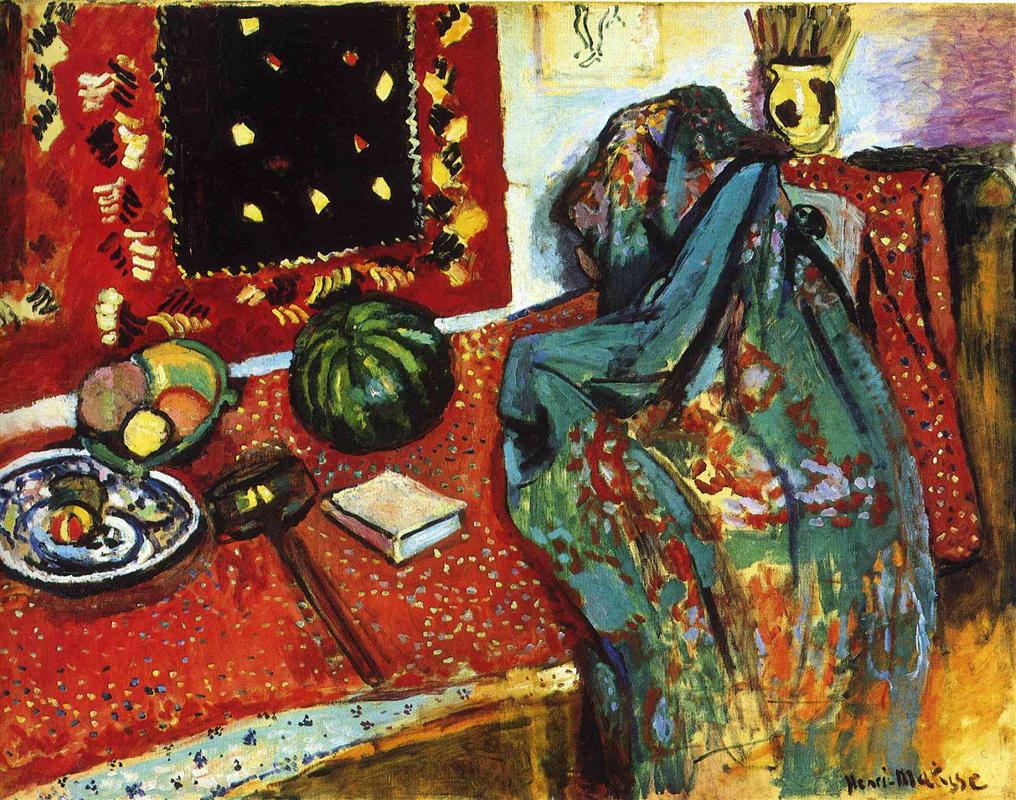
“Still Life with a Red Rug” plunges the viewer into a saturated interior where objects, textiles, and color-fields become actors on a stage. The painting is dominated by a scarlet expanse that spreads across the table and climbs the wall as a hanging rug. This red is not merely a background; it is the climate of the room. Upon it, Matisse arrays a watermelon, a bowl of fruit, a blue-and-white dish with citrus, a small book, a handled object that reads like a wooden mallet or utensil, and—most dramatically—a sweeping turquoise-green shawl cascading off a chair on the right. The entire scene is enclosed by a black-centered wall textile beaded with yellow and cream motifs, and a straw-filled vase sitting high at the back. The first sensation is abundance; the second is order. Amid the riot of hue and pattern, the composition holds together with unforced clarity.
1906: Color After the Fauvist Breakthrough
Created in 1906, the canvas belongs to Matisse’s period immediately following the 1905 Fauvist eruption. In Collioure he had learned that color could do the work of light and volume; in 1906 he explores how that chromatic language can organize richly furnished interiors. This still life is not a retreat to academic description; it is an expansion of Fauvist method. Pure pigments lay down the architecture of the scene, while visible brushwork makes the room feel breathed-in rather than staged. The painting also reflects a real aspect of Matisse’s studio life: his collecting of textiles from North Africa and the Near East. Rugs, printed fabrics, and shawls were not props for exoticism alone; they were tools that taught him how pattern can unify a surface and how ornament can be structural.
Composition: The Table as Stage, the Rug as Proscenium
Matisse builds the composition from two big planes of red—the tabletop sweeping diagonally from lower left to right, and the wall textile that occupies the top left quadrant. Between them, a pale strip of wall acts like a breathing pause, separating the two seas of pattern so the viewer does not drown in scarlet. The right side is anchored by the bent form of the chair and the voluminous green shawl, which introduces a cool counterweight to the reds. The fruit and objects are distributed with musical care: a plate and bowl balance the watermelon; the small book sits like a rest note between larger forms; the dark utensil bridges the lower left and points diagonally into the picture, keeping the eye moving. The geometry is simple—two rectangles of color and a set of diagonals—but the surface is alive with incident.
Color Architecture: Warmth Conducted by Coolness
Red is the keynote, but the painting’s harmony depends on the measured introduction of cool greens and blues. The turquoise shawl at right is decisive: it does not cancel the heat of the room; it gives it something to sing against. Its inner oranges and rose patches ally it to the rug even as its overall temperature relieves it. The watermelon’s deep green repeats and stabilizes the shawl’s hue; smaller mint notes in the bowl of fruit and the blue flourishes on the porcelain dish weave coolness through the left side. These carefully spaced cools articulate depth and keep the painting from flattening into a poster. Just as important are Matisse’s chromatic darks—near-blacks made of purple, green, and brown—used around object contours and within the wall hanging. They are not dead holes; they are the bass that allows the higher keys to ring.
Drawing With Color: Edges by Temperature, Not Line
You can count the outlines in this canvas on one hand. Matisse lets temperature create edges. Where the hot table meets a cooler fruit, a seam appears. Where the green shawl crosses the red cloth, the boundary is as much about contrast as about contour. Even the rectangle of the book is established by adjacent colors rather than hard ruling. This approach has two consequences. First, it harmonizes the still life with its setting; objects are felt as part of the same air rather than pasted on. Second, it turns the viewer’s attention away from accurate depiction and toward the relations that make the scene cohere—exactly the shift that defines Matisse’s modernity.
Pattern as Structure, Not Ornament
The red rug, the wall hanging, the speckled tablecloth, and the printed shawl could easily have dissolved into decorative noise. Instead, pattern becomes the painting’s scaffolding. The rug on the wall, with its black center spotted by small yellow lozenges and flanked by rhythmic border strokes, acts as a framed echo of the entire canvas: a saturated field holding floating notes. The tabletop’s confetti-like dots modulate the big red plane so it does not read as a sheet of paint; they also rhyme with the sprinkled motifs in the hanging, linking horizontal and vertical. The shawl’s floral bursts are painted as loose constellations of color, not literal blossoms, so they add energy without demanding attention as narrative detail. Ornament here is grammar.
Objects With Character: Fruit, Book, Tool, and Vase
The fruits are large, simple presences—spheres and ovals of color that supply scale and mass. The watermelon is a glossy green planet at center-left; the bowl of fruit to its left provides a higher, cooler chord; the blue-and-white dish with a citrus wedge and peel sets down a crisp, porcelain timbre that clarifies the corner. The small book, square and pale, is a calm in the storm—a modern note of everyday reading that also operates as a light patch against the surrounding reds. The dark handled object—mallet, pestle, or utensil—adds a lengthwise accent that breaks the dominance of round forms and, because it is dark, anchors the lower register of the composition. At the back, a straw-filled vase introduces a vertical bouquet of pale strokes, echoing the stripes of the shawl’s inner folds and completing a rhythm from foreground to background.
Space Without Perspective Tricks
There is no plotted vanishing point. The table tilts toward us steeply, the way many Matisse tables do, not to fool the eye but to make the painted surface act like a tabletop itself—useable, generous, close. Depth is created instead by overlap and temperature. The shawl overlaps the chair and the red field, clearly foregrounded; the watermelon occludes dots of the tablecloth; the hanging sits behind objects but in front of the pale wall strip; the straw vase nests in the upper right against a lavender corner that softly recedes. These adjacencies feel truthful and keep the painting spatially readable while protecting its decorative unity.
Brushwork and Facture: Tactile Analogies Everywhere
Matisse changes touch to suit substance. The red fields are laid with broad, elastic strokes that let earlier layers breathe through, like pile seen against the nap. The black center of the wall hanging is denser, with short, compact touches that increase its gravitas. The fruit are built with smoother, rounder sweeps; you sense the slick skin of melon and the waxy rind of citrus. The shawl’s folds are drawn with long, damp, dragging strokes that make the fabric feel heavy yet fluid. Everywhere, paint remains paint—visible decisions that give the room the immediacy of a lived moment.
Light Through Color, Not Cast Shadows
Illumination in this interior is a matter of hue rather than modeling. Brightness arrives as lemon yellows, pale creams, and cool lavenders. Shadows rarely drop in value; they cool in temperature. Under the watermelon, a cooler red and a pinch of dark green stand in for shadow. Within the shawl, muted teals mark deeper folds, not brown. This method produces a light that feels even and breathable, more like daylight passing through a colorful room than like a spotlight picking out objects.
Rhythm and the Eye’s Path
The canvas choreographs a looping route. The eye often begins at the big green watermelon, glides left to the porcelain dish, rises through the bowl of fruit to the border of the wall rug, travels across the black center dotted with yellow, falls down the pale wall strip, lands on the pale book, and then rides the long diagonal of the shawl into its sumptuous folds before returning to the central fruit. Every handoff is supported by a rhyme of color or shape: green to green, oval to oval, border dots to table dots, pale to pale, diagonal to diagonal. The result is restless yet restful movement—the pleasure of scanning a richly set table without ever getting lost.
Cultural Sources and the Studio as Theater
The painting’s textiles hint at Matisse’s sustained dialogue with Islamic and North African design, intensified by his 1906 trip to Algeria. He admired the way Islamic ornament transformed a wall or cloth into a nearly infinite field of repeating units. In his studio, such fabrics were not souvenirs; they were engines for pictorial invention. Here, the wall hanging behaves like a painting within the painting, the red rug is a ground that is both practical and poetic, and the shawl is a chromatic protagonist whose presence is as important as any fruit. The studio becomes theater, and textiles are both set and script.
Meaning Beyond Inventory: Hospitality, Pleasure, and Discipline
Still life traditionally carries moral messages—vanitas clocks, wilting flowers, admonitions about time. Matisse substitutes a different ethic. The table is an invitation. Fruit is plentiful, color is abundant, fabric is generous, and yet the scene never tips into chaos or indulgence. The discipline of distribution, the spacing of cool against warm, the measured use of dark accents—these are acts of care. Hospitality and clarity are not opposites; they are the same gesture practiced through paint.
Dialogues With Matisse’s Other Interiors
Compared with the 1905 “Harmony in Red,” this painting keeps more local contrast and textual detail; the table’s dots and the rug’s articulated border interrupt any rush toward flat redness. Compared with the 1906 “Vase, Bottle and Fruit,” it is more opulent and architectural, replacing a single dark square with the larger strategy of two red fields and a black-centered hanging. With “Open Window, Collioure” it shares the idea that a dominant color climate can organize a world; here, the window is replaced by an ornamental sky—a wall textile that performs the same unifying role.
How to Look So the Picture Keeps Opening
Choose one small motif in the wall hanging—a yellow lozenge floating in black—and notice how its hue recurs in the fruit and in tiny sparks along the rug’s edge. Shift to the shawl and trace one fold from top to bottom; watch how Matisse keeps the turquoise legible by alternating it with orange and rose, then cools it with a run of black-green. Look at the porcelain dish and see how a single swirl of blue both depicts decoration and suggests the plate’s curl. Return to the book and feel how its quiet plane is necessary; remove it in your imagination and the right side becomes top-heavy. These exercises make visible the delicate negotiations that hold the room together.
Material Presence and Time in the Studio
Because Matisse leaves the paint’s body intact, the picture holds the temporal arc of its making. You can read quick additions—the small pale dots on the rug, the highlight on the melon—and slower, weightier zones like the shawl. The surface does not conceal its revisions: a border repainted, a fruit pushed a little, a contour softened. This visibility of process allows the viewer to enter the studio, to feel the pacing of decisions that turned a crowded table into a coherent harmony.
Legacy: A Step Toward Decorative Unity as a Principle
What “Still Life with a Red Rug” proves—decisively—is that an interior may be organized like a textile without losing depth or touch. The belief will flower in the great monochrome rooms of 1908–09 and, decades later, in the cut-outs where color-shape and pattern become the very substance of imagery. The painting also demonstrates how domestic subject matter can carry avant-garde invention. A rug, a chair, fruit, and a book suffice to rethink what a picture is.
Conclusion: A Climate You Can Live In
The canvas endures because it offers a complete climate—warmth moderated by coolness, abundance tempered by structure, ornament anchored by bass notes of dark. The objects are recognizable, but what you live with is the relation among them: red holding green, pattern holding plane, surface holding depth. “Still Life with a Red Rug” is both feast and lesson, proof that clarity and pleasure can inhabit the same room.