Image source: wikiart.org
Historical Context And The Nice-Period Reinvention Of The Portrait
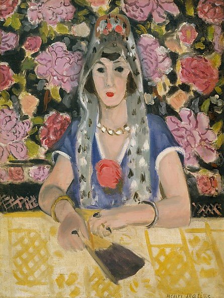
Henri Matisse painted “Spanish Woman: Harmony in Blue” in 1923, deep in the Nice years when he reoriented his art around clarity, calm, and the lyrical power of color. Having already exploded color’s possibilities during Fauvism, he now sought a language that could sustain long looking. Nice gave him a steady maritime light, access to patterned textiles and studio props, and models who could hold a composed presence. Within this framework he turned to the staged portrait—figures presented with ornamental backdrops, measured poses, and a handful of meaningful objects. “Spanish Woman: Harmony in Blue” is one of the most concise and commanding of these portraits. It presents a woman seated at a table, a floral wall behind her, her costume accented by a veil, necklace, bracelets, and a hand fan. Everything is tuned to a single dominant key of blue that structures the image while allowing adjacent reds, pinks, and yellows to resonate.
Composition As A Theater Of Frontality
The composition is intentionally frontal and architectural. The sitter’s torso forms a strong vertical mass at the center. Her forearms extend horizontally to the lower register, creating a stable cross that anchors the picture. Behind her, the floral field presses forward as a continuous plane, abolishing deep recession and turning the wall into a patterned screen. The table provides a wide band of yellow that both grounds the figure and separates her from the floral cascade. Viewed at a distance, the design reads as three stacked zones—floral backdrop, figure in blue, yellow table—locked together by the vertical axis of the face and veil. Matisse’s frontality is not stiffness; it is a strategy that lets color and pattern carry expression without narrative distraction.
The Face As Calm Center
Matisse simplifies the sitter’s face to a mask of poised intelligence. The almond eyes, dark brows, and small rose mouth provide a clear, legible geometry that holds its ground against the busy floral field. Light strikes the bridge of the nose and cheek planes in gentle gradations rather than harsh highlights, preserving the Nice-period ideal of even illumination. The face is set slightly forward of the veil so that flesh reads as a warm, living surface within the painting’s cool climate. This calm center is crucial: while costume, flowers, and table vibrate with color and rhythm, the visage stabilizes the picture, acting as a visual anchor around which the rest of the image circulates.
Harmony In Blue: Color As Structure
The title names the picture’s governing logic. Blue saturates the composition in layered registers: the sitter’s dress carries a deep, tempered ultramarine; the veil’s inner shadows wash toward blue-gray; faint cools temper the floral background’s blacks; and the table’s pattern holds pale blue notes amidst yellows. Blue’s dominance is not a monotone; it is a scaffold that permits other colors to sing. Against it Matisse pitches the warm family—pinks and crimson in the flowers, a coral rose pinned at the dress’s center, flesh tones of apricot and cream, and golden jewelry that flickers with measured warmth. Because the blues are decisive yet modulated, the warms read as accents, not intrusions. The total effect is a climatic harmony rather than a chromatic clash.
Pattern As Architecture Rather Than Ornament
The floral wall is painted as a continuous carpet of blossoms—peonies and roses simplified into rounded petals of pink, carmine, and mauve. Instead of floating as illustration, the flowers function as a structural plane, their repetition converting the wall into a patterned architecture that presses the figure forward. Equally purposeful is the lace-like geometry on the table. Its repeating diamonds and interlaced motifs flatten the foreground into a lucid band while echoing the circular rhythms behind the figure. Matisse learned from Islamic ornament that pattern can build space without linear perspective. Here he deploys that lesson to keep the portrait frontal, breathable, and rhythmically alive.
Costume As A System Of Accents
The costume elements are chosen for pictorial, not anecdotal, reasons. The blue dress establishes the key; the veil, dotted with small black leaf-shapes, adds a field of light cools that bridge between dress and wall; the necklace and bracelets introduce rounded flashes of gold that punctuate the center and the wrists; the red flower at the chest is the painting’s hottest note, an internal sun that pulls the eye back to the figure whenever the floral background threatens to steal attention. Even the fan held at the table’s edge is a compositional instrument. It points diagonally into the foreground, quickening the otherwise flat band of yellow and guiding the eye back toward the hands and the vertical axis of the figure.
Drawing Inside The Paint
There is hardly any contour drawing in the academic sense. Matisse draws with color edges. The arm’s volume is defined where a warm flesh note meets the cool table band; the neckline is a precise seam between lavender shadow and blue garment; the nose is a straightforward wedge of value change rather than a modeled tube. The veil is stated with brisk, translucent strokes that allow underlayers to glow, conveying sheer fabric without resorting to tight detail. The floral forms are painted with confident, rounded strikes of the brush—petal clusters that persuade by rhythm more than by botany. This drawing-through-paint keeps the surface fresh and the image legible at multiple distances.
Light As A Soft Maritime Envelope
The Nice-period light is a continuous veil that refuses theatrical chiaroscuro. It clarifies volume through gentle temperature shifts. The sitter’s cheeks and forehead warm slightly; the hollows along the neck cool toward lavender; the table’s yellow does not blaze but hums with matte radiance. Highlights collect in small, uninsistent places—the rim of a bracelet, the faceted edge of a necklace bead, the top seam of the fan—serving as quiet sparks that affirm material presence. Because the illumination is even, color and pattern can carry the expressive load without noise.
Spatial Logic Through Bands And Planes
Space is shallow but convincing. The patterned wall operates as a single plane just behind the sitter, its slight value drop and the small overlap of the veil generating a tactile sense of distance. The table exists as a broad horizontal band that comes forward through value and color contrast rather than foreshortening tricks. The figure overlaps both back and front planes, securing her in the room. This stacked-band logic is typical of Matisse’s Nice interiors: it permits clarity, keeps the painting legible at a glance, and gives color the authority to define space.
Rhythm, Repetition, And Visual Music
The image is choreographed as a loop. The viewer’s eye first meets the face, drops along the necklace to the rose at the chest, moves outward along the forearm to the fan, glides across the patterned table, then rises back up the opposite arm to the veil and floral wall before returning to the face. Along this route, repetitions keep time: rounded petals behind echo rounded beads at the throat; the veil’s small leaf-marks answer the flower centers; the fan’s dark triangle reappears as the pupil-black of the eyes and the deep shadows in the blossoms. These repeated shapes and tones make the painting readable as visual music—steady tempo with graceful syncopations.
Material Presence And Tactile Hints
Even though the composition is highly designed, it remains sensuous. You can feel the drag of the brush on the floral wall where pigment is laid more thickly; the veil’s sheer passages are thin and watery, catching the canvas weave; the table’s yellow is matte and dry, like sunlit cloth; jewelry beads sit as tiny raised dots; the fan’s edge is a darker, denser swipe of paint that suggests polished wood. These tactile cues ground the painting in lived materials and keep the design from floating into abstraction.
Spanishness As Pictorial Motif, Not Ethnography
The title evokes Spain—veil, fan, florid backdrop—but the painting is not an ethnographic portrait. Matisse treats “Spanish” as a rhythm of forms and colors: dark hair framed by a mantilla-like veil, a bold flower at the chest, a fan to quicken the hands. He distills these cues into a modern grammar of shape and hue. The effect is not exoticism but a concentrated visual theme—how blue can harmonize with hot floral reds and cool patterned whites to create a convincing, contemporary image.
The Psychology Of Presence
The sitter’s character emerges through the logic of the painting rather than through facial psychology alone. Her direct frontality, the measured set of the mouth, and the steady gaze declare composure. The hands’ quiet occupation with the fan suggests a contained energy. The veil brings a ceremonious dignity, while the rose and jewelry add a degree of festivity. The portrait communicates respect without solemnity, intimacy without intrusion. It is a public image of a private person, designed to endure prolonged viewing.
Comparisons Within Matisse’s 1922–1924 Portraits
Seen alongside “Espagnole (Buste)” and other Nice-period portraits, “Spanish Woman: Harmony in Blue” occupies the central lane of Matisse’s program. Some canvases of these years push toward opulence, with crowded textiles and intense ornament; others are pared down to almost abstract geometry. This painting balances both tendencies: a lavish floral field and clear, large planes; saturated notes and tempered blues; costume detail and structural economy. It is exemplary in the way it lets ornament act as architecture.
Lessons In Design: Why The Painting Still Feels Modern
Designers and painters find the canvas instructive because it demonstrates how a dominant color can organize a complex surface. Blue is everywhere, but it is calibrated in saturation and temperature to prevent monotony. A single hot accent—the chest rose—focuses the center without destabilizing the whole. Pattern is distributed strategically: large blooms in back, lace-like geometry below, tiny leaf marks on the veil, each scaled to its plane. The figure binds these domains through overlap and matched temperatures. The result is a portrait that reads immediately and rewards long study.
The Viewer’s Path And The Experience Of Time
The picture is structured for repeated viewing. On the first pass, one absorbs the big chord: blue figure, floral wall, yellow table. On the second, the micro-relations appear—the way a pink petal echoes the sitter’s lip, how a faint cool edge along the arm separates flesh from cloth, how the fan’s triangle stabilizes the near corner. With each return, the surface’s materiality—thick petal strokes, thin veil washes, matte table—steals more of one’s attention. Time in this painting is not narrative time; it is the duration of seeing, lengthened by rhythm and tuned color.
Conclusion: Blue As The Key Of Poise
“Spanish Woman: Harmony in Blue” condenses Matisse’s Nice-period ideals into one lucid portrait. A frontal sitter anchors the center; pattern becomes architecture; a dominant blue organizes the climate; warm accents concentrate meaning; and an even, Mediterranean light allows color to speak without strain. Nothing feels hurried; everything feels decided. The painting is not about spectacle but about the durable pleasure of relations—face to veil, arm to fan, flower to rose, blue to yellow—a harmony that keeps its promise every time the viewer returns.