Image source: artvee.com
Introduction
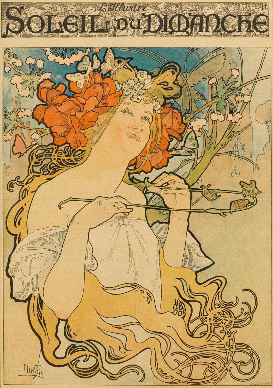
Alphonse Mucha’s Soleil du Dimanche (“Sunday Sun”), created in 1899, is an exquisite example of the artist’s mature Art Nouveau style. Commissioned as part of a decorative portfolio by the Parisian printer F. Champenois, the lithograph measures approximately 120 by 80 centimeters in its original poster format. Rather than promote a specific product or event, Soleil du Dimanche invites viewers into a lyrical vision of restful leisure and natural renewal. At its center stands an idealized maiden crowned with poppies and primroses, holding a slender flowering branch against a sunlit sky. Through harmonious composition, fluid linework, and a warm pastel palette, Mucha captures the distinct stillness of a Sunday afternoon suffused with light. This analysis explores the poster’s historical context, Mucha’s evolving style, its compositional strategies, iconographic depth, color and light techniques, ornamental vocabulary, typographic integration, technical lithographic process, reception and influence, and enduring legacy.
Historical Context of Late-Belle Époque Paris
The closing years of the 19th century in Paris—a period known as the Belle Époque—were marked by rapid industrialization, technological innovation, and a flourishing of the decorative arts. Advances in chromolithography made richly colored posters affordable and ubiquitous; street corners, café walls, and railway stations became open-air galleries showcasing the latest designs. Art Nouveau emerged as a defining aesthetic, characterized by sinuous lines, stylized botanical forms, and the integration of art into daily life. Mucha, a Czech émigré who arrived in Paris in 1887, quickly found favor among theater managers, publishers, and commercial clients. By 1899, he had become the movement’s most celebrated poster artist, his works synonymous with the vibrancy and optimism of the era. Soleil du Dimanche occupies a special niche within this milieu: it was not tied to a celebrity or commercial brand but celebrated the simple, universal pleasure of sunlight and repose.
Alphonse Mucha’s Artistic Evolution to 1899
Mucha’s early years in Paris were marked by struggle—he worked as a theater set painter and magazine illustrator before his breakthrough in 1894 with the poster for Sarah Bernhardt’s Gismonda. That commission inaugurated what critics dubbed the “Mucha style,” defined by graceful female figures, elaborate floral halos, and custom lettering. Over the next five years, Mucha refined his approach: he mastered multi-stone lithography, experimented with metallic inks, and deepened his decorative vocabulary by drawing on Byzantine mosaics, Japanese woodblocks, and Slavic folklore. By 1899, he had produced iconic advertising images for cosmetics, jewelry, and railway travel. These projects honed his ability to marry stunning graphic impact with narrative subtlety. Soleil du Dimanche emerges at this apex of technical skill and decorative imagination, distilling the artist’s ethos—art as a beautifying force in everyday life—into an allegory of sunny serenity.
Commission and Decorative Portfolio Purpose
Ferdinand Champenois, a leading Parisian printer and publisher, recognized the commercial value of Mucha’s work. In addition to contract advertising, he commissioned a series of so-called “Portfolio Sheets” designed purely for aesthetic enjoyment and to demonstrate the firm’s printing capabilities. Soleil du Dimanche was issued without accompanying text beyond the title, allowing the image to stand on its own poetic merits. Such decorative prints were sold in stationery shops and displayed in private homes, cafés, and salons. They communicated directly with a public hungry for visual elegance, effectively democratizing fine art by bringing it into domestic and public spaces. As a portfolio sheet, Soleil du Dimanche was both an artistic statement and a showcase of lithographic craftsmanship.
Subject and Allegorical Significance
The figure in Soleil du Dimanche personifies the leisurely joy of a Sunday afternoon beneath a benevolent sun. Her languorous posture—head tilted back, eyes half-closed, one hand resting gently on her chest—evokes complete relaxation. The wreath of poppies (symbols of sleep and dreams) and primroses (symbols of youth and renewal) crown her in natural regalia. The slender branch she holds curves sinuously across the composition, its buds and blossoms signifying the ongoing cycle of growth. Rather than evoking a narrative moment, Mucha’s design offers an emblematic vision of repose: the viewer, like the maiden, is encouraged to pause, to bask in sunlight, and to savor a brief suspension of time. In this sense, the work transcends seasonal allegory to become a universal ode to rest, light, and natural beauty.
Composition and Spatial Dynamics
Mucha arranges Soleil du Dimanche within a subtly implied circular field, referencing the sun itself. The heroine’s figure rises from the lower left, her golden hair and flowing drapery marking broad diagonal axes that guide the viewer’s gaze upward into the circle. Within the circle, the sky field transitions from pale blue at the top to creamy apricot behind the figure’s head, enhancing the sense of rising warmth. Above the circle, a narrow horizontal band displays the title in ornate script, its width providing a visual anchor. Below, Mucha leaves negative space open, allowing the figure’s drapery tail to sweep downward unimpeded. This tripartite structure—top band, central circle, bottom expanse—creates both stability and visual breathing room. Mucha balances dynamic diagonals (the figure and branch) against static horizontals (title band) and verticals (hair strands), achieving an equilibrium that feels both lively and serene.
Color Palette and Light Effects
Much a’s palette in Soleil du Dimanche is characteristically warm and luminous. Cream-toned paper serves as his base, diffusing light through translucent lithographic inks. The sky field employs pale cerulean, softening into ivory-apricot behind the figure’s head. The poppy blossoms are rendered in vibrant coral-red, their hue echoed in the maiden’s flushed cheeks and subtly in her lips. The primrose flowers in her wreath are a gentle off-white, linking floral and human elements. Her robes and hair shimmer in golden ochre, the highlights achieved by allowing the paper tone to shine through the ink. Very slight green glazing in the branch and foliage adds a complementary cool note. Metallic bronze inks accentuate the title band and the wreath’s leaves, catching lamplight in evening street postings. Through multiple layers of transparent ink and careful registration, Mucha transforms flat lithography into an experience of radiant depth—a hallmark of his technique.
Line Work and Ornamental Vocabulary
Central to Mucha’s Art Nouveau idiom is the “whiplash” line—a continuous, flowing contour that animates figure and ornament alike. In Soleil du Dimanche, this line defines the maiden’s hair strands, the folds of her robe, and the curling stems of the flowering branch. Thick outlines emphasize the figure’s silhouette against the sky, while finer strokes delineate interior details—the branch’s buds, the krinkled petals of poppies, and the subtle ruffles of fabric. The title band features stylized poppy motifs, their petals and leaves arranged in a repeating pattern that echoes the curve of the central circle. Mucha modulates line weight to orchestrate visual hierarchy: the figure’s primary contours are boldest, ornamenting vines and title motifs are medium, and interior texture lines are the most delicate. This interplay of line creates rhythmic movement and ties together human form, botanical ornament, and typographic elements.
Typography and Lettering Integration
Mucha believed that text should be as carefully designed as image. In Soleil du Dimanche, the title lettering appears in a custom hand-drawn serif that combines gothic flourishes with organic terminals reminiscent of plant tendrils. The letters are tightly interwoven, forming an almost tessellated band above the central circle. Each letter occupies its own cell, bordered by tiny poppy blossoms and vine motifs that link text and image. The subtle irregularities of hand-lettering lend warmth and personality absent from mechanized type. Mucha eschews any further explanatory text within the design, confident that the evocative image and title suffice to convey meaning. This integration of lettering into the decorative framework exemplifies his conviction that typography is an essential element of the Gesamtkunstwerk, or total work of art.
Technical Mastery of Lithography
Producing Soleil du Dimanche demanded rigorous lithographic technique. Mucha first created a full-scale watercolor and pencil study, mapping out color areas and linework. This study was then transferred, via light table or pouncing, onto multiple limestone plates—each responsible for a single ink color. Printers used registration pins to ensure exact alignment across eight to ten separate runs. Translucent inks allowed the underlying paper tone to serve as highlight, while dense bronze metallic ink added decorative sheen. Slight variations in proofs reveal the artisanal nature of the process: small shifts in hue, subtle texture differences, and the gentle embossing of the paper under the stone’s pressure. The final product, however, faithfully captures Mucha’s original vision: a luminous lithograph that rivaled the depth and warmth of watercolor.
Reception and Cultural Impact
Upon its release in early 1899, Soleil du Dimanche found favor among art enthusiasts, salon collectors, and the literati. La Plume magazine praised its “dreamlike repose,” while L’Illustration noted its “elegant synthesis of classic allegory and modern design.” Decorative arts dealers sold copies at stationery shops and bookbindery windows across Paris, where the poster’s warm hues and serene subject offered a gentle counterpoint to the bustle of city life. Coffeehouses and private salons displayed the portfolio sheet alongside book illustrations and fine prints, reinforcing its status as a work of serious decorative art. Its success encouraged Champenois to commission further portfolio sheets, cementing Mucha’s role as a leading innovator in graphic design.
Influence on Art Nouveau and Later Design
Mucha’s Soleil du Dimanche contributed to the international diffusion of Art Nouveau. Its motifs—whiplash curves, floral wreaths, harmonious palettes—were adapted by designers in Germany’s Jugendstil, Britain’s Arts and Crafts movement, and even early American graphic design. Interior decorators used the print’s color scheme as inspiration for wall stencils and textile patterns. Book artists incorporated Mucha-style letterforms into title pages and bindings. Even as Art Nouveau gave way to newer modernist tendencies in the early 20th century, Mucha’s decorative vocabulary endured in the creative lexicon of wallpaper designers, stained glass artists, and jewelry makers. The seamless integration of figure and ornament in Soleil du Dimanche remains a touchstone for those seeking to harmonize human form and natural motif.
Legacy and Conservation
Original lithographs of Soleil du Dimanche are held in major collections—including the Musée d’Orsay (Paris), the Victoria & Albert Museum (London), and the Metropolitan Museum of Art (New York). The fragile, cream-toned wove paper often exhibits tanning and slight discoloration at the edges; conservators address these issues through gentle surface cleaning, deacidification baths, and the infilling of losses with compatible paper and reversible adhesives. High-quality facsimiles and digital reproductions ensure that Mucha’s vision remains accessible to scholars, designers, and the general public. Exhibitions on Art Nouveau frequently feature Soleil du Dimanche to illustrate the period’s decorative aspirations and the potential of lithography as a fine art medium.
Conclusion
Alphonse Mucha’s Soleil du Dimanche stands as a radiant testament to Art Nouveau’s decorative ideals and the artist’s conviction that art should permeate everyday life. Through masterful composition, sinuous linework, a luminous pastel palette, and evocative symbolism, Mucha transforms a simple allegory of restful sunlight into a work of transcendent beauty. The poster’s enduring influence—on graphic design, decorative arts, and popular taste—affirms Mucha’s role as one of the most pivotal figures in the history of modern visual culture. More than an image, Soleil du Dimanche remains an invitation to pause, to bask in light, and to remember the simple joy of a Sunday afternoon beneath the sun.