Image source: artvee.com
Overview of the image and its dramatic premise
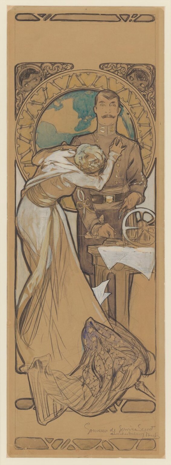
This vertical study shows Alphonse Mucha in the act of designing a theatre poster for a spy melodrama. A uniformed man stands frontally, rigid and imperturbable, while a woman collapses against him, her hand at his chest and her face turned away as if to whisper or weep. Behind them a monumental roundel combines a world map with the numerals of a clock, and at the margins two small faces peer in from curling arabesques. On a table at the right sit a telegraphic or cipher device and scattered papers, several of which are marked by the artist with white arrows to indicate their future emphasis. The whole is drawn on warm brown paper with vigorous black contour, white bodycolor, and notes of blue-green in the globe. Even in this preparatory state the page reads instantly: espionage, urgency, and the strain of divided loyalties.
Historical context: Mucha, the Paris stage, and the poster as storytelling
The year 1896 fell in the heart of Mucha’s Parisian ascent. Lithographic posters for Sarah Bernhardt had turned him into a sensation; publishers and producers queued for his ability to compress a play’s atmosphere into a single, irresistible image. Theatres of the period competed in the streets as fiercely as they did onstage. A poster had to be read from across a boulevard, identify the stars, and deliver the mood before the passerby took a second step. Mucha met that demand by combining a strong emblematic structure with human gesture. The present sheet belongs to that theatre world: a commissioned design for a production billed with the celebrated actor Lucien Guitry and the young Belgian actress Berthe Bovy. It shows how Mucha translated modern subjects—telegraphy, coded dispatches, international intrigue—into the visual grammar of Art Nouveau without sacrificing narrative clarity.
A poster study that lets us watch the artist think
Unlike a polished chromolithograph, this drawing keeps Mucha’s process visible. The warm, toned paper gives an immediate mid-tone; the black brushline stakes the composition; gouache and chalk pick out light on fabric, face and props; patches of color test emphasis. The white arrows and blank rectangles act as working notes to himself and to the printer. He leaves the title cartouches largely empty, indicating where block lettering or hand-drawn type will later live. Because the sheet was not cleaned up for reproduction, it lets us see the designer’s problem solving: where to place the billing, what object should become a leitmotif, how to lead the eye from star names to story and back again.
The figure pairing and the theatre of emotion
Mucha builds the design on a duet of opposites. The man, upright and central, is all verticals: buttons, collar bars, belt buckle, wrist straps. He is the axis of duty. The woman is all diagonals and arcs: skirt, scarf, arm, and the long sweep of her body bending across him. She is the vector of passion and plea. Their meeting point is the chest—a literal heart site—where her hand and head land. That contact communicates an entire plot in one gesture: affection colliding with secrecy, personal need pressed against public role. Because the faces are not exaggerated—his resolute, hers turned away—the scene remains dignified rather than melodramatic, the kind of seriousness producers wanted for high-profile casts.
The world-clock as the poster’s emblem
The large roundel behind the pair is the sheet’s most important device. Mucha fuses a Mercator-like globe with the track of a clock, implying that the drama is international and that time itself is the enemy. The ring also functions as a halo that monumentalizes the protagonists, lifting them out of a specific interior and into symbolic space. This is classic Mucha: a decorative circle that is never merely decorative. It clarifies the composition at a distance, gives printers a firm boundary to register color against, and acts as narrative shorthand—one glance and the passerby understands scale and urgency.
Espionage props and the technology of plot
At right a mechanical wheel, spoked like a cipher device or cable reel, sits beside a stack of papers on a small table. The man’s hand hovers near them as if about to seal, stamp, or conceal a document. Mucha has indicated dropped sheets with white arrows, signaling in the final poster they should gleam or read as gust-tossed evidence. These props anchor the scene in the modern world of codes and communications—telegraph keys, decoding wheels, and typed orders—so that the image speaks the language of contemporary news as much as theatre. In an age when headlines frequently mixed espionage and diplomacy, such details were magnetic.
Marginal masks and the theme of surveillance
The upper corners house two peering faces woven into strapwork. They function like architectural spandrels yet behave as characters: watchers embedded in the very frame. One reads them as spies inside the set, informers in the audience, or fate itself observing the action. Their placement at the threshold of image and border is not accidental. Mucha often used corner ornaments as narrative brackets; here they literalize the feeling of being watched, the essential condition of a spy play and the secret anxiety of any audience member caught up in scandal.
Composition as choreography of attention
A successful poster designs a reading path. Here the eye first locks to the roundel and the soldier’s head, then drops to the woman’s swoop—dress, scarf, hand—before landing on the table with its papers and device. From there, the gaze slides back up along the man’s straight arm to his face and loops again. The path mimics the plot’s tension: heart to evidence, evidence to face, face to heart. Mucha reserves open space near the top and bottom for the names of the stars and the title; those rectangles form visual rests in the composition’s music, places where the reader can absorb information without losing the story’s current.
Palette and lighting: economy that heightens drama
The color is sparing and tactical. Brown paper supplies warmth and unity. Cool teal and pale ochre within the globe lift the background without stealing focus. White bodycolor flashes along the woman’s dress, scarf, and the scattered papers, guaranteeing that the emotional line and the key props will read even under variable street light. Small touches of gold in buttons and buckle punctuate the soldier’s silhouette, while charcoal shadows bind folds and emphasize the table’s weight. This economy is both practical—fewer stones to print—and expressive. Against restraint, every highlight feels urgent.
Art Nouveau frameworks serving a realist core
Even in a spy story Mucha remains himself. The border is a field of curving bands; the empty title plaques are wrapped by latticed forms; the corner masks emerge from a tangle of line. Yet the central pair are modeled with sober observation. Hands and faces receive the most careful attention; clothing falls with credible weight. This balance—ornamental surround, realistic core—was the Mucha recipe that gave his posters their staying power. It allowed a thoroughly modern subject to inhabit a decorative world without turning frivolous.
The unstated triangle: duty, love, and time
Three forces dominate the design. The globe-clock is time, the uniform is duty, and the woman is love. Mucha arranges them so none can be ignored. Time crowns the pair; duty stands at the center and touches the evidence; love arcs across duty and threatens to scatter the papers. The drama of espionage often depends on such a triangle: the message must move before the clock runs out, yet feeling interrupts the route. Without writing a synopsis, Mucha sets the stakes with clarity, a reminder of how effectively a poster can do the work of a first act.
How the study anticipates the printed poster
The arrows and blank fields hint at production. Mucha has left ample room at the top for “Lucien Guitry” and “Berthe Bovy” in large lettering, the billboard appeal of the sheet. The lower margin, framed by a small cartouche, would carry title and venue. The roundel behind the heads acts as a natural stage for the play’s name: any lettering knocked out of its sky would read crisply. In the final printing he would likely strengthen the whites of the papers and scarf, perhaps glaze the globe a shade deeper, and lock the border with a black key line so the image could withstand rain and gaslight.
Relationship to Mucha’s other theatre designs
Compare this study with Mucha’s star portraits for Bernhardt. There the figure typically occupies a frontal, iconic pose with a decorative halo; in the spy design the two-figure vignette introduces narrative movement and props. What remains constant is the circular emblem and the dignified integration of type and image. The study also predicts aspects of his later, more allegorical works: the globe as symbol, the personification of abstract forces through posture, and the belief that a single well-chosen prop can stand in for an entire theme.
Gender and stage politics
The woman’s posture—clinging, imploring—reflects stage conventions of the 1890s, but Mucha draws her with agency. She is not fainting; her hand pushes firmly against the man’s chest, claiming the right to intervene. Her swirl of dress and trailing scarf command more space than any single prop. In the printed poster those shapes would be the movement that catches the boulevard’s eye. The soldier’s stillness is equally theatrical, projecting calm competence. Together they layout a conflict that respects both sides rather than caricaturing either.
The play’s modernity and the poster’s public promise
A spy drama in 1896 was not retrospective fantasy; it was a contemporary thrill, vibrating with the technologies and fears of the day—telegrams, ciphers, maps, and the new sense that empires could be touched at distance. By placing such instruments on the table and a map behind the heads, Mucha signals that the action belongs to the modern world. For producers, that was the promise: despite the stylized frame, the play will feel current. For viewers, the poster provided reassurance that the theatre could converse with newspapers, not just with myths.
What the brown paper reveals about Mucha’s hand
The toned ground lets the artist carve light with white and carve shadow with a wash of ink in a way that resembles sculpting. Fabric catches on hip bones, paper edges glow, hair and mustache are told in a few elastic strokes, and the globe’s oceans sit cool and flat against the warm page. You can see where he pressed harder to darken a contour and where he let the brush skate. That liveliness would be translated into a more formal key for lithography, but the energy here explains why Mucha’s final posters never feel mechanical. They begin in drawing that breathes.
The poster as a promise of suspense
The best theatre poster does not summarize; it teases. Every element in this study opens a corridor of curiosity without closing it. Who are the watchers in the corners? Why does the woman press a note to the soldier’s chest? What is the device on the table, and will it betray them? Will time on the big dial run out? The study’s mastery is that the questions arrive while the page remains visually serene. The measured symmetry and the stable roundel reassure the eye even as the narrative unsettles it. That confidence—tension held inside order—is Mucha’s signature.
Legacy and what this sheet teaches
Although many know Mucha through color-saturated posters, this working design is a crucial document. It shows the scaffolding beneath the glamour: emblem first, gesture second, props third, type placement last; a discipline that allowed him to pivot from mythic subjects to contemporary thrillers without losing his identity. It also demonstrates how Art Nouveau could meet modernity halfway. A cutting-edge story about secret services becomes compatible with sinuous borders and ornamental masks because the design logic is sound. For designers today the lesson is plain: build a strong symbolic engine, let the figures act truthfully, and give typography a place to sing, and any subject can wear elegance.
Conclusion
“Secret Services – poster design – Lucien Guitry and Berthe Bovy” compresses a world of espionage into one poised image. Mucha balances a globe-clock emblem with a human entanglement, threads surveillance into the corners, and scatters papers like live evidence at our feet. The study is both blueprint and drama. It promises a production driven by time and feeling, staged on the modern machinery of codes and cables, and delivered with the decorative authority that made Mucha’s name. Even unfinished, it convinces—proof that the master of Belle-Époque posters could make suspense itself look beautiful.