Image source: artvee.com
Introduction
Egon Schiele’s Secession. 49. Ausstellung (1918) represents the apex of his graphic work and offers a compelling window into the final phase of Vienna’s Secession movement. Commissioned as a promotional poster for the 49th exhibition of the Vienna Secession, the print transcends mere advertisement to become an autonomous work of art. Bold in its flattened perspective, economy of line, and selective color palette, the composition situates a group of stylized figures around a table, their focus both communal and disquieting. Schiele’s design negotiates the boundaries between fine art and graphic design at a moment when Europe reeled from wartime devastation. This analysis explores the poster’s historical context, formal strategies, symbolic content, and enduring impact, revealing how a simple exhibition announcement crystallized the aesthetic and ideological tensions of early 20th-century Vienna.
Historical Context
By 1918, the Vienna Secession—founded in 1897 by Gustav Klimt and colleagues—had weathered two decades of aesthetic ferment, internal schisms, and the cataclysm of World War I. Originally conceived as a platform for progressive artists to challenge the conservative Association of Austrian Artists, the Secession became synonymous with Art Nouveau’s flowing lines, symbolist imagery, and Gesamtkunstwerk aspirations. However, by the end of the war, economic hardship and political upheaval had eroded the movement’s optimism. Schiele, once Klimt’s protégé, had emerged as a leading voice of Expressionism, pushing figuration toward raw psychological intensity. In this fraught climate, the 49th Secession exhibition—held in March 1918—served both as a reaffirmation of artistic autonomy and as a means of rallying cultural life amid scarcity and social dislocation. Schiele’s poster for that exhibition embodies this dual function: it announces but also critiques, it invites but also unsettles.
Visual Description
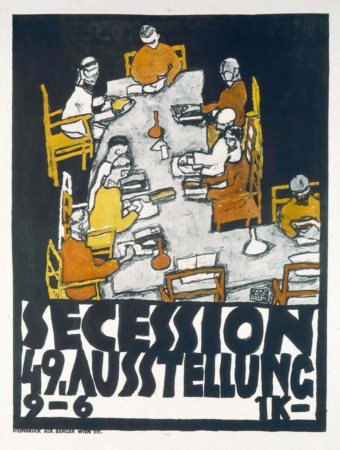
At first glance, Secession. 49. Ausstellung presents a horizontal tableau of eight figures seated around an irregularly shaped table. The table’s surface is a pale gray expanse bisected by a central vase or inkwell rendered in rust-red. The chairs encircling the table are painted in flat, mustard-yellow silhouettes, their straight lines contrasting with the fluid contours of the figures. Each person holds either a book, a sheet of paper, or a stylus, suggesting an assembly of thinkers or artists engaged in dialogue. The background behind them is a deep, velvety black, which isolates the scene and amplifies its theatrical quality. Below this image, the poster’s title and exhibition details—“Secession. 49. Ausstellung 9–6 X I K”—are spelled out in blocky, hand-drawn letters that echo the organic irregularity of the figurative forms above. Small lettering at the lowest edge credits the steindruck (lithography) to “A.B. Berger, Wien VIII.”
Typography and Graphic Design
Schiele’s approach to typography in this poster exemplifies the Secessionist ideal of integrating text and image. The thick, uneven strokes of the lettering mirror the artist’s own hand, blurring the line between illustration and graphic inscription. Unlike the uniform typefaces of commercial posters, Schiele’s letters possess a rhythmic irregularity that lends them a sculptural presence. The word “SECESSION” dominates the lower third of the composition, its seven capitals expanding nearly the full width of the sheet. Beneath, “49. AUSSTELLUNG” occupies two lines, its narrower letters packed tightly to conserve space and intensify visual impact. The numbers “9–6” (indicating the exhibition’s duration) and the enigmatic “X I K” (likely a date or Secession internal code) appear in a smaller scale but maintain the same gestural character. By uniting text and image through consistent line quality and color, Schiele affirms the unity of aesthetic communication central to the Secession’s mission.
Use of Color
Schiele restricts his palette to four principal hues—black, gray, mustard yellow, and rust-red—on an off-white lithographic ground. This economy of color serves multiple purposes. First, it reduces the image to its essentials, compelling the viewer to focus on form, gesture, and spatial relationships rather than chromatic spectacle. Second, the selective application of ochre and rust functions as both unifying motif and semantic marker: the mustard chairs and seat backs visually connect disparate figures, while the rust-red inkwell and select garments introduces a unifying emotional accent. The deep black background performs a theatrical role, severing the scene from any temporal or spatial context and heightening its symbolism. Grays model the table surface and some interior chair planes, suggesting subtle variations of light and material without detracting from the overall flatness. In this harmony of hues, Schiele achieves maximum expressivity with minimal means.
Composition and Spatial Treatment
The poster’s composition revolves around the peculiar geometry of the table, which tilts forward at an angle that defies conventional perspective. Rather than employing vanishing points, Schiele opts for a flattened, diagrammatic space reminiscent of Japanese prints and early modernist experiments. The table’s irregular outline—suggesting an ancient or ritualistic meeting place—anchors the assembly of figures. Chairs and bodies interlock like pieces in a puzzle, their overlapping forms creating a rhythmic alternation of horizontal, vertical, and diagonal lines. The only true “space” is the black behind, which functions less as negative space and more as a void into which the figures are cast. This anti-perspectival strategy underscores the poster’s symbolic nature: it is not a depiction of a real event but a provocation to join a communal act of cultural renewal.
Figures and Gesture
Schiele populates the table with eight figures—four on each long side—each rendered with a sculptural austerity. Their heads are bowed, their faces either obscured or reduced to minimal features. Limbs extend in angular, sometimes clawlike gestures: arms reach across the table in lines as sharp as the chairs’ backs, while legs, partially hidden by the tablecloth, peek out with a fractal irregularity. Some figures hold books or scrolls, others cups; a few appear to be writing or reading. This ambiguity of activity—are they readers, writers, drinkers?—enhances the sense of a fleeting, secretive congregation. The uniformity of posture and accessories suggests a shared purpose, perhaps deliberation or creative exchange, while the slight variations in head tilt and hand position preserve an individual nuance. Schiele’s line delineates each figure with a confident economy, conveying muscle tension, drapery folds, and even the knitted fabric of sleeves through a few incisive strokes.
Symbolism and Message
As a Secession poster, the work carries layers of symbolic meaning. The table can be read as an altar of art, a stage for the movement’s ideals of integration and innovation. The inkwell—or stylized vase—at its center may stand for the artist’s craft or the generative core of collective creativity. The repetition of chairs and books suggests both democracy and erudition, while the bowed heads hint at humility before the task. The black background evokes the undifferentiated forces of history and nature that the Secession sought to confront and transform through art. By populating the scene with eight rather than a heroic figure or ornamental motif, Schiele emphasizes the movement’s communal ethos: it is a fellowship, not a cult of personality. Yet the harsh angularity and flattening of form also signal a rupture with decorative Secessionist hallmarks, reflecting Schiele’s commitment to raw expression over ornament.
Technical Process
Secession. 49. Ausstellung was produced as a color lithograph by the Atelier Berger in Vienna’s VIII district, a workshop renowned for its technical prowess. Schiele prepared separate stones or plates for each color—black for outline and background, gray for the table, yellow for chairs and some garments, and red for the inkwell and limited accents. The registration marks visible at the edges testify to the precise alignment required to achieve clean overlays. Lithography, with its capacity for both painterly washes and crisp drawing, suited Schiele’s hybrid approach: he could transpose his charcoal-like drawings onto stone while preserving the spontaneity of his line. The minimal color layering reduced the complexity of the print run, a practical consideration in postwar Vienna where resources were scarce. The final prints exhibit a slight texture from the stone, adding a tactile richness to the flat fields of tone.
Relation to the Secession Movement
Although the Vienna Secession began in 1897 as a revolt against academic naturalism, by the 1910s it had evolved into a multifaceted platform encompassing painting, sculpture, architecture, and design. Schiele’s poster emerges at a turning point: Klimt had withdrawn in 1905, and new voices like Koloman Moser, Oskar Kokoschka, and Schiele himself sought to push the movement beyond Art Nouveau’s ornamental legacy. The 49th exhibition, dedicated to the Secession’s own members rather than to foreign avant-gardes, signaled a period of introspection and self-definition. Schiele’s graphic announcement thus becomes a manifesto in itself: a stark, unornamented design that unites text and image, communal gathering and personal gesture. It both honors the Secession’s founding ideals of unity and progress and intimates the stylistic rupture that would give rise to Austrian Expressionism.
Reception and Impact
Contemporary accounts of the 1918 exhibition emphasize its somber yet resolute atmosphere, with visitors noting the pared-down aesthetic of both the show and its promotional materials. Schiele’s poster attracted attention for its striking departure from the ornate Secessionist posters of the previous decade. Critics praised its clarity of message and modernist rigor, while some traditionalists lamented its lack of decorative appeal. In subsequent years, the work gained recognition among graphic designers and art historians as an exemplar of early modernist poster art. Its influence extended beyond Vienna: German and Swiss designers admired its integration of type and image, and it inspired similar promotional works for avant-garde exhibitions across Central Europe. Today, the poster stands in museum collections as a testament to the Secession’s final flowering and to Schiele’s versatility as both painter and graphic artist.
Legacy and Continuing Relevance
More than a century after its creation, Secession. 49. Ausstellung retains its power to engage contemporary audiences. Graphic designers study it for its economy of line, bold color contrasts, and inventive typography. Art scholars reference it when tracing the genealogy from Art Nouveau to Expressionism and beyond. Cultural theorists see in its communal table scene a prescient metaphor for collaborative art practices and interdisciplinary exchanges. Its empty black field resonates in today’s visual culture as a stage for projection—inviting viewers to fill the void with their own interpretations. Exhibited alongside Schiele’s paintings and drawings, the poster underscores the artist’s broad oeuvre and his belief in art’s capacity to shape cultural discourse.
Conclusion
Egon Schiele’s Secession. 49. Ausstellung stands as both an effective advertisement and a compelling work of modernist art. Its synthesis of bold graphic design, expressive figuration, and pointed symbolism encapsulates the final phase of the Vienna Secession and the emergence of Austrian Expressionism. Through flattened space, economy of color, and integral typography, Schiele crafted a poster that communicates on multiple levels—practical, aesthetic, and ideological. More than a century later, it continues to inform our understanding of early 20th-century art movements and to inspire designers, historians, and artists seeking to balance clarity of message with expressive depth.