Image source: artvee.com
Overview and First Impressions
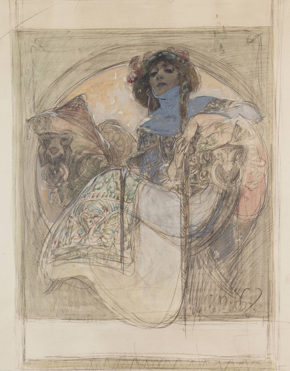
“Seated Woman – Study for a Poster” from 1897 captures Alphonse Mucha at the crucial moment when a vision leaps from idea to image. What we encounter is not the polished lithograph that would have adorned Parisian boulevards but the laboratory where that poise and glamour are engineered. The composition centers on a commanding woman seated within a circular niche. She tilts her head slightly, eyes lowered yet assured, as if aware of the viewer’s admiration. A blue collar or scarf encases her neck, floral forms crown her hair, and swathes of patterned fabric cascade across her lap. Around her, the architecture softens into Art Nouveau arabesque: an arch like a halo, stylized vases, and curving supports that guide the eye. Mucha’s line is alive and exploratory—erasing, redrawing, feathering edges—so that the study reads as both a portrait and a choreography of ornament.
The Year 1897 and the Poster Revolution
By 1897 Mucha was already the face of Parisian poster art. His breakthrough with Sarah Bernhardt in 1894 had transformed commercial graphics into an art form people collected. Lithography studios, department stores, and theaters clamored for images that could command space from across the street. This study belongs to that culture of street-side spectacle but reveals the private discipline behind it. It maps how an image meant for print is composed in pencil, wash, and heightened color on paper. In the 1890s advertising, fine art, and design were not rival territories for Mucha; they were the same field, and this sheet is the turf where they meet.
Subject, Presence, and the Invention of the Modern Muse
The woman is not an identifiable celebrity here; she is a type—a modern muse constructed out of elegance, intelligence, and a hint of aloofness. Mucha repeatedly built such heroines to personify perfumes, plays, biscuits, bicycles, and journals. Their power lay in their mixture of individuality and emblem. In this study the sitter’s relaxed hand draped over the armrest, the other hand touching a staff or slender support, and the lifted chin combine to produce an aura of self-possession. She is not consumed by decoration; she commands it. The message, crucial to fin-de-siècle advertising, is that the product or performance associated with her promises an elevated state of mind.
Composition: A Circle That Behaves Like a Stage
A large circular field behind the figure anchors the composition. It performs several jobs at once. It frames the woman like a halo, isolates her from surrounding architecture, and acts as a theatrical “proscenium” that pushes her forward. Mucha then breaks the perfect geometry with diagonals—the sweep of a fan or wing form to the left, the arc of her skirt, the gentle slope of her shoulders—so that the eye never grows static. At the bottom edge, the hem of the dress hovers near the frame, barely contained, suggesting motion beyond the picture’s limit. This combination of circle and escape is a Mucha signature: stable center, lively periphery.
The Orchestration of Line
Every mark in the study teaches something about Mucha’s draftsmanship. He lays down structural lines with firm pressure—defining the circular niche, the chair’s arm, the key folds of the garment—then laces them with softer hatching to find volume. He is comfortable letting the pencil wander where decisions remain open; you can see alternative contours around the sleeve and skirt, a web of possibilities. The face, by contrast, is more decisively modeled: a few strokes set the eyes, a shadowed plane establishes the nose, and subtle cross-hatching defines cheek and chin. The line’s variety is not accident; it calibrates the viewer’s attention, finishing what must be legible from a distance while leaving room for changes where ornament and drapery can evolve.
Color as Direction Rather Than Fill
Although primarily a drawing, the study includes watercolor or gouache touches—blues for the collar and shadows, greens and reds woven into the decorative panels, warm tones in the circular background. Mucha never merely fills shapes. He uses color to direct emphasis and articulate planes. The cool blue around the throat and shoulders cools the area nearest the face so skin appears luminous; the warm halo behind the head lifts it forward; the green patterning on the dress distinguishes textile from flesh without flattening either. Even where paint thins or spatters, the effect is intentional: the broken surface of the background adds atmosphere and distance, preventing the niche from competing with the figure.
Drapery, Pattern, and the Logic of Ornament
Mucha’s ornament grows out of structure. The complex scrollwork across the woman’s skirt and sleeve follows the logic of seams and flow. Pattern tightens where fabric stretches and relaxes where it pools, so decoration explains form rather than disguising it. The stylized vases flanking the figure operate in the same grammar: their rims echo the curve of the niche; their bodies repeat the arabesque found in the dress; their symmetry balances the seated diagonal. For a poster designer the lesson is clear—ornament should behave like a sentence with grammar and emphasis, not like a scattered list of motifs.
Gesture and Psychology
The head is tilted and the gaze is slightly downward, an angle that allows the viewer to read confidence without confrontation. The left hand droops with languor, fingers relaxed; the right hand, in contrast, rests with purpose along a vertical element. Between these poles Mucha creates emotional temperature: indolence and alertness at once. The neck’s long column, exaggerated by the high blue collar, contributes to an impression of elegance. Look longer and you sense a subtle narrative: the woman is not merely seated; she occupies a throne of style, aloof but available to the promise of performance or product.
Architecture as Emblem
Mucha often treats furniture and architecture as extensions of the figure. Here the seat, armrest, and backdrop form an environment that feels grown, not built. The circular niche reads like a shell, the vases like budding plants, the armrest like a branching stem. This organicization of space is central to Art Nouveau and to Mucha’s ability to weld fine art and design. The viewer doesn’t just see a woman next to a product; the viewer enters a habitat where human and object share the same lifelines.
Evidence of Process and How Posters Are Born
What makes this sheet so compelling is its candor about process. There are faint guidelines for text zones near the borders, indicating where a title or brand might later appear. The lower register remains largely unworked, a reserve likely intended for typography. Pentimenti—those ghost lines of earlier decisions—shadow the sleeve, the edge of the niche, even the outline of the fan. This openness shows how Mucha designed from the figure outward: first establish presence, then decide how decorative fields and type will support it.
Links to the Theatre and the Female Image in Advertising
Even when not tied to a specific play, Mucha’s female figures carry theatrical DNA. The tilt of the head, the costume-like profusion of fabric, the way the figure fills a niche like an actor stepping into a spotlight—all recall stagecraft. In 1890s Paris the line between stage poster and product advertisement blurred, and Mucha perfected that fusion. In the present study the woman could advertise perfume, jewelry, a magazine, or a production; what matters is the affect she produces: aspiration, sophistication, and a promise of sensuous experience.
Material Intelligence Hidden in a Drawing
Although it is simply paper and pigment, this study imagines multiple materials at play in the future lithograph. The brocade-like passages of the skirt suggest silk; the chair suggests carved wood or bronze; the halo implies enamel or painted backdrop. Mucha’s drawing is thus a material rehearsal for the rich, flat inks of the printing press. He forecasts how a limited lithographic palette will still feel opulent by using pattern, value contrast, and complementary warm–cool relationships.
The Art Nouveau Line and Its Ethics
Mucha’s sinuous contours are famous, but their ethics deserve attention. These lines do not imprison the model; they let her breathe. Each curve affirms bodily rhythm rather than distorting it. The most decorative passages occur in inanimate supports and textiles, while the face and hands remain human. In an era when advertising could easily slide into objectification, Mucha’s approach dignifies the subject. The woman is an emblem, yes, but she is also a person whose features are studied with tenderness.
Scale, Legibility, and the Street
Posters had to read at thirty paces. This study anticipates that demand. The dark mass of hair against a pale halo, the blue collar against warm skin, the concentrated shadow under the chin, and the strong diagonal of the sleeve all create high-contrast shapes that remain legible from afar. The more intricate arabesques reward close viewing but do not impede recognition at a distance. Mucha engineers attention in layers: bold silhouette first, decorative detail second, typographic information last.
Comparison with Finished Works Without Naming a Specific Poster
Many finished posters by Mucha share this blueprint: a central woman seated or standing within a roundel, flanked by symmetrical ornaments, draped in patterned textiles, and accompanied by a narrow, unoccupied panel reserved for type. The study shows how that template is customized—pose adjusted to the likely brand mood, accessories modified to hint at product type, background color tuned to seasonal or theatrical context. What remains constant is the synthesis of figure, ornament, and frame.
Cultural Context and the Allure of the Modern Woman
The 1890s city was fascinated by the idea of the modern woman—educated, stylish, a consumer and cultural agent. Mucha both responded to and shaped that fascination. His women are neither ingénues nor stern allegories; they are poised, luminous presences who mediate between the viewer and the world of goods. In this drawing the model’s knowing gaze and relaxed luxury promise a life of cultivated pleasure, precisely the emotion a poster must spark to make passersby stop, look, and remember.
Why This Study Feels Contemporary
Designers today will recognize strategies they still use: anchoring a campaign around a single charismatic figure, staging with a bold geometric backdrop, treating ornament as a system, and leaving deliberate zones for copy. The hand-drawn qualities—the smudges, speed lines, and free adjustments—also align with current appreciation for process in branding. The study reminds us that behind every seemingly effortless visual identity lies hours of drawing where decisions breathe before they harden into print.
Lessons for Artists and Designers
Several practical lessons emerge. Start with the character—posters succeed when a person carries the story. Establish a commanding geometry to hold the eye, then let diagonals keep it moving. Use color not as filler but as a way to separate planes and set temperature around the face. Allow pattern to describe form, not bury it. Reserve space for words early in the design so text collaborates with image. Above all, let line carry emotion; a confident contour can hold more narrative than a paragraph of copy.
The Lasting Charm of an Unfinished Image
Part of this sheet’s magic lies in its incompleteness. The drawing lets us feel how beauty is engineered: the searching lines around a hand, the quick wash that suggests, not dictates, a material, the layered corrections near the arch. We watch Mucha think. That intimacy, more than any polish, makes the study valuable. It proves that the recognizable “Mucha style” is not a formula pressed like a stamp; it is a set of living choices made in real time by eye, hand, and imagination.
Conclusion: From Studio Whisper to Street Voice
“Seated Woman – Study for a Poster” records the whisper that precedes the shout. In the studio, a woman is seated and surrounded by a new kind of architecture—one grown from lines that curve like vines and frames that shine like metal. From this whisper would come a street voice capable of stopping pedestrians under gaslight, of making theaters sell out and shops fill. The study shows not only what Mucha drew, but how he made images speak to a city. It testifies to a belief that grace, clarity, and ornament can live together—and that a single seated figure, drawn with care, can move an entire crowd.