Image source: wikiart.org
First Look: A Coastline Built From Color And Impact
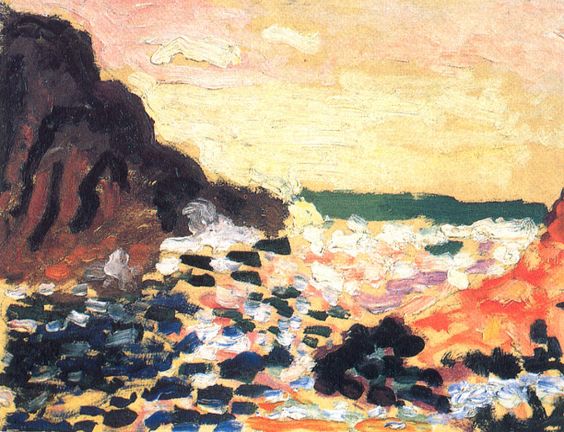
Matisse’s 1906 “Seascape” captures a rugged shoreline where waves detonate against dark rocks beneath a pale, heat-hazed sky. There is no attempt at meticulous description. The world is assembled from assertive strokes—ink-dark blues and blacks for boulders, fleshy oranges for sunstruck cliff faces, whipped whites for spume, and a quiet, lemony atmosphere that seems to dissolve the horizon. Instead of faithful transcription, the painting offers a condensed sensation: the shock of surf, the mineral weight of rock, the glare of afternoon light, and the breath of distance rolling in from the open water.
Fauvism After The Storm Of 1905
Dating from 1906, the canvas belongs to Matisse’s period of testing and consolidating the Fauvist revolution. Having proved the expressive force of unblended, high-key color the year before, he now adapts those discoveries to subjects where light is harsher and forms are more blunt. Here the sea is not decorative backdrop but a proving ground for color as structure. The blackish strokes owe something to the bold “drawing in color” he had evolved in Collioure, yet the palette is recalibrated to the maritime mood: fewer candy hues, more earth and ore, more attention to how pale air can swallow detail. The work reads like an outdoor counterpart to his interior nocturnes of 1906—less glare than resonance, less display than authority.
Composition: Diagonal Drama Between Cliffs And Channel
The composition is a taut triangle. On the left a mass of dark rock climbs steeply; on the right a glowing headland, all orange and vermilion, leans in to answer it. Between them a diagonal channel draws the eye toward a thin, greenish line that seals the horizon like a calm beyond the turmoil. This geometry does several jobs at once. It establishes a stage for the white, roiling water; it creates a rhythm of heavy-light, dark-warm counterweights; and it gives the sky an unexpectedly generous share of the painting so that atmosphere becomes protagonist, not backdrop. The rocks hold the picture like bookends; the sea performs.
Color Architecture: Complements That Create Form
Matisse builds volume and space by placing complements in conversation. Warm ochres and oranges of the right-hand cliff are tightened by neighboring notes of blue and blue-black; the near-black of the left rock burns against the pale, buttery sky; pinks and violets streak the surf to cool the heat of adjacent oranges. Because the pigments remain relatively clean—laid in assertive tiles and commas rather than kneaded into mud—each color retains its integrity and does visible work. A small dark beside a light stroke becomes an edge. A cool violet beside a warm peach becomes shadow. White is used sparingly and effectively, not as a glaze over everything but as detonations of foam that read as light itself.
Brushwork And Surface: A Sea You Can Feel
The facture is varied and precise. Rocks are written with short, chunky strokes that move at angles, giving their faces a broken light. The surf is made from whipped, impastoed whites and lilacs, dragged quickly so that ridges of paint mimic the churn of water. In the sky, the brush broadens and slows; pale yellows and creams are scumbled thinly so the support peeks through, creating a veil of glare. These differences in touch are not decoration; they are description by material analogy. You feel the resistant mass of basalt, the airy granularity of spray, the weightless drift of sky simply through the way the paint sits.
Light And Atmosphere Without Chiaroscuro
Traditional seascapes often hinge on a single, theatrical beam of light. Matisse offers something subtler: a pervasive, high-key atmosphere that bleaches detail and drives contrasts to the edges where forms meet. The cliff at right glows because it is surrounded by cool notes; the left rock darkens not from heavy shading but because it collects complementary blues and violets. The water is luminous not because of added highlights but because small, cool strokes set the warm notes vibrating. The sky’s pale field is not empty; it is carefully tuned across creamy yellows and faint pinks that let the eye rest after the chop and clash below.
Space And Depth Through Adjacency
Depth is achieved with astonishing economy. The foreground water is a busy tessellation of dark and light tiles; the middle distance becomes smoother and paler; the horizon condenses into a flat band as if distance had wrung detail out of the world. No linear perspective grids are required. Overlaps are clear—wave over rock, rock before sky—and temperature steps do the rest. The viewer senses a shallow bowl of water between headlands with open sea beyond, all conveyed by the placement and interaction of color.
The Motif Of Coastline: Weight Against Motion
The painting plays the eternal drama of coastlines: the endurance of rock against the changefulness of water. Matisse expresses this in painterly grammar. The rocks are heavy, made from saturated darks and thickened strokes. The sea is flickering, marked by fast, broken notes and high-value whites that refuse to sit still. Even the thin horizon line participates; it is a moment of composure that divides forces without fully calming them. This thematic clarity—weight versus motion, mass versus flux—gives the picture its satisfying inevitability.
The Role Of Black And Near-Black
Fauvism is often remembered for its pure hues, but Matisse knew when to strengthen a chord with black. Here near-black blues and charcoals articulate the left-hand rock and provide a bass line beneath the surf’s bright notes. Because those darks are modulated—blue-black here, brown-black there—they avoid deadness and instead anchor the orchestration. They also spare the painting from sweetness. Against the buttery sky and peachy surf, the blacks insist on gravity.
Rhythm And The Eye’s Itinerary
The picture choreographs a clear path for the gaze. You begin at the left rock’s cliff face, where dark stair-steps descend into the water. Your eye then rides the diagonal current of foam and dark tiles toward the horizon’s cool green bar. From there you drop along the right-hand cliff’s warm facets back into the collision of white and violet water. The loop repeats effortlessly because each region shares a color or a directional cue with the next. Looking becomes a tide.
Comparisons Within Matisse’s Marine Works
Compared to the 1905 Collioure views with their raspberry and emerald bravura, this “Seascape” is sterner, closer to stone and salt. Compared to the more overtly decorative “La Moulade” variants with carpet-like color patches, it emphasizes impact and structure. It sits comfortably beside the darker still lifes of 1906 where saturated objects glow within a shadowed room; here, saturated cliffs burn within a pale atmosphere. Across subjects, the method is the same: let color shoulder structure, let the ground breathe, let a few darks hold the architecture.
How The Painting Balances Abstraction And Place
Stand too close and the canvas becomes a near-abstract field of oranges, creams, blacks, and blues. Step back and the Atlantic breath snaps into place. The success lies in Matisse’s calibration of signs. He gives the eye just enough cues—horizon bar, cliff profiles, froth shapes, directional flow—and then allows color relations to do the rest. The image is both specific and general: a particular cove in unrepeatable weather, and the idea of coastlines everywhere.
Material Presence And The Sense Of Weather
Because the paint retains its bodily character, the picture actually seems to hold weather. Thick whites feel humid and heavy, like wet air suspended above the break. Scumbled creams in the sky reproduce the sensation of light diffused by high cloud. The rock’s dark ridges catch actual light in the gallery, turning as you move, the way volcanic faces change as the sun edges across them. This material truth prevents the bold color from floating into mere design. The sea is not a pattern; it is stuff.
The Ethics Of Clarity
Matisse often spoke of art as a place of repose and clarity, not because it denies intensity but because it organizes it. Here, clarity arises from relations that are easy to follow. Warm is opposed to cool, heavy to light, dark to pale, rough to smooth. Nothing is overly detailed; nothing is muddy. The clarity is ethical as well as optical in the sense that it respects the viewer’s time. You are not asked to decode shadows; you are invited to register the vital arrangement of forces and enjoy their balance.
How To Look So The Picture Opens
Begin with one patch of white in the surf. Notice how it brightens because it sits beside violet and blue, not because it is pure. Find the green horizon bar and observe how a razor-thin, cool note can hold the entire distance. Shift to the right cliff and track how oranges and peaches harden into volume when notched by a single blue-black mark. Now let your eyes idle in the sky where thinly dragged creams reveal the weave of the ground. After a few such circuits the painting stops being separate zones and becomes a single chord—sky, rock, water, and light sounding together.
What This Seascape Contributes To Matisse’s Arc
The canvas confirms that Fauvist thinking could do more than shock with color; it could deliver convincing landscape with economy and force. It anticipates later works where atmosphere and structure are fused by hue alone, culminating decades later in the cut-outs where color and contour become one material. Here, in 1906, the principle is already robust: let color carry weight; let edges appear where temperatures meet; let paint behave like the thing it describes.
Closing Perspective: The Coastline As Proof Of Color’s Power
“Seascape” is not a postcard view. It is a demonstration under pressure. Using just a handful of pigments placed with nerve and clarity, Matisse makes the sea strike rock, the air dissolve edges, and the horizon rest like a cool verdict. The painting convinces not by counting details but by arranging forces so that they feel unavoidable. More than a century on, its surf still breaks.