Image source: artvee.com
Introduction
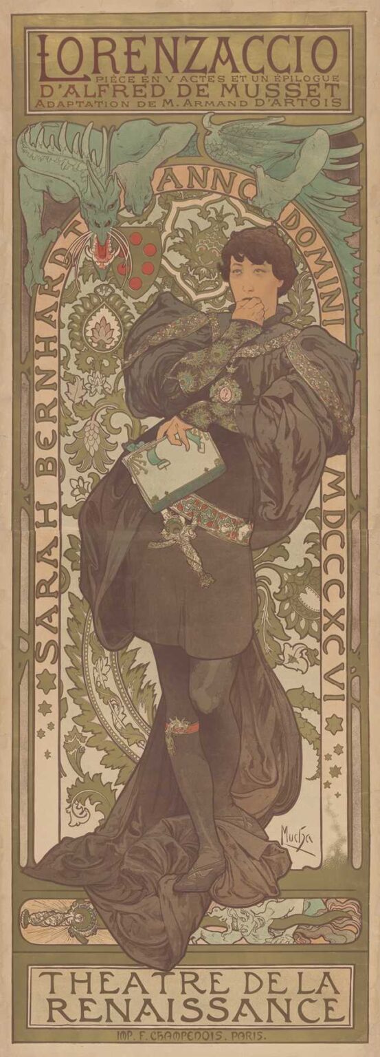
Alphonse Mucha’s 1896 poster Sarah Bernhardt in Lorenzaccio, Théâtre de la Renaissance stands as one of the masterworks of Belle Époque graphic art. Commissioned to advertise Sarah Bernhardt’s performance in Alfred de Musset’s play Lorenzaccio, adapted by Armand d’Artois, this lithograph transcends mere promotion to become an iconic fusion of portraiture, decorative ornamentation, and theatrical narrative. Measuring approximately 120 by 50 centimeters, it captures Bernhardt in contemplative pose, costumed as the tragic Florentine nobleman Lorenzo de’ Medici. Across its sinuous lines, stylized foliage, and harmonious color palette, Mucha synthesizes classical drama and modern design, creating an image that both celebrated the actress’s star power and advanced the visual language of Art Nouveau.
Historical and Cultural Context
The mid-1890s in Paris marked a golden age of theatre, with Sarah Bernhardt reigning as its most luminous star. The Théâtre de la Renaissance, housed in a former church on Boulevard Saint-Martin, specialized in new adaptations of classic and contemporary works. Bernhardt’s choice of Lorenzaccio—a tale of political intrigue and personal vengeance set in Renaissance Florence—aligned with audiences’ taste for historical drama and moral complexity. At the same time, the poster art form was undergoing its own renaissance, driven by advances in chromolithography and a burgeoning café culture that plastered eye-catching images on boulevards. Against this backdrop, Mucha’s work both embodied and shaped the public’s appetite for visually compelling announcements that blended art and advertising.
Alphonse Mucha’s Artistic Evolution
By 1896, Mucha had emerged from relative obscurity to international renown. After arriving in Paris in 1887 and training in Munich, he struggled as an illustrator until Bernhardt commissioned him for Gismonda in 1894. That poster’s success launched Mucha’s signature style—elongated figures, halo-like ornamentation, and botanical motifs rendered in fluid linework. Over the following two years, he refined his technique, experimenting with multi-stone lithography to achieve subtle color gradations and metallic highlights. The Lorenzaccio poster represents a mature iteration of this style: more restrained than his earlier society portraits, yet equally decorative, it demonstrates Mucha’s facility in adapting his visual vocabulary to dramatic portraiture and complex typographic requirements.
Commission and Promotional Purpose
Théâtre de la Renaissance sought a poster that would convey both the gravitas of Lorenzaccio and the magnetic presence of Sarah Bernhardt. Rather than depict a scene from the play, Mucha chose to present Bernhardt in costume, in a moment of introspective pause before action. This approach positioned the poster as both portrait and teaser, emphasizing the star’s dramatic transformation. The large lettering at top proclaims “LORENZACCIO” in custom-crafted capitals, while a tightly spaced subtitle cites the playwright, adapter, and theatre. By integrating text and imagery, Mucha ensured that the poster communicated essential information at a glance, while its decorative power invited closer inspection—a dual strategy that maximized both legibility and allure.
Subject and Dramatic Characterization
In Lorenzaccio, Lorenzo de’ Medici masquerades as a debauched libertine in order to avenge political tyranny. Mucha’s portrayal captures the character’s inner conflict: Bernhardt stands draped in voluminous black robes, one hand raised to her lips as though weighing a fateful decision. Her gaze, directed slightly downward, suggests both melancholy and resolve. The costume—exquisitely detailed with patterned sleeves, jeweled belt, and a cameo pendant—speaks to the opulence of Renaissance court life, while the sword at her side hints at latent violence. Mucha balances these elements to convey the play’s themes of duplicity, honor, and tragedy, encapsulating complex drama in a single frozen gesture.
Composition and Spatial Dynamics
Mucha arranges the composition vertically, echoing the theatrical proscenium. The figure occupies the central third of the poster, framed by an arching foliage motif that recalls both Renaissance architecture and stylized Art Nouveau curves. Flanking the figure, Aztec-green serpentine leaves spiral outward, creating a rhythmic flow that guides the eye from Bernhardt’s contemplative face down to the draped hem of her garment. The background features a circular medallion of intricate floral patterning punctuated by Bernhardt’s monogram and the adapter’s coat of arms. Above, a rectangular panel houses the title text, while at the base, a broad band announces the theatre. This tripartite structure—title, figure, venue—ensures clarity of message and visual harmony.
Use of Line and Ornament
Line defines Mucha’s signature aesthetic, and in the Lorenzaccio poster it acquires dramatic emphasis. The curve of Bernhardt’s cloak, the slender taper of her fingers, and the serpentile foliate border are all rendered in sweeping, unbroken strokes. These “whiplash” curves contrast with the tightly drawn patterns of embroidery and tapestry within the circular frame. Mucha varies line weight to delineate primary forms—thicker for outer contours, finer for interior details—producing a sense of depth despite the two-dimensional medium. The ornamental flourishes, derived from Renaissance arabesques, integrate seamlessly with the figure, underscoring his belief in the unity of subject and decoration.
Color Palette and Light Effects
Mucha employs a restrained palette of muted olive greens, ochres, and browns punctuated by touches of crimson in the Medici heraldry. Bernhardt’s pale skin stands out against her dark robes, illuminated by a soft, diffused light that seems to emanate from within the poster itself. The green of the foliage motifs echoes both the Renaissance’s love of verdure and Art Nouveau’s naturalism, while the ochre background recalls aged parchment or frescoed walls. Carefully placed highlights—on the cameo, the sword’s hilt, and the folds of the sleeve—add visual interest and guide the viewer’s gaze. The overall tonality evokes a mood of solemn elegance befitting the play’s tragic narrative.
Iconography and Symbolism
The poster’s iconography draws heavily on Medici symbolism. A dragon-like creature perches atop the circular frame, its wings unfurled—a nod to Renaissance bestiaries and the notion of power veiled in myth. The dragon’s open maw, poised above Bernhardt’s head, suggests the ever-present threat of political oppression. Surrounding her, stylized pomegranate blossoms symbolize resurrection and secrecy, reinforcing the play’s themes of hidden motives and moral rebirth. The sword, though she does not grip it, signifies both justice and potential violence. Through these layered symbols, Mucha embeds a subtext of political and moral intrigue, deepening the poster’s resonance beyond mere theatrical announcement.
Typography and Lettering Integration
Mucha’s approach to lettering in Lorenzaccio exemplifies his belief that text must be as decorative as image. The title letters are hand-drawn in a tall, narrow serif that echoes the verticality of the figure and architecture. Subtitles appear in a smaller, block serif that nonetheless mirrors ornamental details in the border. Rather than isolating text in boxes, Mucha allows letters to touch bordering ornament, creating a visual unity between name and design. The theatre’s name at the bottom, “THÉÂTRE DE LA RENAISSANCE,” is set in a broad band whose color and line work harmonize with the arch overhead, balancing the composition and ensuring that venue identification resonates with the play’s lofty themes.
Lithographic Technique and Craftsmanship
Producing this poster demanded meticulous execution across seven to nine lithographic stones. Mucha transferred his original gouache and pencil drawing onto limestone slabs, each dedicated to a specific hue or tonal layer. Inks were mixed to precise formulas to achieve the muted Renaissance palette, and registration pins ensured perfect alignment of each pass. The printer’s credit—“Imp. F. Champenois, Paris”—appears discreetly at the base, acknowledging the technical expertise required. Original proofs display subtle variations in color density, revealing the challenges of consistency in pre-digital printing. The result, however, is a harmonious fusion of painterly detail and mechanical reproduction that retains the warmth and depth of an easel painting.
Reception and Critical Acclaim
Upon its release in late 1896, Sarah Bernhardt in Lorenzaccio was celebrated by critics and audiences alike. Contemporary reviews in Le Figaro and La Plume praised its dramatic impact and ornamental beauty, while theatergoers reported that the poster’s enchanting design deepened their anticipation for Bernhardt’s performance. Collectors of theatrical memorabilia and admirers of Mucha’s style sought out early impressions, and the poster quickly became emblematic of the Théâtre de la Renaissance’s stature. Its success reinforced Mucha’s reputation as the foremost poster artist of his generation and solidified the poster as a vital art form within Parisian cultural life.
Influence on Poster Art and Art Nouveau
Mucha’s Lorenzaccio poster influenced a generation of graphic designers across Europe. Its integration of historical motifs with modern design principles provided a blueprint for marrying narrative content with decorative flourish. Artists in Germany, Britain, and Italy adapted Mucha’s methods—fluid line, symbolic motifs, and custom lettering—to their own national narratives. The poster also contributed to the broader Art Nouveau movement’s ascent, demonstrating how public advertising could be infused with the same aesthetic ideals guiding fine arts and architecture. Even today, the Lorenzaccio sheet is cited in design textbooks as a pivotal example of holistic composition and stylistic synthesis.
Legacy and Contemporary Relevance
More than a century after its creation, Sarah Bernhardt in Lorenzaccio continues to captivate audiences. Original lithographs hang in museum collections worldwide, including the Musée d’Orsay and the Victoria & Albert Museum, where they are studied for both artistic mastery and historical context. Contemporary graphic designers reference Mucha’s use of integrated text and image when crafting branding for theaters, cultural institutions, and events. The poster’s themes of political intrigue and personal sacrifice resonate anew in today’s global discourse, underscoring the enduring power of visual art to evoke complex narratives. As digital media increasingly dominates, Mucha’s work reminds us of the tactile beauty and expressive depth possible in print.
Conclusion
Alphonse Mucha’s Sarah Bernhardt in Lorenzaccio, Théâtre de la Renaissance poster exemplifies the apex of Art Nouveau’s fusion of fine art and commercial graphics. Through masterful composition, symbolic depth, and technical finesse, Mucha created an image that both celebrated a theatrical legend and advanced the visual language of the era. Its elegant curves, harmonious palette, and integrated typography set a benchmark for poster design that endures in both art history and contemporary practice. More than a mere advertisement, the Lorenzaccio poster remains a testament to the transformative potential of graphic art to capture drama, character, and national identity in a single, unforgettable image.